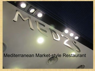
2. Before Entering the Store…
• No door, instead an open fence concept. It
felt welcoming, yet maintained privacy at
the same time.
• Clear, large silver lettering on top, with
spotlights shining on sign.
• Able to sense what food is served from
decorations.
3. Exterior Decoration
Interesting and
captivating decorations
to draw customers in
Cultural representation
signifies the type of
food served
5. Environment
• The store was cold, with white lighting and
concrete floor. This allowed more attention to
be drawn to colourful signs and food, which
increased appetite.
• It was loud and felt like a comfortable place to
chat loudly with friends.
• Cash register was at the exit, and orders
were taken on a punch card. This provided a
tendency to be comfortably spending
more, since customers did not have to pay
upfront. No pressure to leave quickly.
6. Lighting
Use of white spotlights draws attention to
stalls & enables customers to read menu
clearly
7. Products
• Strong visual presence of food
• Open concept provided strong smell and
sound of food cooking
• Colourful menus at eye level
• Prices clearly written
• All senses drawn to products
8. Visual Display
Tangible, visual samples of
food whets appetite and
causes cravings
Handwritten menu adds
personal touch & colours
attract attention
9. Personnel & Customers
• Prompt service to welcome customers and
seat them
• Free and easy after entering, warm service
from staff over the counter serving food
• Customers were mostly youths who were
dining with friends, or young adults with their
co-workers
• Customers explored the place in all
directions, and browsed for food choices
before making their decision
11. Before Entering the Store…
• Spotlights shining on bright red sign
captures attention while passing by
• Automatic doors swing open to welcome
me when I walk near, attracting me into
store
• Opening hours posted right by the doors
• Glass windows provide transparency so
customers can see what the store has to
offer
13. Environment
• White and blue colour scheme in store
gives a clean impression, which is
important for a drug store
• However, interior was cluttered because
staff were restocking shelves all around
the store
• Shelves were organised, which made it
easy to find items
15. Products
• High margin items placed near the front
upon entering
• Promotional products near the cashier
• Products arranged by function
• Milk and snacks at the far end
• Pharmacy on the inside
16. Cluttered and messy
pathways. This
discouraged browsing
because it was
inconvenient to get around
obstacles.
Unappealing display
Yet, there
Squeezy line-up
were empty
aisle declined my
interest in lining up to shelves, whic
pay, and hence h was also
reduced inclination to unattractive.
purchase products.
17. Personnel & Customers
• Staff were busy shelving products and did not
approach customers.
• Counter staff were friendly and welcoming, and
constantly greeted customers with smiles. This
made me feel happy with my purchase.
• Customers were mostly university students and
faculty members and staff, since this was a
campus branch.
• Customers mostly went straight to get what they
wanted and proceeded to pay. Very few were
browsing around.
19. Before Entering the Store…
• Large building gives impression of a giant
store that stocks everything
• Simple design and clear wording provides
impression of affordability
• Clear and easy to spot from the road
• Green walls are easy on the eyes
20. Environment
• White lighting, walls and flooring provides clean, cold
atmosphere
• High ceiling and spacious layout makes it feel more
roomy and comfortable for browsing
• Warehouse-like building gives sense of endless stock
and variety of products
• Inclined to walk around to see what is in store
21. Products
• Wide variety and large quantities
• Neatly shelved products was pleasing to
the eye
• Fresh food all the way inside, which is
different from a regular grocery store
• Promotional items placed near the
entrance and I was attracted to look at
them
22. Personnel & Customers
• Low presence of personnel, only visible at
check-out cashiers. This was suitable
since products were neatly organised and
easy to access
• Customers were mostly middle-aged and
older adults. Mostly Asian
demographic, since this store is located in
an Asian-populated region.
24. Before Entering the Store…
• Lounge located in a mall, as an extension
of main luxury furniture store
• Entrance to store is open, but lounge is
hidden behind a white wall, which makes it
hard to spot
• However, interesting
interior led me to
want to find out what
was hidden at back
25. Environment
• White, black and blue theme gave off a
simple, clean and classy vibe
• Relaxed and quiet environment for
afternoon tea with friends
27. Products
• Fancy and classy presentation of food
increased its value to customers
• Good warm colours that were appetising
28. Personnel & Customers
• We had to wait a while to be seated despite it
not being busy, which is an area they could
improve on
• Once seated, we were promptly served
• Staff were warm and friendly
• Customers were mostly young ladies out for
tea with their girl friends
• Customers tended to take their time and
enjoyed their tea over a long chat with friends