
Recommended
More Related Content
What's hot
Similar to Planning Task 8: Fonts
Similar to Planning Task 8: Fonts (20)
Recently uploaded
Recently uploaded (20)
Planning Task 8: Fonts
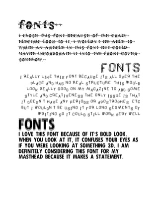
- 1. fonts i chose this font because of the crazy electric look to it. i wouldn’t be able to write an article in this font but could maybe incorporate it into the front cover somehow. FONTS i really like this font because its all over the place and has no real structure. this would look really good on my magazine to add some style and creativeness the only issue is that it doesn’t have any periods or apostrophes etc but i wouldn’t be using it for long segments of writing so it could still work very well FONTS I love this font because of it’s bold look. When you look at it, it confuses your eyes as if you were looking at something 3d. I am definitely considering this font for my masthead because it makes a statement.
- 2. FONTSThis font would be perfect for the name of the artists featuring in my magazine. IT’S SO CREATIVE AND WOULD LOOK PERFECT ON THE ARTISTS MERCHANDISE, WHICH IS STUFF THAT NEEDS TO BE TAKEN INTO CONSIDERATION. I WOULD ALSO USE THIS FONT FOR MAYBE THE WRITING ON THE CONTENTS PAGE AS IT IS VERY STYLISH BUT IS STILL EASY TO READ UNLIKE SOME OF THE OTHERS. FONTS THIS FONT WOULD ALSO BE PERFECT FOR THE MASTHEAD ON THE MAGAZINE AS IT IS EASY TO READ YET ARTISTIC AT THE SAME TIME.IT ISN’T FONT THAT PEOPLE SEE EVERYWHERE THE ONLY ISSUE IS THE SAME AS THE PREVIOUS FONT WHERE THERE IS NO PERIODS BUT ONCE AGAIN THAT’S FINE BECAUSE I WOULDN’T BE USING IT FOR THAT KIND OF WRITING FONTSTHIS FONT IS PROBABLY MY FAVOURITE OUT OF THE ONES I’VE BEEN ABLE TO FIND. IT’S VERY EASY TO READ BUT THE SPLATTERED MARKS ALONG THE LETTERS GIVES IT THAT GRUNGY FEEL. THE LETTER ARE CRACKED IN SOME PLACES AS WELL, WHICH WOULD LOOK AMAZING IN MY MAGAZINE.
- 3. FONTS THIS LAST FONT HAS QUITE A HORROR VIBE TO IT AND IS ACTUALLY QUITE SCARY. THE FIRE EFFECT REALLY GIVES IT A SUSPENSEFUL VIBE AND I THINK I COULD INCORPORATE IT VERY WELL INTO MY MAGAZINE SOMEWHERE.