
Recommended
More Related Content
What's hot
What's hot (20)
Viewers also liked
Similar to Digipak analysis mcfly essay
Similar to Digipak analysis mcfly essay (20)
More from laurencooney2497
More from laurencooney2497 (20)
Recently uploaded
Recently uploaded (20)
Digipak analysis mcfly essay
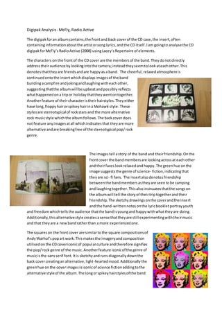
- 1. Digipak Analysis- McFly, Radio Active The digipak for an album contains; the front and back cover of the CD case, the insert, often containing information about the artist or song lyrics, and the CD itself. I am going to analyse the CD digipak for McFly’s Radio Active (2008) using Lacey’s Repertoire of elements. The characters on the front of the CD cover are the members of the band. They do not directly address their audience by looking into the camera; instead they seem to look at each other. This denotes that they are friends and are happy as a band. The cheerful, relaxed atmosphere is continued onto the insert which displays images of the band building a campfire and joking and laughing with each other, suggesting that the album will be upbeat and possibly reflects what happened on a trip or holiday that they went on together. Another feature of their character is their hairstyles. They either have long, floppy hair or spikey hair in a Mohawk style. These styles are stereotypical of rock stars and the more alternative rock music style which the album follows. The back cover does not feature any images at all which indicates that they are more alternative and are breaking free of the stereotypical pop/ rock genre. The images tell a story of the band and their friendship. On the front cover the band members are looking across at each other and their faces look relaxed and happy. The green hue on the image suggests the genre of science- fiction, indicating that they are sci- fi fans. The insert also denotes friendship between the band members as they are seen to be camping and laughing together. This also insinuates that the songs on the album will tell the story of their trip together and their friendship. The sketchy drawings on the cover and the insert and the hand-written notes on the lyric booklet portray youth and freedom which tells the audience that the band is young and happy with what they are doing. Additionally, this alternative style creates a sense that they are still experimenting with their music and that they are a new band rather than a more experienced one. The squares on the front cover are similar to the square compositions of Andy Warhol’s pop art work. This makes the imagery and composition utilised on the CD cover iconic of popular culture and therefore signifies the pop/ rock genre of the music. Another feature iconic of the genre of music is the sans serif font. It is sketchy and runs diagonally down the back cover creating an alternative, light-hearted mood. Additionally the green hue on the cover images is iconic of science fiction adding to the alternative style of the album. The long or spikey hairstyles of the band
- 2. are iconic of early 2000’s pop stars, again, revealing the pop/ rock genre and the alternative style of the band and their music. The relaxed setting seen in the insert portrays a campsite where the band took a trip together. They are seen to be happy and their music is depicted as light- hearted because of this relaxed setting. The plain studio-like setting on the front cover, however, creates a more serious tone as it is the background of a professional photo shoot for the album, making the band seem like they are more focused on their career here than they were on the campsite. This is juxtaposed with the sketchy, alternative illustrations of the album logo which, again, connotes a sense of happiness and relaxation between the band members. Therefore the settings which feature on the digipak create a contradiction between the seriousness of rock and the light- heartedness of pop music. The way in which technical codes on the front and back covers have been utilised through editing to give a pale green hue over the images and text produces a punk-like mood, suggesting that the band make punk/ alternative music. This is supported by the sketchy images of microphones with tongues sticking out of them as they also depict a punk-like, alternative genre of music. The high- key, natural lighting of the images in the insert are relaxed and display the friendship and light-heartedness of the band and their music, contradicting the punk-like imagery and editing on the front cover. The long-shots utilised in the insert to convey the band are also light-hearted as they are seen playing guitars, sitting on the ground around a campfire and laughing, again, depicting the pop genre of music. Overall, the characters, setting, technical codes, iconography and narrative create a sense of the rock/ pop genre and reveal the close- friendly relationship between the band members.