QSM Chap 10 Service Culture in Tourism and Hospitality Industry.pptx
Presentation module guide
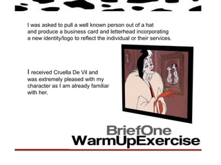
1. I was asked to pull a well known person out of a hat
and produce a business card and letterhead incorporating
a new identity/logo to reflect the individual or their services.
I received Cruella De Vil and
was extremely pleased with my
character as I am already familiar
with her.
2.
3. From my research I began looking for USP’s of Cruella De Vil and
Started to think of how I could put them to use.
I didn’t want to make ordinary business cards as I believe adding a
unique feature to them would make a more fascinating.
My second idea was to
My first idea was to do a dog
reverse the roles of Cruella
poop bag service, as I wanted
wanting Dalmatians fur and
to have some fun with my work,
instead supply fur coats
and Cruella is known for
for dogs. My added feature
her hatred of dogs. My added
would be a small piece of fur
Feature was a poop bag
to give the card texture.
which clients could keep.
4. I like these business cards because
they are not just your average designs,
they have added features which makes
them more unique and fun to receive.
5. What is a letterhead?
Letterhead represents the company or organization the letter is from. Below are some classic
letterheads I have found from big organizations.
6. The images and websites above
gave me inspiration when it came
to designing my business cards,
letterheads & strap lines.
7. Logos for both business cards &
letterheads.
Strap lines-
‘Because life’s full of crap’
‘Made for rich bitches’
8.
9.
10. I was asked to produce a series of six postcards with
a wrap or slip cover. Two aspects of semiotics that
are not usually seen or used in the same place were 210mm
to be explored.
150mm
It was explained that the six post cards may
be primarily image-based, but they each had
to contain a small paragraph of typography,
That provokes a response as a juxtaposition
of semiotics explored.
11.
12. Postcard- A commercially
printed card with space on
one side for an address and
a postage stamp, used for
sending a short message.
13. After looking at my research and understanding all of the
different types of signs I was eager to get started. I was mainly
interested in the signs were we are expected to do certain
things at certain times, Such as rising to ones feet when a
judge enters a courtroom, to serve as a gesture of respect. I
was also interested in looking at road/toilet symbols and what
they meant and started to think of ways that I could link them
together.
Soon after I came up with the
concept ‘The Standing Human’ and
began to explore all of the different
times we rise to our feet to serve
different gestures.
14. • We rise to our feet when a judge enters a courtroom
• Standing is appropriate at certain times in church such as
weddings, funerals, holy communions and christenings
• We stand for the national anthem
• We usually stand when making a speech
• It is appropriate to stand up in front of the pop/royalty
• We are expected to patiently stand in queues when
waiting for services
• Standing on public transport for the elderly can also be
seen as a gesture of respect
15. These are some drawings and rough work to show
my development. I started to think about how I
could create my signs in illustrator.
16. These are my signs I have created in illustrator, each of them represent semiotics
were standing is concerned. I created my images in the style of WC signs to
connect them with the standing human which
gave two aspects of semiotics.
Chivalry Attention Respect
17. Order
I will now design my postcards
including these images and
explain a little about what each
of them mean.
Respect Tradition