Wd133 unit 4 module 1 learning about type fonts and properties[2]
1. WD133: Digital Imaging
Unit 4: Working with Type
Module 1: Learning about Type Fonts and Properties
Type
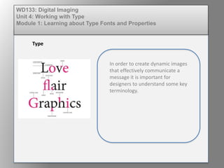
In order to create dynamic images
that effectively communicate a
message it is important for
designers to understand some key
terminology.
2. Readability
Readability is related to how the type is
arranged. Readability is affected by point
size, leading, line length, alignment, letter-
spacing, and word-spacing. Paragraphs of
text, similar to paragraphs in a textbook or
a novel, are meant to be read for
comprehension, and focus must be placed
on readability. This emphasis ensures that
the eyes do not tire and that the formatting
of the copy does not distract a person from
the meaning of the text.
The color and texture of the type selected
will also affect the readability and message
conveyed. Display of red text on a black
background is considered striking, eye-
catching, and readable. White body copy on
a black background can add contrast.
However, the designer must watch out for
strokes that are too thin.
WD133: Digital Imaging
Unit 4: Working with Type
Module 1: Learning about Type Fonts and Properties
3. Legibility
Legibility refers to the typeface design. This
element includes the size of the counters,
the x-height, the size of ascenders and
descenders, the character shape and angles,
stroke contrast, serifs or the lack of serifs,
and the weight. These features help
distinguish one letter from another. A
headline on a poster is meant to capture
attention and immediately convey a feeling.
Legibility, though necessary, is not always
the highest priority.
Script, calligraphic, and hand-written fonts
are used in both display and body copy
applications. Although they can convey
elegance, formality, or individualist
messaging, the legibility can be poor, and
they can be difficult to read.
WD133: Digital Imaging
Unit 4: Working with Type
Module 1: Learning about Type Fonts and Properties
4. Leading
The spacing between the lines of type
is known as leading. This term relates
to the times when type was set
manually and thin strips of lead were
placed between the rows to increase
the spacing. Tight leading—10 point
type size on 11 point leading, read as
10-on-11 and written as 10/11—is
supposed to be more difficult to read.
A 10/12 is more standard, but the
ideal leading always depends on the
typeface characteristics.
Digital Imaging
Unit 4: Working with Type
Module 1: Learning about Type Fonts and Properties
6. Tracking
Spacing between all the
characters in a line is known as
tracking. If letters are too close,
they are said to be set tight; if
they are set too far apart, they
are said to be open or loose.
Many designers do not focus on
proper and consistent character
spacing, a clear message to the
client that the designer is not
experienced.
Digital Imaging
Unit 4: Working with Type
Module 1: Learning about Type Fonts and Properties
7. Justified Text
Word spacing is a tool used when
aligning text so that the beginning of
a line and the end of the line align
with the left and right column edges,
respectively. This is known as
justified text. Too much word spacing
can lead to large, annoying word
spaces that can lead to rivers. Rivers
occur when the spaces between
words line up top to bottom in a
paragraph. More than three line ups
in a row decreases readability
because attention is drawn to the
river that results instead of the
reading process.
Digital Imaging
Unit 4: Working with Type
Module 1: Learning about Type Fonts and Properties
8. White Space
White space is a term used to define
the cramped or crowded look of a
headline, paragraph of text, or an
entire layout. Recall the saying “less is
more.” Try to leave space on a page to
create effect and emphasize the text. It
also helps with the flow of the reader’s
eye. A good test for white space is to
turn the completed job upside down
and look at the design at arms length.
This move restricts the brain from
reading the text and forces it to just
look at the design elements and the
weighting and positioning of each. Is
the leading too small? Is the line length
too long? Is the point size to big or too
text-heavy? If the answer is in the
affirmative for any of these questions,
the white space may not be enough or
the layout may be too packed.
Digital Imaging
Unit 4: Working with Type
Module 1: Learning about Type Fonts and Properties