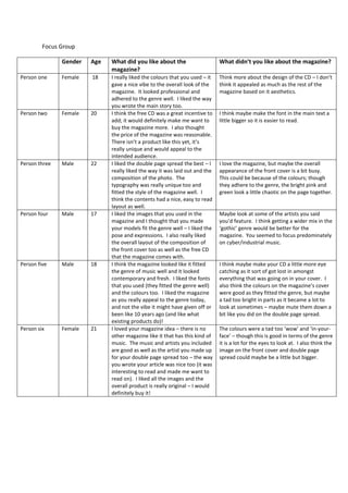
1. Focus Group
Gender Age What did you like about the
magazine?
What didn’t you like about the magazine?
Person one Female 18 I really liked the colours that you used – it
gave a nice vibe to the overall look of the
magazine. It looked professional and
adhered to the genre well. I liked the way
you wrote the main story too.
Think more about the design of the CD – I don’t
think it appealed as much as the rest of the
magazine based on it aesthetics.
Person two Female 20 I think the free CD was a great incentive to
add; it would definitely make me want to
buy the magazine more. I also thought
the price of the magazine was reasonable.
There isn’t a product like this yet, it’s
really unique and would appeal to the
intended audience.
I think maybe make the font in the main text a
little bigger so it is easier to read.
Person three Male 22 I liked the double page spread the best – I
really liked the way it was laid out and the
composition of the photo. The
typography was really unique too and
fitted the style of the magazine well. I
think the contents had a nice, easy to read
layout as well.
I love the magazine, but maybe the overall
appearance of the front cover is a bit busy.
This could be because of the colours; though
they adhere to the genre, the bright pink and
green look a little chaotic on the page together.
Person four Male 17 I liked the images that you used in the
magazine and I thought that you made
your models fit the genre well – I liked the
pose and expressions. I also really liked
the overall layout of the composition of
the front cover too as well as the free CD
that the magazine comes with.
Maybe look at some of the artists you said
you’d feature. I think getting a wider mix in the
‘gothic’ genre would be better for the
magazine. You seemed to focus predominately
on cyber/industrial music.
Person five Male 18 I think the magazine looked like it fitted
the genre of music well and it looked
contemporary and fresh. I liked the fonts
that you used (they fitted the genre well)
and the colours too. I liked the magazine
as you really appeal to the genre today,
and not the vibe it might have given off or
been like 10 years ago (and like what
existing products do)!
I think maybe make your CD a little more eye
catching as it sort of got lost in amongst
everything that was going on in your cover. I
also think the colours on the magazine’s cover
were good as they fitted the genre, but maybe
a tad too bright in parts as it became a lot to
look at sometimes – maybe mute them down a
bit like you did on the double page spread.
Person six Female 21 I loved your magazine idea – there is no
other magazine like it that has this kind of
music. The music and artists you included
are good as well as the artist you made up
for your double page spread too – the way
you wrote your article was nice too (it was
interesting to read and made me want to
read on). I liked all the images and the
overall product is really original – I would
definitely buy it!
The colours were a tad too ‘wow’ and ‘in-your-
face’ – though this is good in terms of the genre
it is a lot for the eyes to look at. I also think the
image on the front cover and double page
spread could maybe be a little but bigger.