Pari Chowk Call Girls ☎️ ((#9711106444)), 💘 Full enjoy Low rate girl💘 Genuine...
Question 2
1. Layout
The layout for each piece follows certain conventions of regular
trailers,postersandfilmmagazine;thisensuresthere won’t be any
brand confusionwiththe audience.The title of the poster is in the
middle emphasizing the central area of the image. I challenged
conventions by doing this as many poster titles are located at the
bottom of the page. The technique of having the title at the bottom of
the page is used in magazines also, and I stuck to this convention for this product as the
mastheadandheadline frame the mainimage,therefore making it stand out. The use of the billing
block and the release date at the end of the trailer makes the trailer look professional as many
trailersfollow this convention. In the main image of the poster I have included the main prop- the
‘possessed’ bear to show how much of an impact this has in the film.
Colour
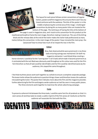
Blue,Red,blackandwhite were prominent in my three
tasks ensuring synergy was maintained. On both my
magazine and poster I used blood drips creating a
horror element.Iused blue forthe “comingsoon”inall 3 tasks whichmade it become prominent as
it contrastedwiththe red.Blackwas obviouslyused throughout as this colour was used for the film
font therefore so that all task could be identifiable and the film could be identified easily by the
audience, this stayed the same throughout.
Final pieces
I feel thatmythree pieces work well together as a whole to ensure a complete corporate package.
The teasertrailerallowsthe audience to question things shown and therefore teases the audience
intowatchingthe trailer.The posterthenindicates more about the film and the magazine provides
furtheradvertisingforthe filmandtargetsawideraudience asitwill be seen in many public places.
The three elements work together to maximise the whole advertising campaign.
Fonts
To presenta coherentlinkbetweenthe three tasks,Iusedthe same font for all products so that it is
seen across all ancillary tasks to create a subtle imprint of the film across all mediums so that the
audience will associate this font with the film.
2. As a promotional tool
I think my three pieces work well as a
promotional tool.Formyposterwe created
two posters, one portrait and another
landscape that it could be shown on a
variety of billboards to target a large
audience. The trailer includes social
networking sites for the film to generate
online hype, this is effective as my target
audience isinthe ‘E’ demographic,meaning
they are Intune with the online age. In the magazine, I have used the actor as my main image and
usedthe tile of the film as the headline which strongly promotes the film ensuring it is noticed on
the shelf in a shop. All products use the same title
throughout ensuring that they all sell each other and
provide a coherent link. To sell this movie to a online
oriented audience I added a web link on the end of the
trailerbillingcreditsallowing the audience to interact more with the film, actively researching and
because a date was notyetgivenforrelease andinstead ‘coming soon’ was given it made this even
more valuable to the audience.
Styling
The stylingworkswell to retain my youthful
target audience of both males and females.
Across all three tasks, I styled my actor in
the same dark minimalistic clothing to have
a simple youthful appearance using red,
blacksand dark blue toneswhichare usedin
the colour scheme of all ancillary products
to add coherence.For my protagonist in the
magazine and trailer, I chose to use simple
clothingwithdarkclothingtoshowher mysterioushiddenidentity. In the trailer
these clothes are used throughout.