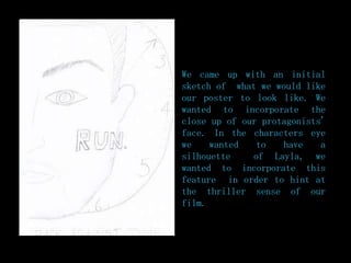
1. We came up with an initial
sketch of what we would like
our poster to look like. We
wanted to incorporate the
close up of our protagonists'
face. In the characters eye
we wanted to have a
silhouette of Layla, we
wanted to incorporate this
feature in order to hint at
the thriller sense of our
film.
2. In order to try-out our first idea we decided
to experiment with an image in Photoshop as
none of us were confident with the program.
We decided to use the image of Tommy from
our casting shots found on our blog.
3. We first cropped the image in Photoshop
in order to create the close-up image
that we wanted. We then chose a clock
face image off Google and edited into
the background making it slightly
transparent. We chose a font that However
‘Run.’ we all
liked and added in the after doing so we
text
started to think
about synergy and
having the same
text font on all
of our products.
This meant that
the Photoshop
text that we had
chosen would not
be appropriate.
4. Instead of the text that we
had previously chosen we
decided to chose one which
was more similar to the font
that we had used for our
titles that were in our
trailer. We then added in
text. The idea was to use the
skills that we had gained
from making this tester
poster in order to create aur
final one.