1. Rocksound
Magazine
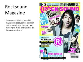
The reason I have chosen this
magazine is because It is a similar
genre magazine to the one I am
planning to make and is aimed at
the same audience.
2. About
• Rocksound magazine is a monthly Rock/metal magazine which
brings interviews and news of rocks biggest underground bands.
• The magazine is one of the UKs most popular and caters to fans
on all genres of rock, from punk to metal.
• Primarily aimed at the british market, this magazine is also sold
outside of the UK in places such as Australia, Canada and the
United States
• First edition launched in 1999, monthly magazine, available in all
major retailers in the UK
3. Cover Buzz Words
Covering
masthead for
established
magazines
Competitions for the readers
to draw them in.
Masthead in
the house
style font
Centred
cover image,
low angle
direct mode
of address
Puffs, stand out from the Lists of bands featured in the
background magazine for fans.
Green and white
house style, the
greens used to Barcode
make the text
stand out Issue number, date and price
4. Contents Magazine title
in the house
Page style font
Short description of
Issue number each article with more
and date detail on what its about.
Medium close up shot of
Jacoby Shaddix with a
Page numbers of the
confused facial
articles
expression. Adds
humour to the image.
Band names for article
titles, then you can see
what your favourite Pull quotes from inside
band is and see an the magazine with the
article related to that page number so the user
band. can read more of the
article. Often can be
taken out of context to
entice the reader.
5. Large image spanning both
pages of the featured band. Feature title, the title of the
High angle long shot of the article or could be a quote.
band members.
Description
Pull quotes
Main content of the
Band logo
magazine article
6. Features
Some features I plan to incorporate into my design are the use is
the way the cover is structured, there doesn’t seem to be a set
layout and would like my design to not be set in a particular way
as I want to get across the metal/rock genre and show that
through the presentation. I also like the way the contents page is
simply layed out with one large image, I would use this design as
its easy to navigate.
7. Kerrang!
Magazine
I have chosen this magazine as
it’s the same genre of magazine I
will be making and I am also a
current fan of the magazine. This
may help me in my analysis.
8. About
• Published by Bauer Media Group
• First published in 6th June 1981 as a one off magazine as part
of the “sounds” newspaper
• The name “Kerrang” comes from an onomatopoeic word
which describes a power chord being struck on an electric
guitar.
• In the early 2000s it became the Uks best selling rock
magazine, weekly.
• Costs £2.20 can buy in all major retailers
9. Mast head, partially covered Distorted typography used
in masthead logo and rest
of cover
Cover image, all
wearing black so
they are the same
and match the
List of bands featured in magazine colour
magazine, readers can look scheme.
to see if their favourite
bands are in the magazine.
Puffs, in a green
box to stand out
Buzz word, free
makes you feel like
you are getting
something for free Barcode
10. Contents title
A section from
the editor of
Issue number
this magazine
and issue
date
Pull quotes Column layout
Featured article
images
Page numbers
for articles
A box about subscribing to the
magazine
11. World exclusive, telling the reader that
Kerrang is the only source for this news Pull quote from article as
article. the title
Page Information
numbers on some of
the bands
songs, fans
of
discovering
new music.
Image
captions
Large full
Live/studio images in a
page image Main “copy”
sepia effect
of the article
12. Features
In the kerrang magazine I like the double page spread and how it
shows the featured band with the pictures in the sepia effect. I
think this is good for my live music magazine as it can show a
band in a calmer atmosphere which contrasts the lively activities
on the road. I like the use of colour as well as it has a set colour
scheme, this means that the rest of the magazine can be in
different colours but these two pages will have their own house
style.