HARNESSING AI FOR ENHANCED MEDIA ANALYSIS A CASE STUDY ON CHATGPT AT DRONE EM...
Evaluation, media
1. In what ways does your media product use, develop or challenge forms
and conventions of real media products
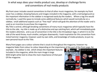
My front cover includes several conventions to that of other music magazines, for example my front
cover has a sidebar, showing features and images included in the magazine, with a red background so
the important information in the sidebar is recognised easily by the readers. Where a tag line would
normally be, I used the space to include some additional features which would normally be on a
sidebar, small additional aspects such as ‘’free mp3’’ which will grab the attention of the reader and is
used as an incentive to purchase the magazine.
My Title is central, although breaking conventions of many music magazines which typically have the
title to the side, my title is made up of a distinctive and eye catching font, which will immediately grab
the readers attention, and a use of convention in the title is the throwdown logo, in which it is to the
side of the word throw, much smaller, and goes downwards, I took inspiration for this convention from
metal hammer magazine, however used my own skills, and knowledge of media products, to put my
own personal touch to the Title.
Many front pages use a colour scheme that is stuck to throughout the magazine, however my
magazine fades from colour to colour depending on the importance of the part of the front page, for
example , my sidebar is red, which shows the important features
Included in the magazine, while the main image is large
With bright white text to show the main importance of that part
Of the magazine.
2. My final front page Tag Line the tag line is used
as a slight after-effect of the
masthead, and is the motto,
or slogan of the magazine,
Masthead The letting the reader know the
title is central to importance or notiority of
the page, although the magazine
breaking
convention, I feel
this attracts the
reader to the Main image my main
magazine more, image is the most important
alongside all the part of my magazines front
cover, I took the shot as a
features of the
medium close up, to focus on
front cover, I used the head and facial features,
strokes and drop as well as stance, posture,
shadows on the and body structure, I chose
font to enhance my model for this photo as he
the visual appeal is 17, and has the image of
many of the artists featured
in the magazine, further
attracting readers.
3. My final contents page
Title,
structured All
differently to contents
the front on one
cover, bold, side,
and clear for font and
readers structure
inspired
from
Cover star, NME and
central to page Metal
to show hammer
importance
Find us on
facebook
Subscription for
logo, attracts
magazine, QR code
my audience
included, for use with
modern technology
4. My final feature page
Page title Large image
uses original covering most
font, to keep of page well
the theme edited so it
of the stands out and
magazine is attractive
Page number
with logo
5. How does your media product represent paticular social groups
With my media product being a music magazine, themed around the metal and
hardcore music scene, representation of the genre is important. A main feature of
representation of the hardcore music scene is my cover star
I picked a bassist from a local metal band to be my coverstar
As he has medium length hair, an ear stretcher and a beard,
I felt that this was the social group I wanted to attract.
When readers see my cover star I think they will find the image
Relevant to my magazine
However I chose my cover star knowing I didn’t want
Stereotyping to occour, and wanted to diversify the genre
Of music my magazine represents.
6. What kind of media institution would produce your media product
• For my publisher of the magazine, I chose Bauer Media Group a german
publishing company who publishes magazines such as Q and Kerrang, big
selling music magazines, the media group produces around 38 million
magazines a week, and circulates worldwide.
• I wanted my music magazine to be produced on a large, worldwide scale
because I am confident in its appeal, and success, and confident in its
profit.
• When researching media publishers and institutions I discovered that
7. Who would be the audience for your media product
• The Audience for my media product would be males and females aged 15-20, I chose this
audience because the content in my magazine is appropiate for, and would appeal to the age
group, some of the content is too explecit or unsuitable for younger audeinces, however
some of the music features would be unfavourable to older audeinces .
• The magazine is also for people who attend many music events, as it contains an extensive
‘’Gig Guide’’, which I intend to be very useful to my target audience.
• My cover star is a good example of my target audience, similar age, style, and is a musician
8. A competitive price,
at £2.40, this is a
monthly magazine,
at a price of a
weekly music
Large masthead, magazine
specialist fonts used, big
and bold, with strokes
and dropshadows, to
stand out on my front Coverstar relevant
How did you
cover. To attract my to audience target
attract/address your
audience into reading and description
audience
the front cover.
9. What have you learnt about technologies from the process or
construction of this product
Before starting this project of creating my magazine, I had never used many of
the software needed to produce the materials.
Photoshop, being the most prolific, was a piece of software I had never used
before, but discovered its many benefits, including downloadable fonts, and
photo editing.
I mainly used the cropping tool, and the polygonal lasso tool, to crop my
images and cut them into a certain style or shape.
I found Photoshop to be a useful tool in my magazine production, as it allowed
me to build and customise my magazine to my own inspriation and vision.
10. Looking back on your preliminary task what do you feel you have learnt from
it to the full product
• Before we started production of our music magazines we were set a task
to create a college magazine, with a front page and a contents page, this
was set to familiarise and introduce some of us to the new software
needed to create our main pieces.