
Recommended
More Related Content
What's hot
What's hot (19)
Viewers also liked
Viewers also liked (17)
Similar to Miley cyrus digipak
Similar to Miley cyrus digipak (20)
Recently uploaded
Recently uploaded (20)
Miley cyrus digipak
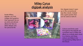
- 1. Miley Cyrus digipak analysis Inside Mileys digipak, you find images and graphics that represent her as an artist and almost allows her fans to delve deeper into her personal life. Her digipak doesn’t open up in the conventional way like a book, instead into a giant poster than can be used as wall art. Colours and fonts used throughout the digipak are consistent and it makes the album as a whole seem stuck to a theme, and these colours are likely to be recognised by Miley fans in the future.
- 2. Editing Here Miley herself has been cropped out and edited onto the artwork, this looks very cheap budget and careless, but this is Mileys personality, she doesn’t care about representation. However this does make Miley stand out from the rest of the graphics on the page. The font used her is spaced apart well, it uses space on the artwork really well and the colours match their backgrounds, still easily seen. Background images are angled slightly and seem like physical photographs on the page, maybe this could represent photos that Miley has herself, and throughout the album we will see more of her life through sound, not necessarily visual.
- 3. Visual/mise en scene The main focal image is of Miley herself staring into the eyes of the consumer, this has a purpose because it makes the fan seem connected to Miley and almost builds a relationship. She wears a short black leather jacket exposing a lot of naked leg, adding to the sexualised persona she gives off. The bold red lipstick is a symbol of lust and love, suggesting the theme for the album. The background colours are purple into orange blended, this looks very similar to a sunset, this could resemble a Memory of Mileys whilst she was on holiday Having fun and making memories, those of Which are told in the album through lyrics. The graphics of the palm trees on the album Are also strong stereotypes of a holiday, maybe An experience she has had in the past is told Through the album and the artwork/digipak is just the start of the story, setting the tone maybe? The ‘Bangerz’ album title is brightly placed into the artwork, the brightness makes the words stand out from the rest of the artwork, and is written in a style that is typically seen on the front of a bar, representing a good, fun time.
- 4. What I have learned From analysing Mileys digipak I will take away several things. Such as.. • I will carefully choose the right colours that suit the song and have a meaning (fun, memories whilst shooting etc?). • Having a main focal image makes a strong digipak because it will be recognised throughout the promotion of the song. • The title of the album needs to be bold and stand out from the rest to allow it to catch peoples eye. • Make it look fun and have consistency throughout (use the same colours/font all the way through).