
Recommended
More Related Content
What's hot
What's hot (20)
Similar to Shot analysis
Similar to Shot analysis (20)
Recently uploaded
Recently uploaded (20)
Shot analysis
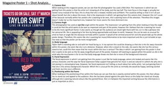
- 1. Magazine Poster 1 – Shot Analysis… 1.) Camera Shot When looking at this magazine poster, we can see that the photographer has used a Mid-Shot. The impression in which we are getting from this poster is that the artist isn’t showing all of her body, just the top half. The main focus in the image is actually her twister torso instead of her face, this to show that she is relaxed, modest and confident. This could be telling us that it isn’t all just about herself, but she is about the music, that is the impression in which I am gaining from this camera shot. However this isn’t usual of her because normally within her posters she is wanting to be seen, she is wanting more of the attention. Therefore this images doesn’t make her as the important one, however her music seems the more dominant one. 2.) Camera Angle The photographer has used an eye-line angle within the poster. The impression I am getting from this when looking at how the angle is could be that the artist wants to be seen as important and part of the poster, however the I believe that she is wanting her music to be the more significant factor. It also seems as though we the audience are stood right there with her, so it is like a glimpse into her personal life. She is appealing to her fans by being approachable and down to earth. However, this can be seen as unusual for artist to have an angle like this because normally within a poster it would all be centred around her and she would take up the whole poster design. Therefore, this seems like she is wanting her music/information to be more important and she is just included at eye- line view so that the poster can be more recognisable. 3.) Body language Taylor Swift is standing side on and with her head facing us. In my opinion this could be showing us that she is this far away character within this poster, she seem like she is at a distance. However, when she is stood on the side, she seems like she has this serious stand to her, could this then mean that her music within this tour is serious? The idea in which I am gaining from this poster is that she is wants to be seen as this far away insignificant part of the poster, however still wanting to appeal within the poster as she is the artist who the tour/poster is for to me that body language shows me that she is more of the background character. 4.) Facial Expression The facial expression in which I am getting from this poster is just like her body language, where she looked and seems like this serious character, and the way her facial expression helps support how genuine her music is and ow natural it is which she why she is not posing in a stereotypical way. However, her facial expression isn’t telling us much about her asthe artist, I am just gaining from it that she is this serious background character. Which this is unusual for the artist as normally she would be happy, seeming excited and fresh, but this one is different. 5.) Positioning within the frame When looking at the positioning of her within this frame we can see that she is exactly centred within this poster, this then allows her to stand out and appeal to the audience. Also she has been placed against this plain fence so this helps her stand out sharply although she is wearing natural colours like the painted fence. She is in between the important writing because the information is just as important as she is.
- 2. Magazine Poster 2 – Shot Analysis… 1.) Camera Shot When looking at this magazine poster in which the photographer has done by using long shot. The reason why this is a long shot is because of the way in which it is a majority of the amount within the entire poster, showing the artist herself from head to feet, her entire body is visible. The impression in which I am gaining from this camera shot is that the artist is the main attraction within this poster and she wants to be seen as the important character within this. However, before I studied a different styled poster of the same tour to what we see now and she seemed more closed, she appealed more as a mid-shot, with her half her body being visible and seemed more of a closed character. Therefore within this shot she is seen as being more open, more appealing as an artist. 2.) Camera Angle The photographer has used an eye-line angle view, which was the same as the poster previously. The impression in which I am gaining from this camera angle is that she is more of the important character/part within this poster. This is then more of an appealing shot for the audience as it does become more attractive and viewable. Before, she was angled as a eye-line angle which is the same as this one. In this one she seems to have more of a significant factor within her as the artist herself, she is still showing that her music is important to her as we see that various music instruments within the background and the one in which she is holding is showing that she has musical talent. 3.) Body language The body language In which she is showing within this magazine cover is the idea of her seeming more of an open character towards the audience. Clearly showing that she wants to sell herself more for who she is and the way in which she wants to be seen. The body language then helps us as the audience know who she is and what her personality would be like and from this one she seems like she is flexible and more moving and revealing, within the way she stands. Showing us that she is feeling comfortable in the way in which she is standing and reflecting herself to her audience as the important character. 4.) Facial Expression When looking at the facial expressions within this magazine poster we can see that she looks yet again this idea of being serious, which can be seen as unusual for the artist. However, her facial expression is looking down at her musical instrument, which in this case is a guitar. The idea of her having this expression and looking down at the instrument could be showing us that she is serious about her music and her talent. This could then be showing that to her music is a significant factor within the her life and we saw this within the poster before that to me she mainly wanted her music to seem important. 5.) Positioning within the frame When looking at the positioning of Taylor swift within the poster we can see that she is more to the left of the poster and enlarged to fit the entire poster. Clearly showing us that she is wanting to be seen as being more important role within this poster. However still allowing to see within the centre and the left of the poster is that it seems that her music features such as the band and instruments are clearly being shown here. This could then be showing us that both her as the artist and her music are both the significant features within this magazine promotional poster and the way in which this has been set out.
- 3. Digipak Cover 1 – Shot Analysis… 1.) Camera Shot When looking at this camera shot of Katy Perry’s digipak “Teenage Dream” we can see that they have used a long shot of Katy Perry, through this we can see the entire length of her body from head to feet. The impression in which I am getting from this digipak cover is the idea of her wanting her audience to see her more as the artist. I am also seeing the idea of the theory of the “Male Gaze” as we can see that she is not wearing any clothes, allowing us to see more of her body and relate to the theme of the songs. To me this could be showing that she wants to appeal more towards the male audience with the way the long shot enables us to see the artist herself, making this seem more of an effective cover for the audience she is trying to attract. 2.) Camera Angle The photographer has used an eye-line angle within this digipak. The impression in which I would be gaining from looking at this chosen angle is that she is wanting the audience to see her directly within the eye view of her audience making this even more effective when wanting to attract her chosen audience. We can see that this would also support the idea of the male gaze because of the way in which she is at a eye-line level with her audience, making this seem more attractive and allowing us to see more of her body, creating that chosen effect. 3.) Body language When looking at this digipak cover, we can see that the body language that she is expressing within this cover is that she seems very relaxed and open. However she does also seem quite closed to with the way in which her legs her sticking up towards her body, this could be giving out the impression of her being a closed person as well as being open, within her different personality's being expressed within this cover. Therefore, this could be also giving out the idea of her being more open towards the male audience, as she looks like she is laying down, which could be also giving out the idea in her being more relaxed within her body posture. 4.) Facial Expression The facial expression in which she is outlining within this digipak cover is that she does look very serious, however still looking a little mischievous. We can see that the idea of her being serious, could be giving me the impression that she seems serious about her music and the way in which she is serious about the way she looks and appears within this cover, she is serious about the way she looks and the way she is presenting herself. However, the idea of also have some mischievous facial expression within this could be supporting the idea of her being this idea of the “Male Gaze” and the way that she wants to appeal to them as this open character in the way in which she is being seen through this. 5.) Positioning within the frame Looking at the position within this we can see that the artist is centred within the middle of the cover, supporting the angle of her being eye-line towards her audience. This could be giving out the impression that she wants to be seen, she wants to be noticed through this cover design, she wants the audience to know she is the significant character within this album and her songs, and the centre giving that idea of her wanting that attention, dragging her eye-line straight towards you.
- 4. Digipak Cover 2 – Shot Analysis… 1.) Camera Shot When looking at this digipak cover we can see that they have used a close up shot on the artist. This could be giving out the impression that she is wanting to be seen as close up and doing this gives out more of an effect. As this allows us to see more of the feelings and emotions in which she is showing within her image. This could then be giving out the idea of emotive language being shown through this towards the audience. It then allows us to see more of the artist and understand more about her artist just through her image, letting us know what she is like. Showing her as being this more dominant character, throughout this design. 2.) Camera Angle However, the camera angle is which we are still getting from this cover is that the angle is this is eye-line as well. The impression that this would then be allowing us to have is the idea of appealing more out towards the audience, wanting us to directly see her. The idea of her covering the entire design of the cover, we can see that this attracts the design further, allowing us to see more of her and then it is showing to us that she is the more important character within this cover, allowing us to see that her music is important if she is showing herself more as being the significant character within this. Expressing this to the audience as well, allowing us to connect more with her as the singer and her music. 3.) Body language The body language in which we are getting from this image is that we are only seeing her face, allowing us to see less of her, but still giving us the idea of her being more dominant and powerful with the way in which she is being expressed. We can see that her head is only a little tilt, which could be showing us the idea of her being more expressive. Therefore, still wanting to be known. To me she is more of being within a closed posture, she doesn’t seem very open character, as she seems very closed up. Furthermore, still wanting the audience to know it is her and wanting to be seen still as the important artist as well as her music. 4.) Facial Expression When looking at the facial expression within this digipak cover we can see that she looks very serious, this could be showing to us as the audience that she is seeing herself and her music being important to her. Looking at the idea of her being more of a closed expression, with her closed eyes, which seems that she doesn’t want to connect with her audience, but we want to connect to her, however still being seen as the important character as she covers the entire design letting the audience know that she is the artist, however the facial expression tells more that she wants to been but because of her closed appearance she could be showing us that her music is more important to her. 5.) Positioning within the frame The positioning of the artist within this frame is that she covers the entire design of the of the digipak cover, this could be then outlining the impression that she is more of an important role within this design, however still wanting to be seen as this serious artist, meaning that her music is seen as important however the positioning allows us to see more of the artist, understand her more as the main artist and allows us to see the emotive appearance that is being seen within her, to have possible connections with her.
- 5. For example, you could comment on: 1. Camera shot (what impression we are getting / is this usual for the artist?) 2. Camera angle (what impression we are getting / is this usual for the artist?) 3. Body language (What do they want us to know about them from their posture? Link to star image.) 4. Facial expression (What are we supposed to know about them? Link to star image.) 5. Positioning within the frame.