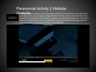
1. The first thing the audience sees is the loader, which is in the same font as the movie title and supports the movie’s apparent ‘digital’ theme. The film’s teaser dominates the screen and plays automatically so the audience’s attention is completely focused on it. The rule of thirds is also important as the main information takes up two thirds of the page while the other information is in the lower third as it is unimportant. Paranormal Activity 2 Website Analysis
2. This link allows people to embed the trailer into their blogs and website to show other people who may be interested, providing the movie with free advertising. Paranormal Activity 2 Website Analysis This bar allows website viewers to tweet straight onto the movie’s twitter page, saving them time and promoting the movie, Giving people a variety of ways (Facebook, Twitter, e-mail, Stumbleupon, Digg) to express their ideas and thoughts about the movie means that the movie gets ample publicity. Scrolling down reveals the technical information about the movie such as ratings, legal information, Privacy Policy and Terms Of Use. This information isn’t what most viewers are interested in, and therefore is at the very bottom of the page in small font.
3. This links to other global sites for those who don’t live in the UK and provide them with extra information about the movie’s release. It’s a good idea to put this information on a separate page so that people first viewing the website aren’t bombarded with information that they aren’t necessarily interested in yet. Paranormal Activity 2 Website Analysis Again, they make sure to use social networking sites to their advantage to promote the movie. People can Follow the movie on twitter and register for updates so that everyone who is interested is kept up to date on recent news about the movie.
4. Paranormal Activity 2 Website Analysis Once you’ve watched the trailer, the screen begins to zoom into the final image, removing almost all control from the viewer, serving as a confusing and creepy experience. A static noise begins, increasing the tension as the viewer realises (perhaps for the first time) that the baby is not in its crib, but is in the mirror. Then the screen cuts to this page, which provides more links and the movie’s release date (October 22). The obscured image of a girl on the left would probably be recognisable to people who had seen the first movie, and slightly frightening for newcomers.
5. Paranormal Activity 2 Website Analysis The title provides a stable brand identity by using the same font and following the colour scheme of red, blue and black. This attracts the viewer as they want to see the movie first. This increases the movie’s popularity and public excitement about the film The arrow icon is for people to view the video again should they wish to. Once again they establish social networking sites to gain more publicity.