Q magazine contents
•Download as DOCX, PDF•
0 likes•134 views
Q magazine - textual analysis
Report
Share
Report
Share
Recommended
More Related Content
Viewers also liked
Viewers also liked (18)
Cara Penggunan teks Editor Nano di linux [ tugas 12 ]![Cara Penggunan teks Editor Nano di linux [ tugas 12 ]](data:image/gif;base64,R0lGODlhAQABAIAAAAAAAP///yH5BAEAAAAALAAAAAABAAEAAAIBRAA7)
Cara Penggunan teks Editor Nano di linux [ tugas 12 ]
Similar to Q magazine contents
Similar to Q magazine contents (20)
Unit 13- Planning and Pitching a Print based Media Product
Unit 13- Planning and Pitching a Print based Media Product
More from hollie98
More from hollie98 (8)
How effective is the combination of your main product & media texts
How effective is the combination of your main product & media texts
Recently uploaded
PEMESANAN OBAT ASLI : 087-776-558-899
Cara Menggugurkan Kandungan usia 1 2 3 4 5 6 7 8 bulan SEMARANG || obat penggugur kandungan SEMARANG || cara aborsi kandungan SEMARANG || obat penggugur kandungan 1 2 3 4 5 6 7 8 bulan SEMARANG || bagaimana cara menggugurkan kandungan SEMARANG || tips Cara aborsi kandungan SEMARANG || trik Cara menggugurkan janin SEMARANG || tata cara aman bagi ibu menyusui menggugurkan kandungan SEMARANG || klinik apotek jual obat penggugur kandungan SEMARANG || jamu PENGGUGUR KANDUNGAN SEMARANG || WAJIB TAU CARA ABORSI JANIN SEMARANG || GUGURKAN KANDUNGAN AMAN TANPA KURET SEMARANG || CARA Menggugurkan Kandungan tanpa efek samping SEMARANG || rekomendasi dokter obat herbal penggugur kandungan SEMARANG || ABORSI janin SEMARANG || aborsi kandungan SEMARANG || jamu herbal Penggugur kandungan SEMARANG || cara Menggugurkan Kandungan yang cacat SEMARANG || tata cara Menggugurkan Kandungan SEMARANG || obat penggugur kandungan di apotik kimia Farma SEMARANG || obat telat datang bulan SEMARANG || obat penggugur kandungan tuntas SEMARANG || obat penggugur kandungan alami SEMARANG || klinik aborsi janin gugurkan kandungan SEMARANG || Cytotec® misoprostol BPOM SEMARANG || OBAT PENGGUGUR KANDUNGAN CYTOTEC© SEMARANG || aborsi janin dengan pil Cytotec© SEMARANG || Cytotec© misoprostol BPOM 100% SEMARANG || penjual obat penggugur kandungan asli SEMARANG || klinik jual obat aborsi janin SEMARANG || obat penggugur kandungan di klinik k-24 SEMARANG || obat penggugur Cytotec© di apotek umum SEMARANG || CYTOTEC© ASLI SEMARANG || obat Cytotec© yang asli 200mcg SEMARANG || obat penggugur ASLI SEMARANG || pil Cytotec© tablet SEMARANG || cara gugurin kandungan SEMARANG || jual Cytotec© 200mg SEMARANG || dokter gugurkan kandungan SEMARANG || cara menggugurkan kandungan dengan cepat selesai dalam 24 jam secara alami buah buahan || usia kandungan 1 2 3 4 5 6 7 8 bulan masih bisa di gugurkan || obat penggugur kandungan cytotec dan gastrul SEMARANG || cara gugurkan pembuahan secara alami dan cepat SEMARANG || cara Menggugurkan janin di luar nikah SEMARANG || contoh aborsi janin SEMARANG || contoh obat penggugur kandungan asli SEMARANG || contoh cara Menggugurkan Kandungan yang benar SEMARANG || telat haid Bali || obat telat haid SEMARANG || obat telat menstruasi SEMARANG || cara Menggugurkan janin anak haram SEMARANG || cara aborsi menggugurkan janin yang tidak berkembang SEMARANG || gugurkan kandungan dengan obat Cytotec© SEMARANG || obat penggugur kandungan Cytotec 100% original SEMARANG || harga obat penggugur kandungan SEMARANG || obat peluntur janin SEMARANG || Obat peluntur kehamilan SEMARANG
_____________________________________________
Cara Menggugurkan Kandungan Usia Janin 1 | 7 | 8 Bulan Dengan Cepat Dalam Hitungan Jam Secara Alami, Kami Siap Meneriman Pesanan Ke Seluruh Indonesia, Melputi: Ambon, Banda Aceh, Bandung, Banjarbaru, Batam, Bau-Bau, Bengkulu, Binjai, Blitar, Bontang, Cilegon, Cirebon, Depok, Gorontalo, Jakarta, 💊💊 OBAT PENGGUGUR KANDUNGAN SEMARANG 087776-558899 ABORSI KLINIK SEMARANG
💊💊 OBAT PENGGUGUR KANDUNGAN SEMARANG 087776-558899 ABORSI KLINIK SEMARANGCara Menggugurkan Kandungan 087776558899
PEMESANAN OBAT ASLI : +62 87,77,65,58,899
Cara Menggugurkan Kandungan usia 1 , 2 , bulan - obat penggugur janin - cara aborsi kandungan - obat penggugur kandungan 1 | 2 | 3 | 4 | 5 | 6 | 7 | 8 bulan - bagaimana cara menggugurkan kandungan - tips Cara aborsi kandungan - trik Cara menggugurkan janin - Cara aman bagi ibu menyusui menggugurkan kandungan - klinik apotek jual obat penggugur kandungan - jamu PENGGUGUR KANDUNGAN - WAJIB TAU CARA ABORSI JANIN - GUGURKAN KANDUNGAN AMAN TANPA KURET - CARA Menggugurkan Kandungan tanpa efek samping - rekomendasi dokter obat herbal penggugur kandungan - ABORSI JANIN - aborsi kandungan - jamu herbal Penggugur kandungan - cara Menggugurkan Kandungan yang cacat - tata cara Menggugurkan Kandungan - obat penggugur kandungan di apotik kimia Farma - obat telat datang bulan - obat penggugur kandungan tuntas - obat penggugur kandungan alami - klinik aborsi janin gugurkan kandungan - ©Cytotec ™misoprostol BPOM - OBAT PENGGUGUR KANDUNGAN ®CYTOTEC - aborsi janin dengan pil ©Cytotec - ®Cytotec misoprostol® BPOM 100% - penjual obat penggugur kandungan asli - klinik jual obat aborsi janin - obat penggugur kandungan di klinik k-24 || obat penggugur ™Cytotec di apotek umum || ®CYTOTEC ASLI || obat ©Cytotec yang asli 200mcg || obat penggugur ASLI || pil Cytotec© tablet || cara gugurin kandungan || jual ®Cytotec 200mcg || dokter gugurkan kandungan || cara menggugurkan kandungan dengan cepat selesai dalam 24 jam secara alami buah buahan || usia kandungan 1_2 3_4 5_6 7_8 bulan masih bisa di gugurkan || obat penggugur kandungan ®cytotec dan gastrul || cara gugurkan pembuahan janin secara alami dan cepat || gugurkan kandungan || gugurin janin || cara Menggugurkan janin di luar nikah || contoh aborsi janin yang benar || contoh obat penggugur kandungan asli || contoh cara Menggugurkan Kandungan yang benar || telat haid || obat telat haid || Cara Alami gugurkan kehamilan || obat telat menstruasi || cara Menggugurkan janin anak haram || cara aborsi menggugurkan janin yang tidak berkembang || gugurkan kandungan dengan obat ©Cytotec || obat penggugur kandungan ™Cytotec 100% original || HARGA obat penggugur kandungan || obat telat haid 1 bulan || obat telat menstruasi 1-2 3-4 5-6 7-8 BULAN || obat telat datang bulan || cara Menggugurkan janin 1 bulan || cara Menggugurkan Kandungan yang masih 2 bulan || cara Menggugurkan Kandungan yang masih hitungan Minggu || cara Menggugurkan Kandungan yang masih usia 3 bulan || cara Menggugurkan usia kandungan 4 bulan || cara Menggugurkan janin usia 5 bulan || cara Menggugurkan kehamilan 6 Bulan
________&&&_________&&&_____________&&&_________&&&&____________
Cara Menggugurkan Kandungan Usia Janin 1 | 7 | 8 Bulan Dengan Cepat Dalam Hitungan Jam Secara Alami, Kami Siap Meneriman Pesanan Ke Seluruh Indonesia, Melputi: Ambon, Banda Aceh, Bandung, Banjarbaru, Batam, Bau-Bau, Bengkulu, Binjai, Blitar, Bontang, Cilegon, Cirebon, Depok, Gorontalo, Jakarta, Jayapura, Kendari, Kota Mobagu, KupangJUAL PILL CYTOTEC PALOPO SULAWESI 087776558899 OBAT PENGGUGUR KANDUNGAN PALOP...
JUAL PILL CYTOTEC PALOPO SULAWESI 087776558899 OBAT PENGGUGUR KANDUNGAN PALOP...Cara Menggugurkan Kandungan 087776558899
Recently uploaded (13)
ONPAGE SEO types presentation, presented by botany science
ONPAGE SEO types presentation, presented by botany science
Sociocosmos empowers you to go trendy on social media with a few clicks..pdf
Sociocosmos empowers you to go trendy on social media with a few clicks..pdf
# HAMIL 4 BULAN # CARA MENGGUGURKAN KANDUNGAN USIA 4 BULAN √087776558899√
# HAMIL 4 BULAN # CARA MENGGUGURKAN KANDUNGAN USIA 4 BULAN √087776558899√
Buku Prediksi Togel Sydney Malam ini 4d 100 perak MAGNUMTOGEL
Buku Prediksi Togel Sydney Malam ini 4d 100 perak MAGNUMTOGEL
TERSEDIA OBAT PENGGUGUR KANDUNGAN MAKASSAR KLINIK ABORSI MAKASSAR 087776558899
TERSEDIA OBAT PENGGUGUR KANDUNGAN MAKASSAR KLINIK ABORSI MAKASSAR 087776558899
Jual obat aborsi Bekasi ( 085657271886 ) Cytote pil telat bulan penggugur kan...
Jual obat aborsi Bekasi ( 085657271886 ) Cytote pil telat bulan penggugur kan...
Marketing Plan - Social Media. The Sparks Foundation
Marketing Plan - Social Media. The Sparks Foundation
Jual obat aborsi Asli Taiwan ( 085657271886 ) Cytote pil telat bulan penggugu...
Jual obat aborsi Asli Taiwan ( 085657271886 ) Cytote pil telat bulan penggugu...
💊💊 OBAT PENGGUGUR KANDUNGAN SEMARANG 087776-558899 ABORSI KLINIK SEMARANG
💊💊 OBAT PENGGUGUR KANDUNGAN SEMARANG 087776-558899 ABORSI KLINIK SEMARANG
At-Sharjah ☎ +971554789724__**☎ Abortion Pills for sale in Sharjah, Uae
At-Sharjah ☎ +971554789724__**☎ Abortion Pills for sale in Sharjah, Uae
JUAL PILL CYTOTEC PALOPO SULAWESI 087776558899 OBAT PENGGUGUR KANDUNGAN PALOP...
JUAL PILL CYTOTEC PALOPO SULAWESI 087776558899 OBAT PENGGUGUR KANDUNGAN PALOP...
Jual Obat Aborsi Kudus ( Asli No.1 ) 085657271886 Obat Penggugur Kandungan Cy...
Jual Obat Aborsi Kudus ( Asli No.1 ) 085657271886 Obat Penggugur Kandungan Cy...
Q magazine contents
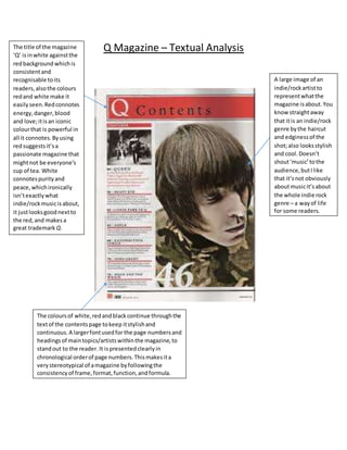
- 1. Q Magazine – Textual Analysis A large image of an indie/rockartistto representwhatthe magazine isabout.You know straightaway that itis an indie/rock genre bythe haircut and edginessof the shot;also looksstylish and cool.Doesn’t shout‘music’tothe audience,butIlike that it’snot obviously aboutmusicit’sabout the whole indie rock genre – a wayof life for some readers. The title of the magazine ‘Q’ isinwhite againstthe redbackground whichis consistentand recognisable toits readers,alsothe colours redand white make it easilyseen.Redconnotes energy,danger,blood and love;itisan iconic colourthat is powerful in all it connotes.Byusing redsuggestsit’sa passionate magazine that mightnot be everyone’s cup of tea. White connotespurityand peace,whichironically isn’texactlywhat indie/rockmusicisabout, it justlooksgoodnextto the red,and makesa great trademark Q. The coloursof white,redandblackcontinue throughthe textof the contentspage tokeep itstylishand continuous.A largerfontusedfor the page numbersand headings of maintopics/artistswithinthe magazine,to standout to the reader. It ispresentedclearlyin chronological orderof page numbers.Thismakesita verystereotypical of amagazine byfollowingthe consistencyof frame,format,function,andformula.