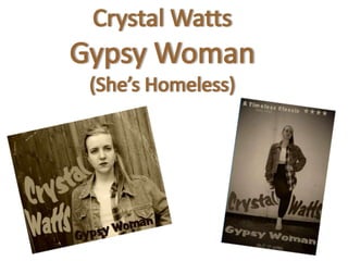
2. My final production was a performance based video to the 1991 hit Gypsy Woman
(She’s Homeless) by Crystal Waters.
I chose to have include a nineties theme, with nineties styling and a vintage video
look as the song was a classic nineties dance hit. Without Adobe Premier
Elements I wouldn’t of been able to achieve this look, as the Vintage film look is
an option only available in Elements.
The target audience for my video would be young adults, as the young female
performer would appeal to both genders of this age group. Also, a current music
trend is artists re-recording old songs for the new generation, so I believe my
target audience would listen to this song.
3. My music video has a restricted Narrative. Parts of the story are kept unclear to
the audience.
Throughout we see my performer singing to the song and dancing happily,
however we soon find out she is the homeless woman she has been singing
about. We know this as at the end we see her wrapped in a blanket and begging
on the streets for money.
It too fits in with Andrew Goodwin’s theory that they narrative links with the
lyrics. The message of the song is not being able to tell the woman is homeless as
‘She’s just like you and me’. I wanted to re-enforce this message with my music
video. At first you cannot tell my performer is homeless as she looks clean and
happy, however she has to beg for money.
4. The genre of my music video is Pop/Dance. I
think I achieve this by including many
conventions of the pop genre
-Exaggerated Styling – I carefully considered
the clothes my performer would wear. I chose
a crop top, checked shirt, denim jacket, baggy
trousers and a high ponytail tied with a
scrunchie.
- Lots of choreography – As this is a
performance based video, my performer sings
and dances along to the song
- Upbeat – Overall it’s a happy song, and my
performer seems happy as she dances and
sings
-Close Camera shots – to create a star
persona, therefore the performer becoming
more well known and popular
5.
6. Similarly I wanted my digipak to fit in with my house style, but more so my
magazine advert. I did this by using the same sepia colour, same wavy, bubbly font
size, and similar sultry pictures of my artist dressed in the same clothing.
Front Cover My front cover follows the standard conventions
of digipaks by being very simple and uncluttered.
It’s likely that all digipaks include one large
picture that covers the whole page of the artist/s
or a picture that represents them. I chose to
include a close up of my performer to increase
her star persona . The more pictures of my artist
that is shown, the more she is recognised,
therefore the more people know her and the
more fans she receives.
7. Track List
Back Page
I chose to produce a single digipak
so included only three songs.
However, from research I
discovered that single digipaks will
often contain the original song and
other versions such as
instrumentals and remixes.
To make it look like a professional
digipack, I created a barcode and
standard text that appears in small
print on most digipaks, such as
distribution and producer names
and companies.
8. Overall I received positive feedback about both my video and ancillary products.
• People picked up on the narrative I was trying
to get across – that she is homeless yet you
cant tell, which is the message of the song.
• People noticed my styling was in the nineties
era
• I had thought about feedback from my last
viewing and used the ideas I was given, such
as the ending showing her homeless.
• An idea that I hadn’t really though about was
that the fades into black could represent her
falling into a darkness and her world isn't as
happy as it is made out at first.
• My Digipack and magazine advert link
well together by the use of the same
font and colour.
• The old vintage feel doesn’t put off my
target audience which is young adults,
as vintage is now popular.
• The old vinyl idea for a disc space was
popular
• An idea was that my magazine advert
would work well being shown in a train
station as it was shot in a station and the
pose looks as if she is waiting for train.
9. To improve my existing video, I would add
another performer to make it more interesting
rather than just one singer and dancer, and keeps
the audience’s attention as they have someone
else to watch or look up to.
However, if I could do this again, I would choose
another pop song with a happier message so I
could follow pop conventions more closely, as
pop songs are meant to be bright and happy,
however with the message of my song, I couldn’t
do this.
10. From my feedback, I did change my magazine advert
in many ways.
One way I changed it is by including a twitter link. I
wanted to include twitter rather than Facebook as
twitter is the most current and used more by young
people.
I made the link @crystalwattsmusic hoping this will
attract young audiences, as they will see the logo and
begin to follow her. I changed the logo to a sepia tint
rather than blue, so it fits in with the nineties theme
and the sepia house style I have used throughout,
therefore all my products link together.
I too added the famous lyrics ‘La Da De La Da Da’ hoping people will recognise the song
when the see these if they don’t know it already. I placed these very faint, as they aren’t
the most important information.
11. I too changed the picture and chose one that was more
eye-catching and reveals more about my narrative
rather than a blank wall. I chose a shot that features
the train station stairs, which also feature in my video.
Therefore it links to my video and audiences will
recognise the location. However, if they have no seen
my video, they will instantly know that my video will
feature many run down locations like this and wonder
why, making them want to watch it.
I also chose a shot taken using a fish eye lens, meaning
that my model is my main focus. The fish eye also
warps the location, such as the lines of the stairs and
ceiling have been bent and curved. This fits with the
text that I have warped and bent.
12. I believe this will still attract my target audience of young adults
of both genders, as a poster of my performer fits in with
Andrew Goodwin’s idea of creating a star
persona. They more they are seen, the more they are
recognised and the more fans they receive.
I chose a body shot of my performer with shows of her midriff
and attitude, which fits in with Laura Mulvey’s theory
about the Male Gaze. This is how men would like to see
woman, so this advert will attract teenage boys. It will also
attract teenage girls as they see an idol they can look up to.
13. I still wanted my magazine advert to fit in
with my nineties house style I created with
my video. I did this by using the same styling,
same wavy font and added a vintage sepia
colouring to the advert.
It follows the conventions of music magazine
advertisements such as including one large
picture of the performer, a newspaper star
rating and the date that the digipak will be
released and now a twitter link.
I wouldn’t of been able to modify my text to
the shape of my artist if I didn’t use Serif
PagePlus as this includes a ‘Warp’ tool that
allows you do drag and re-shape text.
14. Overall I happy with my final products, as I think I successfully gets the message/brand identity
I wanted across to the audience. This is that you cant judge everyone by their first appearance.
This is the message of the song – you cant tell she is homeless. Likewise, from the happy and
jolly beginning that’s full of upbeat choreography, you wouldn’t know she is the homeless
woman begging for money at the end.
I think my ancillary products portray this message, as she looks very sultry and depressed in all
shots. She is also either sitting on the floor or appears to be waiting for something, which are
typical actions associated with homeless people, yet still there is no proof she is homeless.
Before starting production, I researched into existing music videos, digipaks and adverts, so I
followed most conventions I had found of each, therefore my work looks like real media
products, which was my aim.