Mixin Classes in Odoo 17 How to Extend Models Using Mixin Classes
Institution conventions
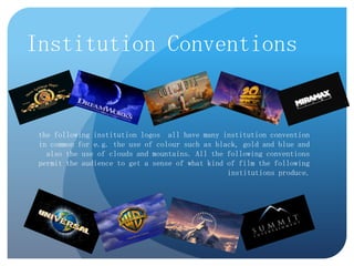
1. Institution Conventions
the following institution logos all have many institution convention
in common for e.g. the use of colour such as black, gold and blue and
also the use of clouds and mountains. All the following conventions
permit the audience to get a sense of what kind of film the following
institutions produce.
2. A fairly common convention that is
used on instructional logos is the uses
of the color gold as it suggest to the
mass audience that the institution is
wealthy , powerful and of high
status. The Warner Bros.
Entertainment logo is constructed to
portray a shield this connotes that
they are a of high status and
authority within the industry. The
blue sky’s within the scenery in the
background clearly implies to the
audience that this institution are
above everyone else and is of high
standard. Another convention that is
commonly use on instructional logos
is the use of clouds as it signifies
celestials and dreams as the
production company aspire to
transport the audience to another
realty(Dream world) with their
movies.
3. The use of the black background
and stars on the Universal Studio
Pictures institutional logo is
usually associated with outer
space which implies to the
audience that the Universals
Studios movies are out of this
world and will transport the
audience to another realty(Dream
world) with their movies. The use
of a long shot of the globe states
their status within the industry as
their movies are world renowned.
Another common convention
within institutional logos is the
uses of the color gold (outline of
the institutions name ‘universal’)
as it suggest to the mass audience
that the institution is wealthy ,
powerful and of high status.
4. The colors white and
and blue denotes goy
,heaven and dreams
which presents the
target audience with an
insight and
understanding into the
films the institutions
produces.
The mountain signifies that
Paramount Pictures are at
the pinnacle of the industry
and it states that they have
fulfilled their goal by
producing high quality
movies.
The stars symbolically
represent the achievement
as stars a generally linked
and associated with success
and attainment.
Another convention that is
commonly use on
instructional logos is the use
of clouds as it signifies
celestials and dreams as the
production company aspire
to transport the audience to
another realty(Dream world)
with their movies.
5. The mountain connotes
that Summit are at the
pinnacle of the industry
and it states that they
have fulfilled their goal
by producing high
quality movies. The use
of a basic black
background maintains
the audience attention
on the mountain to
instill within the
audience that they are
peak within their
industry and to
remember that they are
at the top.
6. The DreamWorks has a lot of
depth to it which make it
comfortable and easy on the
eye for the audience to view.
The uses and color such as
dark blue
and clouds signifies celestials
and dreams as the production
company aspire to transport
the audience to another
realty(Dream world) with
their movies.
The moon connotes that they
are at the top and above the
rest plus show there status
within the industry. The little
boy sitting on the edge of the
moon and fishing in the
clouds implies that the
institution is targeting a
young audience and the films
will be made out of the
targets audiences dreams and
imagination
7. The uses of a lion connotes
power and king or godlike
status as the lion is the king of
the jungle. Also the lion
represents danger which gives
the audience an insight into
the films they produce.
the uses of the color gold as it
suggest to the mass audience
that the institution is wealthy ,
powerful and of high status.
Also, the film strips on the
bottom of the institutional logo
connotes that MGM is
prestigious and states that
MGM has been established for a
long time as film strips are
associated with old camera and
films.
8. Another convention that is
commonly use on
instructional logos is the use
of clouds as it signifies
celestials and dreams as the
production company aspire
to transport the audience to
another realty(Dream world)
with their movies.
The Columbia Pictures looks to
take the form of the statue of
liberty which implies that
Columbia Pictures are situated
and extremely popular within the
USA plus the use of the statue of
liberty shows the institutions god
like status, power and wealth
which suggest that the company’s
success is legendary and worthy of
being celebrated and idolized due
to there high statues within the
industry.
Also, the statue is holding a bright
light that is shining over the
institution name which attracts
the audience attention on to main
element(the name) which is very
iconographic as it shows the
institutions importance.
The statue is place on the top of
the podium thus showing the
company's power, success and
status which suggest that the
company is at the top of the
industry.
9. 20th century fox logo looks to
take the form a statue which
shows the company's power and
wealth which therefore implies
that the company success is
legendary and worthy of being
celebrated and idolized due to
there high statues within the
industry.
Additionally, the low angle worms
eye view shot on 20th century's
fox institutional logo is
interoperated by the audience as
being effective as it ex aggerate
but states the company's statues
and also show their importance
and within the industry which are
usually common conventions
Furthermore the use of
within institutional logos.
strobe lights and lighting
The dark sky within the
suggest that they are
background creates a sense of
associated with celebrity's
elegant and class to the
and people of importance as institutional logo this is due to
they are usually associated the contracted of colors’ that
with event or landmarks of
make the logo easy on the eyes
importance such as the
for the audience consume the
Hollywood sign.
media source.
10. The use of bold font on
the Miramax grabs hold of
the audiences attention
and implies to the
audience that they are a
bold and renowned
institution. The
contracted of size and
between the word
‘Miraman’ and ‘film’ and
The use of a basic black
background was
intentionally added to
maintains the audience
attention and to keep the
audiences attention on the
key elements of the
institutional logo i.e. the
Name.