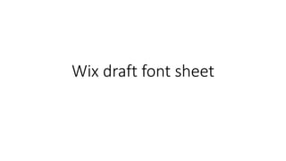
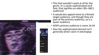
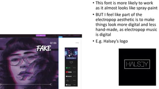
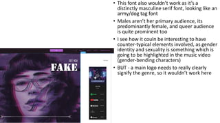
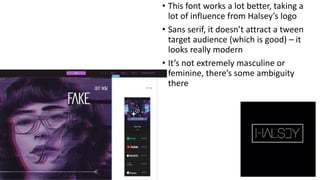
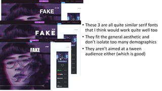
This document discusses different font options for an electropop music video and evaluates them based on their appropriateness for the target audience and genre. It eliminates serif fonts as being too mature or masculine. One sans serif font is praised for its similarity to another artist's logo and its modern, ambiguous look. In the end, three additional serif fonts are proposed as options that would fit the aesthetic and not exclude parts of the target demographic.