1. Evaluation
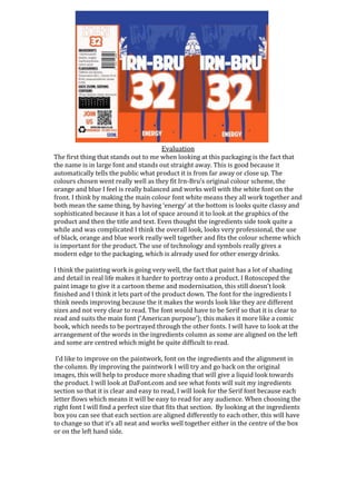
The first thing that stands out to me when looking at this packaging is the fact that
the name is in large font and stands out straight away. This is good because it
automatically tells the public what product it is from far away or close up. The
colours chosen went really well as they fit Irn-Bru’s original colour scheme, the
orange and blue I feel is really balanced and works well with the white font on the
front. I think by making the main colour font white means they all work together and
both mean the same thing, by having ‘energy’ at the bottom is looks quite classy and
sophisticated because it has a lot of space around it to look at the graphics of the
product and then the title and text. Even thought the ingredients side took quite a
while and was complicated I think the overall look, looks very professional, the use
of black, orange and blue work really well together and fits the colour scheme which
is important for the product. The use of technology and symbols really gives a
modern edge to the packaging, which is already used for other energy drinks.
I think the painting work is going very well, the fact that paint has a lot of shading
and detail in real life makes it harder to portray onto a product. I Rotoscoped the
paint image to give it a cartoon theme and modernisation, this still doesn’t look
finished and I think it lets part of the product down. The font for the ingredients I
think needs improving because the it makes the words look like they are different
sizes and not very clear to read. The font would have to be Serif so that it is clear to
read and suits the main font (‘American purpose’); this makes it more like a comic
book, which needs to be portrayed through the other fonts. I will have to look at the
arrangement of the words in the ingredients column as some are aligned on the left
and some are centred which might be quite difficult to read.
I’d like to improve on the paintwork, font on the ingredients and the alignment in
the column. By improving the paintwork I will try and go back on the original
images, this will help to produce more shading that will give a liquid look towards
the product. I will look at DaFont.com and see what fonts will suit my ingredients
section so that it is clear and easy to read, I will look for the Serif font because each
letter flows which means it will be easy to read for any audience. When choosing the
right font I will find a perfect size that fits that section. By looking at the ingredients
box you can see that each section are aligned differently to each other, this will have
to change so that it’s all neat and works well together either in the centre of the box
or on the left hand side.