
Recommended
More Related Content
What's hot
What's hot (19)
Viewers also liked
Viewers also liked (15)
Similar to How effective is the combination of your main product and ancillary texts?
Similar to How effective is the combination of your main product and ancillary texts? (20)
More from flowerpoolamp
Recently uploaded
Recently uploaded (20)
How effective is the combination of your main product and ancillary texts?
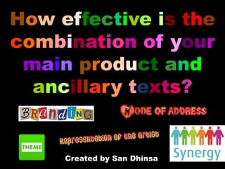
- 1. How effective is the combination of your main product and ancillary texts? Created by San Dhinsa
- 2. The purpose of my ancillary products As you may already know, this year our task was to create a music video. This gave me an insight on the conventions of a music video and also the detail behind an artist’s representation. However, in the music industry it is also vital to promote the artist so they can gain more recognition and sellability. It is also important to create products that can be sold as this financially supports their career and provides money for their music label. Along side my music video, I created two ancillary products that were aimed to represent my artist is the best possible way. The products I decided to make were a digi-pak and a magazine advertisement. Digi-paks are special edition products that contains not only the music CD itself, but other special features such as competitions, codes , messages from the artist and more. Creating a digi-pak has been interesting as these are rare for music artists to sell these days as people tend to just download their music online, but this task enabled me to put my ‘thinking hat’ on and find ways that would make an audience pay for a digi-pak. A magazine advertisement was also fun to make because it is enhanced my graphic/editing skills in order to make an aesthetically pleasing design that would catch someone's attention. In order for my ancillary products to be successful, they needed to clearly represent the artist’s genre and style of music. The following presentation breaks down how effective my ancillary products were in doing so.
- 3. My Digipak
- 5. House style/Branding For my products it was important to keep a good quality style of branding so that my artist could be associated with a specific style. The style I chose was homely, warm and an overall style that my audience can relate to as this what indie fans look for in an artist. In order for this to work, during my research and planning stage I looked up different marketing packages that had a strong sense of branding. I found this was usually formed from the consistent use of the same colour palette and typography. Therefore, in my magazine advertisement and digipak I used the same typography from dafont.com. Using the same typography created a strong branding because the typography looked hand written. The audience would denote handwritten typography to be personal and rustic which connotes the artist to have a warm personality as the hand written style shows a sense of sentimentality. This also made the digipak more enticing to sell as it would attract hardcore fans if the writing looked more personal as if the artist hand wrote it himself, making my products effectively combined as they have a personal touch. Handwritten typography
- 6. House style/Branding I also used the same autumnal colour palette through out my music video and ancillary products as this enforced the indie vibe. The indie genre is usually associated with warm colours to connote a down to earth persona and nature like feel. The consistent colours I included were orange, brown and red. Red is associated with passion and love which highlights how the artist would create songs with emotive lyrics such as Ed Sheeran's ‘Small Bump’ (which you can listen to here) as indie songs tend to reflect on deep personal themes. The orange signified warmth which made the artist seem more approachable so my audience could relate to him. Statistics even show that orange promotes positive energy which links well with the nature shots in the music video to make the artist seem down to earth and nature friendly. The brown also highlighted the earthy atmosphere and comfort. Therefore, using the same constant colour palette made my products very effective. As you can see, my ancillary products and music video use the same colour palette. The guitar is a deep red, the leaves are orange and brown and the leaves/nature is shown everywhere to create a strong iconography of nature and its colours.
- 7. House style/Branding A key piece of iconography I used was a guitar. A guitar is usually associated with the indie genre as most indie songs tend be acoustic and are raw - meaning there are no studio touches such as auto tune or synthesises but rather pure instruments such as an acoustic guitar. It also anchors the artist’s down to earth persona and homely-ness because he seems like an average person rather than a big pop star. We did not conform to the Robert Dyer Star theory as we did not use our artist as the main image, instead we branded our artist through the motif of leaves which are seen in the music video and on the digipak as the main image. Leaves usually signify nature and growth – both of which are deep themes that further shows how relatable the artist is and how his music is branded to have deep lyrics which effectively showcases the genre of the artist. Guitar Leaves on the digipak front cover and leaves in the music video.
- 8. From looking at the magazine advertisement, the guitar, mug of coffee and song sheets signify someone who is relatable in society and is very passionate about their music. Alongside the warm colours the audience will recognise the indie vibe as everything looks very earthy and indie like. The scenery and nature images on the digipak also addresses the audience as very bohemian and someone who is peaceful. This links to the music video very effectively as the artist is taking a walk in the forest, making the audience relate to him as he is nature driven. Mode of Address LEFT : Magazine Ad with guitar, mug of coffee and song sheets MIDDLE: Scenery on digi-pak panel RIGHT: Music video shot of artist walking in forest alone
- 9. The message on the digipak from the artist is also very direct to the audience as he even goes as far as saying his music is “personal” to him. This depicts the artist to be close to his audience as he wants to give a personal vibe about himself to make himself personally relatable so fans can identify their situations and style to him. This is further highlighted in the music video as there are shots of him that are indirect as if we are watching him on his walk like we are able to follow him around, which is rather personal, and there are also close up shots where he directly sings to the audience to form a close relationship. Mode of Address Top images show the artist singing directly to the audience – Bottom images the audience are watching the artist
- 10. To further showcase how the artist is a down to earth person, on our digipak we included a midshot of the artist not looking at the camera. This represents my artist to be very thoughtful which works well with the deep song about a lonely girl. This also effectively combines well with my music video as the artist seemed to look away from the camera whilst performing as if he was in deep thought. The title of the album itself highlights this as it is called “trailer thoughts” which further suggests the artist has deep songs and lyrics as if he reflecting on his own experiences. The reference to a trailer also suggests he may travel a lot, like he is walking in the forest in the music video, which reinforces his thoughtful personality. A lot of indie people love to travel and write journals, and his album is his own journal of his deepest thoughts. Representation of the artist Shots from my music video of the artist looking thoughtful Artist looking down thoughtfully on digipak
- 11. Guitars are iconic in the indie music genre because artistic people tend to play them such as Ed Sheeran. The guitar and music sheets also connote someone who could be busking for a living, the mug of coffee also highlights this as coffee is widely used for working class/ average people who are working early mornings and late nights- suggesting he works for a living which makes the audience relate to him.The coffee mug prop also suggests the artist drinks alot of coffee and my indie audience are the type of people who would go to coffee shops regularly –and bring their laptops or books to write their own songs. This represents the artist to be relatable as he is not rich and he is a small time artist trying to make a living. The song sheets also portray the artist to be very passionate about his music and they may be sentimental to him which indie music tends to be. The sentimental representation is very popular in the indie music industry i.e Ed Sheeran is represented like this to. A sentimental representation makes the artist seem more approachable and homey. The representation of my music artist also effectively combines well with my music video as the artist is wearing high street clothes making him seem like a real person rather than a rich celebrity. The deep red orange colour of the guitar also signifies warmth. In the music video it self, the artist seems to have a warm personality as he is singing about a girl whilst walking in the forest, showing that he has some emotional depth to him. Overall, my magazine advertisement and music video combine to make my music artist seem very relatable and down to earth. Representation of the artist Artist looking thoughtful in the forest Guitar Music sheets Mug of coffee
- 12. The music video itself touches upon a few different themes, however some are illuminated through the ancillary products also, which effectively combines all the products. The imagery of leaves on the CD and on the front panel of the digipak suggests a theme of nature. Nature is a theme that represents growth and time. In our music video , the protagonist is going through a time in her life where she is homeless. We represent this time through a series of jump cuts of her looking for rubbish and looking for somewhere to stay. This links back to nature as this is her personal experience like a flower experiences growth. The visual use of nature is also shown through the mise-en-scene throughout the whole music video. Themes Leaves on the digipak CD and front panel Jump cuts of protagonist looking for somewhere to rest
- 13. My digipak also has an image of a desolate location where there is no physical people in shot. This makes the image look isolated which is another theme in my music video. The protagonist is facing loneliness and isolation in society. An example of a shot that shows this is when she is walking through the forest and a long shot shows no one else in site, the framing also makes her appear smaller as there is lots of space around her to further show how she is alone. Therefore these two products work well together as they further show isolation through scenery on the digipak and the scenery in the music video. Themes Desolate scenery on digipak Protagonist looking alone- Long shot Desolate scenery in music video
- 14. Overall, the final presentation of all three of my products all looked the same which shows how they were effectively combined to represent my artist and the indie genre. They all link together in terms of the autumnal colour palette , Naveed wearing the same outfit, the same out door location and the motif of the leaves, therefore they all brand together effectively.