SlideShare a Scribd company logo
1 of 45
WOU Biology 100 Series Graphs Overview
Making a graph is one of the easiest ways to get an idea of the
patterns in your data.
Graphing is a fairly straightforward process, but there are a few
things to keep in mind.
1. Type of graph. You should think carefully about the kind of
data you have before you
decide what type of graph to produce. See Figure 1.
a. Line graphs are useful to show how a factor changes over
time or in some other
gradual continuous increment (like temperature or ambient
light).
b. Bar graphs are useful to show a total change or overall
difference between
different discrete variables (like types of organisms or specific
experimental
treatments).
Figure 1. Types of Graphs. The graph on the left is a line graph.
The graph on the right is a bar graph.
2. Variables
a. The independent variable is the variable that you change or
manipulate in the
experiment. This variable is usually placed along the x
(horizontal) axis. In the
case of an experiment where you are observing something that
changes over
time, time serves as an independent variable and is always listed
on the x-axis. If,
in addition to time, there is a second independent variable (e.g.
observing what
happens to two different treatments over time) this variable is
usually graphed by
drawing multiple lines on the graph. See Figure 2.
b. The dependent variable is the response or what happens in
response to the
independent variable. Typically, this variable is what you
counted or measured
during the experiment. This variable is placed along the y
(vertical) axis.
3. Titles and Labeling.
a. Every graph needs a concise and descriptive title that
explains what phenomenon
the graph is attempting to visualize. If you averaged data from
several different lab
groups before graphing, you should note in the title that your
graph depicts
averaged data (like in the bar graph in Figure 1).
b. Each axis should be labeled, and the label should include the
units in which the
data was recorded. Without units, your graph is meaningless.
WOU Biology 100 Series Graphs Overview
Table 1, below, shows an example of data collected during an
experiment. The same data is
presented in Figure 2. Note how much easier it is to quickly
examine the patterns of data
collected in the visual graph compared to the data table, as long
as the graph is titled
properly, the axes are labeled (with units) and there is a key.
Table 1: Data table showing gas generation (viewed as
movement of liquid up a tube) by Elodea
plants under different conditions. Note use of units in the table
headings.
Movement of liquid in tube (in centimeters)
Time (minutes) Clear test tube Foil covered test tube
5 0.7 0
10 1.1 0.2
15 1.4 0.3
20 1.7 0.4
25 2.1 0.4
30 2.8 0.4
35 3.6 0.4
40 4.5 0.4
45 5.8 0.4
50 6.7 0.4
55 7.6 0.4
60 8.8 0.4
Figure 2: A line graph with title, labels (including units), and a
key. This data is the same as the data
provided in Table 1.
4. Keys. If your graph includes multiple variables (see Figure
2), it is necessary to include
a key. While you may find it useful to color-code your graph,
remember that not all
printers or copiers produce color. Thus, the use of symbols (like
the diamonds and
squares at each data point in Figure 2) and gray-scale in keys is
most appropriate to
ensure that someone trying to interpret your graph can do, even
in black and white.
WOU Biology 100 Series Graphs Overview
5. Scale. It is important to choose the appropriate scale for each
axis. Figure 2 shows the
appropriate scale for oxygen generation by Elodea in light. See
Figure 3 for
inappropriate scales. To determine the appropriate scale, it is
usually best to examine
the maximum and minimum data points, and then choose a scale
that will allow you to
show those points at either end of the axis.
a. A scale that is too large will compress your data points, and
will not allow you to
see the relevant patterns in the data.
b. A scale that is too small will limit the amount of data you are
able to present and
will also appear too busy and be hard-to-read.
c. Remember also that your scale should be consistent- The y-
axis in Figure 2 does
not suddenly change from increments of 5 cm to increments of
20 cm, for example.
Figure 3A. This graph has a vertical scale that is too large.
Figure 3 B. This graph has a vertical scale that is too small.
General Biology BI102
8
LAB 3: DIFFUSION, OSMOSIS, AND CELL PERMEABILITY
From a Nonrandom to a Random Distribution of Molecules
– without the use of energy!
Learning objectives (What we expect you to get out of this lab):
Concepts & techniques Vocabulary:
• Understand diffusion and osmosis concentration gradient
• Understand how diffusion and osmosis are caused by
concentration gradients diffusion
• Understand the importance of diffusion and osmosis to
biological organisms. osmosis
• Setup laboratory apparatus cell membrane
• Measure movement of solutions and molecules to observe
osmosis and diffusion cytoplasm
• Calculating rate from of processes cell wall
• Developing graphs to show data patterns
• Drawing conclusions from data
Introduction:
On a rainy Sunday afternoon, the smell of baking cookies
slowly spreads through the house. The scent
molecules given off by the cookies are initially strongest in the
kitchen, but over the course of the
afternoon, the entire house begins to take on the delicious
aroma of vanilla, butter and sugar. The
random movement of scent molecules through out the house
occurs as the molecules gradually spread
down the concentration gradient. When the cookies begin
baking, the molecules are concentrated in the
oven, but over time, they move to areas lacking scent
molecules- from areas of higher concentration to
lower concentration until the distribution of molecules
throughout the house is fairly equivalent (this is
why the scent of cookies is strongest in the kitchen when they
first come out of the oven, and becomes
weaker both over time and also the farther you get from the
initial area of concentration).
1 minute 30 minutes 60 minutes
Diffusion, the movement of a substance from a region of high to
a region of low concentration, is the
process by which nutrients and wastes move toward and away
from cells. If molecules could not pass
General Biology BI102
9
through cell membranes, life would end because there would be
no continuous uptake of energy rich
food molecules. Life will also cease if toxic materials, such as
the wastes produced by each cell,
accumulate to lethal levels in the immediate vicinity of the cell.
In this lab, you will observe several
demonstrations of DIFFUSION, each of which emphasizes that
this is a spontaneous process driven by
random molecular motion.
Osmosis is a special type of diffusion that refers to the net
movement of water through a selectively
permeable membrane. A selectively permeable membrane only
allows certain molecules to cross it. In
the context of the living cell, the selectively permeable
membrane is the outer boundary of the cell.
Osmosis is used to maintain appropriate concentrations of
molecules in the cell, which is one feature of
the organization of matter that is required to maintain life.
Analyzing osmosis lets you explore the idea
that a disorganizing process, the diffusion of water, can be
coupled to an organized structure, like a
semipermeable membrane, to do work that increases or
maintains the organization of part of a system. If
you have ever attempted to control slugs in your garden by
sprinkling salt on them, you have used
osmosis. By the end of this activity, you’ll be able to explain
what is happening in the case of the salted
slug!
Three components must be present for osmotic
pressure to exist: a selectively permeable membrane
and two solutions that differ in their concentrations
of a substance that cannot cross the membrane. In
this investigation, and in most biological situations,
the substance that cannot cross the membrane is
dissolved in water. In this diagram, the solution on
the left of the selectively permeable membrane has a
higher concentration of molecules, indicated by dots,
than the solution on the right side of the membrane.
The molecules cannot cross the membrane and
are dissolved in water, which can cross the
membrane. There is a concentration gradient of molecules; that
is, a given volume of solution on the
left has a larger number of molecules than the same volume of
the solution on the right.
You will begin this lab by investigating two physical processes
that control the movement of nutrient
and waste molecules relative to cells. By the end of the
investigation, you should be able to define
diffusion and osmosis; you will need to understand these
concepts to discuss how they apply to
observations of you will make on living cells during next
week’s lab.
☞NOTE: Both lab procedures today will take at least one hour
once you get the
experiments set up. You should get the osmometer set up and
running and then set up the
acid diffusion experiment. Do not wait to finish collecting
osmometer data before you set
up the diffusion experiment. You can collect data
simultaneously on both experiments.
General Biology BI102
10
Part 1: Measuring Osmosis
1. An osmometer is a device for measuring osmotic pressure. To
conceptualize the impact of osmotic
pressure, consider the following questions about a bag of
solution of sucrose (C12H22O11) dissolved
in water (H2O) enclosed by a semipermeable membrane that is
immersed in a beaker of solution that
is less concentrated.
1A. Can the sucrose molecules spontaneously diffuse
down this gradient? Why or why not?
1B. There is also a concentration gradient of water. Is the
water concentration higher inside or outside of the bag?
1C. Will water diffuse down its concentration gradient?
Why or why not?
1D. Will the net movement of water be into or out of the bag?
1F. What will happen to the volume of solution inside the bag?
2. Use your answers in Procedure 1 above to make a hypothesis
about what will happen to the level of
fluid in a tube that can carry excess liquid out of bag. How do
you hypothesize that the concentration
of the solution inside the bag will influence the volume change
in the bag and subsequent fluid
movement in the tube?
Hypothesis:
3. Construct your osmometer (see figure below)
• Get a dialysis bag (made of a semipermeable material) from
your instructor and securely tie off one
end of a soaked tube.
General Biology BI102
11
• Fill the bag with 10 mL of a solution containing sucrose,
which even when dissolved cannot cross
the membrane. There are three different sucrose solutions, 10%,
20%, or 40%. Be sure to record
which solution your table is using.
• Tie off the open end of the bag to the end of the surgical
tubing using the string. The liquid from the
bag must completely cover the end of tube, with no air gap. It is
necessary to be certain that there are
no leaks in the membrane and that the outside has been washed
free of any spilled solution.
• Immerse the filled bag into a beaker of distilled water. Make
sure the bag is completely immersed in
the beaker of water- you can adjust and secure the apparatus
using the clamps at the top of the stand.
• Record the time and the height of the fluid in the glass tube
once you have completed setting up the
osmometer.
• At five-minute intervals over the next 60 minutes, measure
and record in the data table the height of
the fluid column in the osmometer.
• Record your group’s data in the table and on the class data
sheet at the front of the room. Once all of
the class data has been recorded, make sure you copy it down so
that you have data for all three
glucose concentrations.
General Biology BI102
12
Data Table: Osmosis in the Presence of Three Different
Concentrations of Sucrose:
10% Sucrose
20 % Sucrose
40 % Sucrose
Time
(minutes) Table 1 Table 2 Table 3 Table 4 Table 5 Table 6
5
10
15
20
25
30
35
40
45
50
55
60
4. As your team records the data for your osmometer, you can
begin to construct a graph that shows the
change as time goes by in the height of the fluid column in the
osmometer. Plot the data for your
osmometer first; you can add in the other solutions when the
other groups make their data available.
Be sure to use a different symbol (for example, ✕
each solution. Do not forget to label
your graph and both axes!
4A. What should be plotted on the X-axis of your graph? On
the Y-axis?
4B. What are the units of the item plotted on the X-axis? On
the Y-axis?
General Biology BI102
13
5. Do the data points on the graph you plotted for your group’s
osmometer data seem to fit a straight
line or a curved one?
5A. Is this what you would predict from thinking about what is
happening in the experiment? Why?
(SUBTLE HINT: As time passes, what happens to the size of
the concentration gradient that drives
osmosis?)
6. Calculate the rate of osmosis for your osmometer. (Show
your work.)
7. How did you select the part of the graph to use in answering
the last question?
8. Tabulate the rates of osmosis calculated by all other team in
your lab section, including the team that
used the same concentration that you did.
9. Is there a consistent relationship between sucrose
concentration and rates of osmosis?
General Biology BI102
14
Part 2: Measuring Diffusion
1. Obtain three petri dishes which have been filled with agar
dyed with bromothymol blue.
Bromothymol blue is an indicator that will turn yellow-green in
the presence of an acid.
2. Bring the petri dishes back to your lab bench. Use the cork
borer to make a shallow depression in
the center of each block. Be sure that your depression does not
extend all the way to the glass bottom
of the dish.
3. Use what you have learned about diffusion to make a
hypothesis about what will happen when the
acids are added to the depressions in the agar in the petri
dishes.
Hypothesis:
4. You will be using acids of three different molecular weights.
How do you hypothesize that the
molecular weight will influence (or not) diffusion of the acid
through the agar? The molecular
weight of each acid is:
Hydrochloric acid = 37 Acetic acid = 60 K Acid Phthalate =
204
Hypothesis:
5. Put on your goggles and carefully use the droppers to fill the
depression in the first agar block with
hydrochloric acid, and fill the depressions in the second and
third agar blocks with acetic acid and
Potassium acid phthalate, respectively. Record the time at
which each depression is filled. Once you
are done with the droppers, you may take your goggles off.
6. At five minute intervals over the next 60 minutes, measure
and record in the data table in Part 1 of
Results, the diameter of the yellow circle that forms in each
block as the acid diffuses out of the
depression.
General Biology BI102
15
Data Table: Diffusion of Acid in an Agar Block:
Time
(min)
Acetic
Acid
Hydrochloric
Acid
K Acid Phthalate
Aid
5
10
15
20
25
30
35
40
45
50
55
60
7. Plot the data for all three acids on a single time series graph,
using a different symbol (circles, “x”s,
triangles) for each acid. Be sure to label your graph and both
axes!
7A. What should be plotted on the X-axis of your graph? On
the Y-axis?
7B. What are the units of the item plotted on the X-axis? On
the Y-axis?
General Biology BI102
16
8. Review your graph. Do the data points on your graph seem to
fit a straight line or a curved one?
Is this what you would predict from thinking about what is
happening in the experiment? Why?
(SUBTLE HINT: As time passes, what happens to the size of
the concentration gradient that drives
diffusion? NOT-SO-SUBTLE HINT: Will the diameter of the
yellow circle continue to increase if
one of the acids diffuses to the edges of the agar block?)
9. Remember that the molecular weight of each acid is:
Hydrochloric acid = 37 Acetic acid = 60 K Acid Phthalate =
204
Is there a consistent relationship between the size of the acid
molecules and their diffusion rates?
How did you select the part of each acid’s graph to use in
answering the last question?
General Biology BI102
17
Questions Name____________________
1. Define “osmosis”
2. Define “diffusion”
3. Describe the primary differences between osmosis and
diffusion.
4. In the lab, you observed acids with different molecular sizes
diffusing through three agar plates, all of which
had the same density of agar. Suppose you took three agar
plates with different densities: one low density, one
medium density, and one high density. You prepared a hole in
each plate and dropped in one drop of hydrochloric
acid in each plate. What would be the results? Explain the basis
for your answer:
5. Imagine that you wanted to examine diffusion of a gas within
a closed room. You use three gasses, each with a
different molecular weight. Gas X has a molecular weight of 41,
Gas Q has a molecular weight of 320, and
Gas K has a molecular weight of 12. Which of the three gasses
would you expect to diffuse most rapidly
through the room? Why?
6. Use what you learned about osmosis to explain:
a. a slug shrivels when you put salt on it (think about what is
happening to semipermeable cells of the slug)?
b. carrot sticks get crisp when you put them in a bowl of water
in the refrigerator
c. Why it is a bad idea to drink saltwater when you are already
dehydrated
BI
102
Lab
1
Writing
Assignment
How did the different concentrations of sucrose impact osmotic
rate?
This assignment requires you to evaluate a hypothesis and
communicate the results of your
experiment on the rate of osmosis into sucrose solutions of
varying concentrations. The questions
below are meant to guide you to reporting the key findings of
your experiment and help you think
through how to explain the findings and draw conclusions from
them in a scientific manner.
ASSIGNMENT: Please respond to the following questions to
complete your laboratory write up. For this
assignment you will only focus on the osmosis of water into
sucrose concentrations of varying
concentration. Make sure that your write up is accurate, and
clearly written so that it is easily readable.
A grading rubric is provided on the second page of this
assignment. To earn full points on your write up,
you must provide answers that align to the “meets” column of
your grading rubric as well as meeting all
“Quality of Writing and Mechanics” elements described in the
rubric. There are also some tips on pages 3-4
of this assignment to help you succeed.
FORMAT:
• Type your responses, using 1.5 or double spacing.
• Include the section headings (Hypothesis, Results, Analysis)
and question number (example: 1, 2, 3,
etc) in your answers but do not rewrite the question.
• Graphs may be made with a computer program (example:
Microsoft excel, Mac numbers, etc) or may
be neatly produced with a ruler on graphing paper.
• Print out the cover sheet on page 2 of this assignment, read
and sign the academic honesty statement,
and submit it with your write up. Your instructor WILL NOT
accept a write up without the signed cover
sheet.
DUE DATE: Your write up is due at the beginning of class next
week. Late assignments will have 1 point
deducted per day up to 5 days, at which point the assignment
will be assigned 0 points.
Hypothesis and Prediction – Part 1 of Rubric
1. What did you think was going to happen in this experiment
and why? You may find it helpful to state
your answers to these questions as an “if-then” hypothesis-
prediction. Be sure you have included a
biological rationale that explains WHY you made this
hypothesis/prediction. (You worked on this in
question 2 on page 10 of this lab activity)
Results – Part 2 of Rubric
2. How did the different concentrations of sucrose impact
osmotic rate? Answer this question by
creating a line graph that shows the results of your experiment.
If you need assistance building a
graph, there is a Guide to Graphing resource available on your
Moodle lab course site.
Analysis- Part 3 of Rubric
3. Explain why you think that the results shown in your graph
support or refute your hypothesis
(remember we never “prove” anything in science). Consider all
your data and the overall data pattern
as you answer this question. Don’t ignore unusual data that
may not seem to fit into a specific
patterns (“outliers”). Explain what you think might be behind
these unusual data points.
4. What is the biological significance of your results? What
biological concepts explain completely why
these events happened in the experiment? How do these results
help you understand the biology of
the cell and how materials move back and forth across the cell
membrane? (A hint: refer back to
questions 1A-1F on page 10 of this lab activity). Think about
giving a specific example.
References- Mechanics Checklist
5. Provide at least one full citation (make sure you include an
in-text citation that pinpoints where you
used this resource) for a resource you made use of in
performing the experiment, understanding the
concepts and writing this assignment. (Perhaps your lab
manual? Your textbook? A website?) If you
used more than one resource, you need to cite each one! If you
need help with citations, a Guide to
Citing References is available on your Moodle lab course site.
Please
print
out
and
submit
this
cover
sheet
with
your
lab
writeup!
Lab
Writeup
Assignment
(1)
Assessment
Rubric-­‐
10
points
total
Name:
________________________________________
Element Misses (1 point) Approaches (2 points) Meets (3
points)
Hypothesis
Clarity/Specificity
Testability
Rationale
___Hypothesis is unclear and hard-
to-understand
___Hypothesis is not testable
___No biological rationale for
hypothesis or rationale is fully
inaccurate
___Hypothesis included is clearly
stated, but not specific or lacks
specific details
__Hypothesis is testable, but not in a
feasible way in this lab
___Some foundation for hypothesis,
but based in part on biological
inaccuracy
___Hypothesis included is clearly
stated and very specific
___Hypothesis is testable and could
be tested within lab parameters
___Rationale for hypothesis is
grounded in accurate biological
information
Graph
Title
Axes
Variables
Key
Graph clarity
Data accuracy
___Graph lacks a title
___Axes are not labeled
___Variables not addressed in graph
___No key or way to tell data points
apart
___Graph is hard to read and
comparisons cannot be made:
Inappropriate graph type or use of
scale
___Data graphed is inaccurate or
does not relate to experiment
___Graph has a title that is not very
descriptive
___Axes are either unlabeled, or
units are unclear or wrong
___Variables addressed in graph, but
not on correct axes
___Key included, but is hard to
understand
___Graph is somewhat readable,
comparisons can be made with
difficulty: Appropriate graph type, but
not scaled well
___Data graphed is partially
accurate; some data is missing
___Graph has a concise, descriptive
title
___Axes are labeled, including
clarification of units used
___Variables on correct axes
___A clear, easy-to-use key to data
points is included
___Graph is clearly readable and
comparisons between treatments are
easy to make: Graph type and scale
are appropriate to data
___Data graphed is accurate and
includes all relevant data, including
controls (if needed)
Analysis
Hypothesis
Scientific language
Data addressed
Explanation
___Hypothesis is not addressed
___Hypothesis is described using
language like proven, true, or right
___No explanations for data patterns
observed in graph or data does not
support conclusions.
___No biological explanation for data
trends or explanations are completely
inaccurate
___Hypothesis is mentioned, but not
linked well to data
___Hypothesis is not consistently
described as supported or refuted
___Some data considered in
conclusions but other data is ignored.
Any unusual “outliers” are ignored
___Explanations include minimal or
some inaccurate biological concepts
___Hypothesis is evaluated based
upon data
___Hypothesis is consistently
described as supported or refuted
___All data collected is considered
and addressed by conclusions,
including presence of outliers,
___Explanations include relevant and
accurate biological concepts
Quality of Writing and Mechanics: Worth 1 point. Writeup
should meet all of the following criteria!
Yes No
☐ ☐
Write up includes your name, the date, and your lab section
☐ ☐ Write up is free from spelling and grammatical errors
(make sure you proofread!!)
☐ ☐ Write up is clear and easy-to-understand
☐ ☐ Write up includes full citation for at least one reference
with corresponding in-text citation
☐ ☐ All portions of write up are clearly labeled, and question
numbers are included
Plagiarism refers to the use of original work, ideas, or text that
are not your own. This includes cut-and-paste from websites,
copying directly from texts, and copying the work of others,
including fellow students. Telling someone your answers to the
questions (including telling someone how to make their graph,
question #2), or asking for the answers to any question, is
cheating.
(Asking someone how to make the graph for this assignment is
NOT the same as asking for help learning excel or some other
software). All forms of cheating, including plagiarism and
copying of work will result in an immediate zero for the exam,
quiz, or
assignment. In the case of copying, all parties involved in the
unethical behavior will earn zeros. Cheating students will be
referred to the Student Conduct Committee for further action.
You also have the right to appeal to the Student Conduct
Committee.
I have read and understand the plagiarism statement.
____________________________________________________
Signature
Guidelines for Good Quality Scientific Reports
Hypothesis and Prediction: The hypothesis is a tentative
explanation for the phenomenon. Remember
that:
• A good hypothesis and prediction is testable (and should be
testable under the conditions of our lab
environment; For example, if your hypothesis requires shooting
a rocket into space, then its not
really testable under our laboratory conditions).
• Your explanation can be ruled out through testing, or falsified.
• A good hypothesis and prediction is detailed and specific in
what it is testing.
• A good hypothesis provides a rationale or explanation for why
you think your prediction is
reasonable and this rationale is based on what we know about
biology.
• A good prediction is specific and can be tested with a specific
experiment.
Examples*:
I think that diet soda will float and regular soda will sink.
{This hypothesis misses the goal. It is not specific as we don’t
know where the sodas are floating and
sinking, and it does not provide any explanation to explain why
the hypothesis makes sense}
Because diet soda does not contain sugar and regular soda does,
the diet soda will float in a bucket of
water, while regular soda will sink.
{This hypothesis approaches the goal. It is more specific about
the conditions, and it provides a partial
explanation about why the hypothesis makes sense, but the
connection between sugar and sinking is
unclear}
If diet soda does not contain sugar, then its density
(mass/volume) is lower than that of regular soda
which does contain sugar, and so diet soda will float in a bucket
of water while regular soda sinks.
{This hypothesis meets the goal. It is specific and the rationale-
sugar affects density and density is what
determines floating or sinking in water- is clearly articulated}
*Note that these examples are for different experiments and
investigations and NOT about your osmosis
lab. They are provided only to help you think about what you
need to include in your write up.
Graph: The graph is a visual representation of the data you
gathered while testing your hypothesis.
Remember that:
• A graph needs a concise title that clearly describes the data
that it is showing.
• Data must be put on the correct axes of the graph. In general,
the data you collected (representing
what you are trying to find out about) goes on the vertical (Y)
axis. The supporting data that that
describes how, when or under what conditions you collected
your data goes on the horizontal (X)
axis. (For this reason time nearly always goes on the X-axis).
• Axes must be labeled, including the units in which data were
recorded
• Data points should be clearly marked and identified; a key is
helpful if more than one group of data
is included in the graph.
• The scale of a graph is important. It should be consistent
(there should be no change in the units or
increments on a single axis) and appropriate to the data you
collected
Examples:
{This graph misses the goal. There is no title, nor is there a key
to help distinguish what the data points mean. The
scale is too large- from 0 to 100 with an increment of 50, when
the maximum number in the graph is 25- and makes it
hard to interpret this graph. The x-axis is labeled, but without
units (the months) and the y-axis has units, but the label
is incomplete- number of what?}
{This graph meets the goal. There is a descriptive title, and all
of the axes are clearly labeled with units. There is a key
so that we can distinguish what each set of data points
represent. The dependent variable (number of individuals) is
correctly placed on the y-axis with the independent variable of
time placed on the x-axis. The scale of 0-30 is
appropriate to the data, with each line on the x-axis representing
an increment of 5.}
0
50
100
N
um
be
r
Month
0
5
10
15
20
25
30
March
April
May
June
July
N
um
be
r
of
in
di
vi
du
al
s
Month
(2011)
Population
size
of
three
different
madtom
catiCish
in
the
Marais
de
Cygnes
River
in
Spring/Summer
2011
Brindled
madtom
Neosho
madtom
Slender
madtom
Analysis: You need to evaluate your hypothesis based on the
data patterns shown by your graph.
Remember that:
• You use data to determine support or refute your hypothesis. It
is only possible to support a
hypothesis, not to “prove” one (that would require testing every
possible permutation and
combination of factors). Your evaluation of your hypothesis
should not be contradicted by the
pattern shown by your data.
• Refer back to the prediction you made as part of your
hypothesis and use your data to justify your
decision to support or refute your hypothesis.
• In the “if” part of your hypothesis you should have provided a
rationale, or explanation for the
prediction you made in your hypothesis (“then” part of
hypothesis”). Use this to help you explain
why you think you observed the specific pattern of data
revealed in your graph.
• You should consider all of the data you collected in examining
the support (or lack of support for
your hypothesis). If there are unusual data points or “outliers”
that don’t seem to fit the general
pattern in your graph, explain what you think those mean.
Examples:
I was right. Diet Pepsi floated and so did Apricot Nectar.
Regular Pepsi sank. Obviously the regular
Pepsi was heavier. This helps us understand the concept of
density, which is a really important one.
{This analysis misses the goal. The hypothesis isn’t actually
mentioned and the data is only briefly described. There is
no explanation of the importance of the Apricot Nectar results.
Finally, there is no connection to how these results
help understand density or why it is biologically important}
I hypothesized that diet soda would float, and all three cans of
diet Pepsi did float while the regular
Pepsi sank. This supports my hypothesis. Both types of Pepsi
were 8.5 fluid ounces in volume, but the
regular Pepsi also contained 16 grams of sugar. This means that
the regular Pepsi had 16 more grams
of mass provided by the sugar in the same amount of volume.
This would lead to an increase in
density, which explains why the regular soda cans sank. When
we put in a can of Apricot Nectar,
which had 19 grams of sugar, it floated. This was unexpected,
but I think it is explained by the fact
that an Apricot Nectar can had a volume of 7 fluid ounces, but
the dimensions of the can are the
same as that of a Pepsi can. A same-sized can with less liquid
probably has an air space that helped it
float. The results of this experiment help us understand how the
air bladder of a fish, which creates
an air space inside the fish, helps it float in the water and also
how seaweeds and other living things
with air spaces or other factors that decrease their density keep
from sinking to the bottom of the
water.
{This analysis meets the goal. It clearly ties the hypothesis to
the results and outlines what they mean. It describes
how the results support the hypothesis, but also explains a
possible reason behind the unusual results of the Apricot
Nectar. Finally, there is a link to how this experiment helps us
understand biology}
WOU Biology 100 Series Graphs Overview
Making a graph is one of the easiest ways to get an idea of the
patterns in your data.
Graphing is a fairly straightforward process, but there are a few
things to keep in mind.
1. Type of graph. You should think carefully about the kind of
data you have before you
decide what type of graph to produce. See Figure 1.
a. Line graphs are useful to show how a factor changes over
time or in some other
gradual continuous increment (like temperature or ambient
light).
b. Bar graphs are useful to show a total change or overall
difference between
different discrete variables (like types of organisms or specific
experimental
treatments).
Figure 1. Types of Graphs. The graph on the left is a line graph.
The graph on the right is a bar graph.
2. Variables
a. The independent variable is the variable that you change or
manipulate in the
experiment. This variable is usually placed along the x
(horizontal) axis. In the
case of an experiment where you are observing something that
changes over
time, time serves as an independent variable and is always listed
on the x-axis. If,
in addition to time, there is a second independent variable (e.g.
observing what
happens to two different treatments over time) this variable is
usually graphed by
drawing multiple lines on the graph. See Figure 2.
b. The dependent variable is the response or what happens in
response to the
independent variable. Typically, this variable is what you
counted or measured
during the experiment. This variable is placed along the y
(vertical) axis.
3. Titles and Labeling.
a. Every graph needs a concise and descriptive title that
explains what phenomenon
the graph is attempting to visualize. If you averaged data from
several different lab
groups before graphing, you should note in the title that your
graph depicts
averaged data (like in the bar graph in Figure 1).
b. Each axis should be labeled, and the label should include the
units in which the
data was recorded. Without units, your graph is meaningless.
WOU Biology 100 Series Graphs Overview
Table 1, below, shows an example of data collected during an
experiment. The same data is
presented in Figure 2. Note how much easier it is to quickly
examine the patterns of data
collected in the visual graph compared to the data table, as long
as the graph is titled
properly, the axes are labeled (with units) and there is a key.
Table 1: Data table showing gas generation (viewed as
movement of liquid up a tube) by Elodea
plants under different conditions. Note use of units in the table
headings.
Movement of liquid in tube (in centimeters)
Time (minutes) Clear test tube Foil covered test tube
5 0.7 0
10 1.1 0.2
15 1.4 0.3
20 1.7 0.4
25 2.1 0.4
30 2.8 0.4
35 3.6 0.4
40 4.5 0.4
45 5.8 0.4
50 6.7 0.4
55 7.6 0.4
60 8.8 0.4
Figure 2: A line graph with title, labels (including units), and a
key. This data is the same as the data
provided in Table 1.
4. Keys. If your graph includes multiple variables (see Figure
2), it is necessary to include
a key. While you may find it useful to color-code your graph,
remember that not all
printers or copiers produce color. Thus, the use of symbols (like
the diamonds and
squares at each data point in Figure 2) and gray-scale in keys is
most appropriate to
ensure that someone trying to interpret your graph can do, even
in black and white.
WOU Biology 100 Series Graphs Overview
5. Scale. It is important to choose the appropriate scale for each
axis. Figure 2 shows the
appropriate scale for oxygen generation by Elodea in light. See
Figure 3 for
inappropriate scales. To determine the appropriate scale, it is
usually best to examine
the maximum and minimum data points, and then choose a scale
that will allow you to
show those points at either end of the axis.
a. A scale that is too large will compress your data points, and
will not allow you to
see the relevant patterns in the data.
b. A scale that is too small will limit the amount of data you are
able to present and
will also appear too busy and be hard-to-read.
c. Remember also that your scale should be consistent- The y-
axis in Figure 2 does
not suddenly change from increments of 5 cm to increments of
20 cm, for example.
Figure 3A. This graph has a vertical scale that is too large.
Figure 3 B. This graph has a vertical scale that is too small.
WOU Biology 100 Series  Graphs Overview Making a graph is .docx

More Related Content

Similar to WOU Biology 100 Series Graphs Overview Making a graph is .docx

worksheet on diffusion for science aqa triology
worksheet on diffusion for science aqa triologyworksheet on diffusion for science aqa triology
worksheet on diffusion for science aqa triologySonikaNagi2
 
Tugasan3 simulasi ssi 3013
Tugasan3 simulasi   ssi 3013Tugasan3 simulasi   ssi 3013
Tugasan3 simulasi ssi 3013Rahmah Soid
 
Biology chapter one scientific method new
Biology chapter one scientific method newBiology chapter one scientific method new
Biology chapter one scientific method newM, Michelle Jeannite
 
Chapter 2 scientific investigations
Chapter 2 scientific investigationsChapter 2 scientific investigations
Chapter 2 scientific investigationsKristin Eaquinto
 
1.6 the scientific method name objectivesafter comple
1.6 the scientific method name objectivesafter comple1.6 the scientific method name objectivesafter comple
1.6 the scientific method name objectivesafter complesmile790243
 
Chapter 2 scientific investigations
Chapter 2 scientific investigationsChapter 2 scientific investigations
Chapter 2 scientific investigationsKristin Eaquinto
 
Aggregation Analysis of Therapeutic Proteins, Part 2: Analytical Ultracentrif...
Aggregation Analysis of Therapeutic Proteins, Part 2: Analytical Ultracentrif...Aggregation Analysis of Therapeutic Proteins, Part 2: Analytical Ultracentrif...
Aggregation Analysis of Therapeutic Proteins, Part 2: Analytical Ultracentrif...KBI Biopharma
 

Similar to WOU Biology 100 Series Graphs Overview Making a graph is .docx (8)

worksheet on diffusion for science aqa triology
worksheet on diffusion for science aqa triologyworksheet on diffusion for science aqa triology
worksheet on diffusion for science aqa triology
 
Tugasan3 simulasi ssi 3013
Tugasan3 simulasi   ssi 3013Tugasan3 simulasi   ssi 3013
Tugasan3 simulasi ssi 3013
 
Biology chapter one scientific method new
Biology chapter one scientific method newBiology chapter one scientific method new
Biology chapter one scientific method new
 
Chapter 2 scientific investigations
Chapter 2 scientific investigationsChapter 2 scientific investigations
Chapter 2 scientific investigations
 
1.6 the scientific method name objectivesafter comple
1.6 the scientific method name objectivesafter comple1.6 the scientific method name objectivesafter comple
1.6 the scientific method name objectivesafter comple
 
Chapter 2 scientific investigations
Chapter 2 scientific investigationsChapter 2 scientific investigations
Chapter 2 scientific investigations
 
Perm l
Perm lPerm l
Perm l
 
Aggregation Analysis of Therapeutic Proteins, Part 2: Analytical Ultracentrif...
Aggregation Analysis of Therapeutic Proteins, Part 2: Analytical Ultracentrif...Aggregation Analysis of Therapeutic Proteins, Part 2: Analytical Ultracentrif...
Aggregation Analysis of Therapeutic Proteins, Part 2: Analytical Ultracentrif...
 

More from ericbrooks84875

Fundamentals of Risk and InsuranceEmmEtt J. Vaughan • .docx
Fundamentals of Risk and InsuranceEmmEtt J. Vaughan   •   .docxFundamentals of Risk and InsuranceEmmEtt J. Vaughan   •   .docx
Fundamentals of Risk and InsuranceEmmEtt J. Vaughan • .docxericbrooks84875
 
Fungi reproduce ___________________________ by fragmentation, buddin.docx
Fungi reproduce ___________________________ by fragmentation, buddin.docxFungi reproduce ___________________________ by fragmentation, buddin.docx
Fungi reproduce ___________________________ by fragmentation, buddin.docxericbrooks84875
 
Full-Circle LearningMyLab™ Learning Full Circle for Mar.docx
Full-Circle LearningMyLab™ Learning Full Circle for Mar.docxFull-Circle LearningMyLab™ Learning Full Circle for Mar.docx
Full-Circle LearningMyLab™ Learning Full Circle for Mar.docxericbrooks84875
 
Functional Behavior Assessment ExampleStudent NameInes SalazarD.docx
Functional Behavior Assessment ExampleStudent NameInes SalazarD.docxFunctional Behavior Assessment ExampleStudent NameInes SalazarD.docx
Functional Behavior Assessment ExampleStudent NameInes SalazarD.docxericbrooks84875
 
Functional Requirements Document TemplateVersionDescription .docx
Functional Requirements Document TemplateVersionDescription .docxFunctional Requirements Document TemplateVersionDescription .docx
Functional Requirements Document TemplateVersionDescription .docxericbrooks84875
 
Fully answer any ONE of the following essay questions1.  Is the.docx
Fully answer any ONE of the following essay questions1.  Is the.docxFully answer any ONE of the following essay questions1.  Is the.docx
Fully answer any ONE of the following essay questions1.  Is the.docxericbrooks84875
 
Fully answer any ONE of the following essay questions1.  Is t.docx
Fully answer any ONE of the following essay questions1.  Is t.docxFully answer any ONE of the following essay questions1.  Is t.docx
Fully answer any ONE of the following essay questions1.  Is t.docxericbrooks84875
 
From the weeks chapter reading, we learn from the authors that,.docx
From the weeks chapter reading, we learn from the authors that,.docxFrom the weeks chapter reading, we learn from the authors that,.docx
From the weeks chapter reading, we learn from the authors that,.docxericbrooks84875
 
FTER watching the videos and reviewing the other materials in this.docx
FTER watching the videos and reviewing the other materials in this.docxFTER watching the videos and reviewing the other materials in this.docx
FTER watching the videos and reviewing the other materials in this.docxericbrooks84875
 
fter completing the reading this week, we reflect on a few key conce.docx
fter completing the reading this week, we reflect on a few key conce.docxfter completing the reading this week, we reflect on a few key conce.docx
fter completing the reading this week, we reflect on a few key conce.docxericbrooks84875
 
FS-3FORD MOTOR COMPANY AND SUBSIDIARIESCONSOLIDATED INCO.docx
FS-3FORD MOTOR COMPANY AND SUBSIDIARIESCONSOLIDATED INCO.docxFS-3FORD MOTOR COMPANY AND SUBSIDIARIESCONSOLIDATED INCO.docx
FS-3FORD MOTOR COMPANY AND SUBSIDIARIESCONSOLIDATED INCO.docxericbrooks84875
 
Fromm’s concept of the syndrome of decay included three personality .docx
Fromm’s concept of the syndrome of decay included three personality .docxFromm’s concept of the syndrome of decay included three personality .docx
Fromm’s concept of the syndrome of decay included three personality .docxericbrooks84875
 
From your readings in Chapter 4, choose one of the organizational sy.docx
From your readings in Chapter 4, choose one of the organizational sy.docxFrom your readings in Chapter 4, choose one of the organizational sy.docx
From your readings in Chapter 4, choose one of the organizational sy.docxericbrooks84875
 
From your daily briefs, Kaiser Health News Morning Briefing or P.docx
From your daily briefs, Kaiser Health News Morning Briefing or P.docxFrom your daily briefs, Kaiser Health News Morning Briefing or P.docx
From your daily briefs, Kaiser Health News Morning Briefing or P.docxericbrooks84875
 
From the perspective of the public safety field youre in, aspire to.docx
From the perspective of the public safety field youre in, aspire to.docxFrom the perspective of the public safety field youre in, aspire to.docx
From the perspective of the public safety field youre in, aspire to.docxericbrooks84875
 
From the following terms Orthodox Judaism, Hassidic Judaism.  Brief.docx
From the following terms Orthodox Judaism, Hassidic Judaism.  Brief.docxFrom the following terms Orthodox Judaism, Hassidic Judaism.  Brief.docx
From the following terms Orthodox Judaism, Hassidic Judaism.  Brief.docxericbrooks84875
 
From the end of Chapter 14, complete Discussion Question 3 What are.docx
From the end of Chapter 14, complete Discussion Question 3 What are.docxFrom the end of Chapter 14, complete Discussion Question 3 What are.docx
From the end of Chapter 14, complete Discussion Question 3 What are.docxericbrooks84875
 
From the e-Activity, take a position on this statement People that .docx
From the e-Activity, take a position on this statement People that .docxFrom the e-Activity, take a position on this statement People that .docx
From the e-Activity, take a position on this statement People that .docxericbrooks84875
 
From Chapter Seven How does horizontal growth differ from v.docx
From Chapter Seven How does horizontal growth differ from v.docxFrom Chapter Seven How does horizontal growth differ from v.docx
From Chapter Seven How does horizontal growth differ from v.docxericbrooks84875
 
From the e-Activity, determine the fundamental differences between t.docx
From the e-Activity, determine the fundamental differences between t.docxFrom the e-Activity, determine the fundamental differences between t.docx
From the e-Activity, determine the fundamental differences between t.docxericbrooks84875
 

More from ericbrooks84875 (20)

Fundamentals of Risk and InsuranceEmmEtt J. Vaughan • .docx
Fundamentals of Risk and InsuranceEmmEtt J. Vaughan   •   .docxFundamentals of Risk and InsuranceEmmEtt J. Vaughan   •   .docx
Fundamentals of Risk and InsuranceEmmEtt J. Vaughan • .docx
 
Fungi reproduce ___________________________ by fragmentation, buddin.docx
Fungi reproduce ___________________________ by fragmentation, buddin.docxFungi reproduce ___________________________ by fragmentation, buddin.docx
Fungi reproduce ___________________________ by fragmentation, buddin.docx
 
Full-Circle LearningMyLab™ Learning Full Circle for Mar.docx
Full-Circle LearningMyLab™ Learning Full Circle for Mar.docxFull-Circle LearningMyLab™ Learning Full Circle for Mar.docx
Full-Circle LearningMyLab™ Learning Full Circle for Mar.docx
 
Functional Behavior Assessment ExampleStudent NameInes SalazarD.docx
Functional Behavior Assessment ExampleStudent NameInes SalazarD.docxFunctional Behavior Assessment ExampleStudent NameInes SalazarD.docx
Functional Behavior Assessment ExampleStudent NameInes SalazarD.docx
 
Functional Requirements Document TemplateVersionDescription .docx
Functional Requirements Document TemplateVersionDescription .docxFunctional Requirements Document TemplateVersionDescription .docx
Functional Requirements Document TemplateVersionDescription .docx
 
Fully answer any ONE of the following essay questions1.  Is the.docx
Fully answer any ONE of the following essay questions1.  Is the.docxFully answer any ONE of the following essay questions1.  Is the.docx
Fully answer any ONE of the following essay questions1.  Is the.docx
 
Fully answer any ONE of the following essay questions1.  Is t.docx
Fully answer any ONE of the following essay questions1.  Is t.docxFully answer any ONE of the following essay questions1.  Is t.docx
Fully answer any ONE of the following essay questions1.  Is t.docx
 
From the weeks chapter reading, we learn from the authors that,.docx
From the weeks chapter reading, we learn from the authors that,.docxFrom the weeks chapter reading, we learn from the authors that,.docx
From the weeks chapter reading, we learn from the authors that,.docx
 
FTER watching the videos and reviewing the other materials in this.docx
FTER watching the videos and reviewing the other materials in this.docxFTER watching the videos and reviewing the other materials in this.docx
FTER watching the videos and reviewing the other materials in this.docx
 
fter completing the reading this week, we reflect on a few key conce.docx
fter completing the reading this week, we reflect on a few key conce.docxfter completing the reading this week, we reflect on a few key conce.docx
fter completing the reading this week, we reflect on a few key conce.docx
 
FS-3FORD MOTOR COMPANY AND SUBSIDIARIESCONSOLIDATED INCO.docx
FS-3FORD MOTOR COMPANY AND SUBSIDIARIESCONSOLIDATED INCO.docxFS-3FORD MOTOR COMPANY AND SUBSIDIARIESCONSOLIDATED INCO.docx
FS-3FORD MOTOR COMPANY AND SUBSIDIARIESCONSOLIDATED INCO.docx
 
Fromm’s concept of the syndrome of decay included three personality .docx
Fromm’s concept of the syndrome of decay included three personality .docxFromm’s concept of the syndrome of decay included three personality .docx
Fromm’s concept of the syndrome of decay included three personality .docx
 
From your readings in Chapter 4, choose one of the organizational sy.docx
From your readings in Chapter 4, choose one of the organizational sy.docxFrom your readings in Chapter 4, choose one of the organizational sy.docx
From your readings in Chapter 4, choose one of the organizational sy.docx
 
From your daily briefs, Kaiser Health News Morning Briefing or P.docx
From your daily briefs, Kaiser Health News Morning Briefing or P.docxFrom your daily briefs, Kaiser Health News Morning Briefing or P.docx
From your daily briefs, Kaiser Health News Morning Briefing or P.docx
 
From the perspective of the public safety field youre in, aspire to.docx
From the perspective of the public safety field youre in, aspire to.docxFrom the perspective of the public safety field youre in, aspire to.docx
From the perspective of the public safety field youre in, aspire to.docx
 
From the following terms Orthodox Judaism, Hassidic Judaism.  Brief.docx
From the following terms Orthodox Judaism, Hassidic Judaism.  Brief.docxFrom the following terms Orthodox Judaism, Hassidic Judaism.  Brief.docx
From the following terms Orthodox Judaism, Hassidic Judaism.  Brief.docx
 
From the end of Chapter 14, complete Discussion Question 3 What are.docx
From the end of Chapter 14, complete Discussion Question 3 What are.docxFrom the end of Chapter 14, complete Discussion Question 3 What are.docx
From the end of Chapter 14, complete Discussion Question 3 What are.docx
 
From the e-Activity, take a position on this statement People that .docx
From the e-Activity, take a position on this statement People that .docxFrom the e-Activity, take a position on this statement People that .docx
From the e-Activity, take a position on this statement People that .docx
 
From Chapter Seven How does horizontal growth differ from v.docx
From Chapter Seven How does horizontal growth differ from v.docxFrom Chapter Seven How does horizontal growth differ from v.docx
From Chapter Seven How does horizontal growth differ from v.docx
 
From the e-Activity, determine the fundamental differences between t.docx
From the e-Activity, determine the fundamental differences between t.docxFrom the e-Activity, determine the fundamental differences between t.docx
From the e-Activity, determine the fundamental differences between t.docx
 

Recently uploaded

MENTAL STATUS EXAMINATION format.docx
MENTAL     STATUS EXAMINATION format.docxMENTAL     STATUS EXAMINATION format.docx
MENTAL STATUS EXAMINATION format.docxPoojaSen20
 
BASLIQ CURRENT LOOKBOOK LOOKBOOK(1) (1).pdf
BASLIQ CURRENT LOOKBOOK  LOOKBOOK(1) (1).pdfBASLIQ CURRENT LOOKBOOK  LOOKBOOK(1) (1).pdf
BASLIQ CURRENT LOOKBOOK LOOKBOOK(1) (1).pdfSoniaTolstoy
 
_Math 4-Q4 Week 5.pptx Steps in Collecting Data
_Math 4-Q4 Week 5.pptx Steps in Collecting Data_Math 4-Q4 Week 5.pptx Steps in Collecting Data
_Math 4-Q4 Week 5.pptx Steps in Collecting DataJhengPantaleon
 
Micromeritics - Fundamental and Derived Properties of Powders
Micromeritics - Fundamental and Derived Properties of PowdersMicromeritics - Fundamental and Derived Properties of Powders
Micromeritics - Fundamental and Derived Properties of PowdersChitralekhaTherkar
 
Contemporary philippine arts from the regions_PPT_Module_12 [Autosaved] (1).pptx
Contemporary philippine arts from the regions_PPT_Module_12 [Autosaved] (1).pptxContemporary philippine arts from the regions_PPT_Module_12 [Autosaved] (1).pptx
Contemporary philippine arts from the regions_PPT_Module_12 [Autosaved] (1).pptxRoyAbrique
 
Grant Readiness 101 TechSoup and Remy Consulting
Grant Readiness 101 TechSoup and Remy ConsultingGrant Readiness 101 TechSoup and Remy Consulting
Grant Readiness 101 TechSoup and Remy ConsultingTechSoup
 
Hybridoma Technology ( Production , Purification , and Application )
Hybridoma Technology  ( Production , Purification , and Application  ) Hybridoma Technology  ( Production , Purification , and Application  )
Hybridoma Technology ( Production , Purification , and Application ) Sakshi Ghasle
 
Paris 2024 Olympic Geographies - an activity
Paris 2024 Olympic Geographies - an activityParis 2024 Olympic Geographies - an activity
Paris 2024 Olympic Geographies - an activityGeoBlogs
 
How to Make a Pirate ship Primary Education.pptx
How to Make a Pirate ship Primary Education.pptxHow to Make a Pirate ship Primary Education.pptx
How to Make a Pirate ship Primary Education.pptxmanuelaromero2013
 
SOCIAL AND HISTORICAL CONTEXT - LFTVD.pptx
SOCIAL AND HISTORICAL CONTEXT - LFTVD.pptxSOCIAL AND HISTORICAL CONTEXT - LFTVD.pptx
SOCIAL AND HISTORICAL CONTEXT - LFTVD.pptxiammrhaywood
 
URLs and Routing in the Odoo 17 Website App
URLs and Routing in the Odoo 17 Website AppURLs and Routing in the Odoo 17 Website App
URLs and Routing in the Odoo 17 Website AppCeline George
 
Separation of Lanthanides/ Lanthanides and Actinides
Separation of Lanthanides/ Lanthanides and ActinidesSeparation of Lanthanides/ Lanthanides and Actinides
Separation of Lanthanides/ Lanthanides and ActinidesFatimaKhan178732
 
Incoming and Outgoing Shipments in 1 STEP Using Odoo 17
Incoming and Outgoing Shipments in 1 STEP Using Odoo 17Incoming and Outgoing Shipments in 1 STEP Using Odoo 17
Incoming and Outgoing Shipments in 1 STEP Using Odoo 17Celine George
 
mini mental status format.docx
mini    mental       status     format.docxmini    mental       status     format.docx
mini mental status format.docxPoojaSen20
 
Kisan Call Centre - To harness potential of ICT in Agriculture by answer farm...
Kisan Call Centre - To harness potential of ICT in Agriculture by answer farm...Kisan Call Centre - To harness potential of ICT in Agriculture by answer farm...
Kisan Call Centre - To harness potential of ICT in Agriculture by answer farm...Krashi Coaching
 
Call Girls in Dwarka Mor Delhi Contact Us 9654467111
Call Girls in Dwarka Mor Delhi Contact Us 9654467111Call Girls in Dwarka Mor Delhi Contact Us 9654467111
Call Girls in Dwarka Mor Delhi Contact Us 9654467111Sapana Sha
 
POINT- BIOCHEMISTRY SEM 2 ENZYMES UNIT 5.pptx
POINT- BIOCHEMISTRY SEM 2 ENZYMES UNIT 5.pptxPOINT- BIOCHEMISTRY SEM 2 ENZYMES UNIT 5.pptx
POINT- BIOCHEMISTRY SEM 2 ENZYMES UNIT 5.pptxSayali Powar
 
Science 7 - LAND and SEA BREEZE and its Characteristics
Science 7 - LAND and SEA BREEZE and its CharacteristicsScience 7 - LAND and SEA BREEZE and its Characteristics
Science 7 - LAND and SEA BREEZE and its CharacteristicsKarinaGenton
 
Organic Name Reactions for the students and aspirants of Chemistry12th.pptx
Organic Name Reactions  for the students and aspirants of Chemistry12th.pptxOrganic Name Reactions  for the students and aspirants of Chemistry12th.pptx
Organic Name Reactions for the students and aspirants of Chemistry12th.pptxVS Mahajan Coaching Centre
 

Recently uploaded (20)

MENTAL STATUS EXAMINATION format.docx
MENTAL     STATUS EXAMINATION format.docxMENTAL     STATUS EXAMINATION format.docx
MENTAL STATUS EXAMINATION format.docx
 
BASLIQ CURRENT LOOKBOOK LOOKBOOK(1) (1).pdf
BASLIQ CURRENT LOOKBOOK  LOOKBOOK(1) (1).pdfBASLIQ CURRENT LOOKBOOK  LOOKBOOK(1) (1).pdf
BASLIQ CURRENT LOOKBOOK LOOKBOOK(1) (1).pdf
 
_Math 4-Q4 Week 5.pptx Steps in Collecting Data
_Math 4-Q4 Week 5.pptx Steps in Collecting Data_Math 4-Q4 Week 5.pptx Steps in Collecting Data
_Math 4-Q4 Week 5.pptx Steps in Collecting Data
 
Micromeritics - Fundamental and Derived Properties of Powders
Micromeritics - Fundamental and Derived Properties of PowdersMicromeritics - Fundamental and Derived Properties of Powders
Micromeritics - Fundamental and Derived Properties of Powders
 
Contemporary philippine arts from the regions_PPT_Module_12 [Autosaved] (1).pptx
Contemporary philippine arts from the regions_PPT_Module_12 [Autosaved] (1).pptxContemporary philippine arts from the regions_PPT_Module_12 [Autosaved] (1).pptx
Contemporary philippine arts from the regions_PPT_Module_12 [Autosaved] (1).pptx
 
Grant Readiness 101 TechSoup and Remy Consulting
Grant Readiness 101 TechSoup and Remy ConsultingGrant Readiness 101 TechSoup and Remy Consulting
Grant Readiness 101 TechSoup and Remy Consulting
 
Hybridoma Technology ( Production , Purification , and Application )
Hybridoma Technology  ( Production , Purification , and Application  ) Hybridoma Technology  ( Production , Purification , and Application  )
Hybridoma Technology ( Production , Purification , and Application )
 
Paris 2024 Olympic Geographies - an activity
Paris 2024 Olympic Geographies - an activityParis 2024 Olympic Geographies - an activity
Paris 2024 Olympic Geographies - an activity
 
How to Make a Pirate ship Primary Education.pptx
How to Make a Pirate ship Primary Education.pptxHow to Make a Pirate ship Primary Education.pptx
How to Make a Pirate ship Primary Education.pptx
 
SOCIAL AND HISTORICAL CONTEXT - LFTVD.pptx
SOCIAL AND HISTORICAL CONTEXT - LFTVD.pptxSOCIAL AND HISTORICAL CONTEXT - LFTVD.pptx
SOCIAL AND HISTORICAL CONTEXT - LFTVD.pptx
 
Código Creativo y Arte de Software | Unidad 1
Código Creativo y Arte de Software | Unidad 1Código Creativo y Arte de Software | Unidad 1
Código Creativo y Arte de Software | Unidad 1
 
URLs and Routing in the Odoo 17 Website App
URLs and Routing in the Odoo 17 Website AppURLs and Routing in the Odoo 17 Website App
URLs and Routing in the Odoo 17 Website App
 
Separation of Lanthanides/ Lanthanides and Actinides
Separation of Lanthanides/ Lanthanides and ActinidesSeparation of Lanthanides/ Lanthanides and Actinides
Separation of Lanthanides/ Lanthanides and Actinides
 
Incoming and Outgoing Shipments in 1 STEP Using Odoo 17
Incoming and Outgoing Shipments in 1 STEP Using Odoo 17Incoming and Outgoing Shipments in 1 STEP Using Odoo 17
Incoming and Outgoing Shipments in 1 STEP Using Odoo 17
 
mini mental status format.docx
mini    mental       status     format.docxmini    mental       status     format.docx
mini mental status format.docx
 
Kisan Call Centre - To harness potential of ICT in Agriculture by answer farm...
Kisan Call Centre - To harness potential of ICT in Agriculture by answer farm...Kisan Call Centre - To harness potential of ICT in Agriculture by answer farm...
Kisan Call Centre - To harness potential of ICT in Agriculture by answer farm...
 
Call Girls in Dwarka Mor Delhi Contact Us 9654467111
Call Girls in Dwarka Mor Delhi Contact Us 9654467111Call Girls in Dwarka Mor Delhi Contact Us 9654467111
Call Girls in Dwarka Mor Delhi Contact Us 9654467111
 
POINT- BIOCHEMISTRY SEM 2 ENZYMES UNIT 5.pptx
POINT- BIOCHEMISTRY SEM 2 ENZYMES UNIT 5.pptxPOINT- BIOCHEMISTRY SEM 2 ENZYMES UNIT 5.pptx
POINT- BIOCHEMISTRY SEM 2 ENZYMES UNIT 5.pptx
 
Science 7 - LAND and SEA BREEZE and its Characteristics
Science 7 - LAND and SEA BREEZE and its CharacteristicsScience 7 - LAND and SEA BREEZE and its Characteristics
Science 7 - LAND and SEA BREEZE and its Characteristics
 
Organic Name Reactions for the students and aspirants of Chemistry12th.pptx
Organic Name Reactions  for the students and aspirants of Chemistry12th.pptxOrganic Name Reactions  for the students and aspirants of Chemistry12th.pptx
Organic Name Reactions for the students and aspirants of Chemistry12th.pptx
 

WOU Biology 100 Series Graphs Overview Making a graph is .docx

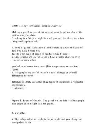
  • 1. WOU Biology 100 Series Graphs Overview Making a graph is one of the easiest ways to get an idea of the patterns in your data. Graphing is a fairly straightforward process, but there are a few things to keep in mind. 1. Type of graph. You should think carefully about the kind of data you have before you decide what type of graph to produce. See Figure 1. a. Line graphs are useful to show how a factor changes over time or in some other gradual continuous increment (like temperature or ambient light). b. Bar graphs are useful to show a total change or overall difference between different discrete variables (like types of organisms or specific experimental treatments). Figure 1. Types of Graphs. The graph on the left is a line graph. The graph on the right is a bar graph. 2. Variables a. The independent variable is the variable that you change or manipulate in the
  • 2. experiment. This variable is usually placed along the x (horizontal) axis. In the case of an experiment where you are observing something that changes over time, time serves as an independent variable and is always listed on the x-axis. If, in addition to time, there is a second independent variable (e.g. observing what happens to two different treatments over time) this variable is usually graphed by drawing multiple lines on the graph. See Figure 2. b. The dependent variable is the response or what happens in response to the independent variable. Typically, this variable is what you counted or measured during the experiment. This variable is placed along the y (vertical) axis. 3. Titles and Labeling. a. Every graph needs a concise and descriptive title that explains what phenomenon the graph is attempting to visualize. If you averaged data from several different lab groups before graphing, you should note in the title that your graph depicts averaged data (like in the bar graph in Figure 1). b. Each axis should be labeled, and the label should include the units in which the data was recorded. Without units, your graph is meaningless.
  • 3. WOU Biology 100 Series Graphs Overview Table 1, below, shows an example of data collected during an experiment. The same data is presented in Figure 2. Note how much easier it is to quickly examine the patterns of data collected in the visual graph compared to the data table, as long as the graph is titled properly, the axes are labeled (with units) and there is a key. Table 1: Data table showing gas generation (viewed as movement of liquid up a tube) by Elodea plants under different conditions. Note use of units in the table headings. Movement of liquid in tube (in centimeters) Time (minutes) Clear test tube Foil covered test tube 5 0.7 0 10 1.1 0.2 15 1.4 0.3 20 1.7 0.4 25 2.1 0.4 30 2.8 0.4 35 3.6 0.4 40 4.5 0.4 45 5.8 0.4 50 6.7 0.4 55 7.6 0.4 60 8.8 0.4 Figure 2: A line graph with title, labels (including units), and a
  • 4. key. This data is the same as the data provided in Table 1. 4. Keys. If your graph includes multiple variables (see Figure 2), it is necessary to include a key. While you may find it useful to color-code your graph, remember that not all printers or copiers produce color. Thus, the use of symbols (like the diamonds and squares at each data point in Figure 2) and gray-scale in keys is most appropriate to ensure that someone trying to interpret your graph can do, even in black and white. WOU Biology 100 Series Graphs Overview 5. Scale. It is important to choose the appropriate scale for each axis. Figure 2 shows the appropriate scale for oxygen generation by Elodea in light. See Figure 3 for inappropriate scales. To determine the appropriate scale, it is usually best to examine the maximum and minimum data points, and then choose a scale that will allow you to show those points at either end of the axis. a. A scale that is too large will compress your data points, and will not allow you to see the relevant patterns in the data. b. A scale that is too small will limit the amount of data you are able to present and will also appear too busy and be hard-to-read.
  • 5. c. Remember also that your scale should be consistent- The y- axis in Figure 2 does not suddenly change from increments of 5 cm to increments of 20 cm, for example. Figure 3A. This graph has a vertical scale that is too large. Figure 3 B. This graph has a vertical scale that is too small. General Biology BI102 8 LAB 3: DIFFUSION, OSMOSIS, AND CELL PERMEABILITY From a Nonrandom to a Random Distribution of Molecules – without the use of energy! Learning objectives (What we expect you to get out of this lab): Concepts & techniques Vocabulary: • Understand diffusion and osmosis concentration gradient • Understand how diffusion and osmosis are caused by concentration gradients diffusion • Understand the importance of diffusion and osmosis to biological organisms. osmosis
  • 6. • Setup laboratory apparatus cell membrane • Measure movement of solutions and molecules to observe osmosis and diffusion cytoplasm • Calculating rate from of processes cell wall • Developing graphs to show data patterns • Drawing conclusions from data Introduction: On a rainy Sunday afternoon, the smell of baking cookies slowly spreads through the house. The scent molecules given off by the cookies are initially strongest in the kitchen, but over the course of the afternoon, the entire house begins to take on the delicious aroma of vanilla, butter and sugar. The random movement of scent molecules through out the house occurs as the molecules gradually spread down the concentration gradient. When the cookies begin baking, the molecules are concentrated in the oven, but over time, they move to areas lacking scent molecules- from areas of higher concentration to lower concentration until the distribution of molecules throughout the house is fairly equivalent (this is why the scent of cookies is strongest in the kitchen when they first come out of the oven, and becomes weaker both over time and also the farther you get from the initial area of concentration). 1 minute 30 minutes 60 minutes
  • 7. Diffusion, the movement of a substance from a region of high to a region of low concentration, is the process by which nutrients and wastes move toward and away from cells. If molecules could not pass General Biology BI102 9 through cell membranes, life would end because there would be no continuous uptake of energy rich food molecules. Life will also cease if toxic materials, such as the wastes produced by each cell, accumulate to lethal levels in the immediate vicinity of the cell. In this lab, you will observe several demonstrations of DIFFUSION, each of which emphasizes that this is a spontaneous process driven by random molecular motion. Osmosis is a special type of diffusion that refers to the net movement of water through a selectively permeable membrane. A selectively permeable membrane only allows certain molecules to cross it. In the context of the living cell, the selectively permeable membrane is the outer boundary of the cell. Osmosis is used to maintain appropriate concentrations of molecules in the cell, which is one feature of the organization of matter that is required to maintain life. Analyzing osmosis lets you explore the idea that a disorganizing process, the diffusion of water, can be coupled to an organized structure, like a semipermeable membrane, to do work that increases or
  • 8. maintains the organization of part of a system. If you have ever attempted to control slugs in your garden by sprinkling salt on them, you have used osmosis. By the end of this activity, you’ll be able to explain what is happening in the case of the salted slug! Three components must be present for osmotic pressure to exist: a selectively permeable membrane and two solutions that differ in their concentrations of a substance that cannot cross the membrane. In this investigation, and in most biological situations, the substance that cannot cross the membrane is dissolved in water. In this diagram, the solution on the left of the selectively permeable membrane has a higher concentration of molecules, indicated by dots, than the solution on the right side of the membrane. The molecules cannot cross the membrane and are dissolved in water, which can cross the membrane. There is a concentration gradient of molecules; that is, a given volume of solution on the left has a larger number of molecules than the same volume of the solution on the right. You will begin this lab by investigating two physical processes that control the movement of nutrient and waste molecules relative to cells. By the end of the investigation, you should be able to define diffusion and osmosis; you will need to understand these concepts to discuss how they apply to observations of you will make on living cells during next week’s lab. ☞NOTE: Both lab procedures today will take at least one hour once you get the experiments set up. You should get the osmometer set up and
  • 9. running and then set up the acid diffusion experiment. Do not wait to finish collecting osmometer data before you set up the diffusion experiment. You can collect data simultaneously on both experiments. General Biology BI102 10 Part 1: Measuring Osmosis 1. An osmometer is a device for measuring osmotic pressure. To conceptualize the impact of osmotic pressure, consider the following questions about a bag of solution of sucrose (C12H22O11) dissolved in water (H2O) enclosed by a semipermeable membrane that is immersed in a beaker of solution that is less concentrated. 1A. Can the sucrose molecules spontaneously diffuse down this gradient? Why or why not? 1B. There is also a concentration gradient of water. Is the water concentration higher inside or outside of the bag?
  • 10. 1C. Will water diffuse down its concentration gradient? Why or why not? 1D. Will the net movement of water be into or out of the bag? 1F. What will happen to the volume of solution inside the bag? 2. Use your answers in Procedure 1 above to make a hypothesis about what will happen to the level of fluid in a tube that can carry excess liquid out of bag. How do you hypothesize that the concentration of the solution inside the bag will influence the volume change in the bag and subsequent fluid movement in the tube? Hypothesis: 3. Construct your osmometer (see figure below) • Get a dialysis bag (made of a semipermeable material) from your instructor and securely tie off one end of a soaked tube.
  • 11. General Biology BI102 11 • Fill the bag with 10 mL of a solution containing sucrose, which even when dissolved cannot cross the membrane. There are three different sucrose solutions, 10%, 20%, or 40%. Be sure to record which solution your table is using. • Tie off the open end of the bag to the end of the surgical tubing using the string. The liquid from the bag must completely cover the end of tube, with no air gap. It is necessary to be certain that there are no leaks in the membrane and that the outside has been washed free of any spilled solution. • Immerse the filled bag into a beaker of distilled water. Make sure the bag is completely immersed in the beaker of water- you can adjust and secure the apparatus using the clamps at the top of the stand. • Record the time and the height of the fluid in the glass tube once you have completed setting up the osmometer. • At five-minute intervals over the next 60 minutes, measure and record in the data table the height of the fluid column in the osmometer. • Record your group’s data in the table and on the class data sheet at the front of the room. Once all of
  • 12. the class data has been recorded, make sure you copy it down so that you have data for all three glucose concentrations. General Biology BI102 12 Data Table: Osmosis in the Presence of Three Different Concentrations of Sucrose: 10% Sucrose 20 % Sucrose 40 % Sucrose Time (minutes) Table 1 Table 2 Table 3 Table 4 Table 5 Table 6 5 10 15 20
  • 13. 25 30 35 40 45 50 55 60 4. As your team records the data for your osmometer, you can begin to construct a graph that shows the change as time goes by in the height of the fluid column in the osmometer. Plot the data for your osmometer first; you can add in the other solutions when the other groups make their data available. Be sure to use a different symbol (for example, ✕ each solution. Do not forget to label your graph and both axes! 4A. What should be plotted on the X-axis of your graph? On the Y-axis? 4B. What are the units of the item plotted on the X-axis? On
  • 14. the Y-axis? General Biology BI102 13 5. Do the data points on the graph you plotted for your group’s osmometer data seem to fit a straight line or a curved one? 5A. Is this what you would predict from thinking about what is happening in the experiment? Why? (SUBTLE HINT: As time passes, what happens to the size of the concentration gradient that drives osmosis?) 6. Calculate the rate of osmosis for your osmometer. (Show your work.) 7. How did you select the part of the graph to use in answering the last question?
  • 15. 8. Tabulate the rates of osmosis calculated by all other team in your lab section, including the team that used the same concentration that you did. 9. Is there a consistent relationship between sucrose concentration and rates of osmosis? General Biology BI102 14 Part 2: Measuring Diffusion 1. Obtain three petri dishes which have been filled with agar dyed with bromothymol blue. Bromothymol blue is an indicator that will turn yellow-green in the presence of an acid. 2. Bring the petri dishes back to your lab bench. Use the cork borer to make a shallow depression in the center of each block. Be sure that your depression does not extend all the way to the glass bottom of the dish. 3. Use what you have learned about diffusion to make a hypothesis about what will happen when the
  • 16. acids are added to the depressions in the agar in the petri dishes. Hypothesis: 4. You will be using acids of three different molecular weights. How do you hypothesize that the molecular weight will influence (or not) diffusion of the acid through the agar? The molecular weight of each acid is: Hydrochloric acid = 37 Acetic acid = 60 K Acid Phthalate = 204 Hypothesis: 5. Put on your goggles and carefully use the droppers to fill the depression in the first agar block with hydrochloric acid, and fill the depressions in the second and third agar blocks with acetic acid and Potassium acid phthalate, respectively. Record the time at which each depression is filled. Once you are done with the droppers, you may take your goggles off. 6. At five minute intervals over the next 60 minutes, measure and record in the data table in Part 1 of Results, the diameter of the yellow circle that forms in each block as the acid diffuses out of the depression.
  • 17. General Biology BI102 15 Data Table: Diffusion of Acid in an Agar Block: Time (min) Acetic Acid Hydrochloric Acid K Acid Phthalate Aid 5 10 15 20 25 30 35
  • 18. 40 45 50 55 60 7. Plot the data for all three acids on a single time series graph, using a different symbol (circles, “x”s, triangles) for each acid. Be sure to label your graph and both axes! 7A. What should be plotted on the X-axis of your graph? On the Y-axis? 7B. What are the units of the item plotted on the X-axis? On the Y-axis? General Biology BI102 16
  • 19. 8. Review your graph. Do the data points on your graph seem to fit a straight line or a curved one? Is this what you would predict from thinking about what is happening in the experiment? Why? (SUBTLE HINT: As time passes, what happens to the size of the concentration gradient that drives diffusion? NOT-SO-SUBTLE HINT: Will the diameter of the
  • 20. yellow circle continue to increase if one of the acids diffuses to the edges of the agar block?) 9. Remember that the molecular weight of each acid is: Hydrochloric acid = 37 Acetic acid = 60 K Acid Phthalate = 204 Is there a consistent relationship between the size of the acid molecules and their diffusion rates? How did you select the part of each acid’s graph to use in answering the last question? General Biology BI102 17 Questions Name____________________ 1. Define “osmosis” 2. Define “diffusion”
  • 21. 3. Describe the primary differences between osmosis and diffusion. 4. In the lab, you observed acids with different molecular sizes diffusing through three agar plates, all of which had the same density of agar. Suppose you took three agar plates with different densities: one low density, one medium density, and one high density. You prepared a hole in each plate and dropped in one drop of hydrochloric acid in each plate. What would be the results? Explain the basis for your answer: 5. Imagine that you wanted to examine diffusion of a gas within a closed room. You use three gasses, each with a different molecular weight. Gas X has a molecular weight of 41, Gas Q has a molecular weight of 320, and Gas K has a molecular weight of 12. Which of the three gasses would you expect to diffuse most rapidly through the room? Why? 6. Use what you learned about osmosis to explain:
  • 22. a. a slug shrivels when you put salt on it (think about what is happening to semipermeable cells of the slug)? b. carrot sticks get crisp when you put them in a bowl of water in the refrigerator c. Why it is a bad idea to drink saltwater when you are already dehydrated BI 102 Lab 1 Writing Assignment How did the different concentrations of sucrose impact osmotic rate? This assignment requires you to evaluate a hypothesis and communicate the results of your experiment on the rate of osmosis into sucrose solutions of varying concentrations. The questions below are meant to guide you to reporting the key findings of
  • 23. your experiment and help you think through how to explain the findings and draw conclusions from them in a scientific manner. ASSIGNMENT: Please respond to the following questions to complete your laboratory write up. For this assignment you will only focus on the osmosis of water into sucrose concentrations of varying concentration. Make sure that your write up is accurate, and clearly written so that it is easily readable. A grading rubric is provided on the second page of this assignment. To earn full points on your write up, you must provide answers that align to the “meets” column of your grading rubric as well as meeting all “Quality of Writing and Mechanics” elements described in the rubric. There are also some tips on pages 3-4 of this assignment to help you succeed. FORMAT: • Type your responses, using 1.5 or double spacing. • Include the section headings (Hypothesis, Results, Analysis) and question number (example: 1, 2, 3, etc) in your answers but do not rewrite the question. • Graphs may be made with a computer program (example: Microsoft excel, Mac numbers, etc) or may be neatly produced with a ruler on graphing paper. • Print out the cover sheet on page 2 of this assignment, read and sign the academic honesty statement, and submit it with your write up. Your instructor WILL NOT accept a write up without the signed cover sheet.
  • 24. DUE DATE: Your write up is due at the beginning of class next week. Late assignments will have 1 point deducted per day up to 5 days, at which point the assignment will be assigned 0 points. Hypothesis and Prediction – Part 1 of Rubric 1. What did you think was going to happen in this experiment and why? You may find it helpful to state your answers to these questions as an “if-then” hypothesis- prediction. Be sure you have included a biological rationale that explains WHY you made this hypothesis/prediction. (You worked on this in question 2 on page 10 of this lab activity) Results – Part 2 of Rubric 2. How did the different concentrations of sucrose impact osmotic rate? Answer this question by creating a line graph that shows the results of your experiment. If you need assistance building a graph, there is a Guide to Graphing resource available on your Moodle lab course site. Analysis- Part 3 of Rubric 3. Explain why you think that the results shown in your graph support or refute your hypothesis (remember we never “prove” anything in science). Consider all your data and the overall data pattern as you answer this question. Don’t ignore unusual data that may not seem to fit into a specific patterns (“outliers”). Explain what you think might be behind these unusual data points.
  • 25. 4. What is the biological significance of your results? What biological concepts explain completely why these events happened in the experiment? How do these results help you understand the biology of the cell and how materials move back and forth across the cell membrane? (A hint: refer back to questions 1A-1F on page 10 of this lab activity). Think about giving a specific example. References- Mechanics Checklist 5. Provide at least one full citation (make sure you include an in-text citation that pinpoints where you used this resource) for a resource you made use of in performing the experiment, understanding the concepts and writing this assignment. (Perhaps your lab manual? Your textbook? A website?) If you used more than one resource, you need to cite each one! If you need help with citations, a Guide to Citing References is available on your Moodle lab course site. Please print out and submit this cover sheet with your lab writeup!
  • 26. Lab Writeup Assignment (1) Assessment Rubric-­‐ 10 points total Name: ________________________________________ Element Misses (1 point) Approaches (2 points) Meets (3 points) Hypothesis Clarity/Specificity Testability Rationale ___Hypothesis is unclear and hard-
  • 27. to-understand ___Hypothesis is not testable ___No biological rationale for hypothesis or rationale is fully inaccurate ___Hypothesis included is clearly stated, but not specific or lacks specific details __Hypothesis is testable, but not in a feasible way in this lab ___Some foundation for hypothesis, but based in part on biological inaccuracy ___Hypothesis included is clearly stated and very specific ___Hypothesis is testable and could be tested within lab parameters ___Rationale for hypothesis is grounded in accurate biological information Graph Title
  • 28. Axes Variables Key Graph clarity Data accuracy ___Graph lacks a title ___Axes are not labeled ___Variables not addressed in graph ___No key or way to tell data points apart ___Graph is hard to read and comparisons cannot be made: Inappropriate graph type or use of scale ___Data graphed is inaccurate or does not relate to experiment
  • 29. ___Graph has a title that is not very descriptive ___Axes are either unlabeled, or units are unclear or wrong ___Variables addressed in graph, but not on correct axes ___Key included, but is hard to understand ___Graph is somewhat readable, comparisons can be made with difficulty: Appropriate graph type, but not scaled well ___Data graphed is partially accurate; some data is missing ___Graph has a concise, descriptive title ___Axes are labeled, including clarification of units used ___Variables on correct axes ___A clear, easy-to-use key to data points is included ___Graph is clearly readable and comparisons between treatments are
  • 30. easy to make: Graph type and scale are appropriate to data ___Data graphed is accurate and includes all relevant data, including controls (if needed) Analysis Hypothesis Scientific language Data addressed Explanation ___Hypothesis is not addressed ___Hypothesis is described using language like proven, true, or right ___No explanations for data patterns observed in graph or data does not support conclusions. ___No biological explanation for data trends or explanations are completely inaccurate ___Hypothesis is mentioned, but not
  • 31. linked well to data ___Hypothesis is not consistently described as supported or refuted ___Some data considered in conclusions but other data is ignored. Any unusual “outliers” are ignored ___Explanations include minimal or some inaccurate biological concepts ___Hypothesis is evaluated based upon data ___Hypothesis is consistently described as supported or refuted ___All data collected is considered and addressed by conclusions, including presence of outliers, ___Explanations include relevant and accurate biological concepts Quality of Writing and Mechanics: Worth 1 point. Writeup should meet all of the following criteria! Yes No ☐ ☐ Write up includes your name, the date, and your lab section ☐ ☐ Write up is free from spelling and grammatical errors (make sure you proofread!!) ☐ ☐ Write up is clear and easy-to-understand ☐ ☐ Write up includes full citation for at least one reference
  • 32. with corresponding in-text citation ☐ ☐ All portions of write up are clearly labeled, and question numbers are included Plagiarism refers to the use of original work, ideas, or text that are not your own. This includes cut-and-paste from websites, copying directly from texts, and copying the work of others, including fellow students. Telling someone your answers to the questions (including telling someone how to make their graph, question #2), or asking for the answers to any question, is cheating. (Asking someone how to make the graph for this assignment is NOT the same as asking for help learning excel or some other software). All forms of cheating, including plagiarism and copying of work will result in an immediate zero for the exam, quiz, or assignment. In the case of copying, all parties involved in the unethical behavior will earn zeros. Cheating students will be referred to the Student Conduct Committee for further action. You also have the right to appeal to the Student Conduct Committee. I have read and understand the plagiarism statement. ____________________________________________________ Signature Guidelines for Good Quality Scientific Reports Hypothesis and Prediction: The hypothesis is a tentative explanation for the phenomenon. Remember that: • A good hypothesis and prediction is testable (and should be testable under the conditions of our lab
  • 33. environment; For example, if your hypothesis requires shooting a rocket into space, then its not really testable under our laboratory conditions). • Your explanation can be ruled out through testing, or falsified. • A good hypothesis and prediction is detailed and specific in what it is testing. • A good hypothesis provides a rationale or explanation for why you think your prediction is reasonable and this rationale is based on what we know about biology. • A good prediction is specific and can be tested with a specific experiment. Examples*: I think that diet soda will float and regular soda will sink. {This hypothesis misses the goal. It is not specific as we don’t know where the sodas are floating and sinking, and it does not provide any explanation to explain why the hypothesis makes sense} Because diet soda does not contain sugar and regular soda does, the diet soda will float in a bucket of water, while regular soda will sink. {This hypothesis approaches the goal. It is more specific about the conditions, and it provides a partial explanation about why the hypothesis makes sense, but the connection between sugar and sinking is unclear} If diet soda does not contain sugar, then its density (mass/volume) is lower than that of regular soda which does contain sugar, and so diet soda will float in a bucket
  • 34. of water while regular soda sinks. {This hypothesis meets the goal. It is specific and the rationale- sugar affects density and density is what determines floating or sinking in water- is clearly articulated} *Note that these examples are for different experiments and investigations and NOT about your osmosis lab. They are provided only to help you think about what you need to include in your write up. Graph: The graph is a visual representation of the data you gathered while testing your hypothesis. Remember that: • A graph needs a concise title that clearly describes the data that it is showing. • Data must be put on the correct axes of the graph. In general, the data you collected (representing what you are trying to find out about) goes on the vertical (Y) axis. The supporting data that that describes how, when or under what conditions you collected your data goes on the horizontal (X) axis. (For this reason time nearly always goes on the X-axis). • Axes must be labeled, including the units in which data were recorded • Data points should be clearly marked and identified; a key is helpful if more than one group of data is included in the graph. • The scale of a graph is important. It should be consistent (there should be no change in the units or
  • 35. increments on a single axis) and appropriate to the data you collected Examples: {This graph misses the goal. There is no title, nor is there a key to help distinguish what the data points mean. The scale is too large- from 0 to 100 with an increment of 50, when the maximum number in the graph is 25- and makes it hard to interpret this graph. The x-axis is labeled, but without units (the months) and the y-axis has units, but the label is incomplete- number of what?} {This graph meets the goal. There is a descriptive title, and all of the axes are clearly labeled with units. There is a key so that we can distinguish what each set of data points represent. The dependent variable (number of individuals) is correctly placed on the y-axis with the independent variable of time placed on the x-axis. The scale of 0-30 is appropriate to the data, with each line on the x-axis representing an increment of 5.} 0 50 100 N
  • 38. Spring/Summer 2011 Brindled madtom Neosho madtom Slender madtom Analysis: You need to evaluate your hypothesis based on the data patterns shown by your graph. Remember that: • You use data to determine support or refute your hypothesis. It is only possible to support a hypothesis, not to “prove” one (that would require testing every possible permutation and combination of factors). Your evaluation of your hypothesis should not be contradicted by the pattern shown by your data. • Refer back to the prediction you made as part of your hypothesis and use your data to justify your decision to support or refute your hypothesis. • In the “if” part of your hypothesis you should have provided a
  • 39. rationale, or explanation for the prediction you made in your hypothesis (“then” part of hypothesis”). Use this to help you explain why you think you observed the specific pattern of data revealed in your graph. • You should consider all of the data you collected in examining the support (or lack of support for your hypothesis). If there are unusual data points or “outliers” that don’t seem to fit the general pattern in your graph, explain what you think those mean. Examples: I was right. Diet Pepsi floated and so did Apricot Nectar. Regular Pepsi sank. Obviously the regular Pepsi was heavier. This helps us understand the concept of density, which is a really important one. {This analysis misses the goal. The hypothesis isn’t actually mentioned and the data is only briefly described. There is no explanation of the importance of the Apricot Nectar results. Finally, there is no connection to how these results help understand density or why it is biologically important} I hypothesized that diet soda would float, and all three cans of diet Pepsi did float while the regular Pepsi sank. This supports my hypothesis. Both types of Pepsi were 8.5 fluid ounces in volume, but the regular Pepsi also contained 16 grams of sugar. This means that the regular Pepsi had 16 more grams of mass provided by the sugar in the same amount of volume. This would lead to an increase in density, which explains why the regular soda cans sank. When we put in a can of Apricot Nectar, which had 19 grams of sugar, it floated. This was unexpected,
  • 40. but I think it is explained by the fact that an Apricot Nectar can had a volume of 7 fluid ounces, but the dimensions of the can are the same as that of a Pepsi can. A same-sized can with less liquid probably has an air space that helped it float. The results of this experiment help us understand how the air bladder of a fish, which creates an air space inside the fish, helps it float in the water and also how seaweeds and other living things with air spaces or other factors that decrease their density keep from sinking to the bottom of the water. {This analysis meets the goal. It clearly ties the hypothesis to the results and outlines what they mean. It describes how the results support the hypothesis, but also explains a possible reason behind the unusual results of the Apricot Nectar. Finally, there is a link to how this experiment helps us understand biology} WOU Biology 100 Series Graphs Overview Making a graph is one of the easiest ways to get an idea of the patterns in your data. Graphing is a fairly straightforward process, but there are a few things to keep in mind. 1. Type of graph. You should think carefully about the kind of data you have before you decide what type of graph to produce. See Figure 1. a. Line graphs are useful to show how a factor changes over time or in some other
  • 41. gradual continuous increment (like temperature or ambient light). b. Bar graphs are useful to show a total change or overall difference between different discrete variables (like types of organisms or specific experimental treatments). Figure 1. Types of Graphs. The graph on the left is a line graph. The graph on the right is a bar graph. 2. Variables a. The independent variable is the variable that you change or manipulate in the experiment. This variable is usually placed along the x (horizontal) axis. In the case of an experiment where you are observing something that changes over time, time serves as an independent variable and is always listed on the x-axis. If, in addition to time, there is a second independent variable (e.g. observing what happens to two different treatments over time) this variable is usually graphed by drawing multiple lines on the graph. See Figure 2. b. The dependent variable is the response or what happens in response to the independent variable. Typically, this variable is what you counted or measured during the experiment. This variable is placed along the y
  • 42. (vertical) axis. 3. Titles and Labeling. a. Every graph needs a concise and descriptive title that explains what phenomenon the graph is attempting to visualize. If you averaged data from several different lab groups before graphing, you should note in the title that your graph depicts averaged data (like in the bar graph in Figure 1). b. Each axis should be labeled, and the label should include the units in which the data was recorded. Without units, your graph is meaningless. WOU Biology 100 Series Graphs Overview Table 1, below, shows an example of data collected during an experiment. The same data is presented in Figure 2. Note how much easier it is to quickly examine the patterns of data collected in the visual graph compared to the data table, as long as the graph is titled properly, the axes are labeled (with units) and there is a key. Table 1: Data table showing gas generation (viewed as movement of liquid up a tube) by Elodea plants under different conditions. Note use of units in the table headings.
  • 43. Movement of liquid in tube (in centimeters) Time (minutes) Clear test tube Foil covered test tube 5 0.7 0 10 1.1 0.2 15 1.4 0.3 20 1.7 0.4 25 2.1 0.4 30 2.8 0.4 35 3.6 0.4 40 4.5 0.4 45 5.8 0.4 50 6.7 0.4 55 7.6 0.4 60 8.8 0.4 Figure 2: A line graph with title, labels (including units), and a key. This data is the same as the data provided in Table 1. 4. Keys. If your graph includes multiple variables (see Figure 2), it is necessary to include a key. While you may find it useful to color-code your graph, remember that not all printers or copiers produce color. Thus, the use of symbols (like the diamonds and squares at each data point in Figure 2) and gray-scale in keys is most appropriate to ensure that someone trying to interpret your graph can do, even in black and white.
  • 44. WOU Biology 100 Series Graphs Overview 5. Scale. It is important to choose the appropriate scale for each axis. Figure 2 shows the appropriate scale for oxygen generation by Elodea in light. See Figure 3 for inappropriate scales. To determine the appropriate scale, it is usually best to examine the maximum and minimum data points, and then choose a scale that will allow you to show those points at either end of the axis. a. A scale that is too large will compress your data points, and will not allow you to see the relevant patterns in the data. b. A scale that is too small will limit the amount of data you are able to present and will also appear too busy and be hard-to-read. c. Remember also that your scale should be consistent- The y- axis in Figure 2 does not suddenly change from increments of 5 cm to increments of 20 cm, for example. Figure 3A. This graph has a vertical scale that is too large. Figure 3 B. This graph has a vertical scale that is too small.