
Recommended
More Related Content
What's hot
What's hot (19)
Similar to Dexter analysis
Similar to Dexter analysis (18)
Recently uploaded
Recently uploaded (20)
Dexter analysis
- 2. Codes and Conventions of TV poster • Eye catching (because it is advertising something, therefore needs to be striking) • Colours that connote the genre of the TV poster (i.e. dark for thriller, bright colours for comedy) • Focal image (usually of main character in the middle of the poster) • Title of the show, in large, bold, outstanding letters • Directors, producers, actors, in smaller, less noticeable font • Quotes, recommendations, ratings • Taglines • Channel it is being aired on
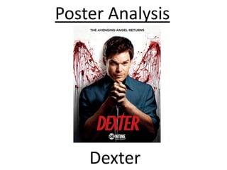
- 4. Large focal image – this is evident in the Dexter poster which shows the main character looking very sneaky holding a knife, which in picture form denotes the storyline of the TV show Interesting background – this is used on the Dexter poster with the angel wings created from blood splashes. This again, portrays the motif behind the TV show and gives a little insight into the show and Dexter’s character without giving too much away Large title – This title is bold, in red, and takes up a lot of the poster. The use of the colour red continues the motif of blood and gore, a theme of Dexter Colours connoting genre of TV show – dark shirt, red blood and title, white background. Shows the juxtaposition of the character of Dexter Tagline – TV posters don’t have lots of text, so a catchy tagline is useful in captivating audience. The use of simile is extra emphasising and adds some fluency to the tagline. Channel it is being aired on – so the audience knows where to go to find the TV show and watch it