
Recommended
More Related Content
What's hot
What's hot (19)
Viewers also liked
Viewers also liked (7)
Similar to Summary of Genre Research: Homework 3
Similar to Summary of Genre Research: Homework 3 (20)
More from ATurner3
More from ATurner3 (20)
Recently uploaded
Recently uploaded (20)
Summary of Genre Research: Homework 3
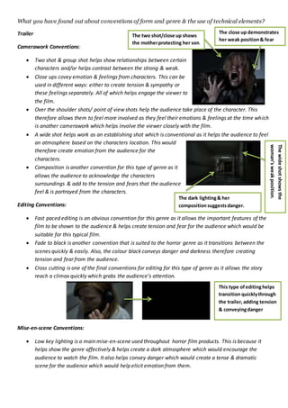
- 1. What you have found out about conventions of form and genre & the use of technical elements? Trailer Camerawork Conventions: Two shot & group shot helps show relationships between certain characters and/or helps contrast between the strong & weak. Close ups covey emotion & feelings from characters. This can be used in different ways: either to create tension & sympathy or these feelings separately. All of which helps engage the viewer to the film. Over the shoulder shots/ point of view shots help the audience take place of the character. This therefore allows them to feel more involved as they feel their emotions & feelings at the time which is another camerawork which helps involve the viewer closely with the film. A wide shot helps work as an establishing shot which is conventional as it helps the audience to feel an atmosphere based on the characters location. This would therefore create emotion from the audience for the characters. Composition is another convention for this type of genre as it allows the audience to acknowledge the characters surroundings & add to the tension and fears that the audience feel & is portrayed from the characters. Editing Conventions: Fast paced editing is an obvious convention for this genre as it allows the important features of the film to be shown to the audience & helps create tension and fear for the audience which would be suitable for this typical film. Fade to black is another convention that is suited to the horror genre as it transitions between the scenes quickly & easily. Also, the colour black conveys danger and darkness therefore creating tension and fear from the audience. Cross cutting is one of the final conventions for editing for this type of genre as it allows the story reach a climax quickly which grabs the audience’s attention. Mise-en-scene Conventions: Low key lighting is a main mise-en-scene used throughout horror film products. This is because it helps show the genre affectively & helps create a dark atmosphere which would encourage the audience to watch the film. It also helps convey danger which would create a tense & dramatic scene for the audience which would help elicit emotion from them. The two shot/close up shows the motherprotecting her son. The close up demonstrates her weak position& fear Thewideshotshowsthe woman’sweakposition. The dark lighting& her compositionsuggestsdanger. This type ofeditinghelps transition quicklythrough the trailer,adding tension & conveyingdanger
- 2. This shot demonstratesthat it isa children’spossession& the reflectionshowssomeone behindthe female which create fear & tension The use of costumes such as white & black, these colours are associated with death & danger which would help show the genre to be horror and then introduce the story line. The props such as children’s possessions are the main props used to show origin of danger that occurs in the film. Once this is shown, most people would clearly understand the storyline & what is happening. Sound Conventions: Sound effects are necessary to help heighten the fear from the characters & the makes the danger obvious to the audience. The use of background music is compulsory as it helps the tension build throughout the film/trailer to help reach a climax. This feeling that comes from the build-up will either encourage the audience to watch the film or will not. Ancillary Products Colour conventions: Red helps connote danger for the characters. But, it also can connote power that the characters have. White is associated with death so can be used to demonstrate the genre to the audience. It is also conventional as it contrasts with dark background, to make the product more eye catching. The colour black is used to connote danger & fear which is conventional as it shows the genre successfully and helps evoke tension & fear from the audience which will grip them. It is also used to allow features to stand out effectively to make the product more interesting & exciting. Language Conventions: Short and snappy sentences to attract the audience Quotes from the film to give the audience insight & allow the story line to be obvious Acknowledgement of actors & directors to interest audience This shot shows the conventionof colour & mise-en-scene aswhite isusedto showdeath. This is apparent through the hangingof the deadbody. The colour black is usedto allow the white text to stand out & be eye catching The colour black adds to the darkness of the story & connotes danger This sentence isattractive as it suggeststhe filmis basedon a true story so would want to findout what happened
- 3. Layout Conventions: Route of the eye to make the audience acknowledge all features of products Main image, masthead, headline & coverlines Typography Conventions: Sans serif font to make the text bold & to stand out to attract the audience Various font sizes to show importance & to create an impact on the audience Image Conventions: Main central image to attract the audience & make it more eye catching Dark background to make the characters stand out Conventional mise-en-scene to make the genre obvious Colours: red, white& black to convey danger Conventions of form for trailer: Editing is an important convention for the form as it enables the audience to feel engaged and involved The use of audience comments allows it to be direct to the audience & provides them with essential information Conventions of form for products: Route of the eye to make sure the audience acknowledges all the features Main image, masthead, headline and coverlines to make sure the audience are informed Important information is always obvious Acknowledging actors and directors & other content so they go and watch the film & by their other products Conventions of Genre for trailer: Consistent use of camerawork, editing, mise-en-scene and sound to help make the genre obvious to the audience. Also, to make the audience feel involved with the trailer so they can experience the characters position & emotion to then elicit emotions from them. Additionally, to make the audience feel tension & fear to grip them to the trailer. This encouragesthe audience to watch the film Main image to have an insighton the film& introduce characters Main title in the route of the eye so theycan see the image first thenfocus on the title Sans seriffont stands out above the dark background due to the colour white.The fonthelps show the genre to be dramatic & tense Central image introducesthe characters & shows the male to be in power& woman to be weak Colour redto show he is in control The dark background in the image of the characters allow them to stand out The use of the route ofthe eye allows all featuresto stand out & makes sure the coversall aspects of a conventional magazine cover. The use of large fonts showsthe important features:title of magazine & the main title which is eye catching
- 4. Conventions of Genre for products: Consistent use of colours to help create a brand identity such as red, black and white to create a sense of danger which would be typical for the genre. Images allow the audience to have an insight into what the film consists of which will encourage them to see the film. Also, would allow the audience to see certain characters & their emotions which would therefore introduce a type of audience they are target & help them distinguish between the strong & weak characters. This image shows how the ‘empire’magazine has giventheir audience insightintosceneswithinthe filmwhich shows differentsuperheroes. The cover is usingthe typical black background to make featuresstand out & the colour redto show power.This relatesto the image ofthe man being portrayed as strong & powerful.