Introduction to ArtificiaI Intelligence in Higher Education
Evaluation
1. Evaluation
1) In what ways does your media product use, develop or challenge forms
and conventions of real media products?
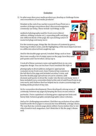
Detailed at the end of my market research PowerPoint are a
number of design conventions that I discovered magazines
commonly use today. These include such things as the
method of photography used for front covers (direct
address, striking costume etc.), separating puffs and plugs
into different thirds of the page, the eyecatching nature of
numerical plugs and many more.
For the contents page, things like the division of contents by genre,
featuring of editors notes, and the highlighting of the most important text
in a different coloured font caught my eye.
And for the double page spread, I studied things such as how
there was usually a lot of empty space on the page, how they used
pull quotes and I learnt what a drop cap is.
I took all of these summary notes and applied them to my own
magazine design. You can see how I have emulated the style of
photography in direct address and genre-appropriate
costumes on my front cover, how I featured my contents in
the left third of its page and included an editor’s note, and
how the double page spread was set out in columns, with
dramatic pull quotes to draw the reader into the text and many more. I
have included every convention listed at the end of said PowerPoint in my
own work, and I believe that has helped me to create a convincingly real
looking media product of my own.
As for convention development, I have developed a strong sense of
continuity between my pages by keeping the focus on one artist in
particular. I have capitalised on having genre-appropriate fonts and
heavy links between graphic and photographic colour schemes.
And as for challenging conventions, I feel that my exclusion of any other
band from the three pages is unusual, but was definitely a design choice.
The way that my contents page photo utilises heavy motion blur is not
often found in such magazines, but I think that it fits the page’s theme
well.
2. 2) How does your media product represent particular social groups?
My product heavily represents the alt-rock scene in its jumbled, chaotic
layout. The costumes of the artists and the attitudes they portray in the
images relates to the way this audience tend to live their lives. My
interviews told me that these people loved the genre as it allowed them to
display their individuality, so I have tried to make the magazine stand out
from standard convention.
The magazine is aimed at young, affluent people with high disposable
income so the models I used are young, with expensive looking clothing.
The magazine’s design seems slick and professional, catering to the
higher-class aspects of my intended audience’s personas and its dark,
dramatic style is reminiscent of their deep personal struggles, as are
commonly associated with this audience (they’re often very
overdramatic).
3) What kind of media institution might distribute your media product and
why?
I would like my product to be distributed by an institution such as
Development Hell Ltd. as their magazines have a high production value
and are usually quite niche and stylised as mine is. I feel that they could
do a better job than, say, Bauer Media Group as BMG deal with more
general magazines with huge audiences.
4) Who would be the audience for your media product?
My audience would be young, hardcore fans of the alt-rock genre. They
would have a high disposable income and be very fashionable in their
day-to-day lives. They could be seen as rule-breakers and leaders in their
peer groups as I would expect them to have a strong moral code.
5) How did you attract/address your audience?
The magazine is heavily stylised towards the alt-rock genre. I hope to
attract the audience with its striking, high contrast appearance and
fashionable feature artists. I hope the use of distorted and chaotic fonts
and layouts will resonate with them, letting them know that this
publication is for individuals like them. Even things such as the featured
band names and fantastical nature of the “celebrity” aspect of the article
was intentional, as I believe that my final decisions will appear “cool” in
the eyes of my audience.
6) What have you learnt about technologies from the process of constructing
this product?
3. As can be seen from the disparity between my first drafts/mockups at the
beginning of my blog and the final products, I have come a long way in
understanding the utilisation of computer programs such as:
- Adobe Photoshop and Indesign for my three final pages. I had little to
no knowledge of these programs when I began but I now understand
how to use all the different tools, their respective layouts, how to use
the layering feature, how to enhance photographs and how to make
sure the final product looks professional and thought-out.
- I have learnt how to embed different types of media into Microsoft
Word, Powerpoint and Excel. I already had basic knowledge of these
programs but I feel that I now know more than the average user.
- I have also learnt how to carry out successful interviews with a DSLR
camera in a proper photo studio, create and collect data from a
SurveyMonkey survey and how to advertise these two research
methods across social media in order to get a balanced audience to
take part in them.
- Inbetween these programs, I now know much more about different
filetypes and compatibilities as I have had to do so much fiddling
about with them.
- Even the act of uploading all this work to an online blog has informed
me about the function of sites such as YouTube, SlideShare and
WordPress of which beforehand I was never aware.
7) Looking back at your preliminary task, what do you feel you have learnt
in the progression from it to the full product?
I think the most dramatic development between the preliminary task and
final product is the technical advancements detailed above. I hope to
utilise these skills in the future if I am to go into a media productive
career and am thankful to have been taught them. Most interesting for me
was the analysis of existing media products, because I didn’t realise how
much thought went into catching the eye of a magazine’s audience and I
know understand that there is a certain science to how it is carried out.
The fact that the same conventions are present across so many different
examples of the products really goes to show that they work, and I had no
knowledge of this at the time of the preliminary task.
I am very proud of this production and feel that I have learnt more than I
ever expected to do in creating it.