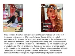
1. If you compare these two front covers which I have created you will notice that
there are a vast number of differences between them and there is a lot of
improvement. For instance the front cover which I created at the beginning of the
year (the cover on the left) I used very minimal Photoshop skills and followed very
few magazine conventions. For instance I did not follow any sub-line conventions, I
simply just used different font to make them stand out instead of using a specific
order. However in the latter cover I researched different magazines to find common
conventions to make my magazine look more professional. I also used more
elements of Photoshop to get my magazine to the highest possible standard.
2. When creating my music magazine contents page I was more aware of
the Photoshop tools and how to use them. For example in my school
magazine you are not able to see very many Photoshop skills. There is
only the bare minimum such different colour fonts and different shape
sizes for the images. On my music magazine page, one is able to see
that I have coordinated my images and my texted so that the page is in
order. Although I have used less pictures in my music magazine
contents page, they are more interesting and professional.