The document discusses the evaluation of a media product created by the author. [1] It describes how the author's magazine used conventions of real magazines such as price, central images, and puffs, but also challenged conventions by using an unconventional background color and contents page image. [2] The author learned about technologies like Photoshop and blogging through constructing the magazine, gaining skills in editing images and using feedback from a blog. [3] The intended audience is described as males and females aged 15-30, particularly in larger cities, and the author aimed to attract this audience through design choices on the cover like the title, colors, and price.
1. Evaluation
In what ways does your media product use, develop
or challenge forms and conventions of real media
products?
My media product has used and has conveyed a range of effective
conventions used in magazines. However there are many different
characteristics that are isolating my magazine from the others that have
been presented to me. From my questionnaire my audience responded to
low prices so I had decided to maintain an affordable price for my audience.
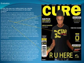
My central image features a male with a direct mode of address, but I
decided to opt for a more interesting pose. The front page of my magazine I
used a bold title block ‘CURE’I included an attractive central image with text
implemented across the lower part of the image. Which is called the
anchorage text ’R U HERE’ used to connect with the audience a message
from the artist to them. I also used puffs to convey my artist’s name and I
used this to indicate the conventions of magazines. One other aspect I
noticed with magazines was that they used on average three colours and
that is what I have maintained I used the colours yellow black and white. I
also contained a consistence house style throughout my front cover using
the same font and the same colours. I didn’t use the same font size because
it would then express that everything on the page has the same significance
and importance.
To Enhance and deepen my development of my magazine I hadn’t used a
plain black background which most magazines have done in the past. This
would immediately show gives an idea of the genre of the magazine without
the consumer opening it. However this has come as an advantage so it
doesn’t look much different to existing ‘Rnb’ magazines so the audience
could familiarise with the front cover. I wanted to follow a formula that is
proven to work, I also didn’t want to alienate anyone in my target audience
by making the cover too unconventional. However I challenged conventional
‘Rnb’ contents pages with an image that dominates the page when creating
my contents page I wanted to feature articles that focused on the musical
achievements of the star rather than gossip, something that a magazine like
VIBE is guilty of, although I lightly feature some ‘gossip’. I also attempted to
develop other music magazine conventions such as using Photoshop to
‘touch up’ my images to improve my magazines overall standard.
2. Evaluation
How does your media product represent particular social groups?
My magazine targets a particular social group which is predominantly my
target audience. it aims to at males and females between the ages of 15-30 it
i s mainly for those that are not so wealthy as readers of more expensive
magazine. My magazine also has a low standard of vocabulary due to the age
of my target audience I don’t want them to be confused about certain this
there reading i wanted my magazine to be easy, clear and understandable
for my audience for all ages this would then enable people to not feel
isolated. My feature article shows and portrayed the type of audience I
wanted to attract .A man from one of the most violent areas of Toronto that
has seen many things and experienced life at the age of 25 and jus wants to
tell his story Which could be a form of inspiration for many young troubled
readers I have used my feature article to suck in readers to create a sense of
belonging and understanding between writer and reader I have used direct
mode of address to almost call out my readers that if this young boy can
make it make it why cant they.
The advantage of getting the connection of the people allows them to
become regular readers I haven’t challenged conventions of other magazines
due to the fact that I am targeting males which would be normal and original
for a ’R n b’ magazine. My magazine can be said to be aimed at anyone that
loves. Music and aspirations are enjoyed by every social class and contrary to
popular belief there are intelligent people in the lower and working classes.
To offer a sense of belonging to everyone that is a music person. My
contents page image was used to bring that little bit of sexiness to my
magazine which then again would interest my target audience. I would like
my magazine to be sold as nationwide as possible as there are people from
my social group all over the country. However, I would focus marketing the
magazine at the major cities such as London, Exeter, Manchester etc as I
feature coverage of gigs and festivals, something that someone in a small
town might not have access to.
3. Evaluation
What have you learnt about technologies from the process of constructing this product?
During the process of constructing this project I have leant about the advantages of
blogging and Photoshop. I have used Photoshop in my previous year however I have
leant more and developed and enhance my skills using the programme. I have
demonstrated in my magazine work things I have known and leant this year. For
example resizing and moving, fading, spraying, tool of crop, black and white tool and
placing in front and behind other items to serve different effects and purposes .I
have also shown how to use glowing effects and shadowing effects. All these tools
have been very useful to me making my magazine a successful one too. Blogging was
the second advantage I had it was helping me to gather information I needed to stay
up to date and I also got a general feedback. Since using the poll to allow people to
vote for the best title block also comments on my work that I posted allowing me to
improve everything. These comments would come from my following class mate’s
and my teacher. This was very helpful I have also tried to use the blog to a larger
extent by learning how to use the dashboard which would allow inserting pictures
and YouTube links. It also helped me edit my work and removed unwanted items. I
have used other things like illustrator and leant the basics however I prefer
Photoshop because it comes more natural to me. It is easier and gave me a better
finishing product and a better result. Photoshop was used throughout the process of
making my magazine. Beginning my music magazine I have learnt a lot about the
technologies within the industry.
I found taking the images easier than others as I own a 12 megapixel camera
which produces quite a high quality picture, however composing the images
and getting things like lighting and costume correct was more of a challenge.
I also learned how to use Photoshop successfully, it became easier to use
once I had learnt the basics. It also showed to me how I could drastically
improve alright images to make them suitable for my magazine. I learned
how to change my images completely by using cropping, highlights, shadows,
glow, contrasting, changing the curves amongst others. To improve my
images I also used the magic eraser, magic lasso and refined the edges to
take the image and put it on a better background. I learned that the cover
was the most important part of the magazine according to the editor of
‘VIBE’ In an interview we watched, this made me realise that I had to get a
better grasp of the technologies in constructing the magazine. This then
allowed me to assess myself and know what I needed to do.
4. Evaluation
Who would be the audience for your media product?
I have chosen this target audience because there is a gap in the
market for it as there is no other magazine that caters for this
type of audience; every RNB magazine targets the males and
female. I have also decided that as the magazine will be
published in larger towns such as London and Liverpool.
However, by having a gangster like image on the front cover,
females might be interested in this magazine too, and they are
also welcome to read the it; most RNB magazines do this,
particularly ‘VIBE’.
To attract my target audience, I used a strong yellow title block
that conveyed the 'RNB genre' of my magazine, but used black
white and yellow colours on the front cover to imply that this is a
magazine targeted primarily for males; however not suggesting
that females cannot read it. The picture I used has an indirect
mode of address to not overwhelm the new-readers on the first
issue, but as the magazine issues progress, direct contacts should
be maintained. I found it on www.1001fonts.co.uk as it portrays
a 'RNB theme' and invites regular RNB readers. I have also picked
a low price for my magazine which is presented clearly on the
front cover, as my target audience are not from the richer rungs
of society.
5. Evaluation
How did you attract/address your audience?
In my magazine I have advertised something free for my target
audience, making the magazine more persuasive to buy, an element
frequently used in magazine. As this is a music magazine I thought it
was appropriate to do a completion about winning tickets to a festival,
as these competitions in magazines are a chance for the reader to get
more interactive with the magazine which is what I wanted my Volume
to be able to provide.
6. Evaluation
What kind of media institution might distribute your media product
and why?
Having previously done research on publishing institutions, I am hoping that "IPC Media"
would be the media institution to distribute my magazine, which is known for publishing
both niche and mainstream magazines. I have chosen this; it has work with great
magazines, such as 'NME' and would therefore have experience and knowledge on this
matter. It is also relevant to note that over 44% in the UK read an IPCMedia
magazine, which opens the door for my magazine to a wider audience as perhaps previous
IPCMedia magazine readers would try reading my magazine, 'Fusion.' Furthermore, this
publishing company could assist in further plans of making a website or a radios
7. Evaluation
Looking back at your preliminary task, what do you feel you have
learnt in the progression from it to the full product?
looking back at my preliminary tasks, I feel that I have learnt in progression
from then to the finished product. From the early tasks it is now clear that I
know how to use Photoshop and take better images, also I learnt of the
importance of constructing images such as costume and pose, you have to
make the image and layout attractive or the target audience will not be
attracted. The background work, such as analysing covers, articles and
researching about magazine companies allowed me to have a better insight
into producing magazines and also hopefully improve my quality of work. I
changed the shadows/highlights, contrast/light fill, I cropped and resized the
images and often made it sepia or black and white(such as on the contents
page and on the first page of the main article). To understand the layout
conventions, I analysed a few magazine front covers and articles; this helped
me to make my own magazine. I realised how important a house style is and
spent a while deciding on colours and the layout. Throughout my magazine I
used white boxes behind the text to convey the conventionality of
magazines, but used different untypical font and images to contradict this.
Overall, I have learnt and understood the importance of layout conventions.