Global Terrorism and its types and prevention ppt.
Evaluation Queue Cards
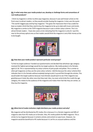
1. Q1: In what ways does your media product use, develop or challenge forms and conventions of
real media products?
I think my magazine is similar to other pop magazines, because it uses well known artists on the
front cover to attract readers- so they would consider buying the magazine. It also uses the quote
“The world’s biggest pop and hip hop magazine.” This gives the impression that it has a wide fan
base so readers think that they need to buy the magazine to be up to date with music and trends.
My magazine is similar to the TOTP magazine because it uses a similar colour scheme. This is to
attract female readers. I have also used a circle indicating that the magazine is only £2. I put this
near to the primary optical area so that readers would think the magazine is very little money so has
to be bought.
Q2: How does your media product represent particular social groups?
To find my target audience I handed out questionnaires and decided that whichever age category
received the highest percentage would be my target audience. My media product is for females
aged 12-18. This is represented by my colour scheme of pink purple and yellow. This is similar to
other girl magazines as they use the same colour scheme. I did this because the colour scheme then
indicates that it is for females without anybody having to pick it up and flick through the articles. This
would widen the target audience because more females would want to see if the magazine was
good because it looks like other ones that they read. Also, my cover artist Emily fits in with the age
category, this relates to the audience of the magazine and makes them feel like they are similar, so
they buy the magazine.
Q3: What kind of media institution might distribute your media product and why?
My magazine will be distributed by IPC media, this is because it is a female magazine and 58% of
magazine sales from IPC media are to females. Also, IPC media publish the NME magazine. This is
similar to my magazine because it contains articles and content on pop music. However, my
magazine would be beneficial to IPC media because it is set for an unusual audience and the
2. company does not distribute a magazine exactly like this, so the individuality of my magazine would
suit the media institution.
Q4: Who would be the audience for your media product?
The audience for my magazine would be females aged 12-18 years. This is because I found that in my
results the people I asked were mostly 12-18 and the genre they liked most was hip hop and pop.
This is the genre that I had chosen originally so I chose the most common age group off my
questionnaire. I tried to make the target audience as large as I could to ensure that the magazine
would receive a wider fan base. I created a focus group on the social networking site Facebook. This
allowed me to create a private group and invite my friends to evaluate my work. In this focus group I
asked the questions “What do you like about my front cover?” and “What do you like about my
double page spread?” I also used a poll to ask which out of my two covers and they preferred and
thought was more suitable, and which of my double page spread they preferred and thought was
more suitable. The results I collected told me that my ...... ADD RESULTS
Q5: How did you attract/address your audience?
The house style of my magazine was pink, purple and yellow. This is because they are girly colours
and suit the target audience and would attract attention to the magazine. In my double page spread
I used a different colour scheme of blue and black, this was because I wanted to represent that the
artist was individual and did not follow the crowd. Also, on the front cover I made sure that my
cover lines were in the primary optical area of the magazine. This was to attract attention to the
stories so that people would buy the magazine. I decided to put the price in the corner of the
magazine instead of the terminal optical area near the barcode. This is to make it look as if it is a
special offer and the reader is getting the magazine for cheaper because it is a special edition. The
content of the magazine is related to the genres hip-hop and pop, these are advertised on my front
cover so that they would attract more readers.
Q6: What have you learnt about technologies from the process of constructing this product?
During editing my photos, I learned how to use the contrast and brightness tool to enhance the
lighting of the photo. I also learnt how to use the lasso tool to cut out the background of an image. I
think this is effective because a white background creates mystery- as you do not know where the
artist was. I think it also looks better because you can just focus on the person and their features
instead. I have also learnt to scale an image, to fit a document. For example, how much space the
picture took up on my front cover, so that it stood out. I have also used the polygonal lasso tool; this
was to select the eyes, lips and hair of one of my artists. I then changed the hue and saturation to
make the colouring of these areas brighter so that they stand out more. By using blogger I have
learnt how to organise and put work onto an online source. I have also learnt how to convert a file
into a different file type, using slide share. This is helpful as word documents and presentations
3. cannot be uploaded on to Blogger, so converting the file type allowed me to put all my work in one
place.
Q7: Looking back at your preliminary task, what do you feel you have learnt in the progression
from it to the full product?
From my ancillary task I have learnt how to advertise the articles inside the magazine. For example
my main articles for my magazine are located in a large san serif font on the front cover. I have also
improved on the use of fonts, as my final magazine makes use of a more dynamic font, whereas my
ancillary magazine just uses an everyday font off a normal computer. I think that a more dynamic
font improves the presence of my magazine because it makes it look more artistic and expensive. I
also think that from my ancillary task I have made a better use of the rule of third principle. For
example, on my ancillary task my image is very small and in the right of my rule of thirds, but in my
final magazine it is in the centre and to the right of them image, because I wanted to make a good
use of the space.