1. I have tried to make my masthead look a
bit rocky so it appeals to people who like
rock music but I also tried to keep it
looking clean as well so people that don’t
like an in your face rock font. I choose
red as it is a popular colour in masthead
and it stands out.
My inspiration for my logo was the metal
hammer logo as I like the font but it
looked a bit bland so I found a different
one.
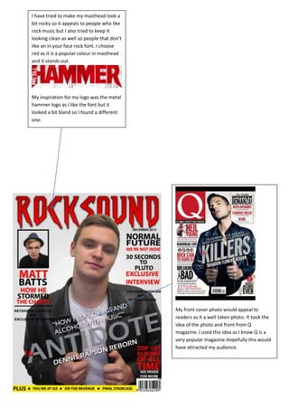
My front cover photo would appeal to
readers as it a well taken photo. It took the
idea of the photo and front from Q
magazine. I used this idea as I know Q is a
very popular magazine.Hopefully this would
have attracted my audience.