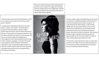
1. I chose thisparticularposterforAmy Winehouse,asIfeel
as if it representsherasa personmore thanany other
posterI explored.
I am particularlyintriguedbythe textatthe topof the
poster,“I toldya.I was trouble.”AsI feel the poster
wouldn’tbe the same withoutit,whichisahighly
significantpointtolookat.Thistextreflectsthe artistasa
person,asit comesacross to the audience thatshe isa bit
of a rebel,andthather personalityisquiteinsouciant.This
may or may notencourage certainage groupsto
listen/supporthermusic,particularlyparentswithyoung
children.However,nowadays,it’ssomeone whowould
inspire people to‘letthemselvesgo’andtherefore
implyinghermusiccanletpeople escape andbecome a
little more carefree, whichiswhatIfeel musicshoulddo;
letpeople escape andbecome trulyinvolvedwiththe
musictheyare listeningto.
The main image isa photoof AmyWinehouse inthe centre
of the poster,immediatelytellingthe audience thatthisis
whotheyare goingto be listeningto/seeinglive.The
image showsherhairhalf tiedback,an olderlooking
50s/60s vibe.Thisalsoimpliesthathermusicnotonly
representsthe traditional jazz,butshe bringsherown
moderntwistintohermusic,lettingawide varietyof
people interestedinthe workshe produces. She iswearing
blackonce again,makingherface stand outwiththe
signature eyeliner.Herarmsare on show,hertattooson
show,emphasisingherpersonalityevenmore.
The font that isusedto presenthername isinhuge letters
across the mainimage.Thisfontillustratesthe jazzgenre,
as it looksverymusically-orientated,whichiskeytojazz
music,as instrumentsare the keyfeature.
The layoutin whichthisposterispresenteddrawsthe
audience’seyesinstantly.The image isthe firstthingI
lookedat,recognisingthe artiststraightaway,andthen
my eyeswere drawntothe name of the artist,where it
linksthe whole postertogether.