SlideShare a Scribd company logo
1 of 9
This is an example of a student post and her response.
Consistency - The same typeface is maintained throughout the
infographic. When showing the numbers that Ford wants the
customer to pay attention to, they are all in the same size and
color to emphasize their importance.
Contrast - The chart on this infographic does a good job of
contrasting different companies through the use of different
colors representing their sales numbers. The pie chart however
uses very similar colors to show the difference in sales between
different models of the same truck. This may be a tool to show
that it is the same truck, but makes differentiation between the
two halves more difficult than it needs to be.
Balance - This infographic uses informal balance through the
mixture of visually dominant elements and weaker elements.
This makes the viewer feel more engaged and more likely to
read the entire infographic.
Emphasis - The company places an emphasis on the sales
numbers and comparisons to other companies rather than the
text. They do this by making the text smaller and black while
the numbers are larger, bold, and blue. By enlarging the
numbers and making them a different color, the viewers are
drawn to the numbers and see them as the most important
information.
Convention - This infographic follows normal conventions and
does nothing in order to draw attention to any special
meanings.
Simplicity - Overall, this infographic is very simple. It only
uses 4 colors, has limited pictures, and very simple charts. This
allows the viewer to see the information and take it in without a
risk of confusion.
This infographic was created in an ethical manner. This is
because it provides information that is backed up with charts
that are also provided. It's simple presentation eliminates any
chances of misinterpreting its message to be anything other than
a direct report of sales.
Infographic Link:
https://images.hgmsites.net/med/2011-ford-f-series-sales-
infographic_100375597_m.jpg (Links to an external site.)Links
to an external site.
Reference:
Bovee, C. L., & Thill, J. V. (2018). Business communication
today (14th ed.). New York, NY: Pearson.
ReplyReply to Comment
·
Collapse SubdiscussionSUSAN HONEA
SUSAN HONEA
10:25amFeb 23 at 10:25am
Manage Discussion Entry
M8A1 Formatting Help: Contrast
Hi, Adam.
You mentioned the issues associated with contrast. This is
something that many students find challenging; however,
PowerPoint actually helps us make these decisions. Did you
know that many of the design templates and color schemes in
PowerPoint are set up to provide adequate contrast? Don't be
tempted in Module 8 to do something custom...choose a design
template and color scheme that's already set up, and use it
unmodified, so you don't have to worry about that sort of thing.
~Susan
Reply
Visual Media
You are writing a report for the director of human resources on
implementing team-based management throughout your
company, which you are going to be presenting to the board.
You want to emphasize that since the new approaches were
implemented six months ago, absenteeism and turnover have
been sharply reduced in all but two departments and you have
gathered a lot of data from a variety of sources with which to
support your case.
Find an business related info graphic online (please make sure
you provide the link in your discussion) and do the following:
1) Analyze the info graphic using the Six Fundamental
Principles of Design (pages 232-233 in the textbook). Pages are
attached below.
2) Discuss whether the info graphic is created in an ethical
manner and why.
Visual Design Principles
Creating effective visuals requires basic knowledge of the
principles of good design.
Just as creating effective sentences and paragraphs requires
working knowledge of the principles of good writing, creating
effective visuals requires some knowledge of the principles of
good design. Even though few businesspeople have the
opportunity to formally study the “language” of line, mass,
space, size, color, pattern, and texture, anyone can learn enough
of the basic concepts to craft effective basic visuals.
When you encounter visuals that you find appealing or
unappealing, effective or ineffective, stop and ask yourself what
caused your response. Did a particular design grab you and
practically force you to pay attention, or did you pass right by
with hardly a notice? Did one chart reveal its information
quickly and easily, while another made you spend time decoding
its confusing message? Did one photo appeal to you at an
emotional level and therefore draw you into a document,
whereas another was off-putting and caused you to lose
interest? By thinking about your own reactions to visual
designs, you can become a more effective designer yourself.
As you consider your reactions to various designs and create
designs of your own, you’ll begin to see how six fundamental
principles help distinguish ineffective and effective designs:
· Consistency. Audiences view a series of visuals as a whole
and assume that design elements will be consistent from one
page to the next. Think of consistency as visual parallelism, in
the same way that textual parallelism helps audiences
understand and compare a series of ideas.7 You can achieve
visual parallelism in a variety of ways, including through
consistent use of color, shape, size, texture, position, scale, or
typeface.
· Contrast. To emphasize differences, depict items in
contrasting colors, shapes, or sizes. For example, to highlight
the difference between two quantities in a chart, don’t use two
shades of blue; instead, use blue for one and yellow or some
other dramatically contrasting color for the other.
· Balance. Balance can be either formal, in which the elements
in the images are arranged symmetrically around a central point
or axis, or informal, in which elements are not distributed
evenly, but rather stronger and weaker elements are arranged in
a way that achieves an overall effect of balance. A common
approach to informal balance is weighing one visually dominant
element against several smaller or weaker elements.8 In
general, formal balance is more calming and serious, whereas
informal balance tends to seem more dynamic and engaging.
· Emphasis. Audiences usually assume that the dominant
element in a design is the most important, so make sure that the
visually dominant element really does represent the most
important information. You can do so through color, position,
size, or placement, for example. Conversely, be sure to visually
downplay less important items. For instance, avoid using strong
colors for minor support points, and deemphasize background
features such as the grid lines on a chart.
· Convention. Visual communication is guided by a variety of
generally accepted rules or conventions, just as written
communication is guided by an array of spelling, grammar,
punctuation, and usage conventions. These conventions dictate
virtually every aspect of design.9 Moreover, many conventions
are so ingrained that people don’t even realize they are
following these rules. For example, if English is your native
language, you assume that ideas progress across the page from
left to right because that’s the direction in which English text is
written. If you are a native Arabic or Hebrew speaker, however,
you might automatically assume that flow on a page or screen is
from right to left because that is the direction in which those
languages are written. Flouting conventions often causes
breakdowns in communication, but in some cases, it can be done
to great effect.10 For instance, flipping an organizational chart
upside down to put the customers at the top, with frontline
employees directly beneath them and on down to the chief
executive at the bottom, can be an effective way to emphasize
that customers come first and that the managers are responsible
for supporting employees in their efforts to satisfy customers.
· Simplicity. As a general rule, simple is better when it comes
to visuals for business communication. Remember that you’re
conveying information, not expressing your creative flair. Limit
the number of colors and design elements you use, and take care
to avoid chartjunk, a term coined by the visual communication
specialist Edward R. Tufte for decorative elements that clutter
documents and potentially confuse readers without adding any
relevant information.11 Computers make it far too easy to add
chartjunk, from clip art illustrations to three-dimensional charts
that really display only two dimensions of data.
Nearly every aspect of visual design is governed by conventions
that set audience expectations.
The Ethics of Visual Communication
Remember that the power to communicate with visuals comes
with the responsibility to communicate ethically.
Power always comes with responsibility—and the potential
power of visuals places an ethical burden on every business
communicator. Ethical problems, both intentional and
unintentional, can range from photos that play on racial or
gender stereotypes, to images that imply cause-and-effect
relationships that may not exist, to graphs that distort data (see
Figure 9.2 on the next page).
Figure 9.2 Influencing Perception Through Visual Design
Figure 9.2a shows impurities measured over the course of a 12-
month period; the vertical scale is set from 0 to 120, sufficient
to cover the range of variations in the data. However, what if
you wanted to make the variations from month to month look
more severe? Less severe? Figure 9.2b, with the scale “zoomed
in” to a narrow range of 60 to 110, makes the variations look
much more dramatic. The result could be a stronger emotional
impact on the reader, creating the impression that these
impurities are out of control. In contrast, Figure 9.2c expands
the scale from 0 to 200, which minimizes the appearance of the
variations in the data. This graph is visually “calmer,” creating
the opposite impression—that there’s really nothing to worry
about. The data shown in all three graphs are identical, but the
graphs send three different messages to the reader. Are any of
the graphs unethical? That depends on the communicator’s
intent and whether it inhibits the audience’s ability to make
informed decisions.
Altering the scale of items in a visual is just one of many ways
to emphasize or deemphasize certain aspects of information. For
example, to increase the perceived size of a product, an
advertiser might show a close-up of it being held by someone
with smaller-than-average hands. Conversely, a large hand
would make the product seem smaller.
You can work to avoid ethical lapses in your visuals by
following these guidelines:12
You can take many steps to emphasize or deemphasize specific
elements in your visuals, but make sure you don’t inadvertently
commit an ethical lapse while doing so.
Visuals can’t always speak for themselves; make sure your
audience has enough context to interpret your visuals correctly.
· Consider all possible interpretations—and misinterpretations.
Try to view your visuals from your audience members’
perspective. Will their biases, beliefs, or backgrounds lead them
to different conclusions than you’ve intended? For instance,
assume that you want to show how easy your product is to use,
and the photograph you’ve chosen just happens to show an older
person operating the product. Will anyone conclude that what
you really mean to say is that your product is so simple that
“even an old person can use it”?
· Provide context. Even when they are completely accurate,
visuals can show only a partial view of reality. Part of your
responsibility as a communicator is to provide not only accurate
visuals but enough background information to help audiences
interpret the visual correctly.
· Don’t hide or minimize negative information that runs counter
to your argument. Obscuring information prevents your
audiences from making fully informed decisions regarding your
content.
· Don’t exaggerate information that supports your argument.
Similarly, you have a responsibility not to oversell information
in support of your argument. You should also resist the
temptation to alter or enhance photographs and other images in
order to support your arguments.
· Don’t oversimplify complex situations. By their very nature,
visuals tend to present simplified views of reality. This is
usually a benefit and one of the key reasons for using visuals.
However, take care not to mislead an audience by hiding
complications that are important to the audience’s
understanding of the situation.
· Don’t imply cause-and-effect relationships without providing
proof that they exist. For example, if you create a line chart that
shows how increasing sales seem to track with increasing
advertising expenditures, you can claim a correlation but not
necessarily a cause-and-effect relationship between the two.
You can claim a causal relationship (meaning that the increase
in advertising spending caused the increase in sales) only if you
can isolate advertising spending as the only factor that can
account for the increase in sales.
· Avoid emotional manipulation or other forms of coercion. For
instance, a photograph of an unhappy child being treated as a
social outcast because he or she doesn’t own the trendiest new
toys could be considered an unethical way to persuade parents
to buy those products for their children.
· Be careful with the way you aggregate data. Preparing charts,
graphs, and tables that present data often involves decisions
about aggregating, or grouping, data. Such decisions can have a
profound effect on the message your audience receives
(see “Ethics Detective: Solving the Case of the Hidden
Numbers”). For example, if you aggregate daily production
levels to show only a single data point for each week, you might
be obscuring important variations that happen from day to day.
The ways in which you aggregate data for display can affect the
messages and meanings that your audience extracts from your
visuals.

More Related Content

Similar to This is an example of a student post and her response.Consistenc.docx

Design 101 > Lesson 01
Design 101 > Lesson 01Design 101 > Lesson 01
Design 101 > Lesson 01Sean Buch
 
Lesikar−Flatley−Rentz Business Communication Making Conn.docx
Lesikar−Flatley−Rentz Business Communication Making Conn.docxLesikar−Flatley−Rentz Business Communication Making Conn.docx
Lesikar−Flatley−Rentz Business Communication Making Conn.docxSHIVA101531
 
Typography and Colors for GUI Designers
Typography and Colors for GUI DesignersTypography and Colors for GUI Designers
Typography and Colors for GUI DesignersRavi Bhadauria
 
Creating Functional Art in Excel
Creating Functional Art in ExcelCreating Functional Art in Excel
Creating Functional Art in ExcelAmanda Makulec
 
Lesson 5 Manipulating Text, Graphics, and Images
Lesson 5 Manipulating Text, Graphics, and ImagesLesson 5 Manipulating Text, Graphics, and Images
Lesson 5 Manipulating Text, Graphics, and ImagesJuvywen
 
Impact of Visual Design on UX
Impact of Visual Design on UXImpact of Visual Design on UX
Impact of Visual Design on UXMayank Ranjan
 
The Psychology of Good Web Design
The Psychology of Good Web DesignThe Psychology of Good Web Design
The Psychology of Good Web Designolindgallet
 
Lesson 1 Proximity And Alignment
Lesson 1 Proximity And AlignmentLesson 1 Proximity And Alignment
Lesson 1 Proximity And AlignmentJeff Taylor
 
COMPUTER 7 - Lesson 5-QUARTER 5 DESKTOP PUBLISHING
COMPUTER 7 - Lesson 5-QUARTER 5 DESKTOP PUBLISHINGCOMPUTER 7 - Lesson 5-QUARTER 5 DESKTOP PUBLISHING
COMPUTER 7 - Lesson 5-QUARTER 5 DESKTOP PUBLISHINGMayAnnRodriguez2
 
Nediger_Infographics_2019.pdf
Nediger_Infographics_2019.pdfNediger_Infographics_2019.pdf
Nediger_Infographics_2019.pdfPitchcliff
 
Graphic Design (Theory & Practice)
Graphic Design (Theory & Practice) Graphic Design (Theory & Practice)
Graphic Design (Theory & Practice) wael gomaa
 
Business guide to_visual_communication_by_visage
Business guide to_visual_communication_by_visageBusiness guide to_visual_communication_by_visage
Business guide to_visual_communication_by_visageAtner Yegorov
 
A Business Guide to Visual Communication
A Business Guide to Visual CommunicationA Business Guide to Visual Communication
A Business Guide to Visual CommunicationColumn Five
 
101 Landing Page Optimization Tips
101 Landing Page Optimization Tips101 Landing Page Optimization Tips
101 Landing Page Optimization TipsUnbounce
 
David Christensen Capability and Experience in Presentation Development
David Christensen Capability and Experience in Presentation DevelopmentDavid Christensen Capability and Experience in Presentation Development
David Christensen Capability and Experience in Presentation DevelopmentDavid Christensen
 

Similar to This is an example of a student post and her response.Consistenc.docx (20)

Design 101 > Lesson 01
Design 101 > Lesson 01Design 101 > Lesson 01
Design 101 > Lesson 01
 
Project 2
Project 2Project 2
Project 2
 
Lesikar−Flatley−Rentz Business Communication Making Conn.docx
Lesikar−Flatley−Rentz Business Communication Making Conn.docxLesikar−Flatley−Rentz Business Communication Making Conn.docx
Lesikar−Flatley−Rentz Business Communication Making Conn.docx
 
Typography and Colors for GUI Designers
Typography and Colors for GUI DesignersTypography and Colors for GUI Designers
Typography and Colors for GUI Designers
 
Creating Functional Art in Excel
Creating Functional Art in ExcelCreating Functional Art in Excel
Creating Functional Art in Excel
 
Lesson 5 Manipulating Text, Graphics, and Images
Lesson 5 Manipulating Text, Graphics, and ImagesLesson 5 Manipulating Text, Graphics, and Images
Lesson 5 Manipulating Text, Graphics, and Images
 
Impact of Visual Design on UX
Impact of Visual Design on UXImpact of Visual Design on UX
Impact of Visual Design on UX
 
The Psychology of Good Web Design
The Psychology of Good Web DesignThe Psychology of Good Web Design
The Psychology of Good Web Design
 
Lesson 1 Proximity And Alignment
Lesson 1 Proximity And AlignmentLesson 1 Proximity And Alignment
Lesson 1 Proximity And Alignment
 
Design for Delight
Design for DelightDesign for Delight
Design for Delight
 
COMPUTER 7 - Lesson 5-QUARTER 5 DESKTOP PUBLISHING
COMPUTER 7 - Lesson 5-QUARTER 5 DESKTOP PUBLISHINGCOMPUTER 7 - Lesson 5-QUARTER 5 DESKTOP PUBLISHING
COMPUTER 7 - Lesson 5-QUARTER 5 DESKTOP PUBLISHING
 
Nediger_Infographics_2019.pdf
Nediger_Infographics_2019.pdfNediger_Infographics_2019.pdf
Nediger_Infographics_2019.pdf
 
Graphic Design (Theory & Practice)
Graphic Design (Theory & Practice) Graphic Design (Theory & Practice)
Graphic Design (Theory & Practice)
 
Slideology sample30
Slideology sample30Slideology sample30
Slideology sample30
 
Lecture11 A Image
Lecture11 A ImageLecture11 A Image
Lecture11 A Image
 
Business guide to_visual_communication_by_visage
Business guide to_visual_communication_by_visageBusiness guide to_visual_communication_by_visage
Business guide to_visual_communication_by_visage
 
A Business Guide to Visual Communication
A Business Guide to Visual CommunicationA Business Guide to Visual Communication
A Business Guide to Visual Communication
 
101 Landing Page Optimization Tips
101 Landing Page Optimization Tips101 Landing Page Optimization Tips
101 Landing Page Optimization Tips
 
Web Accessibility
Web AccessibilityWeb Accessibility
Web Accessibility
 
David Christensen Capability and Experience in Presentation Development
David Christensen Capability and Experience in Presentation DevelopmentDavid Christensen Capability and Experience in Presentation Development
David Christensen Capability and Experience in Presentation Development
 

More from christalgrieg

Please read the case  Fraud at WorldCom in the book provided below  .docx
Please read the case  Fraud at WorldCom in the book provided below  .docxPlease read the case  Fraud at WorldCom in the book provided below  .docx
Please read the case  Fraud at WorldCom in the book provided below  .docxchristalgrieg
 
Please read the below two discussion posts and provide the response .docx
Please read the below two discussion posts and provide the response .docxPlease read the below two discussion posts and provide the response .docx
Please read the below two discussion posts and provide the response .docxchristalgrieg
 
Please read the below discussion post and provide response in 75 to .docx
Please read the below discussion post and provide response in 75 to .docxPlease read the below discussion post and provide response in 75 to .docx
Please read the below discussion post and provide response in 75 to .docxchristalgrieg
 
Please read the assignment content throughly Internet Resources .docx
Please read the assignment content throughly Internet Resources .docxPlease read the assignment content throughly Internet Resources .docx
Please read the assignment content throughly Internet Resources .docxchristalgrieg
 
Please read the article by Peterson (2004). Your responses to th.docx
Please read the article by Peterson (2004). Your responses to th.docxPlease read the article by Peterson (2004). Your responses to th.docx
Please read the article by Peterson (2004). Your responses to th.docxchristalgrieg
 
Please read the article which appears below. Write and submit an.docx
Please read the article which appears below. Write and submit an.docxPlease read the article which appears below. Write and submit an.docx
Please read the article which appears below. Write and submit an.docxchristalgrieg
 
Please Read instructions Role Model LeadersChoose one • 1 .docx
Please Read instructions Role Model LeadersChoose one • 1 .docxPlease Read instructions Role Model LeadersChoose one • 1 .docx
Please Read instructions Role Model LeadersChoose one • 1 .docxchristalgrieg
 
Please read each attachment for instructions, please answer each q.docx
Please read each attachment for instructions, please answer each q.docxPlease read each attachment for instructions, please answer each q.docx
Please read each attachment for instructions, please answer each q.docxchristalgrieg
 
PLEASE READ BEFORE STARTING! 500 WORD PAPER ONLY USING THE NOTES I.docx
PLEASE READ BEFORE STARTING! 500 WORD PAPER ONLY USING THE NOTES I.docxPLEASE READ BEFORE STARTING! 500 WORD PAPER ONLY USING THE NOTES I.docx
PLEASE READ BEFORE STARTING! 500 WORD PAPER ONLY USING THE NOTES I.docxchristalgrieg
 
Please read Patricia Benners Five Stages of Proficiency. Explai.docx
Please read Patricia Benners Five Stages of Proficiency. Explai.docxPlease read Patricia Benners Five Stages of Proficiency. Explai.docx
Please read Patricia Benners Five Stages of Proficiency. Explai.docxchristalgrieg
 
Please Read Instructions OBJECTIV.docx
Please Read Instructions OBJECTIV.docxPlease Read Instructions OBJECTIV.docx
Please Read Instructions OBJECTIV.docxchristalgrieg
 
Please react to this student post. remember references and plarigari.docx
Please react to this student post. remember references and plarigari.docxPlease react to this student post. remember references and plarigari.docx
Please react to this student post. remember references and plarigari.docxchristalgrieg
 
Please provide the following information about your culture which is.docx
Please provide the following information about your culture which is.docxPlease provide the following information about your culture which is.docx
Please provide the following information about your culture which is.docxchristalgrieg
 
Please proof the paper attached and complete question 6 and 7..docx
Please proof the paper attached and complete question 6 and 7..docxPlease proof the paper attached and complete question 6 and 7..docx
Please proof the paper attached and complete question 6 and 7..docxchristalgrieg
 
Please prepare PPT( 5 Slides and 1 citation slide) and also explain .docx
Please prepare PPT( 5 Slides and 1 citation slide) and also explain .docxPlease prepare PPT( 5 Slides and 1 citation slide) and also explain .docx
Please prepare PPT( 5 Slides and 1 citation slide) and also explain .docxchristalgrieg
 
Please prepare a one-pageProject Idea that includes the .docx
Please prepare a one-pageProject Idea that includes the .docxPlease prepare a one-pageProject Idea that includes the .docx
Please prepare a one-pageProject Idea that includes the .docxchristalgrieg
 
Please prepare at least in 275 to 300 words with APA references and .docx
Please prepare at least in 275 to 300 words with APA references and .docxPlease prepare at least in 275 to 300 words with APA references and .docx
Please prepare at least in 275 to 300 words with APA references and .docxchristalgrieg
 
Please provide references for your original postings in APA form.docx
Please provide references for your original postings in APA form.docxPlease provide references for your original postings in APA form.docx
Please provide references for your original postings in APA form.docxchristalgrieg
 
Please provide an update to include information about methodology, n.docx
Please provide an update to include information about methodology, n.docxPlease provide an update to include information about methodology, n.docx
Please provide an update to include information about methodology, n.docxchristalgrieg
 
Please provide an evaluation of the Path to Competitive Advantage an.docx
Please provide an evaluation of the Path to Competitive Advantage an.docxPlease provide an evaluation of the Path to Competitive Advantage an.docx
Please provide an evaluation of the Path to Competitive Advantage an.docxchristalgrieg
 

More from christalgrieg (20)

Please read the case  Fraud at WorldCom in the book provided below  .docx
Please read the case  Fraud at WorldCom in the book provided below  .docxPlease read the case  Fraud at WorldCom in the book provided below  .docx
Please read the case  Fraud at WorldCom in the book provided below  .docx
 
Please read the below two discussion posts and provide the response .docx
Please read the below two discussion posts and provide the response .docxPlease read the below two discussion posts and provide the response .docx
Please read the below two discussion posts and provide the response .docx
 
Please read the below discussion post and provide response in 75 to .docx
Please read the below discussion post and provide response in 75 to .docxPlease read the below discussion post and provide response in 75 to .docx
Please read the below discussion post and provide response in 75 to .docx
 
Please read the assignment content throughly Internet Resources .docx
Please read the assignment content throughly Internet Resources .docxPlease read the assignment content throughly Internet Resources .docx
Please read the assignment content throughly Internet Resources .docx
 
Please read the article by Peterson (2004). Your responses to th.docx
Please read the article by Peterson (2004). Your responses to th.docxPlease read the article by Peterson (2004). Your responses to th.docx
Please read the article by Peterson (2004). Your responses to th.docx
 
Please read the article which appears below. Write and submit an.docx
Please read the article which appears below. Write and submit an.docxPlease read the article which appears below. Write and submit an.docx
Please read the article which appears below. Write and submit an.docx
 
Please Read instructions Role Model LeadersChoose one • 1 .docx
Please Read instructions Role Model LeadersChoose one • 1 .docxPlease Read instructions Role Model LeadersChoose one • 1 .docx
Please Read instructions Role Model LeadersChoose one • 1 .docx
 
Please read each attachment for instructions, please answer each q.docx
Please read each attachment for instructions, please answer each q.docxPlease read each attachment for instructions, please answer each q.docx
Please read each attachment for instructions, please answer each q.docx
 
PLEASE READ BEFORE STARTING! 500 WORD PAPER ONLY USING THE NOTES I.docx
PLEASE READ BEFORE STARTING! 500 WORD PAPER ONLY USING THE NOTES I.docxPLEASE READ BEFORE STARTING! 500 WORD PAPER ONLY USING THE NOTES I.docx
PLEASE READ BEFORE STARTING! 500 WORD PAPER ONLY USING THE NOTES I.docx
 
Please read Patricia Benners Five Stages of Proficiency. Explai.docx
Please read Patricia Benners Five Stages of Proficiency. Explai.docxPlease read Patricia Benners Five Stages of Proficiency. Explai.docx
Please read Patricia Benners Five Stages of Proficiency. Explai.docx
 
Please Read Instructions OBJECTIV.docx
Please Read Instructions OBJECTIV.docxPlease Read Instructions OBJECTIV.docx
Please Read Instructions OBJECTIV.docx
 
Please react to this student post. remember references and plarigari.docx
Please react to this student post. remember references and plarigari.docxPlease react to this student post. remember references and plarigari.docx
Please react to this student post. remember references and plarigari.docx
 
Please provide the following information about your culture which is.docx
Please provide the following information about your culture which is.docxPlease provide the following information about your culture which is.docx
Please provide the following information about your culture which is.docx
 
Please proof the paper attached and complete question 6 and 7..docx
Please proof the paper attached and complete question 6 and 7..docxPlease proof the paper attached and complete question 6 and 7..docx
Please proof the paper attached and complete question 6 and 7..docx
 
Please prepare PPT( 5 Slides and 1 citation slide) and also explain .docx
Please prepare PPT( 5 Slides and 1 citation slide) and also explain .docxPlease prepare PPT( 5 Slides and 1 citation slide) and also explain .docx
Please prepare PPT( 5 Slides and 1 citation slide) and also explain .docx
 
Please prepare a one-pageProject Idea that includes the .docx
Please prepare a one-pageProject Idea that includes the .docxPlease prepare a one-pageProject Idea that includes the .docx
Please prepare a one-pageProject Idea that includes the .docx
 
Please prepare at least in 275 to 300 words with APA references and .docx
Please prepare at least in 275 to 300 words with APA references and .docxPlease prepare at least in 275 to 300 words with APA references and .docx
Please prepare at least in 275 to 300 words with APA references and .docx
 
Please provide references for your original postings in APA form.docx
Please provide references for your original postings in APA form.docxPlease provide references for your original postings in APA form.docx
Please provide references for your original postings in APA form.docx
 
Please provide an update to include information about methodology, n.docx
Please provide an update to include information about methodology, n.docxPlease provide an update to include information about methodology, n.docx
Please provide an update to include information about methodology, n.docx
 
Please provide an evaluation of the Path to Competitive Advantage an.docx
Please provide an evaluation of the Path to Competitive Advantage an.docxPlease provide an evaluation of the Path to Competitive Advantage an.docx
Please provide an evaluation of the Path to Competitive Advantage an.docx
 

Recently uploaded

CELL CYCLE Division Science 8 quarter IV.pptx
CELL CYCLE Division Science 8 quarter IV.pptxCELL CYCLE Division Science 8 quarter IV.pptx
CELL CYCLE Division Science 8 quarter IV.pptxJiesonDelaCerna
 
MARGINALIZATION (Different learners in Marginalized Group
MARGINALIZATION (Different learners in Marginalized GroupMARGINALIZATION (Different learners in Marginalized Group
MARGINALIZATION (Different learners in Marginalized GroupJonathanParaisoCruz
 
Incoming and Outgoing Shipments in 1 STEP Using Odoo 17
Incoming and Outgoing Shipments in 1 STEP Using Odoo 17Incoming and Outgoing Shipments in 1 STEP Using Odoo 17
Incoming and Outgoing Shipments in 1 STEP Using Odoo 17Celine George
 
How to Make a Pirate ship Primary Education.pptx
How to Make a Pirate ship Primary Education.pptxHow to Make a Pirate ship Primary Education.pptx
How to Make a Pirate ship Primary Education.pptxmanuelaromero2013
 
DATA STRUCTURE AND ALGORITHM for beginners
DATA STRUCTURE AND ALGORITHM for beginnersDATA STRUCTURE AND ALGORITHM for beginners
DATA STRUCTURE AND ALGORITHM for beginnersSabitha Banu
 
ECONOMIC CONTEXT - PAPER 1 Q3: NEWSPAPERS.pptx
ECONOMIC CONTEXT - PAPER 1 Q3: NEWSPAPERS.pptxECONOMIC CONTEXT - PAPER 1 Q3: NEWSPAPERS.pptx
ECONOMIC CONTEXT - PAPER 1 Q3: NEWSPAPERS.pptxiammrhaywood
 
Alper Gobel In Media Res Media Component
Alper Gobel In Media Res Media ComponentAlper Gobel In Media Res Media Component
Alper Gobel In Media Res Media ComponentInMediaRes1
 
Computed Fields and api Depends in the Odoo 17
Computed Fields and api Depends in the Odoo 17Computed Fields and api Depends in the Odoo 17
Computed Fields and api Depends in the Odoo 17Celine George
 
Employee wellbeing at the workplace.pptx
Employee wellbeing at the workplace.pptxEmployee wellbeing at the workplace.pptx
Employee wellbeing at the workplace.pptxNirmalaLoungPoorunde1
 
Meghan Sutherland In Media Res Media Component
Meghan Sutherland In Media Res Media ComponentMeghan Sutherland In Media Res Media Component
Meghan Sutherland In Media Res Media ComponentInMediaRes1
 
Introduction to AI in Higher Education_draft.pptx
Introduction to AI in Higher Education_draft.pptxIntroduction to AI in Higher Education_draft.pptx
Introduction to AI in Higher Education_draft.pptxpboyjonauth
 
18-04-UA_REPORT_MEDIALITERAСY_INDEX-DM_23-1-final-eng.pdf
18-04-UA_REPORT_MEDIALITERAСY_INDEX-DM_23-1-final-eng.pdf18-04-UA_REPORT_MEDIALITERAСY_INDEX-DM_23-1-final-eng.pdf
18-04-UA_REPORT_MEDIALITERAСY_INDEX-DM_23-1-final-eng.pdfssuser54595a
 
Crayon Activity Handout For the Crayon A
Crayon Activity Handout For the Crayon ACrayon Activity Handout For the Crayon A
Crayon Activity Handout For the Crayon AUnboundStockton
 
Earth Day Presentation wow hello nice great
Earth Day Presentation wow hello nice greatEarth Day Presentation wow hello nice great
Earth Day Presentation wow hello nice greatYousafMalik24
 
Types of Journalistic Writing Grade 8.pptx
Types of Journalistic Writing Grade 8.pptxTypes of Journalistic Writing Grade 8.pptx
Types of Journalistic Writing Grade 8.pptxEyham Joco
 
How to Configure Email Server in Odoo 17
How to Configure Email Server in Odoo 17How to Configure Email Server in Odoo 17
How to Configure Email Server in Odoo 17Celine George
 
Introduction to ArtificiaI Intelligence in Higher Education
Introduction to ArtificiaI Intelligence in Higher EducationIntroduction to ArtificiaI Intelligence in Higher Education
Introduction to ArtificiaI Intelligence in Higher Educationpboyjonauth
 
Roles & Responsibilities in Pharmacovigilance
Roles & Responsibilities in PharmacovigilanceRoles & Responsibilities in Pharmacovigilance
Roles & Responsibilities in PharmacovigilanceSamikshaHamane
 
Solving Puzzles Benefits Everyone (English).pptx
Solving Puzzles Benefits Everyone (English).pptxSolving Puzzles Benefits Everyone (English).pptx
Solving Puzzles Benefits Everyone (English).pptxOH TEIK BIN
 
Biting mechanism of poisonous snakes.pdf
Biting mechanism of poisonous snakes.pdfBiting mechanism of poisonous snakes.pdf
Biting mechanism of poisonous snakes.pdfadityarao40181
 

Recently uploaded (20)

CELL CYCLE Division Science 8 quarter IV.pptx
CELL CYCLE Division Science 8 quarter IV.pptxCELL CYCLE Division Science 8 quarter IV.pptx
CELL CYCLE Division Science 8 quarter IV.pptx
 
MARGINALIZATION (Different learners in Marginalized Group
MARGINALIZATION (Different learners in Marginalized GroupMARGINALIZATION (Different learners in Marginalized Group
MARGINALIZATION (Different learners in Marginalized Group
 
Incoming and Outgoing Shipments in 1 STEP Using Odoo 17
Incoming and Outgoing Shipments in 1 STEP Using Odoo 17Incoming and Outgoing Shipments in 1 STEP Using Odoo 17
Incoming and Outgoing Shipments in 1 STEP Using Odoo 17
 
How to Make a Pirate ship Primary Education.pptx
How to Make a Pirate ship Primary Education.pptxHow to Make a Pirate ship Primary Education.pptx
How to Make a Pirate ship Primary Education.pptx
 
DATA STRUCTURE AND ALGORITHM for beginners
DATA STRUCTURE AND ALGORITHM for beginnersDATA STRUCTURE AND ALGORITHM for beginners
DATA STRUCTURE AND ALGORITHM for beginners
 
ECONOMIC CONTEXT - PAPER 1 Q3: NEWSPAPERS.pptx
ECONOMIC CONTEXT - PAPER 1 Q3: NEWSPAPERS.pptxECONOMIC CONTEXT - PAPER 1 Q3: NEWSPAPERS.pptx
ECONOMIC CONTEXT - PAPER 1 Q3: NEWSPAPERS.pptx
 
Alper Gobel In Media Res Media Component
Alper Gobel In Media Res Media ComponentAlper Gobel In Media Res Media Component
Alper Gobel In Media Res Media Component
 
Computed Fields and api Depends in the Odoo 17
Computed Fields and api Depends in the Odoo 17Computed Fields and api Depends in the Odoo 17
Computed Fields and api Depends in the Odoo 17
 
Employee wellbeing at the workplace.pptx
Employee wellbeing at the workplace.pptxEmployee wellbeing at the workplace.pptx
Employee wellbeing at the workplace.pptx
 
Meghan Sutherland In Media Res Media Component
Meghan Sutherland In Media Res Media ComponentMeghan Sutherland In Media Res Media Component
Meghan Sutherland In Media Res Media Component
 
Introduction to AI in Higher Education_draft.pptx
Introduction to AI in Higher Education_draft.pptxIntroduction to AI in Higher Education_draft.pptx
Introduction to AI in Higher Education_draft.pptx
 
18-04-UA_REPORT_MEDIALITERAСY_INDEX-DM_23-1-final-eng.pdf
18-04-UA_REPORT_MEDIALITERAСY_INDEX-DM_23-1-final-eng.pdf18-04-UA_REPORT_MEDIALITERAСY_INDEX-DM_23-1-final-eng.pdf
18-04-UA_REPORT_MEDIALITERAСY_INDEX-DM_23-1-final-eng.pdf
 
Crayon Activity Handout For the Crayon A
Crayon Activity Handout For the Crayon ACrayon Activity Handout For the Crayon A
Crayon Activity Handout For the Crayon A
 
Earth Day Presentation wow hello nice great
Earth Day Presentation wow hello nice greatEarth Day Presentation wow hello nice great
Earth Day Presentation wow hello nice great
 
Types of Journalistic Writing Grade 8.pptx
Types of Journalistic Writing Grade 8.pptxTypes of Journalistic Writing Grade 8.pptx
Types of Journalistic Writing Grade 8.pptx
 
How to Configure Email Server in Odoo 17
How to Configure Email Server in Odoo 17How to Configure Email Server in Odoo 17
How to Configure Email Server in Odoo 17
 
Introduction to ArtificiaI Intelligence in Higher Education
Introduction to ArtificiaI Intelligence in Higher EducationIntroduction to ArtificiaI Intelligence in Higher Education
Introduction to ArtificiaI Intelligence in Higher Education
 
Roles & Responsibilities in Pharmacovigilance
Roles & Responsibilities in PharmacovigilanceRoles & Responsibilities in Pharmacovigilance
Roles & Responsibilities in Pharmacovigilance
 
Solving Puzzles Benefits Everyone (English).pptx
Solving Puzzles Benefits Everyone (English).pptxSolving Puzzles Benefits Everyone (English).pptx
Solving Puzzles Benefits Everyone (English).pptx
 
Biting mechanism of poisonous snakes.pdf
Biting mechanism of poisonous snakes.pdfBiting mechanism of poisonous snakes.pdf
Biting mechanism of poisonous snakes.pdf
 

This is an example of a student post and her response.Consistenc.docx

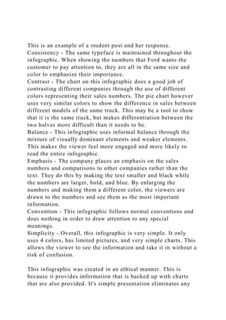
  • 1. This is an example of a student post and her response. Consistency - The same typeface is maintained throughout the infographic. When showing the numbers that Ford wants the customer to pay attention to, they are all in the same size and color to emphasize their importance. Contrast - The chart on this infographic does a good job of contrasting different companies through the use of different colors representing their sales numbers. The pie chart however uses very similar colors to show the difference in sales between different models of the same truck. This may be a tool to show that it is the same truck, but makes differentiation between the two halves more difficult than it needs to be. Balance - This infographic uses informal balance through the mixture of visually dominant elements and weaker elements. This makes the viewer feel more engaged and more likely to read the entire infographic. Emphasis - The company places an emphasis on the sales numbers and comparisons to other companies rather than the text. They do this by making the text smaller and black while the numbers are larger, bold, and blue. By enlarging the numbers and making them a different color, the viewers are drawn to the numbers and see them as the most important information. Convention - This infographic follows normal conventions and does nothing in order to draw attention to any special meanings. Simplicity - Overall, this infographic is very simple. It only uses 4 colors, has limited pictures, and very simple charts. This allows the viewer to see the information and take it in without a risk of confusion. This infographic was created in an ethical manner. This is because it provides information that is backed up with charts that are also provided. It's simple presentation eliminates any
  • 2. chances of misinterpreting its message to be anything other than a direct report of sales. Infographic Link: https://images.hgmsites.net/med/2011-ford-f-series-sales- infographic_100375597_m.jpg (Links to an external site.)Links to an external site. Reference: Bovee, C. L., & Thill, J. V. (2018). Business communication today (14th ed.). New York, NY: Pearson. ReplyReply to Comment · Collapse SubdiscussionSUSAN HONEA SUSAN HONEA 10:25amFeb 23 at 10:25am Manage Discussion Entry M8A1 Formatting Help: Contrast Hi, Adam. You mentioned the issues associated with contrast. This is something that many students find challenging; however, PowerPoint actually helps us make these decisions. Did you know that many of the design templates and color schemes in PowerPoint are set up to provide adequate contrast? Don't be tempted in Module 8 to do something custom...choose a design template and color scheme that's already set up, and use it unmodified, so you don't have to worry about that sort of thing. ~Susan Reply Visual Media You are writing a report for the director of human resources on implementing team-based management throughout your company, which you are going to be presenting to the board.
  • 3. You want to emphasize that since the new approaches were implemented six months ago, absenteeism and turnover have been sharply reduced in all but two departments and you have gathered a lot of data from a variety of sources with which to support your case. Find an business related info graphic online (please make sure you provide the link in your discussion) and do the following: 1) Analyze the info graphic using the Six Fundamental Principles of Design (pages 232-233 in the textbook). Pages are attached below. 2) Discuss whether the info graphic is created in an ethical manner and why.
  • 4. Visual Design Principles Creating effective visuals requires basic knowledge of the principles of good design. Just as creating effective sentences and paragraphs requires working knowledge of the principles of good writing, creating effective visuals requires some knowledge of the principles of good design. Even though few businesspeople have the opportunity to formally study the “language” of line, mass, space, size, color, pattern, and texture, anyone can learn enough of the basic concepts to craft effective basic visuals. When you encounter visuals that you find appealing or unappealing, effective or ineffective, stop and ask yourself what caused your response. Did a particular design grab you and practically force you to pay attention, or did you pass right by with hardly a notice? Did one chart reveal its information quickly and easily, while another made you spend time decoding its confusing message? Did one photo appeal to you at an emotional level and therefore draw you into a document, whereas another was off-putting and caused you to lose interest? By thinking about your own reactions to visual designs, you can become a more effective designer yourself. As you consider your reactions to various designs and create designs of your own, you’ll begin to see how six fundamental principles help distinguish ineffective and effective designs: · Consistency. Audiences view a series of visuals as a whole and assume that design elements will be consistent from one page to the next. Think of consistency as visual parallelism, in the same way that textual parallelism helps audiences understand and compare a series of ideas.7 You can achieve visual parallelism in a variety of ways, including through consistent use of color, shape, size, texture, position, scale, or typeface. · Contrast. To emphasize differences, depict items in contrasting colors, shapes, or sizes. For example, to highlight the difference between two quantities in a chart, don’t use two shades of blue; instead, use blue for one and yellow or some
  • 5. other dramatically contrasting color for the other. · Balance. Balance can be either formal, in which the elements in the images are arranged symmetrically around a central point or axis, or informal, in which elements are not distributed evenly, but rather stronger and weaker elements are arranged in a way that achieves an overall effect of balance. A common approach to informal balance is weighing one visually dominant element against several smaller or weaker elements.8 In general, formal balance is more calming and serious, whereas informal balance tends to seem more dynamic and engaging. · Emphasis. Audiences usually assume that the dominant element in a design is the most important, so make sure that the visually dominant element really does represent the most important information. You can do so through color, position, size, or placement, for example. Conversely, be sure to visually downplay less important items. For instance, avoid using strong colors for minor support points, and deemphasize background features such as the grid lines on a chart. · Convention. Visual communication is guided by a variety of generally accepted rules or conventions, just as written communication is guided by an array of spelling, grammar, punctuation, and usage conventions. These conventions dictate virtually every aspect of design.9 Moreover, many conventions are so ingrained that people don’t even realize they are following these rules. For example, if English is your native language, you assume that ideas progress across the page from left to right because that’s the direction in which English text is written. If you are a native Arabic or Hebrew speaker, however, you might automatically assume that flow on a page or screen is from right to left because that is the direction in which those languages are written. Flouting conventions often causes breakdowns in communication, but in some cases, it can be done to great effect.10 For instance, flipping an organizational chart upside down to put the customers at the top, with frontline employees directly beneath them and on down to the chief executive at the bottom, can be an effective way to emphasize
  • 6. that customers come first and that the managers are responsible for supporting employees in their efforts to satisfy customers. · Simplicity. As a general rule, simple is better when it comes to visuals for business communication. Remember that you’re conveying information, not expressing your creative flair. Limit the number of colors and design elements you use, and take care to avoid chartjunk, a term coined by the visual communication specialist Edward R. Tufte for decorative elements that clutter documents and potentially confuse readers without adding any relevant information.11 Computers make it far too easy to add chartjunk, from clip art illustrations to three-dimensional charts that really display only two dimensions of data. Nearly every aspect of visual design is governed by conventions that set audience expectations. The Ethics of Visual Communication Remember that the power to communicate with visuals comes with the responsibility to communicate ethically. Power always comes with responsibility—and the potential power of visuals places an ethical burden on every business communicator. Ethical problems, both intentional and unintentional, can range from photos that play on racial or gender stereotypes, to images that imply cause-and-effect relationships that may not exist, to graphs that distort data (see Figure 9.2 on the next page). Figure 9.2 Influencing Perception Through Visual Design Figure 9.2a shows impurities measured over the course of a 12- month period; the vertical scale is set from 0 to 120, sufficient to cover the range of variations in the data. However, what if you wanted to make the variations from month to month look more severe? Less severe? Figure 9.2b, with the scale “zoomed in” to a narrow range of 60 to 110, makes the variations look much more dramatic. The result could be a stronger emotional impact on the reader, creating the impression that these impurities are out of control. In contrast, Figure 9.2c expands the scale from 0 to 200, which minimizes the appearance of the
  • 7. variations in the data. This graph is visually “calmer,” creating the opposite impression—that there’s really nothing to worry about. The data shown in all three graphs are identical, but the graphs send three different messages to the reader. Are any of the graphs unethical? That depends on the communicator’s intent and whether it inhibits the audience’s ability to make informed decisions. Altering the scale of items in a visual is just one of many ways to emphasize or deemphasize certain aspects of information. For example, to increase the perceived size of a product, an advertiser might show a close-up of it being held by someone with smaller-than-average hands. Conversely, a large hand would make the product seem smaller. You can work to avoid ethical lapses in your visuals by following these guidelines:12 You can take many steps to emphasize or deemphasize specific elements in your visuals, but make sure you don’t inadvertently commit an ethical lapse while doing so. Visuals can’t always speak for themselves; make sure your audience has enough context to interpret your visuals correctly. · Consider all possible interpretations—and misinterpretations. Try to view your visuals from your audience members’ perspective. Will their biases, beliefs, or backgrounds lead them to different conclusions than you’ve intended? For instance, assume that you want to show how easy your product is to use, and the photograph you’ve chosen just happens to show an older person operating the product. Will anyone conclude that what you really mean to say is that your product is so simple that “even an old person can use it”? · Provide context. Even when they are completely accurate, visuals can show only a partial view of reality. Part of your responsibility as a communicator is to provide not only accurate visuals but enough background information to help audiences interpret the visual correctly. · Don’t hide or minimize negative information that runs counter to your argument. Obscuring information prevents your
  • 8. audiences from making fully informed decisions regarding your content. · Don’t exaggerate information that supports your argument. Similarly, you have a responsibility not to oversell information in support of your argument. You should also resist the temptation to alter or enhance photographs and other images in order to support your arguments. · Don’t oversimplify complex situations. By their very nature, visuals tend to present simplified views of reality. This is usually a benefit and one of the key reasons for using visuals. However, take care not to mislead an audience by hiding complications that are important to the audience’s understanding of the situation. · Don’t imply cause-and-effect relationships without providing proof that they exist. For example, if you create a line chart that shows how increasing sales seem to track with increasing advertising expenditures, you can claim a correlation but not necessarily a cause-and-effect relationship between the two. You can claim a causal relationship (meaning that the increase in advertising spending caused the increase in sales) only if you can isolate advertising spending as the only factor that can account for the increase in sales. · Avoid emotional manipulation or other forms of coercion. For instance, a photograph of an unhappy child being treated as a social outcast because he or she doesn’t own the trendiest new toys could be considered an unethical way to persuade parents to buy those products for their children. · Be careful with the way you aggregate data. Preparing charts, graphs, and tables that present data often involves decisions about aggregating, or grouping, data. Such decisions can have a profound effect on the message your audience receives (see “Ethics Detective: Solving the Case of the Hidden Numbers”). For example, if you aggregate daily production levels to show only a single data point for each week, you might be obscuring important variations that happen from day to day.
  • 9. The ways in which you aggregate data for display can affect the messages and meanings that your audience extracts from your visuals.