Downloaded 277 times


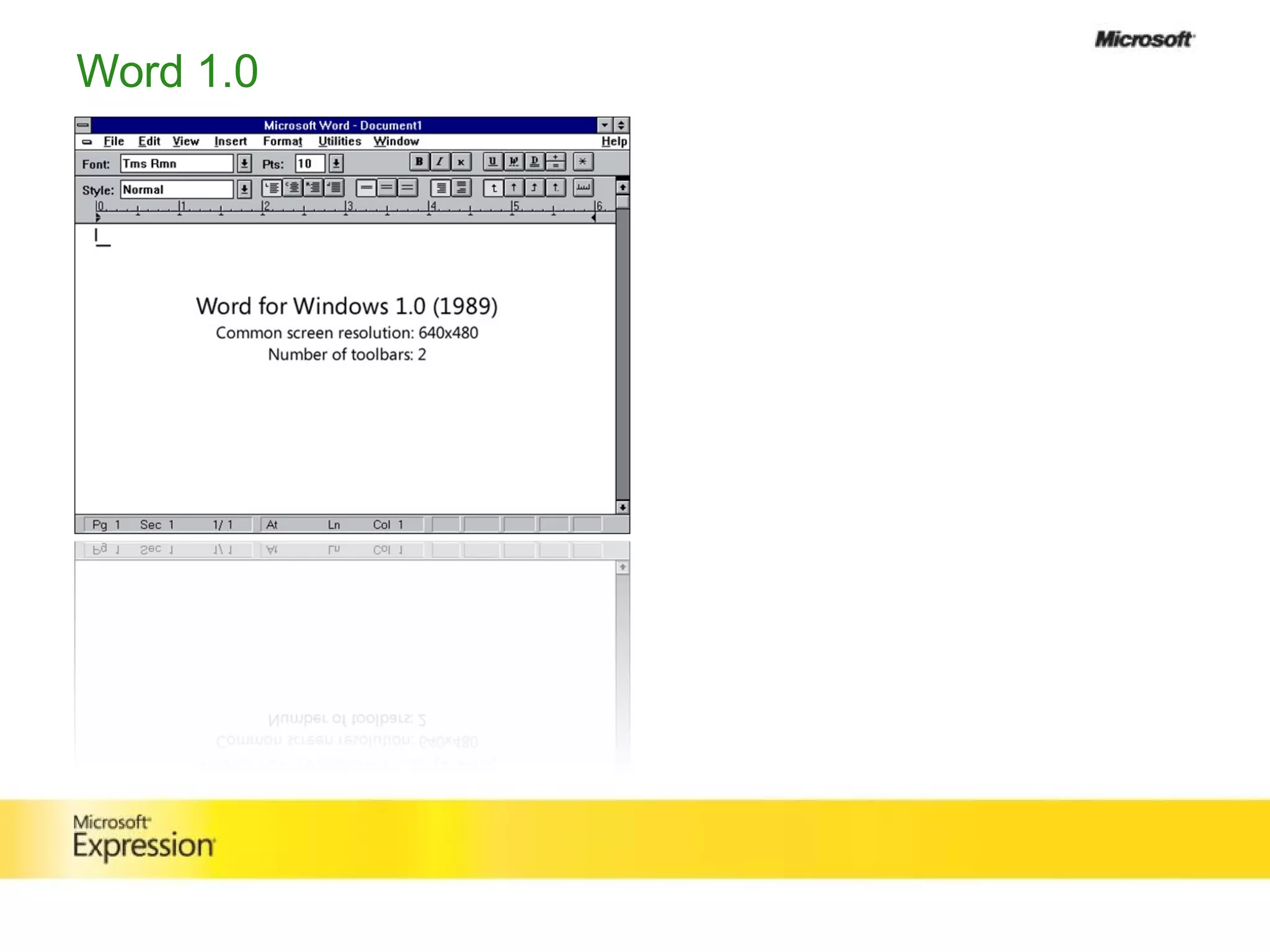
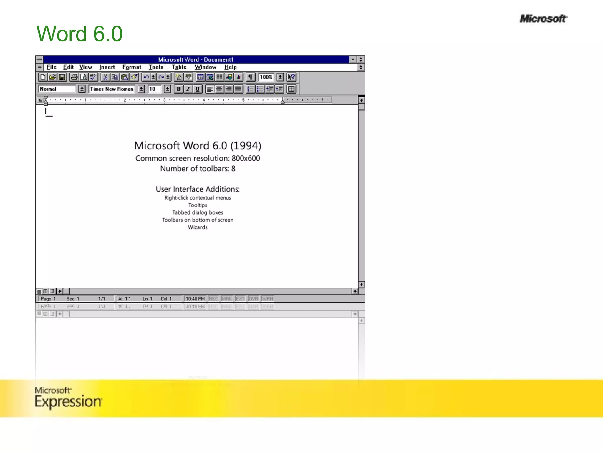
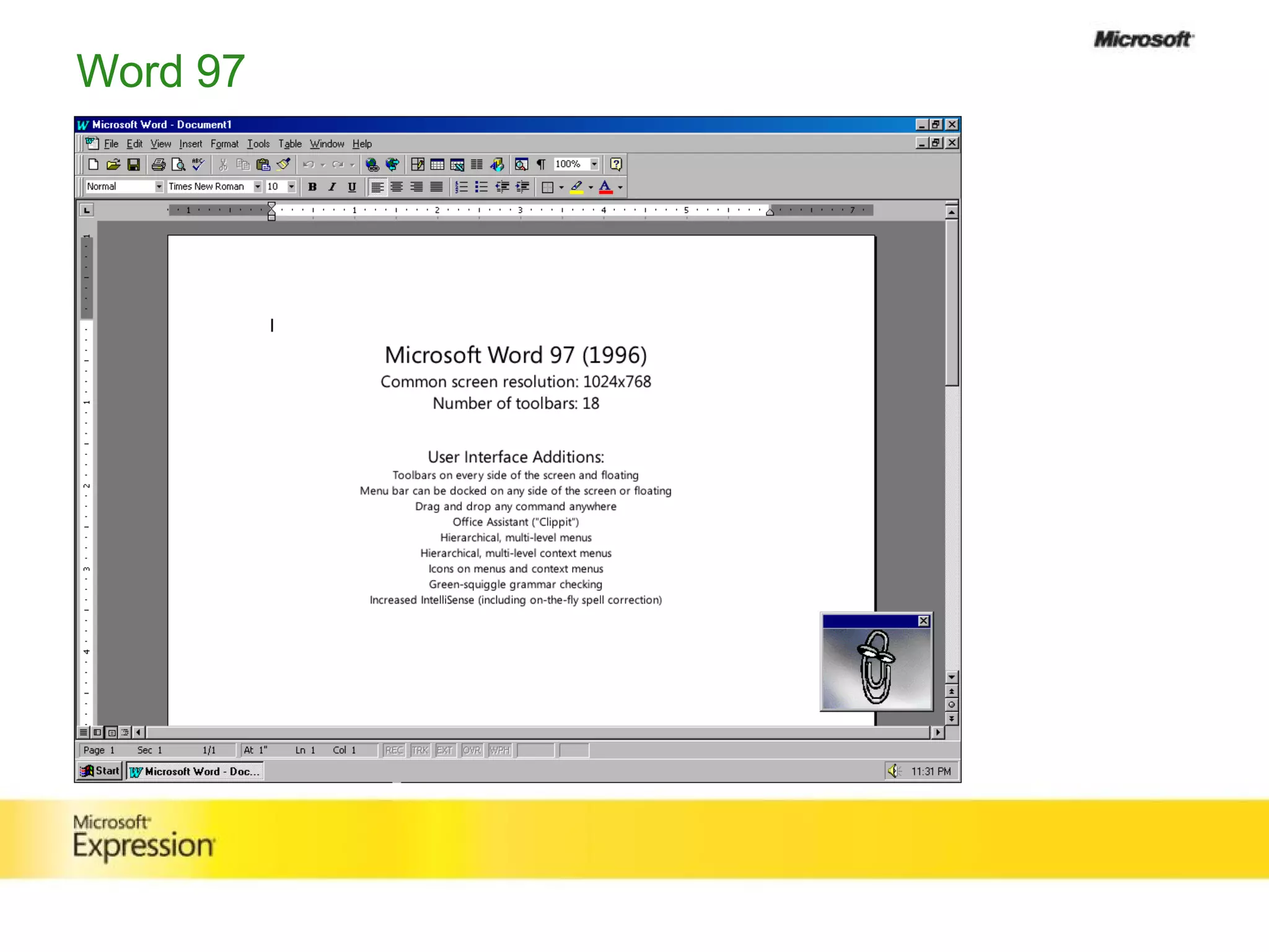
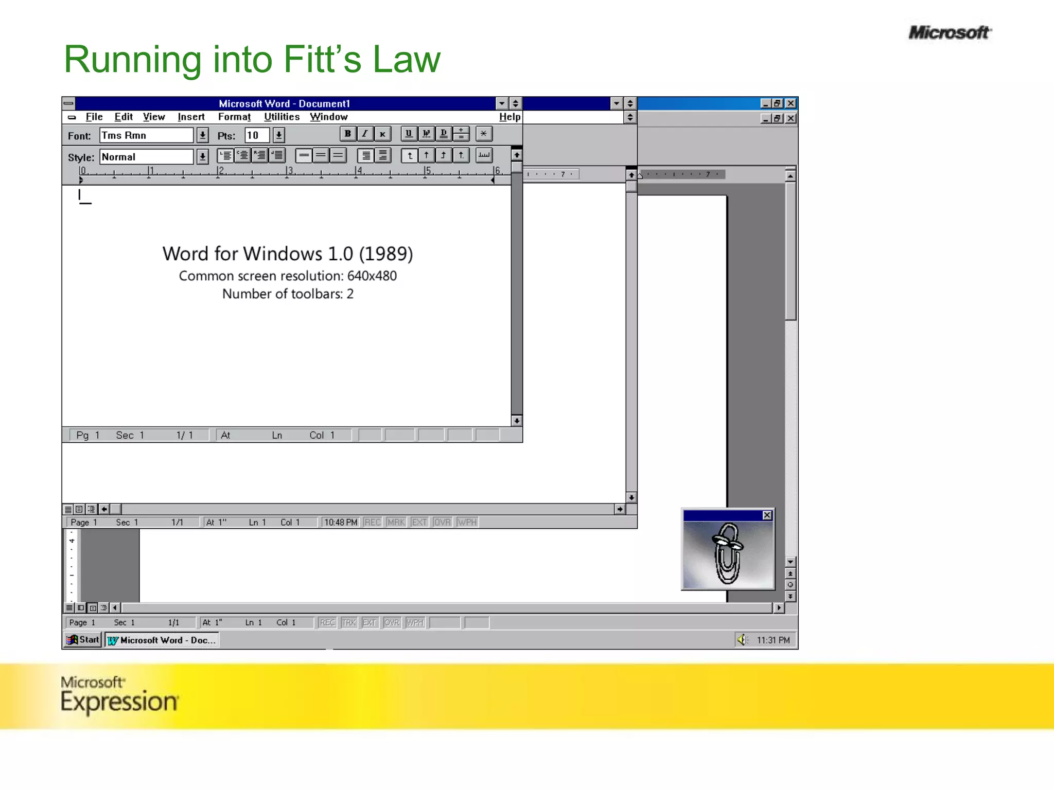

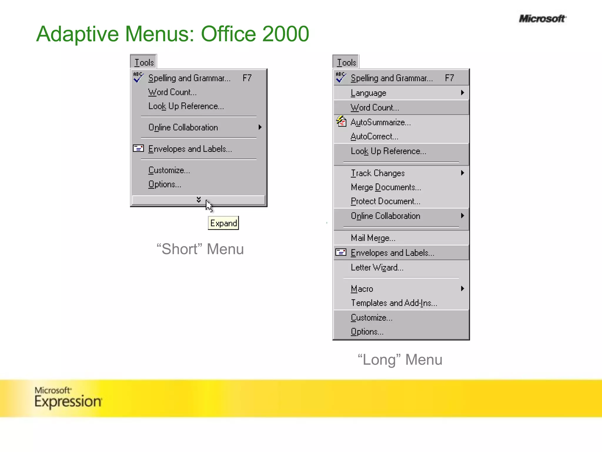
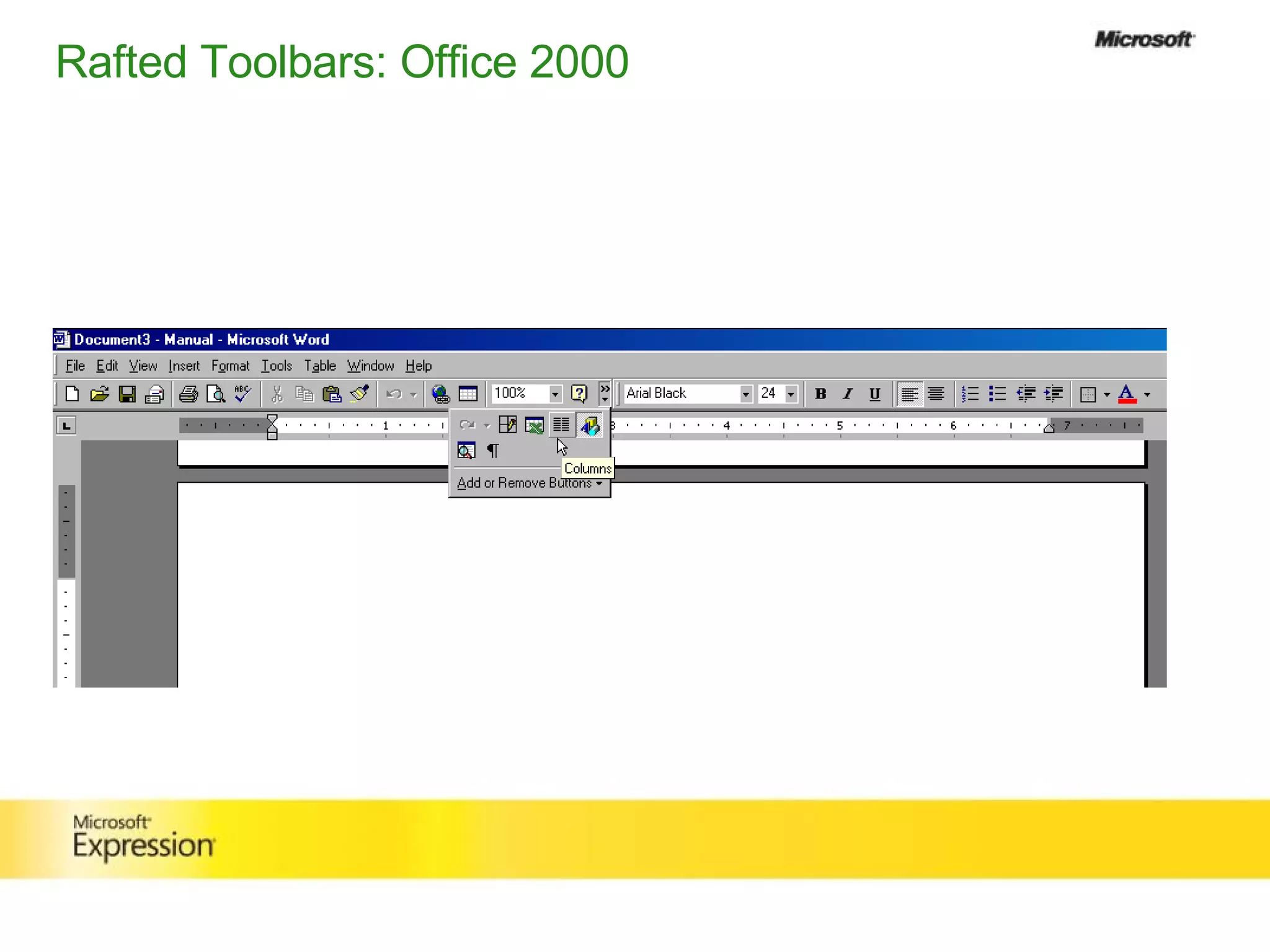
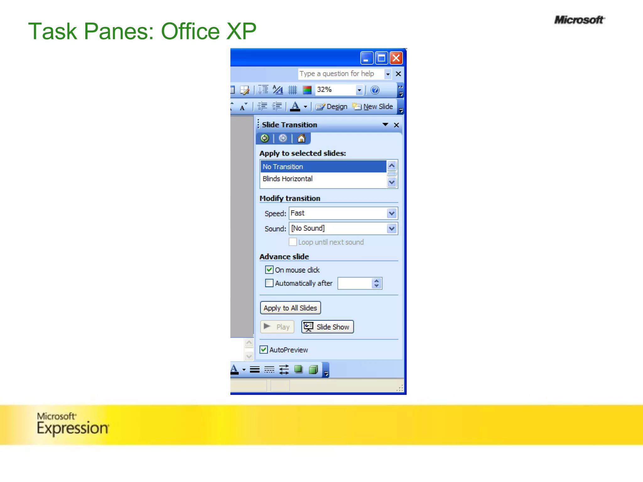


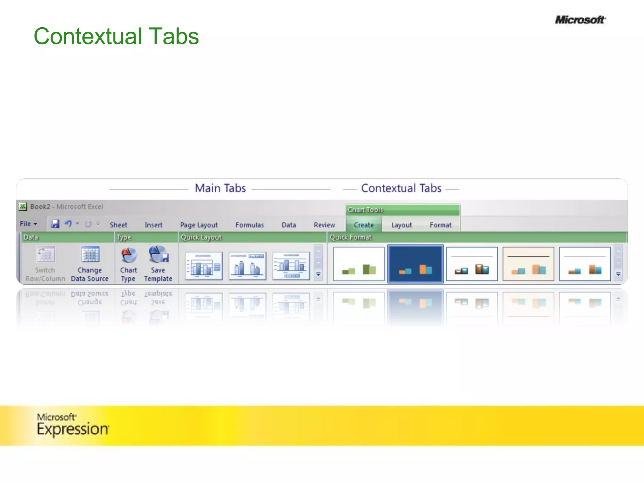
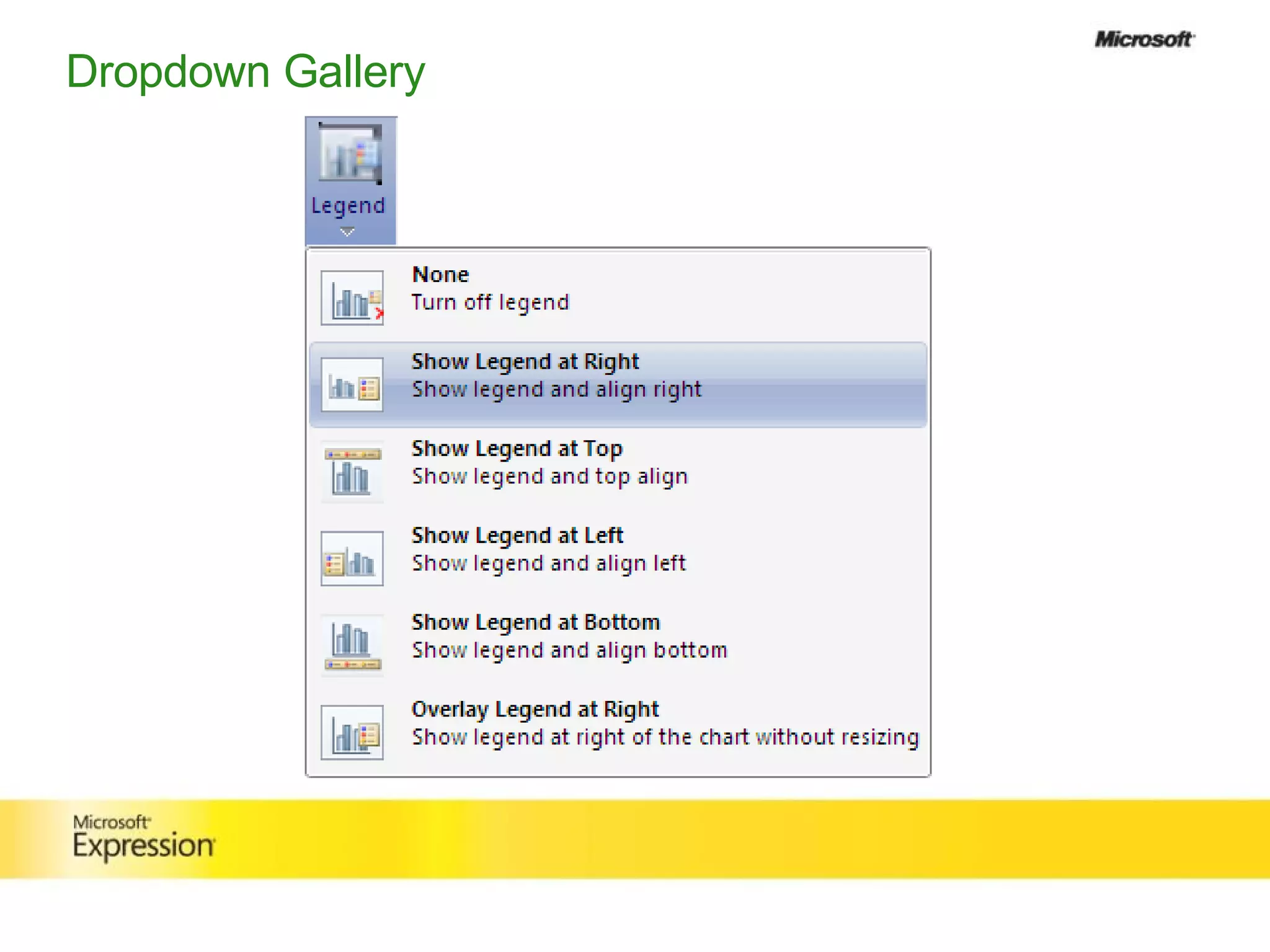
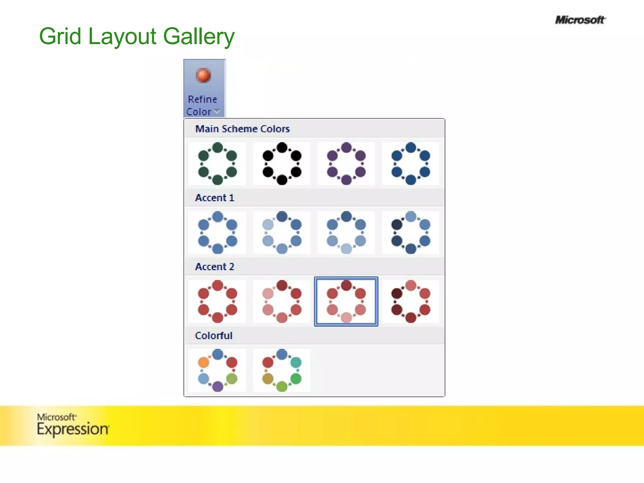
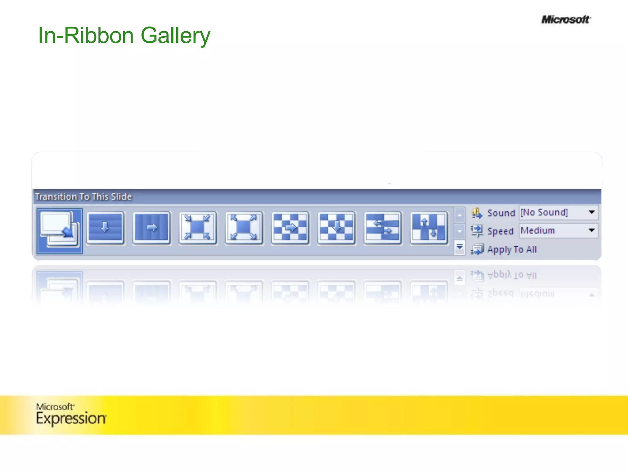
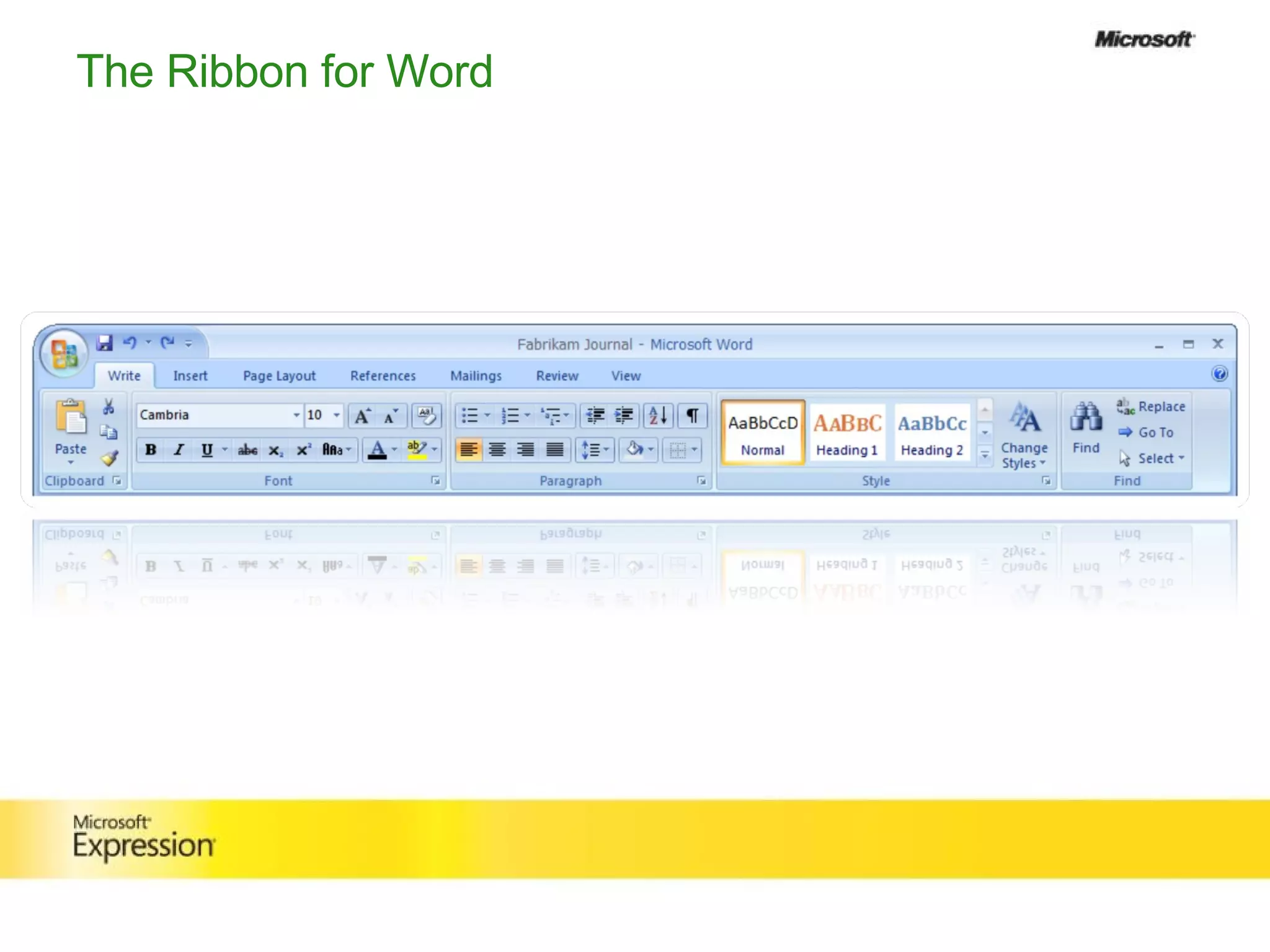
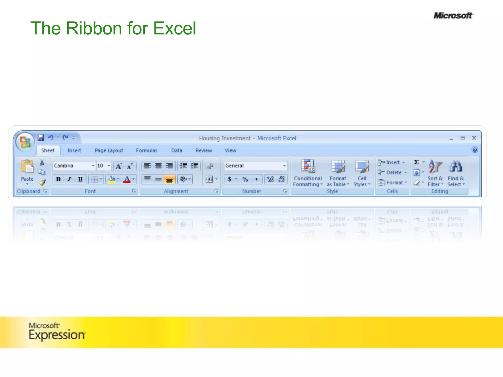
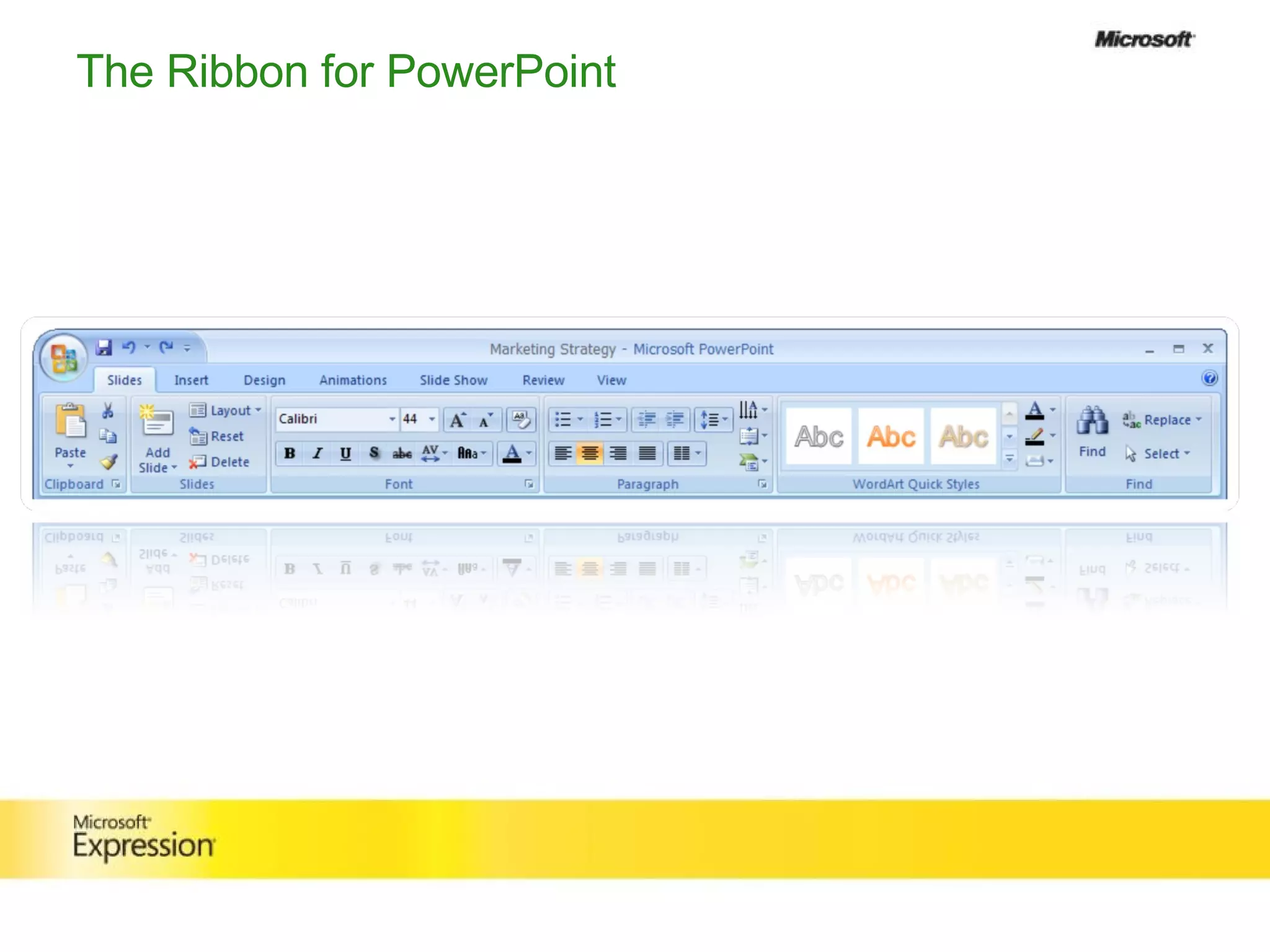


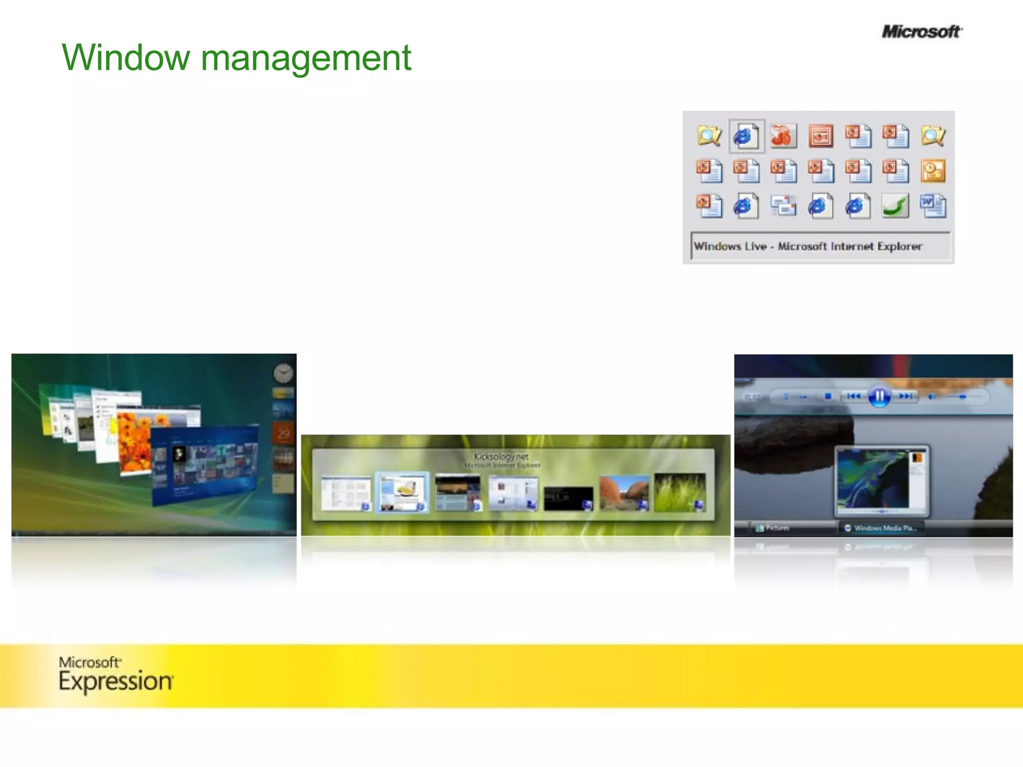
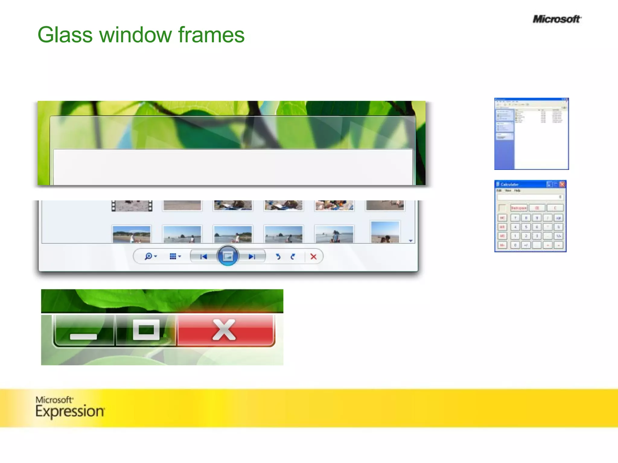
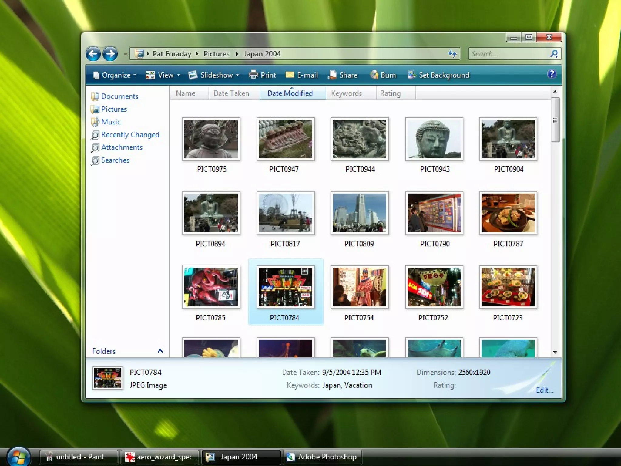
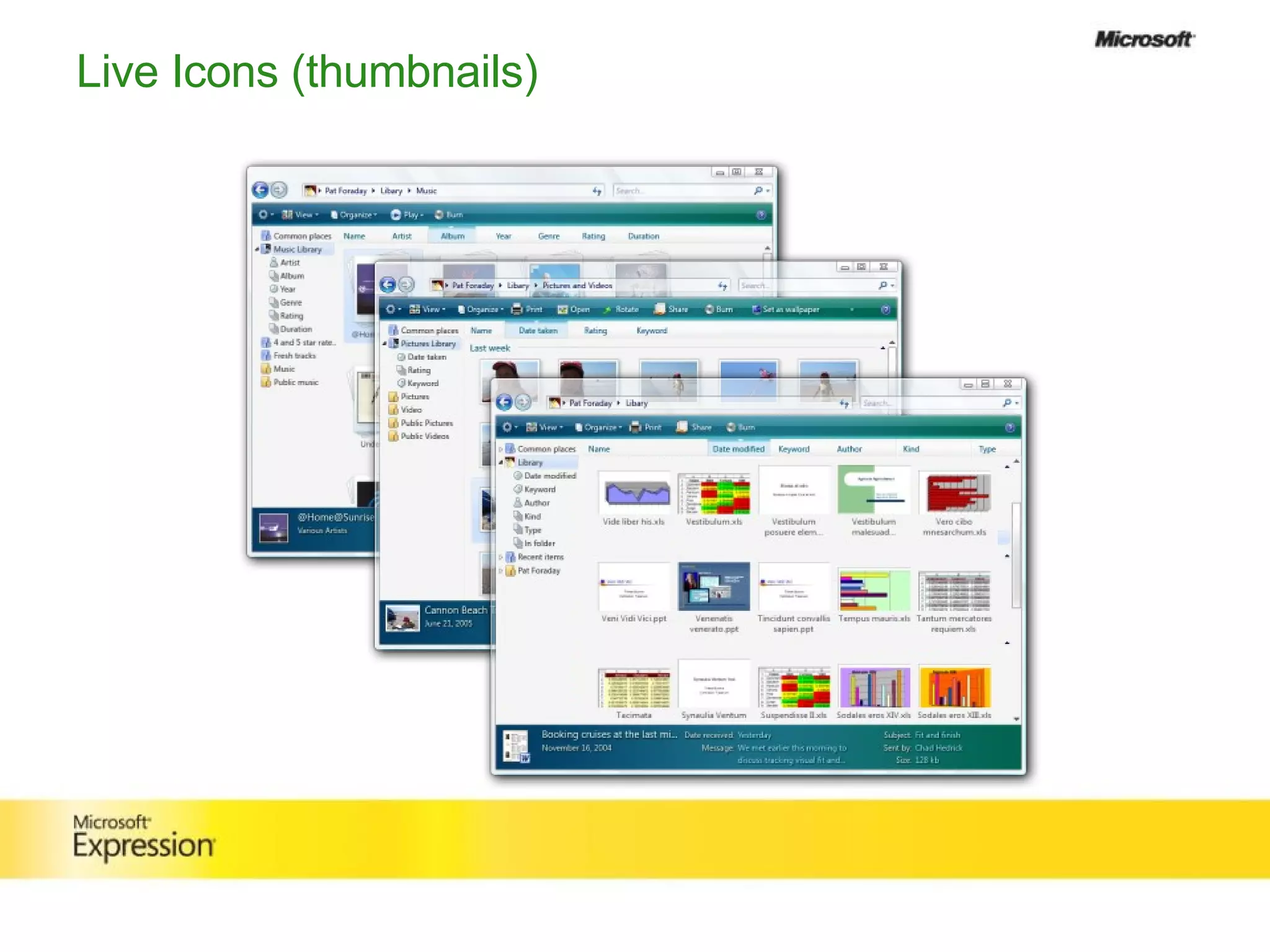
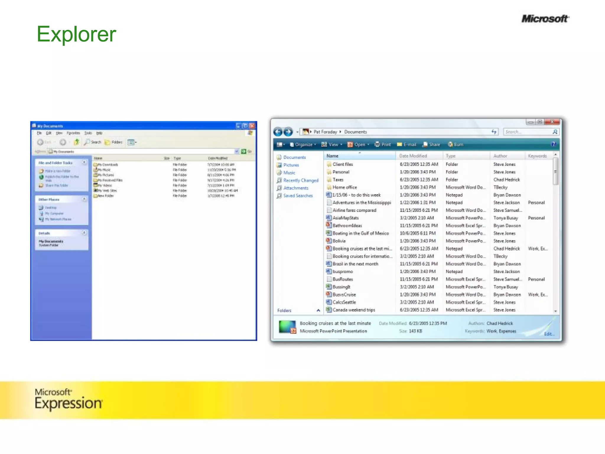
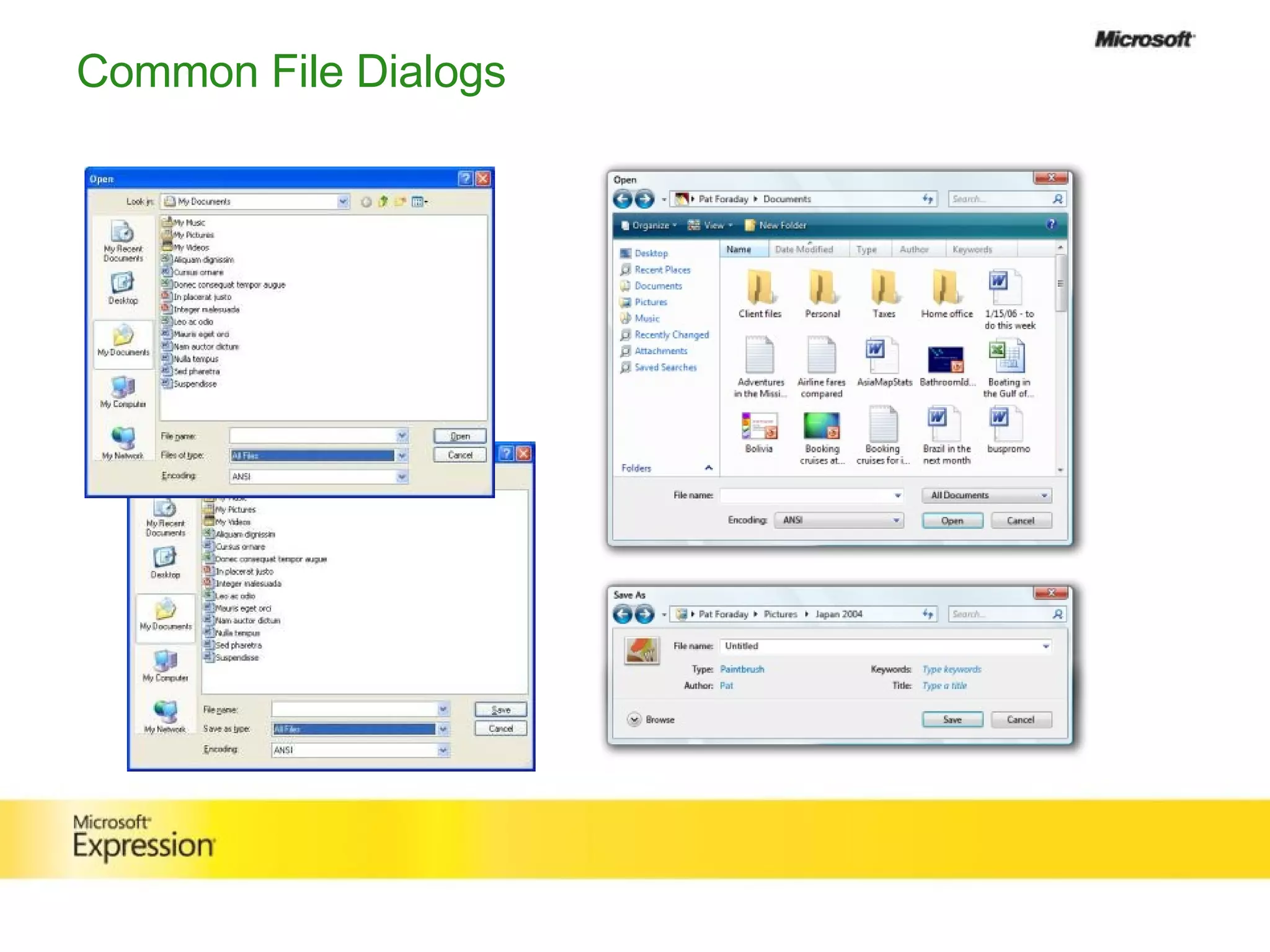
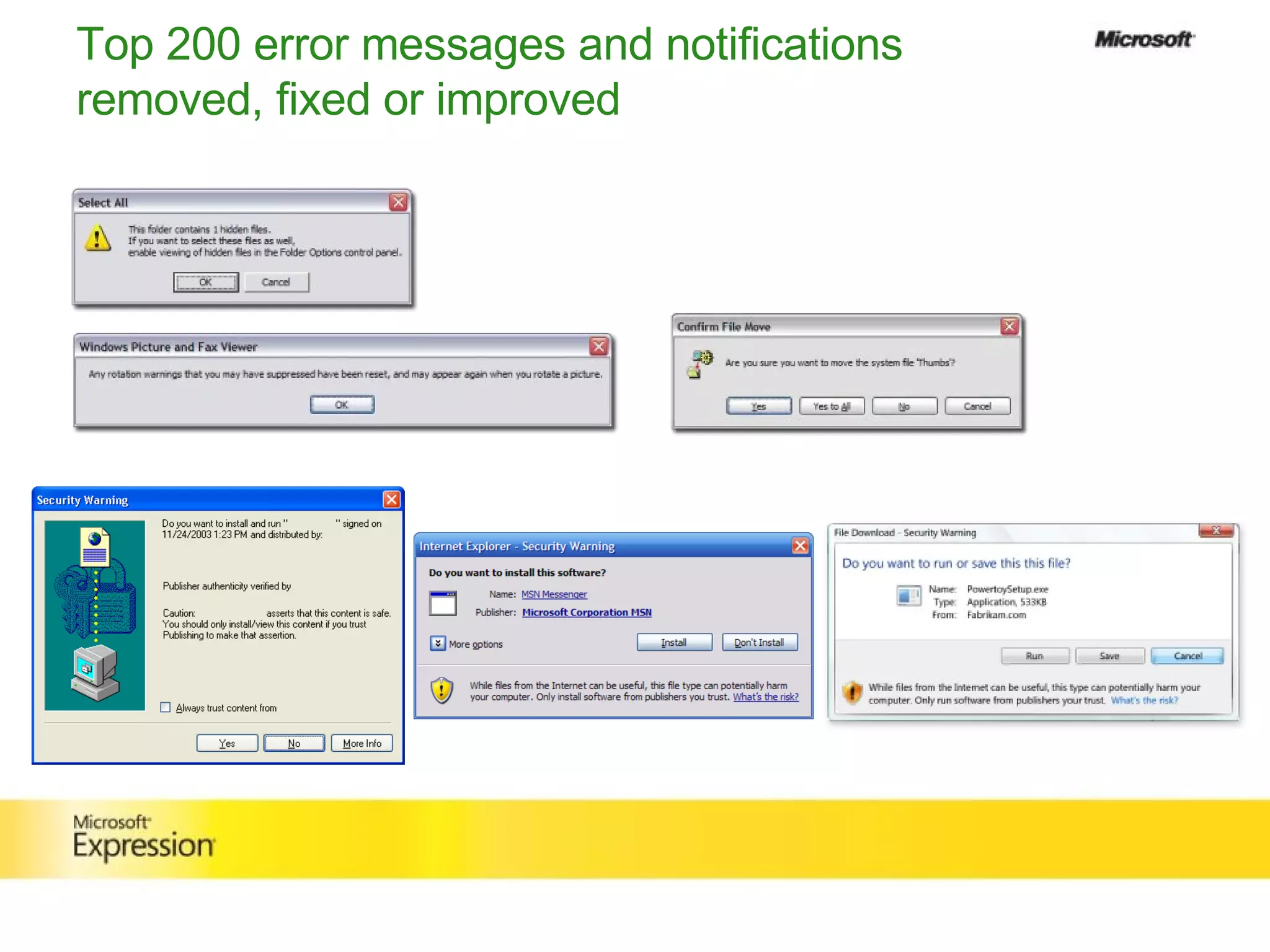
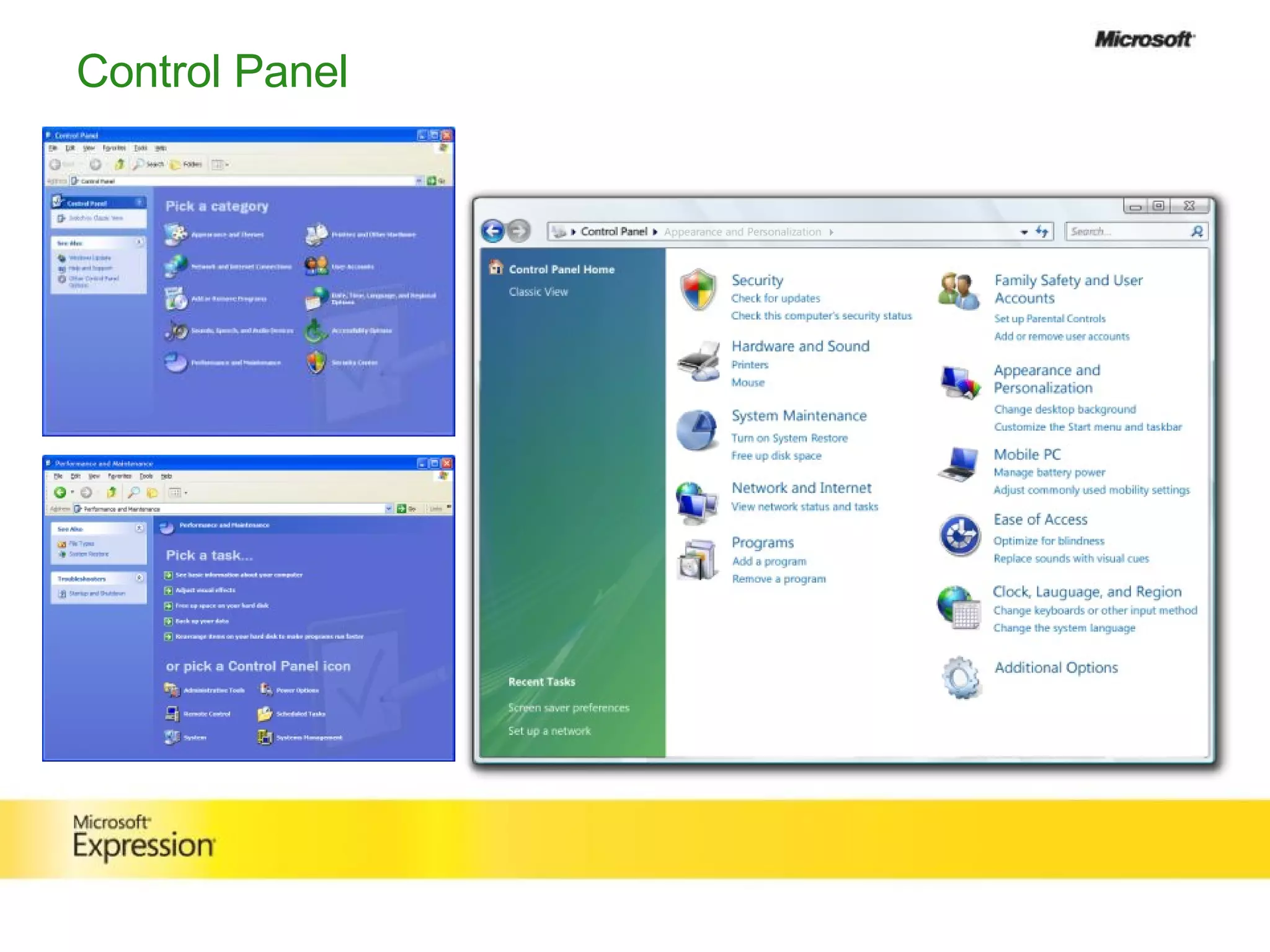


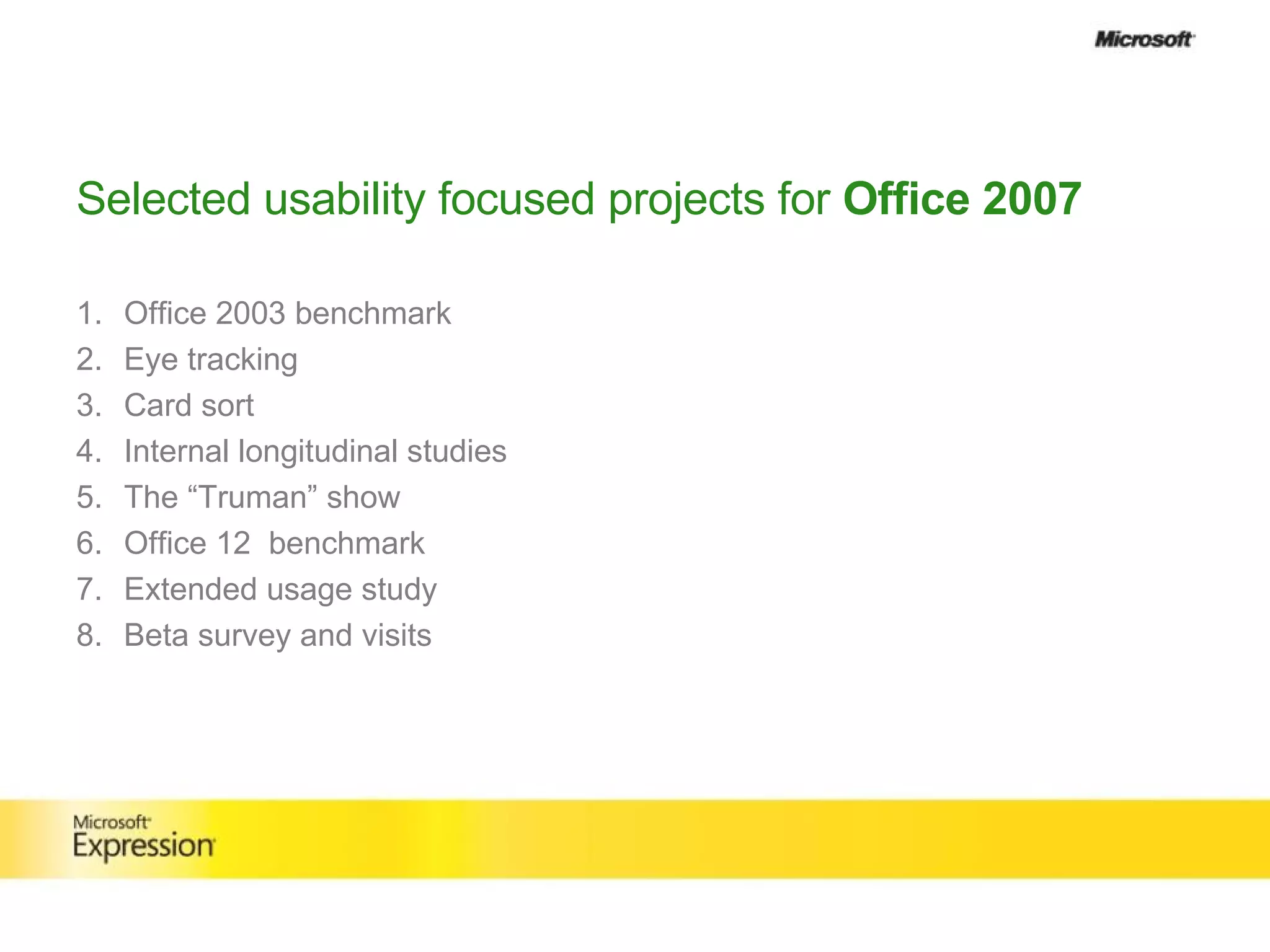
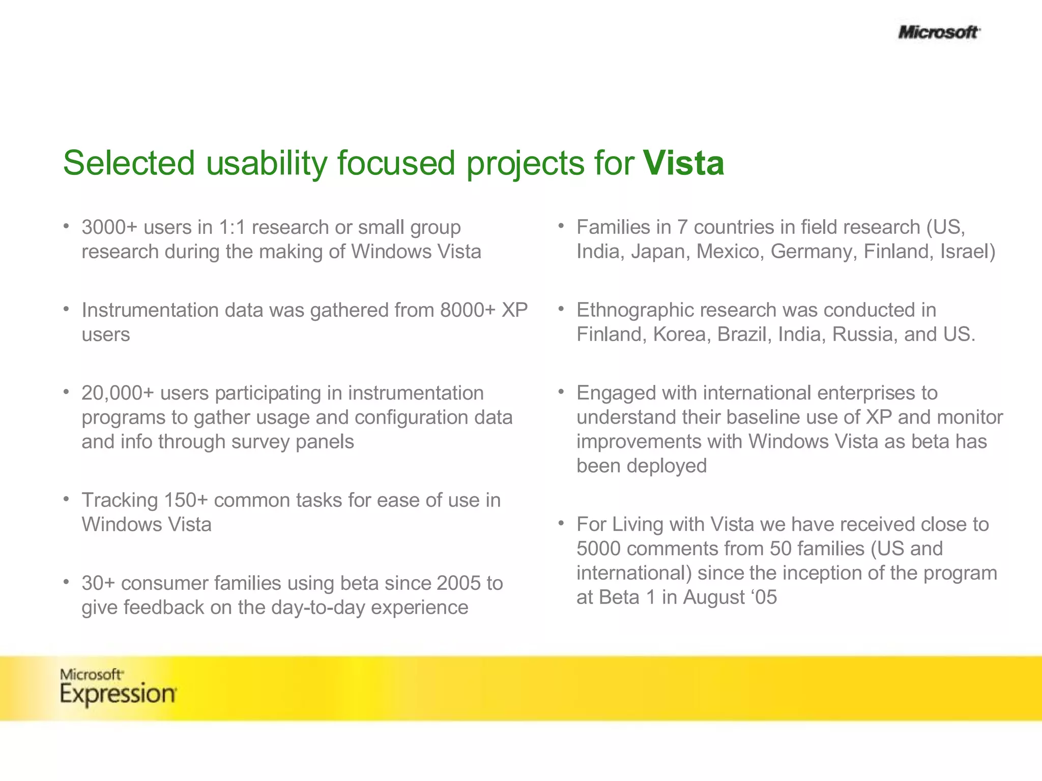


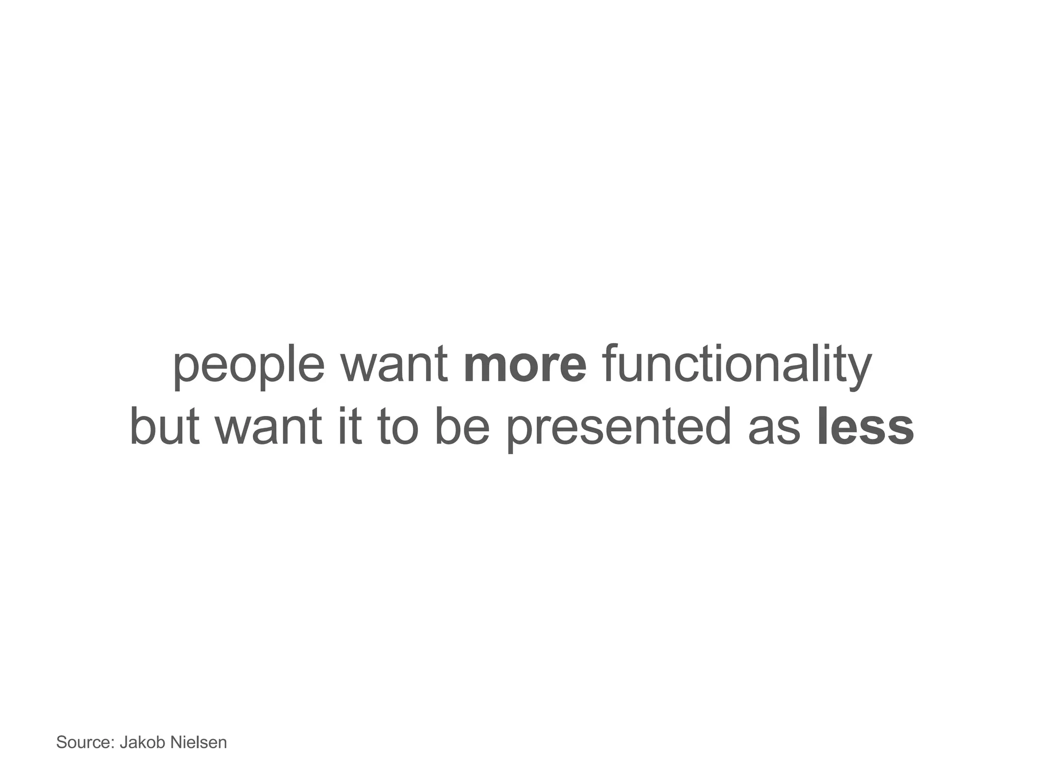
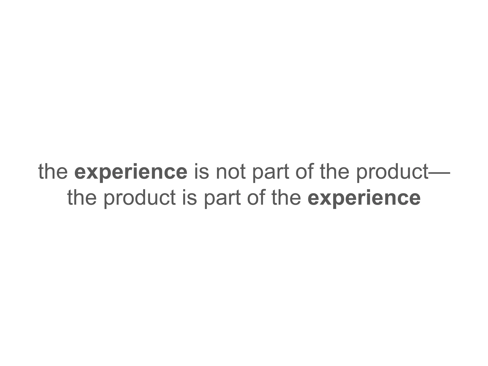


This document summarizes the user experience design process at Microsoft for Office and Windows Vista. It discusses how Office evolved from Word 1.0 to introduce innovations like the ribbon interface to make the software more efficient and easy to use. For Windows Vista, the goals were to make common tasks efficient and results more visual. Extensive user research involving thousands of participants was conducted to understand user needs and measure improvements. Key lessons learned included focusing on the overall experience rather than just new features and making the experience less complex.


![Designing with Lean UX : Rapid Product Design [UX Lisbon 2014]](https://cdn.slidesharecdn.com/ss_thumbnails/uxlisbon2014designingleanux-workshopslideshare-140604100358-phpapp02-thumbnail.jpg?width=640&height=640&fit=bounds)


![IObit Driver Booster Pro Crack 12.2.0 with License Key [2025]](https://cdn.slidesharecdn.com/ss_thumbnails/2-250825210428-9749d455-250826030111-154f5106-thumbnail.jpg?width=640&height=640&fit=bounds)