Remember
Interaction designprocess involves three components
User Research
Design and Prototyping
Evaluation (Improvement)
User Research
Working with users rather than guessing (user-centric design)
Invisible interfaces (task-oriented design)
3.
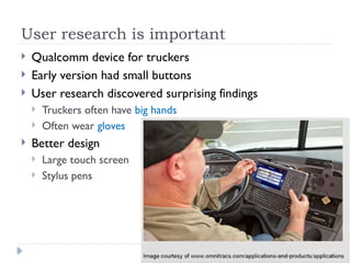
User research isimportant
Qualcomm device for truckers
Early version had small buttons
User research discovered surprising findings
Truckers often have big hands
Often wear gloves
Better design
Large touch screen
Stylus pens
4.
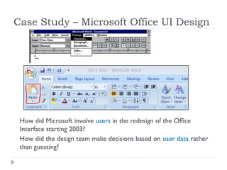
Case Study –Microsoft Office UI Design
How did Microsoft involve users in the redesign of the Office
Interface starting 2003?
How did the design team make decisions based on user data rather
than guessing?
5.
Jensen Harris material
Watch the presentation at
https://www.youtube.com/watch?v=AHiNeUTgGkk&t=14s
Read the Office user interface blog series at
https://learn.microsoft.com/ar-sa/archive/blogs/jensenh/table-of-contents
6.
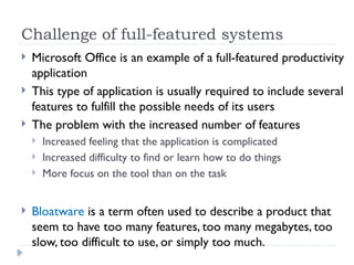
Challenge of full-featuredsystems
Microsoft Office is an example of a full-featured productivity
application
This type of application is usually required to include several
features to fulfill the possible needs of its users
The problem with the increased number of features
Increased feeling that the application is complicated
Increased difficulty to find or learn how to do things
More focus on the tool than on the task
Bloatware is a term often used to describe a product that
seem to have too many features, too many megabytes, too
slow, too difficult to use, or simply too much.
7.
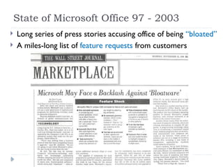
State of MicrosoftOffice 97 - 2003
Long series of press stories accusing office of being “bloated”
A miles-long list of feature requests from customers
8.
State of MicrosoftOffice 97 - 2003
Since 1997, People were feeling less in control of the
program
Menu and toolbar system was not scalable enough to fit the
richness of the product
Menus and toolbars are essentially full, people did not even
notice new commands from version to version
People were not finding or using new features
9.
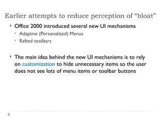
Earlier attempts toreduce perception of “bloat”
Office 2000 introduced several new UI mechanisms
Adaptive (Personalized) Menus
Rafted toolbars
The main idea behind the new UI mechanisms is to rely
on customization to hide unnecessary items so the user
does not see lots of menu items or toolbar buttons
10.
Adaptive (Personalized) Menus
Clicking a top-level menu opens a short list of most likely
used commands by a user
Clicking a chevron at the end of the menu expands the
menu to show the full contents
11.
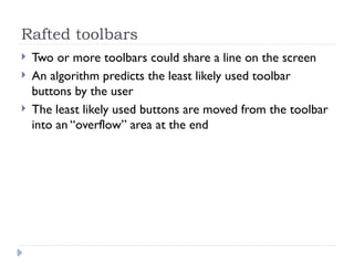
Rafted toolbars
Twoor more toolbars could share a line on the screen
An algorithm predicts the least likely used toolbar
buttons by the user
The least likely used buttons are moved from the toolbar
into an “overflow” area at the end
12.
The added UImechanisms failed
Customization was not easy and was not accurate
This led to added complexity and inefficiency to the
interface, why?
Bad selection of short menu items appearing to the user
requires him an additional scan of the full menu (scanning
menus took twice as long)
Features like adaptive menus and rafted toolbars were
turned off by default later in applications using them
“Auto-customization, unless it does a perfect job, is
usually worse than no customization at all”
13.
Why UI designfails
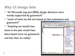
“At Microsoft, (say, pre-2003), design decisions were
mostly supported by guesswork”
“much of what we did was based on feel, estimation, and
guesswork”
“Anything we would have
done in the past would have
been based more on guesswork
and bias than on reality.”
14.
Office UI designdecisions after 2003
Microsoft Office Customer Experience Improvement
Program (CEIP)
Office 2003 users see a balloon popping up asking "Help
Make Office Better.“
Clicking on the balloon enrolls the user in the CEIP
program and collects anonymous data about how he uses
the software and on what kind of hardware
15.
Data for Designteam of Office 2007
More than 1.3 billion sessions of usage data
“We get so much Word and Outlook data that 70% of it
is thrown away”
“For the first time, we have the data we need to make
intelligent decisions”
which commands people use often and which they don't
which commands are used in sequence with which other
commands
which commands are used 7x more with the keyboard than
with the mouse
how many documents they use at once
how big people's screens are
16.
Activity
If youare involved in the design of a mobile application
for football lovers to watch matches and know match
results and statistics
Think about a layout of the interface that you may
consider usable and easy
Can you think of a plan of user research, how can you
conduct it to understand user needs and preferences
better
Can you think how you can gather usage data similar to
the way Microsoft did for the design of Office 2007, what
data can be useful, how can this data help improve the UI