Call Girls Umbergaon / 8250092165 Genuine Call girls with real Photos and Number
Question 2
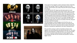
1. A key aspect of my magazine, poster and teaser trailer is that they
must all have synergy. To gain an insight into how to form that
synergy I have formed a case study of how the film Scream conveys
the synergy.
On the film title the ‘M’ always has that extra point on it and
therefore whenever people see the word ‘scream’ with it on, they
will associate it to the movie Scream. Also, since the first film the
number is in red and will be involved within the appearance of the
title and therefore that has become recognisable. Another iconic
feature of the Scream franchise that has created synergy between
all the films is the mask. The mask is used within all 5 films and
whenever people see the mask out of context of the film, they will
associate it with the franchise.
The same weapon is used throughout all of the films also, so
people will expect the same murders and the same layout of the
previous film. Due to this, they know what to expect and will seek
pleasure in having their expectations met when viewing the film.
The use of this synergy is useful as the better products work
together, the more productive and efficient they will run. The more
efficient and productive a media franchise is run, the more profits
will result. If a product looks pleasing and works together, the
more people will take the film seriously and therefore it will be a
bigger success.
2.
3. MASK
I have used the same mask throughout
all of my media forms- the teaser trailer
involves the masked man as a character,
the poster uses a still image from the
teaser trailer which includes the
masked man and the magazine is purely
of the masked man. Using this mask
forms iconography for the film as the
mask alone will remind audiences of
the film – this is due to the consistency
of the mask. I based my idea on using a
mask on the Scream films as it works as
an effective way to create a brand for
the film. I have used the mask as
creates an anonymous killer that have
previously been famous to work well.
4. FINAL GIRL
Carol Glover created the concept of
the ‘final girl’ which refers to the girl
who defeats and survives the killer.
This concept is used in many horror
films as it breaks away from the
stereotype that women are weak
and creates a more interesting and
relatable dialogue for the audience. I
have used this concept throughout
all of my media forms – she is
featured in the teaser trailer and also
featured on the poster. By having her
clearly evident as the final girl, it
holds the conventions of existing
horror products and therefore is
effective.
5. TEXT I have used the same font for the text and the title of
the film throughout all 3 media forms. I have used this
specific font as it looks like a font from a text message as
it has that cyber appeal to it. As we have a film that is
highly based on technology and this idea of threats
being issued through mobile phones, we felt this font
was appropriate and fitted in with the films brand by
creating synergy. It was important for the title to have
the same font throughout all of the media forms as it
creates an image for the film so that whenever people
see the word ‘unknown’ out of context to the film, they
will still find connections. This is shown through the film
Scream. On the title for the film Scream the ‘m’ is extra
pointy and immediately when you see that ‘m’ you will
be reminded on the franchise.
I have also used the same blood splatter across the title
for all 3 media forms. I have purposely done this as it
adds to the horror conventions of the film and creates a
brand for the film. The blood splatter is important as the
film is of the slasher/house invasion subgenres so
therefore is appropriate.