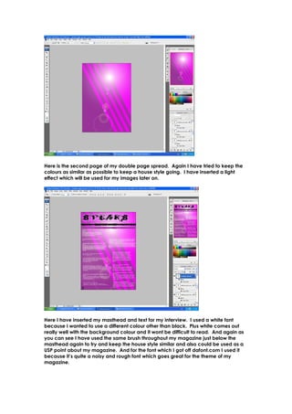
1. Here is the second page of my double page spread. Again I have tried to keep the
colours as similar as possible to keep a house style going. I have inserted a light
effect which will be used for my images later on.
Here I have inserted my masthead and text for my interview. I used a white font
because I wanted to use a different colour other than black. Plus white comes out
really well with the background colour and it wont be difficult to read. And again as
you can see I have used the same brush throughout my magazine just below the
masthead again to try and keep the house style similar and also could be used as a
USP point about my magazine. And for the font which I got off dafont.com I used it
because it’s quite a noisy and rough font which goes great for the theme of my
magazine.
2. Here is my double page spread with images inserted. I wanted to use three different
images for this as I wanted to get across the whole ‘two sides’ idea. As you can see I
have used a slight glow around the pictures just so they can stand out and look more
professional. The pictures I feel came out really well and the font also works well with
the images as you can see clearly read the font without having to worry about the
images making it more difficult to read.