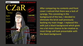
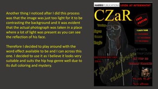
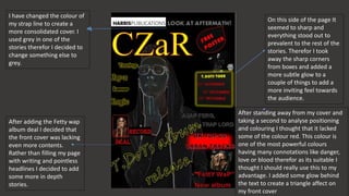
The document discusses revisions made to a magazine cover design. The designer replaced the brick wall background with black for more creative flexibility. The main image was too light, so a photo effect was added to increase contrast. Red was also added to take advantage of its powerful connotations. Box edges were softened and glow was adjusted to create a more inviting feel and balanced design. Additional stories were included to fill out the cover rather than excessive text or headlines.