
Recommended
More Related Content
What's hot
What's hot (20)
Viewers also liked
Viewers also liked (17)
Similar to Analysis of front cover (nme) media AS
Similar to Analysis of front cover (nme) media AS (20)
More from asmediaf12
More from asmediaf12 (20)
Analysis of front cover (nme) media AS
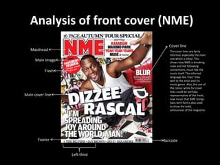
- 1. Analysis of front cover (NME) Cover line Masthead The cover lines are fairly informal, especially the main one which is tilted. This Main Image shows how NME is breaking rules and not following Flash conventions, much like the music itself. The informal language like ‘man’ links well to the artist and his music genre. Also, the use of the colour white for cover lines could be perhaps Main cover line representative of the fresh, new music that NME brings. Sans Serif font is also used to show the bold, seriousness of the magazine. Footer Barcode Left third
- 2. Front cover (continued) • MAIN IMAGE - The main image is a long shot of a popular, well known artist. This encourages the reader to buy the magazine as they know it features him and a certain style of music (rap and RnB). His positioning is inviting, bold and energetic and the image is anchored to the quote from Dizzee Rascal as he seems to be reaching out to the audience. The mise en scene also reinforces the music genre as the background(street art), clothing(gold chain) and facial expression could all easily be associated with rap music. • MASTHEAD – The masthead is a vibrant red colour. This has many connotations but here the main one is energy and joy which links with the main cover line. Most of the NME covers use red for the masthead as it is ideal because all music genre’s can link fairly easily with the colour red in some way. It also uses a bold outline, to make it stand out even more and this provides a strong impact as well as fitting in with the house style of NME.
- 3. Analysis of contents page (NME) LAYOUT: The layout is fairly basic and this is mainly because it uses the Rule of Thirds structure. The banner at the top of the page takes up two thirds, and the main image is in the middle of the page with some text underneath which are placed in an image of what appears to be a road case (used for going on tour) this image is anchored with the text well and is a clever way of getting across the information whilst linking it with the images. The subscription box in the right third of the page appears to be less important than other magazine features but still stands out and this is mainly due to the fact that it does not fit with the house style. There are sub headings above the subscriptions box which help readers find exactly what they are looking for quickly and this is helped by the page numbers in the left third. HOUSE STYLE: The masthead from the front cover is also featured on the contents page to add familiarity to the page and also the red, black and white colours used help readers recognise NME immediately by keeping the same house style of the masthead throughout. The subheadings are all bold and again keep with the red, black and white theme by placing font colours over contrasting background colours e.g. black font on white background or vice versa. A drops cap is also used in the middle section of the text to make the reader realises this story in the main feature.
- 4. Analysis of double page spread (NME) LAYOUT: The layout is very simple. The first page being purely an image of Dizzee Rascal with a bright and appropriate background which lets the reader know the article is about him and also the mise en scene of the image (e.g. street art, gold chains and the positioning of Dizzee) may help readers realise the genre of music/artist that this feature is about. The second page has a by/headline that takes up most of the top half of the page. Underneath that is the subheading, follow by the article which is split into 4 different columns. All of this text is over a faded image, and in the top right hand corner there is a tag saying ‘Dizzee’.
- 5. Continued… MAIN IMAGE: The main image of the double page spread is extremely appropriate to both Dizzee Rascal, his genre of music and the target audience that are likely to read the article. We can assume the audience are fairly young and outgoing as the graffiti used in the background of the image is sometimes typical of street youth. The pose and expression of Dizzee suggest that he is quite confident but also quite sneaky and maybe unique which is what NME is all about. Finally, the clothes Dizzee Rascal is wearing suggests he is brave, powerful and perhaps dangerous, these ideas all coming from the connotations of the red jacket he is wearing. The reader will instantly feel more comfortable with Dizzee as they are given an idea about his background and his music, and that essentially helps them relate to him as an artist. HOUSE STYLE: The headline is extremely bold and certain words are given bigger font sizes to add emphasis e.g. “tags” and “riches”, this is so draw attention to the use of specific language and to make readers realise there is play on words with “tags” instead of rags from the popular saying. Drops cap is used to start the article but apart from size, keeps the style of the rest of the text. The tag in the right hand corner of the spread tells us that the article is about Dizzee and does so in a fairly informal way. By doing this it gives the entire article a more relaxed and friendly approach and so the reader will feel more comfortable.
- 6. New Musical Express (NME) www.nme.com/magazine The NME is a popular music magazine that has been published weekly in the United Kingdom since 1952. It started as a music newspaper and gradually moved into a magazine format. It was the first British magazine to include the singles chart. Over time is has changed in structure and has adapted to new technology, mainly due to the ever changing target audience (due to new artists and music genre’s). NME is published by IPC Media and edited by Mike Williams. TARGET AUDIENCE: Age – 16-20 (core target audience) Mostly males, but both genders.