Interactive Powerpoint_How to Master effective communication
Progress 3
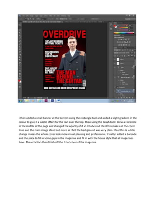
1. i then added a small banner at the bottom using the rectangle tool and added a slight gradient in the
colour to give it a subtle effect for the text over the top. Then using the brush tool I drew a red circle
in the middle of the page and changed the opacity of it so it fades out I feel this makes all the cover
lines and the main image stand out more as I felt the background was very plain. I feel this is subtle
change makes the whole cover look more visual pleasing and professional. Finally I added a barcode
and the price to fill in some gaps in the magazine and fit in with the house style that all magazines
have. These factors then finish off the front cover of the magazine.