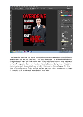
1. i then added the main cover line and the other cover lines by using the text tool. This allowed me to
get the correct font style and size to make it look more professional. The text tool also allows you to
change the colour of the text which allowed me to change the colour of the main cover line and the
smaller info and position them where I wanted. I then added stroke and drop shadow effects onto
the text so that it will stand out the image behind it while improving the visual aspect of it. Using
these effects makes it easier for the reader to read and appreciate as they stand out and they apply
to the rule of thirds improving the professionalism of the cover.