2. Main character in the forefront of the image Details of previous
to link it in with the film and to also give the films made by the
audience an idea of what the film is about directors/producers-
(haunted house, possessed child suggests used to add to the
supernatural horror. credibility of the film.
Location is integrated
into the background
to set the scene and
to also link it in with
the location of the Reviews of the film
film. again to give more
credibility to the film
and encourage
Details of the cast, audiences to watch it.
director located below
the title and tagline in
smaller fonts, perhaps
done to promote the Title of the film positioned at
film first, the makers the bottom of the page- allows
and actors second. the audience to focus in on the
Tagline located below the title visual graphics of the poster.
of the production.
3. Details of previous
films made by the
makers used again to
Title of the film placed
give credibility to the
in the centre of the
film.
poster surrounded by a
black background
perhaps to add to the
Tagline featured below mystery of the film.
title in a small font to The title of the film
emphasise that the itself is quite
name of the film ambiguous, the colours
should be in the centre and how much of the
point of the audiences location is revealed
mind. reflects that.
Release date and website of
the film positioned at the
bottom of the poster instead
of the name of the actors, Logo of the production
director. house.
4. Details of previous films made by the makers, a
common theme emerging to reassure the
audience of the film’s credibility.
Title of film on the
upper centre of the
poster. Placed
above the image of
the killer in order to
emphasise the killer
and the child also Brief reviews of the
emphasises that film to reassure the
the killer and the audience once
child are central to again.
the story of the
film.
List of cast, director, producers,
production house, links to
Twitter and Facebook page of
the film at the bottom of the
page.
5. A brief insight into the Location of the film in
plot of the film- longer the background- the
than a tagline which poster reflects the
suggests that the movie.
makers of the film
wanted their audience
to know more about
the film.
Title of the project placed
List of the actors,
at the bottom- to
directors, website and
emphasise the location and
production house logo
the single character on the
at the bottom.
poster.
6. Common themes
• Location of the film in the background.
• Shot of one of the main characters in the forefront .
• Reviews of the film- to reassure the audience.
• List of actors, director, producers at the bottom
along with website information, Facebook page.
• Title of the film very prominent- centre or at the
bottom.
• Details of other films made by the makers.
• Colours used are quite dark and grey, reflects the
horror genre and the content of the film.
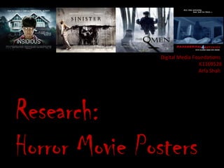
7. Poster for “Chaos”
• Taking into account the common themes of horror trailer
posters, below are some of the ideas I would like to
incorporate into the poster for “Chaos”:
– Location of the film blended into the background of the poster with
the shadow of the killer at the forefront.
– Place the title of the film at the bottom of the trailer along with the
tagline below it.
– Reviews of the film will be placed in the centre of the poster next to
the killer’s profile.
– Details of the release date- in the posters I analysed, only one poster
had a release date on it but I would like to incorporate it into the
poster anyway because it would make the poster more authentic.