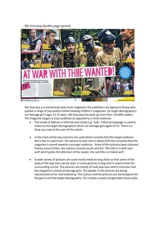
1. We love pop double page spread:
We love pop is a mainstream pop music magazine; the publishers are Egmount Group who
publish a range of top quality market-leading children’s magazines. Its target demographics
are teenage girl’s ages 13-15 years. We love pop has built up more than 135,000 readers.
The magazine targets a mass audience as opposed to a niche audience.
The mode of address is informal and chatty e.g. ‘lads’. Informal language is used to
relate to the target demographics which are teenage girls aged 13-15. There is a
drop cap used at the start of the article.
In the main article two columns are used which connote that the target audience
don’t like to read much. The picture to text ratio is about 65% this connotes that the
magazine is aimed towards a younger audience. Some of the pictures have coloured
frames around them, the colours connote youth and fun. The title is in pink sans
serif which grabs the attention of the reader, the sub title is in black serif.
A wide variety of pictures are used mostly medium long shots so that some of the
body of the pop stars can be seen. In some pictures a long shot is used so that the
surrounding can be. The pictures are mostly of male pop stars which connotes that
the magazine is aimed at teenage girls. The people in the pictures are being
represented as fun and outdoorsy. The colours and the pictures are stereotypical for
the genre and the target demographic, this creates a easily recognizable house style.