The document discusses how the magazine and film poster for a horror movie connect and reinforce each other. Both use the same font and color scheme of red, white, and blue to create consistency. They also feature low-key lighting and dark backgrounds common in horror works to set the mood. Additionally, the poster and trailer were shot in the same location and feature the same antagonist, challenging genre conventions. The target audience of 15-25 year old males and females is consistent across the materials. Overall, various design elements were deliberately chosen to clearly link the magazine, poster, and film trailer.
UGC NET Paper 1 Mathematical Reasoning & Aptitude.pdf
Evaluation 2
1. Evaluation 2
Q.2 How effective is the combinationofyour main product and
ancillary texts?
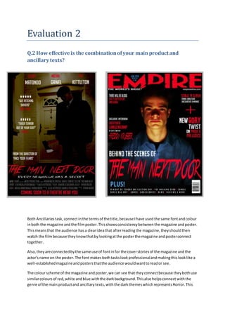
Both Ancillaries task,connectinthe termsof the title,because Ihave usedthe same fontandcolour
inboth the magazine andthe filmposter.Thisshowsconsistencybetweenthe magazine andposter.
Thismeansthat the audience hasa clearideathat afterreadingthe magazine,theyshouldthen
watch the filmbecause theyknowthatbylookingatthe posterthe magazine andposterconnect
together.
Also,they are connectedbythe same use of fontinfor the coverstoriesof the magazine andthe
actor's name on the poster. The font makesbothtaskslookprofessionalandmakingthislooklike a
well-establishedmagazineand postersthatthe audience wouldwanttoreador see.
The colour scheme of the magazine andposter,we can see thattheyconnectbecause theybothuse
similarcolours of red,white andblue withthe darkbackground.Thisalsohelpsconnect withthe
genre of the main productand ancillarytexts,withthe darkthemeswhichrepresentsHorror.This
2. connects to the audience because thatmeansitmakes themwanttogo and see thisfilmwiththe
stabilityof these horrorconventions thathasbeenadoptedtopromote thisgenre. Also,itcanbe
saidthat inthe title of the magazine.
I have usedlowkeylightingintakingthe imagesbothonthe magazine andposter.The use of the
lowkeylightingusedinhorrorfilmstocreate suspense orcontrol how muchof the surrounding
scene isrevealed,especiallyonthe magazine how Idecidedtouse the protagonistinamysterious
settingandmakingthe protagonistplaythe role of the antagonist.
Alsowiththe conceptand layoutof the ancillaries followhorrorconventionsandhow itlinkswith
the filmtrailerwithdarkbackgrounds.
The locationinthe posteristhe same locationthatthe trailerwasshotin the same location tolink
the posterand trailertogetherfromthe posteranalysisthatwasconducted.Theyuse locationsin
the traileron the posterto make sure that the storylinesfollowandthe audience doesn’tget
confused.
The font usedonthe posterand magazine was
pickedoutfroma fontanalysisthatI conducted.
The font useditcalled‘true lies’.Ipickedthisfont
because itrepresentshorrorandhas an enigmatic
impressiontocatchthe audience attentionof whenthey
see the poster,itwill connecttothe magazine andthen
the filmtrailer. Alsowiththe colourred,withthe
connotationswithdangeranddeath as itcan stimulate somanysensesinthe viewerandcanbe
linkedtoanynumberof themesandmotives.Alsothe title’The mannextdoor’waschosenbecause
it givesenigmatothe characterand mysteryto know that thiscouldbe a real life situationwith
your neighborbutyoumightnotbe aware of the situationuntil muchlater.Therefore we decidedto
use the title ‘The Man NextDoor’.
The filmtrailerproductioncompanyisAVCN filmsandthisalsolinkstothe posterwiththe credits
whichI alsodevelopedusingPhotoshop. AVCN issomethingthatwasmade upwiththe firstletters
of the people ingroup.We decidedthisbecause we wantedtohave asophisticatedproduction
company.
The filmtrailerandposterconnectbecause theyfeature the role of the antagonist,whoisablack
male.We didthisbecause to challenge the conventionsof horrorgenre because mostof the
antagonistrolesthatare playedare majoritywhite male.Alsowiththe role of blackmeninhorror
filmstheyare mostlythe firstcharacterto die or suspectedof beingthe antagonisteventhoughthey
are innocent.
3. The primarytarget audience of the filmtraileris15-25 white males, thisisbecause fromresearchof
target audience forhorror.Alsothere isasecondarytargetaudience thatisfemalesaged15-25. This
isbecause the femalesare likelytowatchhorror filmsandplaythe role of the damsel’sindistress
and therefore can hide behindthe males,if there are anygruesome scenes.Thisalsoconnectswith
the posterand magazine coverbecause theyare mostlylikelytohave the same targetaudience
across the 3 mediaplatforms.
The filmtrailerwill be viewedinthe eveningthisisthe perfecttime forhorrorgenre because itgives
the filma mysteriousatmosphere andthatthe audience are more likelytowantto see the filmin
the evening/nightbecausethatiswhenmosthorror filmsare shownaccordingto some secondary
researchthat wasconducted.
Withthe five starreviewthatindicatesthatthe trailerandposterconnecttogetherbecause
of the connotesof the phrase ‘gutretchingshivers’identifiesthatthatthishas strong
meaningsandmakesthe audience imagine whatthe filmwouldbe like fromthe reviewsand
that thisiswhat wouldhappenif theywere towatchthe trailer.
The style of the photographyonthe ancillarytextandthe mainproductare different
because,forthe magazine Iuseda close up shotof the protagonistlookinglike athe
antagonistthiswasa deliberate because Ididn’twanttoreveal whothe antagonist was,but
laterdecidedagainstitforthe poster,eventhoughIuseda mid- longshotof the antagonist
for the posterbutI useda darktint to make the antagonistlookmysterious.