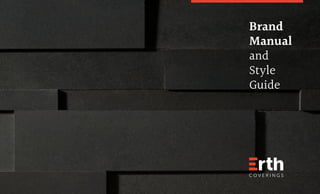
ErthCoverings - Brand Manual 2018
•
2 likes•235 views

This document provides Erth Coverings' new brand manual and style guide. It outlines the company's mission and vision to become the most admired natural stone veneer brand. It introduces the new logo design and provides guidelines on its proper usage and applications. It also establishes the brand's color palette, typography, and templates for various marketing collateral. The style guide aims to sculpt a unified brand identity and positioning for Erth Coverings in the years to come.

Recommended
More Related Content
Similar to ErthCoverings - Brand Manual 2018
Similar to ErthCoverings - Brand Manual 2018 (20)
More from Victor Schmidlin
More from Victor Schmidlin (9)
Recently uploaded
Recently uploaded (20)
ErthCoverings - Brand Manual 2018
- 2. 2 Casting the Stone for Change. Erth produces and distributes high-quality natural stone veneers under the brand Erth Coverings. An innovative brand and a pioneer in the natural stone veneer industry, Erth Coverings is preferred by many renowned designers, architects, renovators, builders, stone cladding professionals and DIYers throughout North America. We love what we do and we do it very well. Since our inception in 2002, we have strived to be the best that we can be in every aspect of our business, and this shows in the great success and growth that we have experienced. Our stringent quality control and constant efforts to exceed our customers’ expectations, sets us apart. We love our stone, and we are now demonstrating it by rethinking our corporate identity and market positioning, to be more inline with what our customers expect from a leading brand. Ivan Rapa, Founder
- 3. 03 05 Our Mission and Vision Statements 06 Brand Temple: Foundations 08 Brand Temple: Pillars 09 Brand Temple: Tagline 11 The New Logo 12 Construction and Proportions 13 Minimum Protection Areas 14 Minimum Sizes 15 Correct Applications 16 Application Don’ts 18 Colour Palette 21 Typography 24 Web Design Elements 25 Corporate Identity 26 Stationery 28 Clothing and Gifts 32 Vehicle Fleet 35 Templates - Print Ads 36 Templates - Product Sheets 37 Templates - Technical Documents 40 Templates - eBlasts 41 Communication Guidelines 42 Brand and Voice Tonality 43 Key Selling Points 44 Photography Table of Contents
- 5. 05 Our Vision and Mission Statements Vision To become North America’s most admired natural stone veneer brand for homeowners, designers and professionals. Mission To develop fashionable, high-quality and sustainable natural stone veneer products that people are inspired to use in their homes.
- 6. 06 Brand Temple: Foundations Pioneerism,AdaptabilityandInnovation BeautySetinStone Respect SupplyChain Sustainability Design Service Quality Pioneerism, Adaptability and Innovation Pioneerism: Do it first, make it memorable. ErthCoverings was the first company to introduce natural stone veneer panels into Canada in 2002. We keep on looking for new alternatives and new opportunities. Forward thinking, smart ideas and taking risks motivate us. Adaptability: The world is always changing – people with different backgrounds move all around the world, governments work on new regulations, quarries can vary their compositions and colours. Our brand needs to think ahead and be ready to adapt to the market, to customer expectations, and to inevitable and uncontrollable circumstances. Innovation: Just like a stone shaped by nature throughout millions of years, we believe that perfection is created by a continual, endless, and never ceasing effort. We believe that constant improvement of our products and processes, as well as planning and development of new collections, are both fundamental to retaining a leading position in the market and to continuing to be regarded as a trendsetting brand that offers innovative designs. The brand foundations represent our internal culture and beliefs. Concepts that are immutable and that helped shape who we are today. We apply this philosophy to everything we do.
- 7. 07 Brand Temple: Foundations Pioneerism,AdaptabilityandInnovation BeautySetinStone Respect SupplyChain Sustainability Design Service Quality Respect Respect is the base of everything we do. Our culture is built on loyalty, consistency and care. We respect nature: We only work with responsible quarries that use the most current extraction procedures, and we make use of raw materials that would be considered post-industrial-waste in order to reduce the consumption of natural resources. We respect people: From internal staff to third parties that source our raw materials, to shipment, sales and delivery, every stakeholder in our sales chain deserves respect for their dedication or their decision. Every person that holds ErthCoverings in high- esteem helps to solidify our name as a brand that can be trusted. We respect partnerships: Our suppliers, our dealers and distributors – we work to create bonds for life with all of them, acting in a way that ensures mutual benefit and progress. We respect expectations: Our products follow rigid quality control in order to be able to present the same look and feel between a sample seen in-store and in the box the client receives. Quality We imprint quality in every aspect of the product, in our respect for every individual involved, in our service and after-sales support, and in everything that comes together to differentiate our product. Unmatched quality is our our daily rallying cry and it sets us apart from our competitors.
- 8. 08 Brand Temple: Pillars Pioneerism,AdaptabilityandInnovation BeautySetinStone Respect SupplyChain Sustainability Design Service Quality In order to create high-quality products and a great customer experience, ErthCoverings relies on four main pillars – the strengths of our business model. Supply Chain We apply stringent rules to guarantee quality and precision when: Sourcing new suppliers Quarrying raw materials Manufacturing products and samples Packaging Warehousing and transporting Validating dealers and distributing products to retail Delivering products to the end user Sustainability Our products are developed with their impact on the planet, the surrounding communities, and the people we partner with in mind. They need to be: Socially responsible Environmentally friendly Energy efficient Design Our stone veneers have to create a great impression, inspire pride of ownership and be designed to last. In order to be a trendsetting brand, our products need to offer: New ideas and styles Uniqueness Batch consistency Clever methods of installation and application Service Satisfied clients always return to and refer the brands they trust. Credibility is built with excellence, so we treat customers and sales professionals exactly the way we want to be treated: with the respect and attention they deserve. Key B2C service differentiators: Knowledge database for homeowners After-sales support Lifetime warranty Key B2B service differentiators: Knowledge database for designers, professionals and dealers Marketing support for dealers Technical support for professionals
- 9. 09 Brand Temple: Tagline Pioneerism,AdaptabilityandInnovation BeautySetinStone Respect SupplyChain Sustainability Design Service Quality ErthCoverings’ new tagline sums up what our brand promises will mean to our buyers. But, we need to be cognisant that today’s capitalism is about creating value to people: there’s a difference between what we offer and what buyers will consider an essential or important feature in a product they intend to purchase. What do we offer? A high-quality, unique, sustainable, easy-to-install product. These technical attributes could be expanded upon indefinitely. Yet, what do customers want when they are improving their homes? To beautify their homes, to be proud of their renovated space, to impress, to create a wow factor. Everything else we say will support the sale, but won’t be the main reason. In the end, our unique-selling- proposition should be understood by our customers as “we’re in business to make your home more beautiful”. This is why our tagline states that we sell products that are undeniably beautiful, impressive, like a poem engraved in stone or a sculptural artwork. A product that transforms raw stone into a feature wall or an inspiring path that looks like a piece of art, turning your home into your masterpiece. A personal monument dedicated to your good taste. Beauty set in stone. Beauty set in stone. Beauty is what buyers are looking for. Set is a powerful word. It is action oriented and speaks to how the product is assembled, arranged, laid out, and installed. In stone as per the natural material. A literal explanation of the product. Set in Stone means truth and trust. It’s our guarantee. Something you don’t need to question.
- 11. 11 Erth Lavastone Black CMYK 0, 15, 25, 95 RGB 50, 38, 30 HEX 32261E PANTONE Black 4 C Benjamin Moore 2118-10 Erth Lava CMYK 0, 90, 95, 0 RGB 239, 65, 41 HEX EE4128 PANTONE PMS 179 C Benjamin Moore 2011-10 This is an evolution of Erth Coverings’ logo. It still maintains the same sans-serif typeface as the previous version, but now the classic Grotesk sans-serif has received a geometric treatment and more dynamic proportions. Inspiration was drawn from both the well-known Futura family and the modern and sturdy Museo Sans. A custom design to give Erth Coverings the unique personality it deserves. The icon, once a letter E separate from the logotype, is now incorporated into the main visual element, creating an immediate reference to the product installation (strips) in a single, concise and easy-to-read composition. The colours have evolved as well. The orange received a more modern and darker treatment to create a premium appearance and to better balance the strength of the black area. The whole composition is condensed for better application in many situations, making it easy to reduce and quick to recognize. The New Logo
- 12. 12 The modernized Erth Coverings logo was designed using a proportion of 7:4 (width x height). The goal was to maintain the horizontal proportion while reducing the wideness of the previous version, which posed a challenge in some restricted space applications. Instead of a regular grid, the alignments were defined based on the proportions of the letter E from the Museo Sans 900 font. The new E icon with its modern and robust shape, defines a rigid set of rules represented by two different heights (x and y) for the subsequent letters to follow, creating a more geometric, architectural feel throughout the logo. The word Erth (the brand name) received more importance than the word Coverings (what the brand does) as Erth itself can expand its offerings in the future and easily update the bottom part of the logo. The word Coverings was simply spaced away from the Erth element by its own height (represented by the letter z in the construction grid). x 7 4 x z z y x y Construction and Proportions
- 13. 13 No object, text (except for a tagline) or other logos can invade the proposed minimum protection area, represented by the width of the letter “E” of the logo. The same distance can be applied as the vertical minimum distance. Minimum Protection Area x x x x x
- 14. 14 ErthCoverings’ new logo was designed to optimize legibility even at the smallest of sizes. If a space requires a smaller application – on a pen, for example – it’s recommended to exclude the support line “Coverings”. Finally, although the logo is readable while small, remember that different printing processes might not deliver an optimum result. A golden rule for sizing the logo: ErthCoverings is a premium brand, so avoid going too big as well. Prioritize white spaces and layout harmony to create an elegant brand presence. 1 1/2 in 1 in 3/4 in 1/2 in Minimum Sizes
- 15. 15 4 colours (CMYK) or 2 colours (Pantone) 1 colour versions with 50% shade on E Solid 1 colour versions Correct Applications: Colours
- 16. 16 Never alter the proportions. Do not stretch or compress the logo in any way. Never alter colours. The only permitted colours are the versions explained on the previous page. Don’t apply any kind of perspective. Do not distort or rotate the logo. Don’t use effects of any sort. No drop shadows, no glow, no embossing, no 3D or extrusion, no outlines, no gradients. Application Don’ts
- 18. 18 ErthCoverings’ selection of hues and tones was inspired by natural elements such as earth, sand and stone, and by classic paintings that utilized pigments extracted from nature. The orange tonalities derived from the logo are intended to be used as accent colours for buttons, call-to-actions and other attention grabbers. They are vibrant and subconsciously tell the audience of the importance of the highlighted information. But no more than 5-10% of the page should use those warm variants. Overuse will tend to add too much dynamism to a layout that needs to feel as peaceful and comfortable as the spaces ErthCoverings helps create. Backgrounds and secondary visual elements will prioritize the use of softer, calmer and more serious colours to convey refinement and the classic look and feel of a premium brand. Colour Palette
- 19. 19 Highlight Colours: Warm Tones Secondary Colours: Reassuring and Refined Erth Lavastone Black CMYK 0, 15, 25, 95 RGB 50, 38, 30 HEX 28251C PANTONE Black 4 C Benjamin Moore 2118-10 Ash Limestone CMYK 57, 51, 56, 23 RGB 104, 101, 94 HEX 68, 65, 5E Terracotta CMYK 0, 90, 95, 15 RGB 207,56, 35 HEX CF3823 Grey Wolf CMYK 30, 25, 25, 0 RGB 181, 179, 179 HEX B5B3B3 Silver Fox CMYK 6, 5, 5, 0 RGB 236, 235, 234 HEX ECEBEA Erth Lava CMYK 0, 90, 95, 0 RGB 239, 65, 41 HEX EE4128 PANTONE P 45-8 C Benjamin Moore 2011-10 Blustone CMYK 10, 5, 0, 70 RGB 97, 101, 109 HEX 60656D Mountain Grey CMYK 26, 22, 25, 0 RGB 190, 186, 181 HEX B3BAB5 Clay CMYK 0, 90, 95, 30 RGB 178, 46, 26 HEX B22E1A White Wolf CMYK 5, 3, 3, 0 RGB 239, 240, 241 HEX EFF0F1 Coral White CMYK 1, 0, 0, 1 RGB 247, 249, 251 HEX F7F9FB Dover Cream CMYK 0, 3, 8, 3 RGB 246, 236, 224 HEX F6ECE0 Kakadu Green CMYK 8, 0, 4, 2 RGB 226, 239, 237 HEX E2EFED Colour Palette Highlight and Secondary Colours
- 20. 20 A Natural Feel Use the colour picker tool from your favourite software to capture these tones and use them on your layouts. Colour Palette Complementary Colours
- 21. 21 Light – AaBbCcDdEeFfGgHhIiJjKkLlMmNnOoPpQqRrSsTtUuVvWwXxYyZz0123456789 Regular – AaBbCcDdEeFfGgHhIiJjKkLlMmNnOoPpQqRrSsTtUuVvWwXxYyZz0123456789 Medium – AaBbCcDdEeFfGgHhIiJjKkLlMmNnOoPpQqRrSsTtUuVvWwXxYyZz0123456789 Semibold – AaBbCcDdEeFfGgHhIiJjKkLlMmNnOoPpQqRrSsTtUuVvWwXxYyZz0123456789 Bold – AaBbCcDdEeFfGgHhIiJjKkLlMmNnOoPpQqRrSsTtUuVvWwXxYyZz0123456789 Thin – AaBbCcDdEeFfGgHhIiJjKkLlMmNnOoPpQqRrSsTtUuVvWwXxYyZz0123456789 Light– AaBbCcDdEeFfGgHhIiJjKkLlMmNnOoPpQqRrSsTtUuVvWwXxYyZz0123456789 Regular – AaBbCcDdEeFfGgHhIiJjKkLlMmNnOoPpQqRrSsTtUuVvWwXxYyZz0123456789 Medium – AaBbCcDdEeFfGgHhIiJjKkLlMmNnOoPpQqRrSsTtUuVvWwXxYyZz0123456789 Bold – AaBbCcDdEeFfGgHhIiJjKkLlMmNnOoPpQqRrSsTtUuVvWwXxYyZz0123456789 ExtraBold – AaBbCcDdEeFfGgHhIiJjKkLlMmNnOoPpQqRrSsTtUuVvWwXxYyZz0123456789 Black – AaBbCcDdEeFfGgHhIiJjKkLlMmNnOoPpQqRrSsTtUuVvWwXxYyZz0123456789 A serif typeface with a very classic feel, yet with a modern touch that makes it look timeless and elegant. With a resemblance to the Mercedes Benz font style, it is very legible and confers a timeless appearance to the brand. It complements the newly redesigned logo, with its architectural, geometrical and modern forms to create the feel of a premium brand. HEADLINE FONT Halant A versatile and humanist sans serif typeface that is easy to read. It is ideal for paragraphs and longer body copy and is available in a variety of different weights. It encompasses a modern elegance and pairs seamlessly with the headline font. BODY FONT Alegreya Sans Typography Fonts
- 22. 22 H1 HALANT REGULAR 52PX UPPERCASE HEX#28251C H2 Halant Medium 45px HEX#28251c H3 Halant Regular 36 px HEX#28251c <H3>Headline</H3> H4 Alegreya Sans Medium 24 px HEX#28251c H5 Alegreya Sans Medium 18 px HEX#28251c H6 P Alegreya Sans bold 15 px HEX#28251c Alegreya Sans Medium 15 px HEX#60656d Headlines Hierarchy Text Example <H6>Alegreya Sans bold </H6> <p>Sed ut perspiciatis unde omnis iste natus error sit voluptatem accusantium doloremque laudantium, totam rem aperiam, eaque ipsa quae ab illo inventore veritatis. Sed ut perspiciatis unde omnis iste natus error sit voluptatem accusantium doloremque laudantium. Sed ut perspiciatis unde omnis iste natus error sit voluptatem accusantium doloremque laudantium, totam rem aperiam, eaque ipsa quae ab illo inventore veritatis. Sed ut perspiciatis unde omnis iste natus error sit voluptatem accusantium doloremque laudantium, totam rem aperiam.</p> Typography for Web
- 23. 23 Using System fonts can sometimes be a challenge. Example of headline using Erth’s print and web fonts. Example of headline on Windows Documents. Sharing files between computers using different systems or Office versions might create a problem when using custom fonts. This would require third parties to install font files just to be able to visualize the document as intended. Only in these cases, such as when creating a Word, Excel or PowerPoint file, it is permitted to use similar fonts available for Windows. They lack the same refinement of Erth’s font collection, but they can keep a certain level of standardization and professionalism across all of the documents produced by the company’s staff. Editataque rem lati dolla doluptam fugit am voluptius. Nam qui suntibea quae sus quam harciis aborit, optam int, occusandit la quos ditinition pror maionse nisima experi dolorerepel ellecae iunt qui aliae rem inciendae nit dolese plit hilit re maiossequat pos dent quibus net vernatem aut arciis delecta volent. Editataque rem lati dolla doluptam fugit am voluptius. Nam qui suntibea quae sus quam harciis aborit, optam int, occusandit la quos ditinition pror maionse nisima experi dolorerepel ellecae iunt qui aliae rem inciendae nit dolese plit hilit re maiossequat pos dent quibus net vernatem aut arciis delecta volent. Typography for Windows and Microsoft Office HEADLINE FONT Georgia BODY FONT Calibri Regular – AaBbCcDdEeFfGgHhIiJjKkLlMmNnOoPpQqRrSsTtUuVvWwXxYyZz0123456789 Bold – AaBbCcDdEeFfGgHhIiJjKkLlMmNnOoPpQqRrSsTtUuVvWwXxYyZz0123456789 Regular – AaBbCcDdEeFfGgHhIiJjKkLlMmNnOoPpQqRrSsTtUuVvWwXxYyZz0123456789 Bold – AaBbCcDdEeFfGgHhIiJjKkLlMmNnOoPpQqRrSsTtUuVvWwXxYyZz0123456789
- 24. 24 CALL TO ACTION CALL TO ACTION CALL TO ACTION CALL TO ACTION Inactive Inactive On Hover On Hover Selected Selected Disabled Disabled CALL TO ACTION CALL TO ACTION CALL TO ACTION CALL TO ACTION Buttons: 1st Level Buttons: 2nd LevelIcons: Positive and Negative Tools for Professionals Tools for Professionals Erth’s Toolbox Erth’s Toolbox Resource Library Resource Library Tools for Dealers Tools for Dealers People are Saying Lifetime Warranty Share / Pin People are Saying Lifetime Warranty Share / Pin Loyalty Program Loyalty Program Selection Criteria Selection Criteria Visualizer Visualizer Maintenance Maintenance Information Information Search Search Installation Installation FAQ FAQ Favourites Favourites Cart Un favourite Download Customer Care Favourites Favourites Cart Un favourite Download Customer Care Web Design Elements
- 26. Stationery 26
- 27. Stationery 27
- 32. 32 Vehicle Fleet
- 33. 33 Vehicle Fleet
- 34. 34 Vehicle Fleet
- 35. 35 Corporate Templates Print Ads Lorem ipsum dolor sit amet,consectetur adipiscing elit.Maecenas viverra lectus non elit ultrices,sed fermentum nisi tincidunt. Vestibulum ante ipsum primis in faucibus orci luctus et ultrices posuere cubilia Curae; In varius mollis orci eget efficitur.Phasellus pharetra est id mauris convallis,non imperdiet massa sodales.Suspendisse in ante odio. erthcoverings.com Beauty Set in Stone. Lorem ipsum dolor sit amet. Lorem ipsum dolor sit amet,consectetur adipiscing elit. Maecenas viverra lectus non elit ultrices,sed fermentum nisi tincidunt.Vestibulum ante ipsum primis in faucibus orci luctus et ultrices posuere cubilia Curae; In varius mollis orci eget efficitur. Lorem ipsum dolor sit amet. Beauty Set in Stone. DOV-CAS DOVER FOS-CAS FOSSIL FOS-CAS FOSSIL 905.265.8565 erthcoverings.com
- 39. 39 Corporate Templates Technical Documents Detail Drawings INSTALLATION OVER Z-GIRTS 1.Brick Detail 2.Parapet Detail 3.Pre-Cast Sill Detail 4.Window Head Detail 5.Window Jamb Detail 6.Wall Base Detail INSTALLATION OVER SHEATHING AND WOOD STUDS 7.Pre-Cast Sill Detail 8.Wall Base Detail 9.Pre-Cast Sill Detail-Window 10.EIFS Detail 11.Adjacent Finish Detail 12.Soffit Detail 13.Window Head Detail 14.Window Jamb Detail 15.Window Sill Detail 1 2 3 7 10 8 69 43 1113 12 14 5 2 1 7 8 3 9 6 4 14 12 1113 5 15 10 erthcoverings.com Beauty Set in Stone. Brick Detail Installation over z-girts BRICK VENEER RODAND CAULKING MINIMUM 3/8″ VERTICALZ-GIRTS SPRAYFOAM INSULATION 10 MILCAVITYSYSTEM 1/2″ CEMENTBOARD POLYMER MODIFIED MORTAR ERTHCOVERINGSAS SPECIFIED erthcoverings.com Beauty Set in Stone.
- 42. 42 Naturally the best. Perfected by Nature. Time makes perfection. Inspired by Nature. Perfected by hands. Inspired by Nature. Nature and craft at its best. The elements conspire in your favour. Be the first to cast the stone. Inspiration, carved in stone. Brand and Voice Tonality When communicating to customers, designers, architects, installers and its sales chain, ErthCoverings assumes a market leader approach. We make sure our audiences perceives the brand as highly competent, reliable, and premium. We want to ensure that people feel confident about their choice in a product that is recognized for its superior quality, easy installation, innovative looks and design flexibility, one that matches with many different tastes and styles. Yet, when you know you offer the best option, there is a thin line between sounding confident and sounding arrogant. ErthCoverings offers a superior product, but they do so using an approachable and inclusive tonality. Possible headlines and call-outs to be used in sales materials and on the website. The Stepping Stone to Style. Quality is natural. Beauty is natural. Artisan style. Natural beauty. Artisan inspiration. Natural beauty. Artisan class. Natural beauty. Artisan elegance. Natural beauty. Artisan’s touch. Nature’s signature. Premium stone veneers. Natural elegance. Nature’s signature for your home. Nature’s signature. Variations of the tagline are totally allowed and encouraged. Quality set in stone. Certainty set in stone. Set your style in stone. The best is set in stone. The Reinvention of the Stone Age. Welcome to the Stone Age. The Heart of the Stone. The majesty of nature at your home. The majesty of nature. The magic of details. From nature to your personal habitat. Make your bathroom your own personal spa. Your own natural feel. Your own natural style. Nature’s best impression. Try to call the attention of the audience with something catchy and clever, creating an emotional connection or an analogy to something beautiful, meaningful, artisanal or precious.
- 43. 43 Product Attributes and Key Selling Points ErthCoverings doesn’t compete for price. We acknowledge that we offer a superior product and we want our customers to make a confident decision when renovating or decorating their homes. When writing for web, advertising, sales support materials and collaterals, or any communication piece that will present our key selling points, refer to this section in order to choose some of our differentiators what will matter most to the target in a specific campaign: The Things You See Perception: our products create a great impression where they are installed. They promote a sense of grandness and elevate the perception of the environment. Premium:each piece of stone we use has millions of years of history that makes it unique. No single box of ErthCoverings’ products is equal. Our stone selection criteria, our strict assembly procedures and our differentiated collections all help to create a more prestigious and consistent product. Consistency: each batch has to be consistent in colour and texture, and flat panels and corner panels are made from the same batch. Each lot is colour matched and approved prior to shipment, with all orders being inspected before they leave the production facility. When natural colour variation in stone occurs, dealers are informed and new samples are provided. Consistency is key, perception is everything. Uniqueness: we source different quarries around the globe in order to offer exclusive lines of products, unmatched in the industry. Ease-of-Use: our product is always designed with usability and versatility in mind. Homeowners renovating their homes must get great results even when installing the product themselves. Precision: each stone saw used to cut raw material is inspected and calibrated daily according to stringent standards, ensuring straight cut panels and tiles that fit tight and leave no gaps after installation. Our products are warehoused in a climate-controlled environment to reduce further variations. The Things You Get Quality Control: because product quality is of such importance to us we have partnered with our suppliers to establish rigorous quality control processes guided by our code of standards. Every ErthCoverings product goes through a checklist with 42 points of quality control, from raw materials to packaging and delivery. Our policies are extended to selecting only the best stores and to referring only qualified partners and vendors, and we absolutely refuse to conduct business with suppliers who do not meet or exceed these standards. DesignedforEfficiency: home builders and renovators that utilize ErthCoverings products in their projects qualify for extra points toward LEED (Leadership in Energy and Environmental Design) Certification. Sustainability: our panels use 100% post-industrial-waste material, collected from stone producers and quarries, resulting in reduced quarrying, lower consumption of raw materials, reduced energy required to extract raw materials, reduced transportation emissions, and less energy and material required to install each square foot of product. An environmentally friendly solution that minimizes ecological impacts by maximizing the use of already extracted stones. Social Responsibility: ErthCoverings condemns poor work conditions. Our facilities, spread throughout different parts of the world, must be exemplary in terms of promoting a healthy and safe work environment; equipped with fresh running water; places employees and their families are proud to be a part of; and where clients can be sure they are choosing a clean and conscious product. Lifetime Warranty: ErthCoverings only develops products that excel in terms of longevity. As a natural material, stone colours and texture may vary over the years, but our collections are designed to last and to satisfy our customers for life. Knowledge: our business relies on experienced people that know exactly how to assemble each unique stone tile we produce so that we can offer a differentiated product, and so that DIYers or installers can be provided with clear instructions and their projects will look exactly as desired. Service Excellence: for dealers, ErthCoverings provides marketing support and ensures that all samples and product information are kept up-to-date. For installers, we provide technical support as well as testing data, and on-site support when required. For customers, any product deemed damaged or unusable will be returned and exchanged at our expense. Our brand prides itself of offering unmatched customer service.
- 45. 45 Photography: Creating a New Image Bank These samples, taken from the internet, exemplify the intended art direction when producing new photography for ErthCoverings. They highlight the stone veneers and tiles being used in the following ways: A focus on the feature wall, generally centralizing on the stone finish. The product is the star of the show. The pictures have their angles corrected (normally caused by lens distortion) and are very precise, with parallel, straight lines. Perfect use of light and shadows to enhance the texture, the 3D effect and the way the stone interacts with the ambiance. A consistent colour palette with emphasis on whites, beiges, browns, greys and blacks to create a natural, comfortable and refined space. Even when presenting a very calm colour palette, the addition of accent lights, colourful greenery and other objects add warmth to the photo’s composition. Life is felt in the room through the use of people (without making them the center of attention), plants, etc. Natural objects and organic shapes also help by breaking the rigid lines of the architecture. Sample photography-product application Sample photography-product application
- 46. 46 Erth Coverings Brand Manual and Style Guide 2018. Project designed by NGEN Communications. All rights reserved. This is an internal document. The strategies contained in this file are proprietary, confidential and provided for the exclusive consideration of the person that it was intended for. Acceptance of copies either written or in electronic form signifies the recipients’ agreement that none of the information contained in this document shall be released or made available to persons within the recipients’ organization who do not have a need to know or who are not otherwise involved in the evaluation of marketing decisions. Unless otherwise required by law, this information must not be disclosed, directly or indirectly, to any other offer or competitor, without the prior written consent of Erth Coverings and NGEN Communications ©2018.