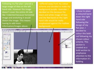
1. Following my flat plan I placed a large image of Alex on the left hand side. However the image doesn’t cover the entire A4 side like I indented because horizontal image and stretching it would distort the image. This means having to add more information/images above. I differed away from my colour scheme and decided to make my background purple –lavender. I decided on this because the black and white image of Alex and the Red band on the right hand side would be really emphasised against the mellow background. I chose to place a coloured band down the right hand side following the design of my flat-plan. I decided to colour this bold red following my chosen colour scheme. This section is created as a bold section to emphasise attention to the information it’s holding.
2. I inserted my Q&A article in an obvious Colum format filling the majority of the right hand side of the page. The font is an italic “Calibri” font size 10. I chose italics to make it look more interesting and the size seemed appropriate for the amount of content, it filled the page appropriately. Because it was a Q&A I decided to change the colouring of the questions to a blue (sticking with the popular colour from my questionnaire) and than the answer in a solid white which contrasts greatly against the lavender type background I chose. I also added an image of “Alex Mountford” Art work for his album cover to the red strip I created on the left hand side. I decided from this point onwards that this will be seen as an advertising area for my featured artist. This album cover projects the advertisement of his E.P. Also the colours add a bubbly focus to the page. With the positioning you will see that I placed it slight larger than the column. This simply just makes positioning and sizing interesting.
3. This was the only Image of Alex I took on the black and white setting. As you can see I manipulated the image by slipping it so that Alex himself would be placed at the side rather than in the centre of the page. Because I wanted the main image to be on the left hand side of the page. You can also see that I have enhanced the contrast of the colours so that the blacks and whites seen on the page are thick. As you can see I have removed the tree trunk behind Alex's head and painted in over the greys towards the top of the background do that the image can slowly blend out into white to cover the top of that entire page. This makes the image cover this entire page of A4 without stretching it. I have also painted in a top section of the tree on the left so that there is no blunt end keeping the image flowing.
4. At the top of the column I inserted an arrow which I intend to point to another advertisement. Once again the corners of the arrow section hang of the edge of the blunt strip just to make it interesting and slightly imply a 3D effect. This also makes the page interesting with the playing around with the use of shapes., To create this tag I found a template on the internet which I simply cut and edited within ‘gimp’ to make it appropriate for my magazine, it’s an individual piece constructed of several layers I placed it on the white background in the sweet spot to fill space and also so it will be more noticeable right away. It gives the page a much more scrap book feel. This gives it a higher audience appeal within my age range. After some evaluation with my tutors we decided the lavender didn’t grasp the attention of my audience positively, after testing out various colour I went back to my initial research and changed the strip to a bright blue (one of my most popular colours in the questionnaire) I changed it to this so I could successfully use my other top colour as the main colour for the background. Red implies dominance and makes the page much bright and more exciting and youthful targeting my audience appropriately.