
Recommended
More Related Content
What's hot
What's hot (13)
Similar to Branding Style Guides
Similar to Branding Style Guides (20)
Recently uploaded
Recently uploaded (20)
Branding Style Guides
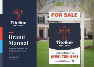
- 1. Brand Manual Rules and guides for the design elements brand Titeline Construction Titeline Realty Group Titeline Properties REALTY GROUP
- 2. “ To be successful in real estate, you must always and consistently put your clients’ best interests first. When you do, your personal needs will be realized beyond your greatest expectations. ” - Anthony Hitt Manifesto. REALTY GROUP
- 3. One of the key priorities for a successful brand is a consistent presentation which everybody recognizes straight away. Irrespective of where and when someone encounters the brand, be it a consumer or business partner, in print, mailing or catalogue, he/she must always feel the same way: “it can only be Titeline Properties” It will take discipline and consistency, but it will pay out. The brand – as idea, promise and experience – must fulfill 5 standards: 1. It must be relevant to a real or projected need. 2. It must be deliverable. 3. It must be credible. 4. It must be differentiating. 5. It must be both inspired and inspiring. The identity comprises of a very simple kit of parts which used together carefully with the correct relationships will form the distinctive visual expression of the Titeline Propoerties brand. This document outlines the components, their structure and their relationships which will help you to apply the Titeline Properties brand consistently across all communications. Every detail of the Titeline Properties brand identity has been created to ensure that it is expressive of the brand and its values. The identity is designed to meet the future challenges of a competitive consulting business, and to connect naturally with our customers. If you have any questions along the way, please e-mail the Creatx Marketing Brand Team at hello@CreatxMarketing.com or call (480) 490-1780 Introduction.
- 4. Brand Positioning. Our Brand Our Mission Our Vision WE GUIDE A DEMANDING INTERNATIONAL CLIENTELE IN THEIR SEARCH FOR THE EXTRAORDINARY. We are the most innovative company in the veteran real estate sector. We specialize in brokering the sales of the most respected properties and operate according to a highly technological business model that allows maximum efficiency in managing the sales process and making our clients experience effortless. Working within the national and international property market, Titeline Properties was created solely to specialize in the veteran real estate segment. The careful selection of properties carried out by professionals at Titeline Properties is finalized towards the most proficient placement of properties within the selected target audience. Our mission is to modernize and progress the experience of buying and selling real estate by cultivating a spirit of collaboration, innovation, and integrity. To be the only TRUE real estate franchise that provides an EXCELLENT & CONSISTENT customer experience 100% of the time. We base every decision on what’s best for our clients, our company as a whole and individual team members. We commit to help our clients build wealth through quality advisory, consulting and management of their real estate assets.
- 5. Core Values. Our brand values reflect our core ideologies and drive the decisions we make. They act as a reality-check which helps us to ensure that design, photographic and written communications express the unique character of Titeline Properties. Every piece of work needs to encapsulate and express something of each value, and should not contradict these values under any circumstances. These values statements reflect what we must live, breathe and reflect in all our daily activities. They are the guidelines for driving every associates’ day-to-day decision making and are the tools to help bring the brand to life. We exist to keep our clients satisfied; our colleagues & collaborators happy; our staffs fulfilled and motivated; our management proud and celebrated; our brand competitive and progressive. To achieve the above, we pride ourselves on these Values: We keep our promises: we are honest, trustworthy and ethical in our all actions. We are research driven: we give reliable information that help our clients make the right decisions. Our clients are the driving force of our existence; keeping them satisfied is the fundamental reason for our existence. Integrity Competence Quality Client We work together to achieve more. We commit to achieving common goals. We support one another. We are quick to act and respond to clients needs and we perform our duties without delay. We are professional and adaptable to the varied needs of our clients: we provide exceptional services. Team Work Prompt delivery Versatility
- 6. Ideal Clients. Between the ages of 30 and 55 They are willing to price it right The home they are selling was built after 1990 They are willing to do the recommended repairs They have an email address and are willing to sign electronic documents They are selling this home and buying another with us
- 7. Tone of Voice. Developing a distinct tone of voice is about reflecting your personality as an agent. This will be present in both verbal and written communication; how you greet people, your email sign-off, your social media posts, and even your celebratory phrase of choice when a deal goes through. When it comes to writing a real estate ad, there are various parts of the message to get across The facts These are the property’s features, the type, and size. The appeal What are the standout features and benefits of the home? Is it the location, the decor, the section size, or the view? These key points are often what you’ll bring out into your headline. The ideal audience Your target market is often implied by your tone of voice. Are they seasoned investors or hopeful first home buyers? Know your audience Take the time to understand your audience and learn their vocabulary, so you can speak in a tone of voice that they can relate too. Developing your unique tone of voice is an opportunity to put your own flair into things and it can even form part of your point of difference as an agent.
- 8. Name, company logo, colours, typeface: these are the pillars of the identity of the company. Their characteristics ensure an individual and consistent image of the company on the market. The graphic of the definitive logo is very clean, square, linear, essential, strong and emphasizes the values of the brand. The logo is a graphic comprised of the wordmark (logotype) and figurative mark (symbol). The lettering is created using the Proxima Nova typeface, and the stylized anchor with column+lines is inseperable. The logo should be always produced from the master artwork. The only time you should use the symbol alone is on the website or social media channels where there are other elements to help the user recognise the brand. The Titeline Properties logo can exist with an “inverted” colour scheme, which means that the main colour is dark blue and the details remains tangerine on a light background. The monocromatic version has been specifically designed to meet some specific printing requirements. They should not be used in other circumstances. Company Logo.
- 14. Anchor Column (Strength) Business Name Real Estate TITELINE PROPERTIES + + + = Concept Storytelling.
- 15. Brand Color Palette. Our company colours are professional and modern, expressing who we are. Pantone 101-16 C is the main colour of the Titeline Properties identity so it has the strongest presence on our brand. Pantone 663 C complements the dark blue colour, creating balance and making the palette more distinctive and sophisticated. Pantone 17-1463 C balances the other colours and gives space to the elements. Alternative colours should not be introduced into the system, or they would reduce the impact of our colour palette. The Titeline Properties logotype can be produced only from these colors. Please select the most appropriate color for your communication and over time try to use them equally so we don’t become associated with just one color. You should always try to use the positive (main) version of the logo. However, when the background is the same colour as an element of the logo you can use the negative version. The secondary color palette may be used in moderation when you require an alternate option for items like charts, diagrams or special highlights. They are not to be used as a primary color.
- 16. PANTONE 663 C — C00 M00 Y00 K05 R242 G242 B242 Hex #F2F2F2 PANTONE 17-1463 C — C00 M82 Y80 K0 R225 G82 B61 Hex #E84632 PANTONE 101-16 C — C85 M75 Y45 K50 R45 G50 B67 Hex #2D3243 Light Grey — Minimal Balanced Honesty Tangerine — Preciousness Energy Exclusivity Dynamism Dark Blue — Sophistication Elegance Confidence Corporate
- 17. Light Grey — Minimal Balanced Honesty Tangerine — Preciousness Energy Exclusivity Dynamism Dark Blue — Sophistication Elegance Confidence Corporate PANTONE 663 C — C00 M00 Y00 K05 R242 G242 B242 Hex #F2F2F2 PANTONE 101-16 C — C85 M75 Y45 K50 R45 G50 B67 Hex #2D3243 PANTONE 15-1334 Shell Coral — C00 M54 Y49 K00 R234 G146 B118 Hex #EA9575 PANTONE 14-4320 Baltic Sea — C64 M10 Y00 K00 R121 G179 B224 Hex #79B3E0 Shell Coral Baltic Sea PANTONE Cool Grey 2 — C00 M00 Y00 K25 R207 G207 B209 Hex #CFCFD1 Cool Grey PANTONE 17-1463 C — C00 M82 Y80 K0 R225 G82 B61 Hex #E84632
- 18. Logo Grid. Designing a logo and a visual identity goes way beyond the free form and artistic side of what most people think. There is all the rational part including proportions, scaleability optical adjustments and reproduction that has to be thought in order to create an efficient and well design logo. The visual design guidelines will provide this information to ensure that the brand is used correctly. Here we want to illustrate the construction or guidelines of our logo. 2X 2X 3X 2X 3X 5X 1,5X 30X
- 19. Clear Space. We’ve defined an exclusion zone that stops other graphic elements interfering with the Titeline Properties logotype and make sure the logo is easy to read. Proportions, space and size relationships of all blocks have been carefully developed and must not be altered, redrawn, embellished or recreated in any way. An important part of maintaining a consistent presentation is keeping a clear space around the logo from other text, graphics or illustrations. Crowding the logo detracts from its legibility and impact.
- 20. Legibility. 32 x 32px App Icon / Favicon 70mm | A2 45mm | A3 30mm | A4/A5 20mm | 60px Minimum Size The logo should never be too small to read. It is not recommended to use the logo at less than 20mm or 60 pixels in width. The Titeline Properties favicon graphic is linked with the website: it is a smaller representation of the brand for the browser and for the mobile interfaces. Take into account that the favicon is not the brand logo and should never replace the logo.
- 21. Iconography.
- 22. Typography. Typography is a powerful tool in the development of a creative identity and is a key element to create a cohesive look across all communications. Using a typeface consistently makes it recognizable; it pulls together communications and makes them more distinctive. The style of type we use to bring our communication to life sets the tone of our brand: clean, modern, stylish, distinctive and legible. Selected fonts are a great combination between serif and sans-serif: Proxima Nova and Playfair Display.
- 23. Primary Typeface. PROXIMA NOVA by Mark Simonson ABCDEFGHIJKLMNOPQRSTUVWXYZ abcdefghijklmnopqrsutvwxyz 0123456789 .,?!(@+=/*)$%& Marty, is that you? That’s right. No, it was The Enchantment Under The Sea Dance. Our first date. It was the night of that terrible thunderstorm, remember George? Your father kissed me for the very first time on that dance floor. It was then I realized I was going to spend the rest of my life with him. Listen, I gotta go but I wanted to tell you that it’s been educational. How’s your head? Marty, is that you? That’s right. No, it was The Enchantment Under The Sea Dance. Our first date. It was the night of that terrible thunderstorm, remember George? Your father kissed me for the very first time on that dance floor. It was then I realized I was going to spend the rest of my life with him. Listen, I gotta go but I wanted to tell you that it’s been educational. How’s your head? Marty, is that you? That’s right. No, it was The Enchantment Under The Sea Dance. Our first date. It was the night of that terrible thunderstorm, remember George? Your father kissed me for the very first time on that dance floor. It was then I realized I was going to spend the rest of my life with him. Listen, I gotta go but I wanted to tell you that it’s been educational. How’s your head? Regular Semibold Extra Bold
- 24. Secondary Typeface. Playfair Display by Claus Eggers Sørensen ABCDEFGHIJKLMNOPQRSTUVWXYZ abcdefghijklmnopqrsutvwxyz 0123456789 .,?!(@+=/*)$%& Marty, is that you? That’s right. No, it was The Enchantment Under The Sea Dance. Our first date. It was the night of that terrible thunderstorm, remember George? Your father kissed me for the very first time on that dance floor. It was then I realized I was going to spend the rest of my life with him. Listen, I gotta go but I wanted to tell you that it’s been educational. How’s your head? Marty, is that you? That’s right. No, it was The Enchantment Under The Sea Dance. Our first date. It was the night of that terrible thunderstorm, remember George? Your father kissed me for the very first time on that dance floor. It was then I realized I was going to spend the rest of my life with him. Listen, I gotta go but I wanted to tell you that it’s been educational. How’s your head? Marty, is that you? That’s right. No, it was The Enchantment Under The Sea Dance. Our first date. It was the night of that terrible thunderstorm, remember George? Your father kissed me for the very first time on that dance floor. It was then I realized I was going to spend the rest of my life with him. Listen, I gotta go but I wanted to tell you that it’s been educational. How’s your head? Regular Bold Black
- 25. Application Examples. The following section brings all of the identity elements together to show the Titeline Properties Brand in application: we would like as many people and organizations as possible to use the identity elements of the Titeline Properties Brand. Please use these example applications as a visual guide to help you create your communications. This section demonstrate the flexibility of the brand, exploring the use of all the elements, elements working in partnership and logotype only.
- 28. Application Details. Paper: A4 110g / US Letter 24# Bond paper with cockle finish and 25% rag content Font and lines spacing: Proxima Nova 12pt, Line Height 16pt Colours: Text in Light Grey Graphics in Dark Blue/Orange Watermark: 4% opacity Distances: 15mm / 0.6 inches from all borders Paper: 90x55 mm 350g / 3.5x2 inches 80# Cover paper Font and lines spacing: Proxima Nova 8pt, Line Height 11pt Colours: Text in Light Grey Graphic details in Dark Blue/Orange Logo: Centered on the front 45mm width Top Left corner on the back 20 mm width Distances: 5mm / 0.2 inches from all borders Letterhead & Invoice Business Card Envelope DL Paper: A4 110g / US Letter 24# Bond paper with cockle finish and 25% rag content Font and lines spacing: Proxima Nova 12pt, Line Height 16pt Colours: Text in Light Grey Graphics in Dark Blue/Orange Logo: Top Left corner 40 mm width Distances: 10mm / 0.4 inches from all borders
- 30. For a strong corporate image, all email messages should identify the sender in a standard and clear manner. Please follow the example shown. To keep a professional look and to minimize file size, do not add any additional graphics, logos, slogans, or messages to your e-mail signature. Michael Dubert Real Estate Agent and Broker contact@TitleineProperties.com (956) 789-4141 www.TitelineProperties.com 951 W. Nolana McAllen, Tx. 78504
- 31. Corporate Identity A corporate identity is the overall image of a corporation or firm or business in the minds of diverse publics, such as customers and investors and employees. It is a primary task of the company communications department to maintain and build this identity to accord with and facilitate the attainment of business objectives. Identity Manual A formal reference document establishing technical and creative standards for a visual identity system. Typical standards include descriptions and specifications for reproducing the logo or logotype stationery system, common print and web applications and examples of use on merchandise. Logo A logo is a graphic mark or emblem commonly used by commercial enterprises, organizations and even individuals to aid and promote instant public recognition. Logos are either purely graphic (symbols/icons) or are composed of the name of the organization (a logotype or wordmark). Typeface/Font Family In typography, a typeface (also known as font family) is a set of one or more fonts each composed of glyphs that share common design features. Each font of a typeface has a specific weight, style, condensation, width, slant, italicization, ornamentation, and designer or foundry. There are thousands of different typefaces in existence, with new ones being developed constantly. Stationery Stationery has historically pertained to a wide gamut of materials: paper and office supplies, writing implements, greeting cards, glue, pencil cases and other similar items. Template A pre-developed page layout in electronic or paper media used to make new pages with a similar design, pattern, or style. Brand Brand is the “name, term, design, symbol, or any other feature that identifies one seller’s product distinct from those of other sellers.” Initially, branding was adopted to differentiate one person’s cattle from another’s by means of a distinctive symbol burned into the animal’s skin with a hot iron stamp and was subsequently used in business, marketing, and advertising. CMYK The CMYK color model (process color, four color) is a subtractive color model, used in color printing, and is also used to describe the printing process itself. CMYK refers to the four inks used in some color printing: cyan, magenta, yellow, and key (black). The “K” in CMYK stands for key because in four-color printing, cyan, magenta, and yellow printing plates are carefully keyed, or aligned, with the key of the black key plate. RGB The RGB color model is an additive color model in which red, green, and blue light are added together in various ways to reproduce a broad array of colors. The name of the model comes from the initials of the three additive primary colors, red, green, and blue. Primay Colors The core selection of identifying colors that are used in a logo. Palette A given, finite set of colors for the management of digital images. Glossary.