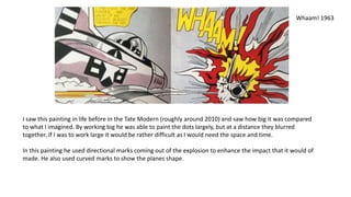
Roy Lichtenstein
b.1923 d.1997
Shannon Lewis
‘Roy Lichtenstein was one of the most influential and innovative artists of
the second half of the twentieth century.’ - Avis Berman
He identified with the pop art movement and his paintings were
influenced by comic strips and advertisement in a rendered style copying
the printing processes of newspaper reproduction. His paintings changed
the history of modern art.
Girl with Ball
1961
The skin of the girl (like I’ve noticed in many of
Lichtenstein’s paintings) is made up of many dots with
no shadow. The only sign of any tonal change is the
hair where there is very dark and also very light marks
contrasting against each other, and shows light
reflecting.
The dots on the skin also gives it texture, making it
contrast against the background and other objects in
block colours.
The figure is also flattened by the dark outline it has.
However you can still get a sense of form as you can
relate and recognise the shape of the objects and what
they symbolise: circle with lines curving from the
centre going red, white, red, white clearly states it
being a beach ball.
This monotone painting of a vase of flowers still shows similarities to
Lichtenstein’s more well known pieces but as has many differences.
To start with it is monotone, very different to his bold coloured
paintings like ‘Girl with Ball’. Making it much more eerie and more
comic book like.
Unlike the ‘Girl with Ball’, this painting uses a textured background
instead of a blocked colour. I feel like this works well as it fuzzes the
background bringing more focus on the object which is solid.
This painting uses directional lines on the flowers making it show
form. It reminds me a bit of Henry Moore and how he used
directional marks that curve around the subject. These marks in the
painting also shows the small indents of the petals (for instance on
the centre flower). Also another way the marks show form is how it
shows shadows: There are parts that are left white to show where
the light is mainly hitting it, gapped marks to show mid tone
shadows, and blocked marks showing the darkest of shadows.
Black Flowers 1961
This painting is rather tonal and shows a strong contrast of light on
dark on a face. The marks are once again directional, following the
shape of the face, hair and clothing. You can really understand
how the hair curls through the marks that are used that change
direction. However, I don’t fully understand how the marks on the
face work as they are jaggered. Is it trying to separate the face
from the clothing by having different marks?
Unlike the ‘Girl with Ball’, this painting uses a range of line quality
for the outline, portraying the form much more clearly. Some parts
such as the right side to the jacket doesn’t have much of an
outline and just blends in with the object itself. Making it appear
slightly more natural compared to the last two paintings I
analysed.
George Washington 1962
In the Car 1963
This painting is much more comic book
related as it shows a frame of something
that could lead to a story. For instance, it
has a dramatic atmosphere from the
speed marks across the females head and
also the moody facial expressions between
the two characters.
Like the ‘Girl with ball’, it appears that the
only bold colours that are used are
primary colours, no secondary colours. Is it
done to make certain features stand out?
Was he limiting himself?
He used straight, limited marks on the
faces to show where the face dents or
curves, for example under the eyes.
Keeping dark lines basic on lighter areas as
you don’t want them too over powering.
Dawning 1964
Lichtenstein even kept his landscapes simplistic, and
like the ‘Black Flowers’ painting he used the dots in the
distant background pushing the block coloured clouds
and (I think) sea into the foreground.
Even in this painting he still kept to primary colours
and black and white but not using blue. There is no
need for a blue in the particular landscape he had
painted because the sun realistically would alter the
colours to be yellows, reds and oranges.
I feel like he had based this painting off or influenced
by symbols; his clouds have resemblance to the
stereotypical cloud icon and he gave the sun beams.
Whaam! 1963
I saw this painting in life before in the Tate Modern (roughly around 2010) and saw how big it was compared
to what I imagined. By working big he was able to paint the dots largely, but at a distance they blurred
together. If I was to work large it would be rather difficult as I would need the space and time.
In this painting he used directional marks coming out of the explosion to enhance the impact that it would of
made. He also used curved marks to show the planes shape.
Overall I found looking at Lichtenstein’s work rather inspiring for my
own practice as it is another take on the mark making subject,
especially compared to Vincent van Gogh’s and Henry Moore’s loose
mark making work. I have a few ideas on mixing wax mark making with
dots to see how they can work together. But I won’t know if it’ll work
unless I try it out.
Roy Lichtenstein Pop-Paintings 1961-1969 Schirmer’s Visuelle Bibliothek
http://lichtensteinfoundation.org/biography/

Roy lichtenstein

  • 1.
  • 2.
    ‘Roy Lichtenstein wasone of the most influential and innovative artists of the second half of the twentieth century.’ - Avis Berman He identified with the pop art movement and his paintings were influenced by comic strips and advertisement in a rendered style copying the printing processes of newspaper reproduction. His paintings changed the history of modern art.
  • 3.
    Girl with Ball 1961 Theskin of the girl (like I’ve noticed in many of Lichtenstein’s paintings) is made up of many dots with no shadow. The only sign of any tonal change is the hair where there is very dark and also very light marks contrasting against each other, and shows light reflecting. The dots on the skin also gives it texture, making it contrast against the background and other objects in block colours. The figure is also flattened by the dark outline it has. However you can still get a sense of form as you can relate and recognise the shape of the objects and what they symbolise: circle with lines curving from the centre going red, white, red, white clearly states it being a beach ball.
  • 4.
    This monotone paintingof a vase of flowers still shows similarities to Lichtenstein’s more well known pieces but as has many differences. To start with it is monotone, very different to his bold coloured paintings like ‘Girl with Ball’. Making it much more eerie and more comic book like. Unlike the ‘Girl with Ball’, this painting uses a textured background instead of a blocked colour. I feel like this works well as it fuzzes the background bringing more focus on the object which is solid. This painting uses directional lines on the flowers making it show form. It reminds me a bit of Henry Moore and how he used directional marks that curve around the subject. These marks in the painting also shows the small indents of the petals (for instance on the centre flower). Also another way the marks show form is how it shows shadows: There are parts that are left white to show where the light is mainly hitting it, gapped marks to show mid tone shadows, and blocked marks showing the darkest of shadows. Black Flowers 1961
  • 5.
    This painting israther tonal and shows a strong contrast of light on dark on a face. The marks are once again directional, following the shape of the face, hair and clothing. You can really understand how the hair curls through the marks that are used that change direction. However, I don’t fully understand how the marks on the face work as they are jaggered. Is it trying to separate the face from the clothing by having different marks? Unlike the ‘Girl with Ball’, this painting uses a range of line quality for the outline, portraying the form much more clearly. Some parts such as the right side to the jacket doesn’t have much of an outline and just blends in with the object itself. Making it appear slightly more natural compared to the last two paintings I analysed. George Washington 1962
  • 6.
    In the Car1963 This painting is much more comic book related as it shows a frame of something that could lead to a story. For instance, it has a dramatic atmosphere from the speed marks across the females head and also the moody facial expressions between the two characters. Like the ‘Girl with ball’, it appears that the only bold colours that are used are primary colours, no secondary colours. Is it done to make certain features stand out? Was he limiting himself? He used straight, limited marks on the faces to show where the face dents or curves, for example under the eyes. Keeping dark lines basic on lighter areas as you don’t want them too over powering.
  • 7.
    Dawning 1964 Lichtenstein evenkept his landscapes simplistic, and like the ‘Black Flowers’ painting he used the dots in the distant background pushing the block coloured clouds and (I think) sea into the foreground. Even in this painting he still kept to primary colours and black and white but not using blue. There is no need for a blue in the particular landscape he had painted because the sun realistically would alter the colours to be yellows, reds and oranges. I feel like he had based this painting off or influenced by symbols; his clouds have resemblance to the stereotypical cloud icon and he gave the sun beams.
  • 8.
    Whaam! 1963 I sawthis painting in life before in the Tate Modern (roughly around 2010) and saw how big it was compared to what I imagined. By working big he was able to paint the dots largely, but at a distance they blurred together. If I was to work large it would be rather difficult as I would need the space and time. In this painting he used directional marks coming out of the explosion to enhance the impact that it would of made. He also used curved marks to show the planes shape.
  • 9.
    Overall I foundlooking at Lichtenstein’s work rather inspiring for my own practice as it is another take on the mark making subject, especially compared to Vincent van Gogh’s and Henry Moore’s loose mark making work. I have a few ideas on mixing wax mark making with dots to see how they can work together. But I won’t know if it’ll work unless I try it out. Roy Lichtenstein Pop-Paintings 1961-1969 Schirmer’s Visuelle Bibliothek http://lichtensteinfoundation.org/biography/