7. It should be motivational to make the reader more interested in the school or college.
8. It should be formal and respectful towards teachers and pupils inside.
9. Front cover image should be relevant to the magazine and the topics inside.
10. Some humour would make the magazine more appealing to the younger age group and also make it a more interesting read.
11. Up to date information would attract more readers as it would be more interesting
12.
13. Audience Questionnaire Would you prefer the sell lines to be light-hearted, formal or a mix of both? What would be your preferred colour scheme? I had a range of results some suggested using the school colours but others suggested to use colours which were unrelated to the school. Therefore I chose pink and white, these are colours that relate to a school for girls. What gender would you prefer to see on the front cover? The most popular answer for this question was ‘either’ or ‘female’. I have chosen to put a female on the cover of my school magazine. What would you call a school magazine? Many ideas were suggested such as Exclamation!, FSFG monthly, FSG mag and Grade A. The one that stood out most for me was Grade A.
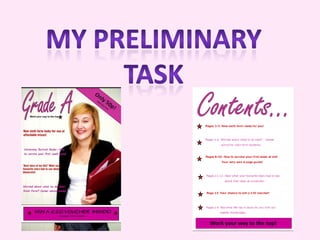
14. Front Cover Model has eye contact with the camera which makes it more inviting. The model is of the same age and gender of the target audience. Model is holding a folder which has school connotations. The title ‘Grade A’ has connotations of success meaning the reader will feel that if they read this they too will be a ‘Grade A’ student. Sell lines include career advice, a University survival guide and other aspects relating to the age range of the target audience. Feminine colour scheme.
15. Contents Page Feminine colour scheme followed on from front cover. The articles shown on the contents page have relevance to the school environment. Articles from sell line are also shown on the contents page. Light-hearted language which the reader can identify with.
![Research Conventions of a school/college magazine ,[object Object]](data:image/gif;base64,R0lGODlhAQABAIAAAAAAAP///yH5BAEAAAAALAAAAAABAAEAAAIBRAA7)