47 Conversion Rate Optimization Tips
•Download as PPTX, PDF•
33 likes•16,207 views

This document summarizes a 101-tip presentation on conversion rate optimization (CRO) given by Josh Patrice. The presentation covers tips related to psychology, testing, user experience, and landing page and ecommerce optimization. Some key tips include leveraging fear and greed in users, using social proof and calls to action, and testing colors, buttons and messages. It also provides tips for crafting the user journey through the AIDA model, matching pages and ads to keywords and users, and reducing distractions and commitments on pages.

Recommended
Recommended
More Related Content
What's hot
What's hot (20)
Similar to 47 Conversion Rate Optimization Tips
Similar to 47 Conversion Rate Optimization Tips (20)
More from BrightEdge
More from BrightEdge (20)
Recently uploaded
Recently uploaded (20)
47 Conversion Rate Optimization Tips
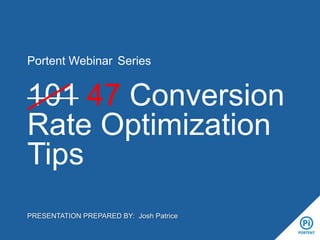
- 1. Portent Webinar Series 101 47 Conversion Rate Optimization Tips PRESENTATION PREPARED BY: Josh Patrice
- 3. WHO IS THIS GUY? Josh Patrice Director of SEO, Portent • Over 10 years in the search industry • User Experience, Info Architecture background • Agency experience • Passion for CRO 3
- 5. PSYCHOLOGY #1 Fear v. Greed • • • • The basis of all our users’ online interactions. Origins in market trading. Users default to fear, more conversions come from trust Greed is good. • • • • Free whitepaper & site evaluation 20 minute consultation Analysis of 5 competitors Send your website address to info@domain.com 5
- 6. PSYCHOLOGY #2 Familiarity leads to Conversions Familiarity builds trust. Trust builds greed. Greed leads to conversions. 6
- 7. PSYCHOLOGY #3 Habit Forming Leads to Success Restaurant receipts are habitual. User form fields: Subtotal, Tip, Total, Signature True worldwide. Meaning there is no barrier to success regardless of the language barrier. 7
- 8. PSYCHOLOGY #4 Loss Aversion Practiced by Living Social, Groupon, Amazon Local, Touch of Modern, etc. Messages like: • Only 10 left! • 3 days remaining • Limited time offer Think …infomercial 8
- 9. PSYCHOLOGY #5 Social Proof Trust factors through social resources. Your friend Tommy likes this and so do 9,000 other people • Facebook Likes • Tweets • Shares • +1 If you don’t have social presence, leave these off your site! 9
- 10. PSYCHOLOGY 10 #6 Call to Action Users need to be told what to do. Craft a message that will not only resonate with their wants, but also compel them to take action Sign Up Now! Give us Your Email NOW Get Your Quote Order Now Buy Login
- 11. PSYCHOLOGY #7 Color Psychology People relate to colors differently 84.7% buy because of a color 52% customers didn’t return to a store due to aesthetics http://www.webpagefx.com/blog/web-design/psychology-of-color-infographic/ 11
- 12. PSYCHOLOGY 12 #8 Button Color Orange may be the new black, but it's not the only answer. Contrast is king due to the Von Restorff effect. Blue is common on the Web, orange stands out. Some studies are skewed by poor testing scenarios. http://dmu.cdmginc.us/testing-corner-do-bigger-buttons-work-better/ http://blog.kissmetrics.com/color-psychology/?wide=1 Orange Facts: • SAP saw 32.5% uptick with a big orange button • Wider Funnel calls the big orange button BOB • Is the opposite of blue
- 13. PSYCHOLOGY #9 Personalized Button Message Reach out to your audience, it’s a leap of faith for them to buy online because there’s no human interaction. By making a button more personalized, more direct, speak to the user, you can see an increase in engagement. http://contentverve.com/10-call-to-action-case-studies-examples-from-button-tests/ 13
- 14. PSYCHOLOGY 14 #10 Study Your User Your audience isn’t a set of keywords. Build online user personas and find their habits, action paths, etc. Interviews Card Sorting &
- 16. TESTING #11 A/B Testing • • • • Test your message Test your colors Test your pictures Test everything • Test one thing at a time 16
- 17. TESTING #12 B/C Testing Don’t stop with the winner of A/B tests. Keep going! Maybe C will be better than both A & B 17
- 18. TESTING #13 Do not throw B away A/B testing can lead you astray. 31% choose B. Why? Don't ignore the "failing" message… it has a 31% success rate. Go back to your personas, see if there’s a message that works for the “B” users that could improve that conversion rate. 18
- 19. 101 CRO TIPS User Experience 19
- 20. USER EXPERIENCE #14 ABCD Layout your site with regard to the ABCD grid as seen in the landing page at right 20
- 21. USER EXPERIENCE #15 A&D Users’ eyes gravitate naturally from A to D 21
- 22. USER EXPERIENCE #16 Take out the B & C Avoid putting important information in quadrants B & C, as users will often miss the information. 22
- 23. USER EXPERIENCE #17 A&D By arranging your primary actions in quadrant D, you can expect a higher level of user engagement. 23
- 24. USER EXPERIENCE #18 Avoid Templates We’ve all seen the same landing page before, it looks a lot like the one at the right 24
- 25. USER EXPERIENCE #19 Get Creative This is much cooler, while still following the ABCD format. Essentially the same thing, with a little design for good measure and a better user experience 25
- 26. USER EXPERIENCE #20 Avoid Too Many Calls to Action Stick to 1, maybe go upto 3, but 8 is more than enough. Where should the user begin on the page below? 26
- 27. USER EXPERIENCE #21 Do not Forget New Customers You have 2 types of visitors: customers and potential customers. Remember to write content for both users. Your potential customers won’t react to the same content as your current customers and vice versa. 27
- 28. USER EXPERIENCE #22 Ditch the Drop-Down Navigation Drop-down navigation can be hit or miss. While it helps users dig deeper into your site, it can also be a major distraction. When it’s overwhelmingly huge, it can cover up the entire window when on a small screen. If you can ditch it, go for it. If not, then focus on your main user paths. There’s no reason for a direct link to your miscellaneous accessories page from the main navigation. 28
- 29. USER EXPERIENCE #23 Ditch the Distractions Sometimes, design elements distract the user from completing their goal. Site elements like banners, rotating offers, and intrusive pop-ups should be avoided. 29
- 30. 101 CRO TIPS Landing Page Optimization 30
- 31. LANDING PAGE OPTIMIZATION #24 Construct the AIDA Flow Take your users through a journey on your landing pages. awareness interest desire action 31
- 32. LANDING PAGE OPTIMIZATION #25 Awareness Get folks to your site. How? SEO, PPC, Social Media, etc. Then what? Keep them there. 32
- 33. LANDING PAGE OPTIMIZATION #26 Attraction Resonate with your users’ pain. What problem are visitors trying to solve? Your site is about THEM not you. 33
- 34. LANDING PAGE OPTIMIZATION #27 Desire Your users have outcomes in mind when they visit your landing page. Be sure to address their outcomes. This is where your value proposition comes into play. Help them answer: What’s in it for me? 34
- 35. LANDING PAGE OPTIMIZATION #28 Action Reason to believe you. Users need to trust more than they need to be sold. Examples: • icons for the halo effect • testimonials • etc. 35
- 36. LANDING PAGE OPTIMIZATION #29 Match Your Keyword to Your Ad Seeing the search query appear in the ad helps create familiarity. 36
- 37. LANDING PAGE OPTIMIZATION #30 Match Your Ad to Your Landing Page Carrying that familiarity to the landing page, continues the bond. 37
- 38. LANDING PAGE OPTIMIZATION #31 Match Your Landing Page to Your User Designing your landing page for your specific users, will lead to more frequent conversions, and stronger sentiment. 38
- 39. LANDING PAGE OPTIMIZATION #32 Match Your Socks to Your Pants 39
- 40. LANDING PAGE OPTIMIZATION #33 Avoid Instructions Instructions won’t resonate with their pain, rather compound it. Do what you can intuitively. 40
- 41. LANDING PAGE OPTIMIZATION #34 Avoid Options Keep it simple. Options create confusion and roadblocks in the conversion process. 41
- 42. LANDING PAGE OPTIMIZATION #35 Avoid Solutions Address Problems I have a problem. I don’t know the solution. Stop offering blanketed solutions to your users. 42
- 43. LANDING PAGE OPTIMIZATION #36 Avoid Statements “I don’t know you. Don’t claim you make the best pie.” -Josh Patrice This time, try to forget infomercials, as bold superlative statements can be very polarizing to users. You only get a few seconds, avoid overtly selling to them. 43
- 44. LANDING PAGE OPTIMIZATION #37 Avoid Commitment Think of your users as male characters from 90s movies & sitcoms: they’re terrified of commitment Sometimes it’s too much to ask for an email address. If there’s another way, use it. Keep forms to a minimum. 44
- 45. LANDING PAGE OPTIMIZATION #38 Embrace Instinct & Affordances Since we’re avoiding instructions, we have to embrace the instincts of our users. Landing pages should be created such that users instinctually know what to do. A door with a handle should always pull open, one with a flat bar should always push open. 45
- 46. LANDING PAGE OPTIMIZATION #39 Embrace a Garden Path Guide your users through your process, site, landing page, etc. Your site should bridge the knowledge gap between their awareness and your desired actions. 46
- 47. LANDING PAGE OPTIMIZATION #40 Embrace the Result It’s not all about showing them that you know their needs, that you can help. It’s also about showing the outcome which should be recognizable to your user. 47
- 48. LANDING PAGE OPTIMIZATION #41 Embrace Questions The user doesn't need to have the answer, and they can be open to suggestion because they don't know the answer. Sometimes, it’s best to initiate a conversation in order to get your users to their desired outcome. Find your 3 most common problems, and turn them into questions. 48
- 49. LANDING PAGE OPTIMIZATION #42 Embrace Engagement We’re detached online. Create interaction without users submitting their info. Have them create something of value for free, and then save it through registration. Use filters for user engagement. 49
- 50. 101 CRO TIPS eCommerce: Product Pages & Shopping Carts 50
- 51. ECOMMERCE #43 Show me the Price Don’t hide your price under copy or with a color that blends in. Make it stand out! 51
- 52. ECOMMERCE #44 Show me the Shipping Humans will rely on one trait or piece of info when making a decision. Free shipping is most important order factor: • • 52 percent of abandoned online shopping carts in 2011 were due to a lack of free shipping deals* Shoppers spend an average of 30% more when free shipping is available* *http://www.freeshipping.org/statistics/ 52
- 53. ECOMMERCE #45 Common Product Page Info • • • • • • • • • • Customer reviews/ratings Product videos Unique product descriptions Individual Q&A on the product page Social sharing buttons CTA Trust signals: Certified Reseller, etc… Stock & availability levels Product options – Fewer options make for easier decisions. Image size – Large images can help sell. Probably not a major concern if your product is butter, we all know what butter looks like. If your product is a dress with detailed print, then bigger is better. 53
- 54. ECOMMERCE #46 Show me the Cart & make it Persistent Put the cart in the top right and keep it there. Make it easy to preview, show me what’s in it when I hover over it. And by all means, make it persistent. Save my order for the next time I visit the site. A National Mail Order Association study showed that 35% of shoppers took over 12 hours to complete their purchase. Another 21% took more than 72 hours. Keeping their items in the cart for 7 days could lead to significantly higher conversion rates. 54
- 55. ECOMMERCE #47 Progress Tracking Roadmap Steps help users see the finish line, leading to less drop-off. 55
- 57. Portent Webinar Series Thank You! PRESENTATION PREPARED BY: Josh Patrice @syzlak