VIP Call Girls Service Charbagh { Lucknow Call Girls Service 9548273370 } Boo...
Evaluation question 5 part 3 /
1. Evaluation Question 5 Part 3
Appealing to my Target Audience
To appeal to my target audience I deliberately took several routes to keep me on track with my genre.
Before starting I performed some initial research about what to include, this showed me that I needed
a range of locations, a fast pace of shot changes, a relatable character to the audience, and the
correct colours for the genre. I have included these things hopefully making it appropriate to my
audience.
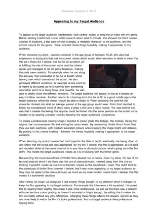
When choosing my actor, I wanted someone in the age group of between 15-25 who also had
experience in acting and that met the current trends which would allow watchers to relate to them. For
this job I chose Ed. I believe that he did an excellent job
at fulfilling the role of the runner as he met the criteria
above and managed to do the parts flawlessly, making
the parts seem realistic. For example when he ran along
the alleyway then pretended to be out of breath whilst
leaning over which dramatised the action. He also
portrayed different emotions, for example at one point he
is meant to be scared as he is running from something.
At another point he is being brave and powerful, he was
able to clearly show the different emotions. The target audience will appeal to this as it creates an
easy to follow narrative. Another reason for choosing ed is that he is 19, ie a good middle age in the
target audience which the viewer should be able to relate to. When choosing the outfit for the
character i looked into what an average person in the age group would wear. From this I decided to
follow the standardised trend of black jeans a white t-shirt and a black hoodie. The idea behind this
was that it creates the feeling that anyone could be thrown into the same position as the runner so he
needed to be wearing standard clothes following the target audiences conventions.
To create a professional looking image I decided to colour grade the footage, this involves taking the
original raw uncompressed file and setting the colour levels. By researching thriller films I found that
they use dark overtones with medium saturated colours whilst keeping the image bright and detailed.
By grading to this criteria I believe I followed the trends hopefully making it appropriate to the target
audience.
When planning my product researched font types for the titles in depth, eventually narrowing down on
one which met the styles and was appropriate for my film. I believe that this is appropriate as it is bold
and rounded whilst at the same time not to in your face to distract you from what’s going on in the film
entry. This meets the target audience's needs as it is in keeping with the thriller genre.
Researching the music/soundtrack of thriller films allowed me to narrow down my ideas. On two of the
textural analysis which I did there was the use of classical music. I veered away from this due to
thinking it wouldn't create as much of a dramatic impact as the soundtrack I used. This didn't stick to
the stereotype of thriller films however i believe that it was more appealing to my target audience as
they may not relate to the classical music as much as my more modern sound track. I believe that this
makes it a worthwhile decision.
After having my rough cut analysed, I had several things brought to my attention which I changed to
keep the film appealing to my target audience. For example the titles were a bit squashed, I improved
this by spacing them slightly, this made it look more professional. As well as this there was a problem
with one sections colour grading as it wasn’t saturated or bright enough, by editing this it makes the
film run better without any jolty differences. Changing these things affects the viewer's opinion as they
are more likely to watch the film if it looks professional. And my target audience likes professional
looking films.