
Recommended
More Related Content
Similar to Evaluation of Websites- Mocking Elections
Similar to Evaluation of Websites- Mocking Elections (20)
More from Nazish
More from Nazish (20)
Recently uploaded
Recently uploaded (20)
Evaluation of Websites- Mocking Elections
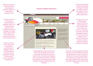
- 1. Right at the top there is They have a register/log a scroll down place, in hyperlink at the top where you get to of the page. This allows Evaluation of Websites- Mock Elections choose your region. This you to get involved in shows that this this campaign. This is a campaign is a well- way that they will be established campaign able to measure their They have a banner at The tabs are across the the top, which top of the page. illustrates what this However they’re just campaign is about, as its speech bubbles and ‘mocking elections’, don’t have writing on which you know them, which in my through the name of the opinion is really bad, as campaign. The images the readers don’t know are also really colourful, what page has what on which catches your it. So if I was to create a eyes, and all the colours website, I would used complement each definitely have text for other the tabs, so that the readers know exactly They have used one what they’re clicking on centre image, which shows people participating in the campaign. This also shows that they are The homepage has way too much text on it, They have a lot of text along the side which successful, and are which I don’t think helps at all, as most in my opinion makes the website look really getting their message readers won’t be bothered to read all of boring. However, the reason to why they across, and their that, as it looks very boring. Even though the have the text is because they want to give opinion is being heard, text is there to give information, I still think the readers more information. They also and taken into the paragraphs of writing should be saved to have links through which the readers can go consideration be written on pages, and definitely not the onto different pages, and that will be easier homepage for them.