Guitarist magazine presentation powerpoint
•Download as PPTX, PDF•
1 like•699 views

This document provides details about the Guitarist magazine, including its history, editors, photographers, and analyses of its front cover, contents pages, and a double-page spread. Some key points: - Guitarist is a long-running guitar magazine in Europe that has been published monthly since 1984 focusing on alternative rock and heavy metal. - It features reviews of new guitars/equipment, interviews with players, and is aimed at an upper-middle class, male readership. - The magazine costs £5.50 and includes a free CD, with the cover price subsidized by advertisements within.
![Facts About ‘Guitarist’ Magazine ,[object Object]](data:image/gif;base64,R0lGODlhAQABAIAAAAAAAP///yH5BAEAAAAALAAAAAABAAEAAAIBRAA7)
Recommended
More Related Content
What's hot
What's hot (20)
Similar to Guitarist magazine presentation powerpoint
Similar to Guitarist magazine presentation powerpoint (20)
Recently uploaded
Recently uploaded (20)
Guitarist magazine presentation powerpoint
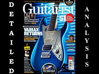
- 1. D E T A I L E D A N A L Y S I S
- 3. Longest running guitar magazine in Europe.
- 6. Plus interviews with guitar players.
- 8. Jim Douglas (Editorial Director)
- 9. Matthew Hurlain ( Group Art Editor)
- 10. Julie Tolley (Group Senior Editor)
- 12. Dave Caudery
- 13. Neil Godwin
- 15. Launched as response to advertiser demand.
- 17. Contents Page Analysis – Part 1 How many fonts have been used and why? 4 to 5 have been used throughout the contents page. This is because the word ‘contents’ must be in bold to indicate that it’s the contents page; to the audience. Also different sections in the magazine are addressed by different fonts for specific sections. How is language targeting the audience? The language used is generally directed to the A – C1 category of the ‘Standard Occupational Classification’ system. Meaning that the language used throughout the magazine is formal (Standard English) – as the magazine is targeted to an upper – middle class niche audience. Give examples ‘Line 6 upgrades its digital guitar with the help of master craftsman James Tyler. We exclusively review and demo the first MK II variax to storm the UK’. What images have been used and why? On the first page there is a close up shot of the guitar in the middle of the page. I think this is because the designers want to remind the audience it is ‘Guitarist’ magazine. On the second half on the contents page there is medium shot of a musician on the top left hand side corner of the page. Give a denotative description of the layout of the contents page. The first page of the contents page shows an electric guitar which covers 2/3 of the page. With 1/3 of the page containing page numbers and briefly what contents will be on that specific page or pages within the magazine.
- 18. Contents Page Analysis – Part 2 Give a denotative description of the layout of the contents page. The second page contains one image which is larger than another image on the same page. The rest of the page contains the continuation of the page numbers and there brief relevant page information. Discuss the use of colour using denotation and connotation The use of colour is minimal – meaning that the in the two page of the contents magazine they use roughly 4- 5 colours. Which area all masculine colours; that shows that the magazine is directed to a male readership rather than female. Also the use of few colours may be to make the audience focus more on the images provided on both pages of the contents page rather than the text.
- 19. Double Page Spread Analysis Give a denotative description of the layout The layout on the double page spread is busy, there are images scattered around both pages with associated text relevant to the image close by, also information for example booking tickets, telephone numbers, animations are at the sides of the pages. What images have been used and why? The images used are relevant to the text which accompanies the images. For example if there is an image of a bass guitar the image would be relevant to the text. When reading the text the purchaser may not know what guitar the text is discussing; so having the image of the guitar joint to the text makes it easier for the reader to identify with what the text is talking about. How many fonts have been used and why? The amount of different fonts used is around 4 – 5 on both pages of the spread. This may be to break up the text; so that the purchaser is not overwhelmed with text and will find it somewhat enjoyable to read and also to comprehend. Discuss the use of colour using denotation and connotation Also another example is a sign stating - ‘TICKETS FOR SALE NOW’ in bold white font with a red circular background. The use of a red background is possibly used to associate with warning that tickets are running low.
- 21. Price + including free CD : £5.50
- 22. Standard occupational Classification : Between A- C1 Band
- 23. Number Of Pages: 202 including front & back cover.
- 24. Number Of Editorial Pages: 70+
- 25. Has many adverts within the magazine meaning the cover is cheaper.
Editor's Notes
- (2) for independent verification on the claims made by advertising sales (magazine/newspapers)
- When looking at a magazine based on its front cover; to initially access whether the content within the magazine is relevant or interesting to the prospering buyer they will have a quick glance at the relevant information provided. This tells you what feature articles are within the magazine
- Give a connotative analysis of the layout of the contents page.The first page of the contents page; I previous said contained a image of an electric guitar that took up 2/3 of the page – this shows that the magazine ‘Guitarist’ is more concerned about showcasing that specific guitar than having a page containing a larger ratio of text than image.