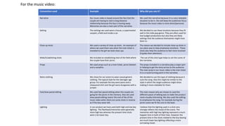
1. Convention used Example Why did you use it?
Narrative Our music video is based around the fact that the
couple are having to start a long distance
relationship because the boy is moving away.
Memories are also a main part of the narrative.
We used this narrative because it is a very relatable
situation to be in. this will keep the audiences focus
because the music video is more direct/personal.
Setting The settings we used were a house, a supermarket
carpark, a field and inside a car.
We decided to use these locations because they fit
well in the indie pop genre. They are often used for
low budget productions but also they are likely
settings that the audience themselves might have
been to .
Close up shots We used a variety of close up shots . An example of
where we used them was when the train ticket is
revealed to the girl we took close ups.
The reason we decided to include close up shots in
our piece was to help emphasise emotions . These
shots also help the audience to feel more involved
(It grabs their attention).
Wide/Establishing shots We included an establishing shot of the field where
the couple have their picnic.
The use of this shot type helps to set the scene of
the narrative.
Props We used props such as a train ticket, picnic blanket
and a campfire.
The props included in a narrative play a major part
in helping to get the story across to the audience.
The main prop in our music video is the train ticket
it is a crucial turning point in the narrative.
Retro clothing We chose for our actors to wear casual generic
clothing. The typical style for the teenager age
group. For example the boy wore jeans and a
chequered shirt and the girl wore dungarees with a
jumper.
We decided to use this type of clothing because it
suits the song. Also this might be similar to the
style in which the target audience might dress
making it more relatable for them.
Fast/slow paced editing We used fast-paced editing when the couple are
going for the picnic in the memory. Also we used
slow-paced editing nearer the end of the of the
music video when there are some shots in reverse
as if the boy never left.
The main reason why we choses to used the
different paces of editing was to make the product
more visually interesting. We also used the editing
to emphasise the song. For example during the
picnic scene we fit the cuts to the beat.
Lighting In our product we have used both high and low key
lighting . The flashback/memories were generally
more high key whereas the present time shots
were a lot lower key.
I believe that the lighting used in a shot very
strongly reflects the mood of the scene. The
memories with high key lighting represent a much
happier time in both of their lives. However the
present time in the shots related to the boy leaving
are much lower key lighting reflecting a more
sorrowing mood.
For the music video:
2. Convention challenged Why did you not use it?
Performance element We did not include a performance element in our product because we felt that our narrative was
enough to fill our video. We felt that if we did include a performance then there would be way too
much going on. It would also appear too complex to the audience. We wanted our product to be
easily understood but at the same time not too simple.
Black and white filter An indie pop convention is to apply a drastic black and whit filter to certain parts of the music video.
We however did not think that this particular convention would fit our narrative. It would have
stood out too much from the rest of the footage making it look out of place. We have used filters
however they are a lot more subtle. For example on the memories we have brightened them to help
show the contrast between past and present.
Non diegetic sound Because of the nature of the our narrative , adding non diegetic sound was not needed. Actually
there is one tiny bit that could be classed as no diegetic sound is when the girls is on the skateboard
in the very first shot. The sound of the wheels running along the payment is played when the music
track is very quiet and is about to begin. So they only slightly cross over.
For the music video:
3. For Digipak:
Conventions used (example) Why did you use it? Conventions challenged Why did you not use it?
Making a clear connection between the music
video and the ancillary products- For example the
main prop in the narrative of the music video is a
train ticket. In our digipak this is featured right in
the centre of the design.
We made sure there was a clear visual connection
between the two products because it ties
everything together. Also it would be a source of
advertisement because the consumer would see
the digipak and wonder where the pictures had
come from.
A convention of indie pop digipaks is to use
alternative images in the cartoony style.
Because we wanted the digipak to have a very clear
link to the music video this convention wouldn’t be
suitable. There is no kind of alternative footage
included in our product.
Its not usual for the digipak to feature a photo of
the band. In our product we have followed this
convention. The digipak is very much based around
the actors and narrative.
It only seemed logical to not include a band photo
because there is no performance element (there
would be absolutely no link). Indie pop bands tend
to not have the spotlight on their appearances but
on their music.
A common convention used in digipaks for the indie
genre is the use of dark colours to emphasise the
mood of the whole digipak.
The main theme of our products is happy memories
so darker colours wouldn’t not fit with this theme.
The aesthetics wouldn’t not be suitable.
Another convention of the indie pop genre is using
unusual texts for the main font included in the
digipak.
We wanted to stick to this convention because the
band have their own font as their logo. This logo
identifies the band and so we felt like without it
there would be a huge key factor missing.